On this page

Scott
Layout design organizes text, images, controls and space so readers can understand a message and act on it. In an interface, a good layout makes the main task clear and stays usable when content or screen width changes.
Use these principles in a UI design tool with reusable layouts, then try the appointment-card example below to see how hierarchy, alignment and spacing work together.
Why Layout Design Matters
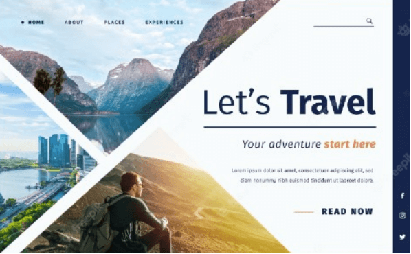
Layouts are simply crucial to support a designer’s creative flow and ensure there is a structure to their work. Moreover, it is the backbone for delivering the brand value and image of one’s message to the target audience. Hence, understanding its benefits is crucial for any type of designer. Layout design provides:
- Beautiful flow of the content which makes all the information more comprehensible and digestible, without breaking the segment.
- An aesthetically pleasing view that engages users to keep reading and gain information.
- Harmony to the design with the practical arrangement of elements, texts, colors, and white space.
- Organization of the message being communicated to users and a better experience when interacting with your website or app.
Six Building Blocks and Principles of Layout Design
When working on any design project, it is crucial to know the fundamental principles behind a layout design. Start with the elements in the layout, then consider five principles that organize them:
1. Elements
The first thing you need to know about is what elements make up a typical design of layout. A layout design comprises:
- Text - All your typography that consists of your headlines, headers, subheaders, body text, etc.
- Images - All your graphical illustrations that include photographs, infographics, and other illustrations.
- Lines - Usage of horizontal, vertical, and diagonal lines of different lengths, thicknesses, and colors to divide each section in your layout.
- Shapes - The inclusion of organic, geometric, and abstract shapes that help to make certain parts of your layout stand out and support the message being communicated.
- White space - All your blank space available between the elements can be utilized to make certain elements stand out and grab the user’s attention.
Now that you have learned about the basic elements that make up a layout, let’s explore other principles that support making a great design.
2. Visual Hierarchy
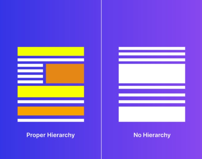
A beautiful layout usually consists of an arrangement of information and elements in such a way that it forms a pleasing visual hierarchy. Hierarchy simply refers to the positioning of certain elements within the layout that makes it stand out and helps the user digest the information in a well-organized manner.
3. Alignment
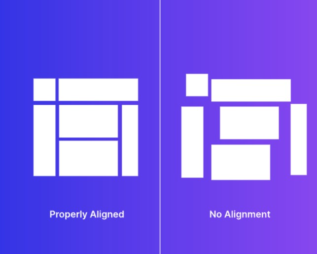
Alignment is important when it comes to arranging different design elements in relation to each other. Optimizing the alignment of text, images, and other elements by utilizing left, right, or centered alignment can help your users to focus on important information.
4. Contrast
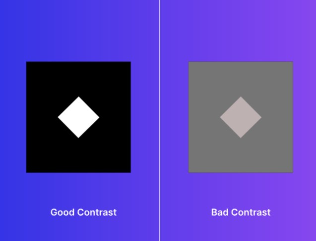
Contrast helps to make certain elements in the layout more attractive to the user’s eyes. The usage of different colors and typography fused against the background elements and color helps to make your design more distinctive and visible.
5. Balance
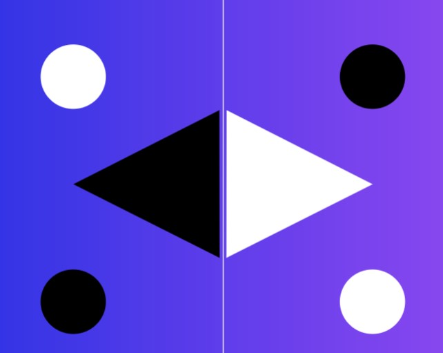
Balance usually refers to the way your visual elements balance each other out to make a visually pleasing look. You can utilize symmetrical or asymmetrical visual arrangements depending on the core message you are delivering in your design.
6. Proximity
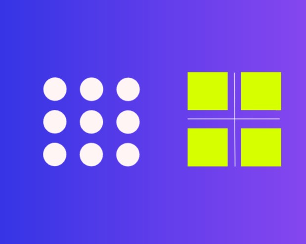
Last but not least, managing the proximity in your layout design is crucial too. It typically refers to the distance between each element in your layout. You can adjust how close or far you want your elements to be which caters to your goal and the message being communicated.
Tips for Planning a Useful Layout
Put these principles into practice by planning the content and testing how the layout behaves.
Prep yourself with planning and inspiration
Planning your layout design goal is crucial; hence making use of mood boards to create a collage of inspirational designs can help. Brainstorm and put your ideal color palettes, design elements, images, fonts, etc., and plan in advance how you can arrange all the information. This will make your workflow go smoother when you start designing the layout.
Ensure the design theme relates to the content
Match the layout to the information and the reader’s task. A formal service can use warm colors, and a playful product can use a restrained palette. What matters is whether the hierarchy, imagery and tone help people understand the content; color temperature alone does not determine professionalism.
Focus on contrast for clarity
Making your most important pieces of information visible to your readers is crucial. Hence, ensure that you create strong visual contrast by playing around with your colors, fonts, images, and other elements.
Use white space deliberately
Moreover, your white space or negative space also helps in a way to draw users’ attention to important information. Therefore, look to give more room for your white space so your layout is not too crowded and have your white space draw the user’s eyes onto other important elements.
Don’t forget your fonts matter too
Your typography also aids in making your layout very appealing. You can utilize specific font pairings that match the content you are delivering and the target audience. Feel free to test different typefaces and find the right font combination for you.
Make use of templates
For gaining more inspiration, it is good to refer to templates available online to base a good design layout on. This can help you to plan out layouts with grids and make beautiful layouts.
Apply the principles: a responsive appointment list
Imagine a clinic page where a person compares three available appointments. Each card contains the practitioner’s name, specialty, clinic address, next available time and a booking action. The layout should support comparing availability without hiding where the appointment takes place.
| Principle | Decision in this layout | Failure to look for |
|---|---|---|
| Hierarchy | Place the practitioner and next available time before secondary background details. | A large portrait dominates while the appointment time is hard to find. |
| Alignment | Align comparable fields across wide-screen cards; keep labels beside their own values. | The booking action appears to belong to a neighboring practitioner. |
| Proximity | Keep the clinic name and address together; separate them from the time choices. | A time is visually grouped with the wrong location. |
| Contrast | Give the booking action a clear visual role and keep secondary text readable. | Everything looks like a primary action, or the address is too faint to read. |
At a wide width, three columns may work. As the available space shrinks, move to fewer columns before names, addresses and actions become cramped. On a narrow screen, stack the same cards in the same meaningful order. The exact breakpoint follows the content’s ability to fit, not a particular phone model.
Build one card with a vertical Auto Layout group, put the name and specialty in a nested text group, and keep the booking control after the availability. Give the text room to wrap. If equal-height cards are useful in the wider layout, test the longest address before pinning actions to a shared baseline.
Now replace a short name with a long one, add a second clinic line and change “Book” to a longer translated action. Check that the card grows without overlapping the next card and that the reading order is still clear. Also test the no-availability state: an unavailable card should explain what the person can do, not leave an empty gap where the action was.
For implementation, include the intended reading order and reflow behavior with the design. W3C’s reflow guidance explains why people should be able to read ordinary content without scrolling in two directions when zooming. A static desktop mockup alone cannot demonstrate that behavior.
Make Repeated Layouts Easier to Maintain with Auto Layout
Auto Layout helps manage spacing, alignment and how containers respond to their contents. It does not choose the right reading order or guarantee that every design fits every screen. Set sensible sizing rules, then test long text, extra rows and narrow widths.
Pixso combines Auto Layout with reusable components and team editing, so changes to a representative card can be reviewed alongside the surrounding layout.
The main features of Pixso include:
- Advanced design tool options that help designers to create professional-looking layouts with ease.
- Auto Layout maintains chosen spacing and sizing relationships; designers still decide how the composition changes at different widths.
- Collaborative tools that allow designers to collaborate with their colleagues and make edits in real time.
- A design community that gives designers inspiration and shares design ideas with other creative designers.

Start with One Representative Layout
A useful layout helps readers identify the main information, compare related items and find the next action.
Start with one representative layout and real content. Reuse its structure where the task is similar, and change the structure when the content no longer fits. Consistency should make information easier to understand, not force every page into the same arrangement.