On this page

Scott
A mobile app wireframe shows the information, controls and screen sequence needed to complete a task before visual styling is settled. Start with one job, such as reserving a meeting room, and include the states that make it possible: selection, review, confirmation and a way to recover when the chosen room is unavailable.
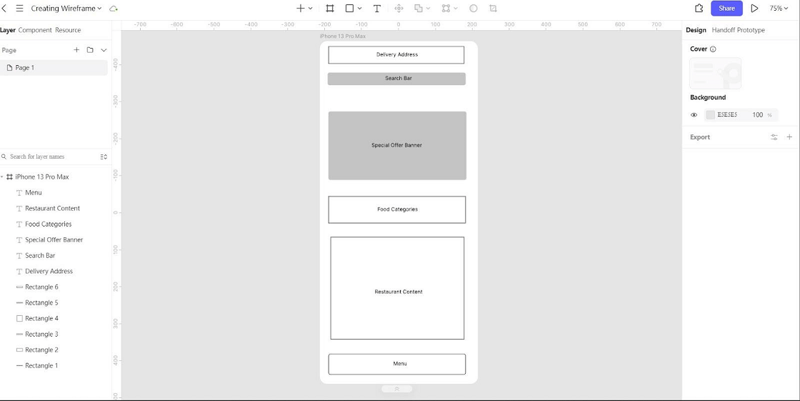
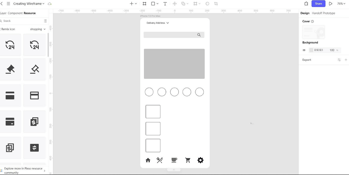
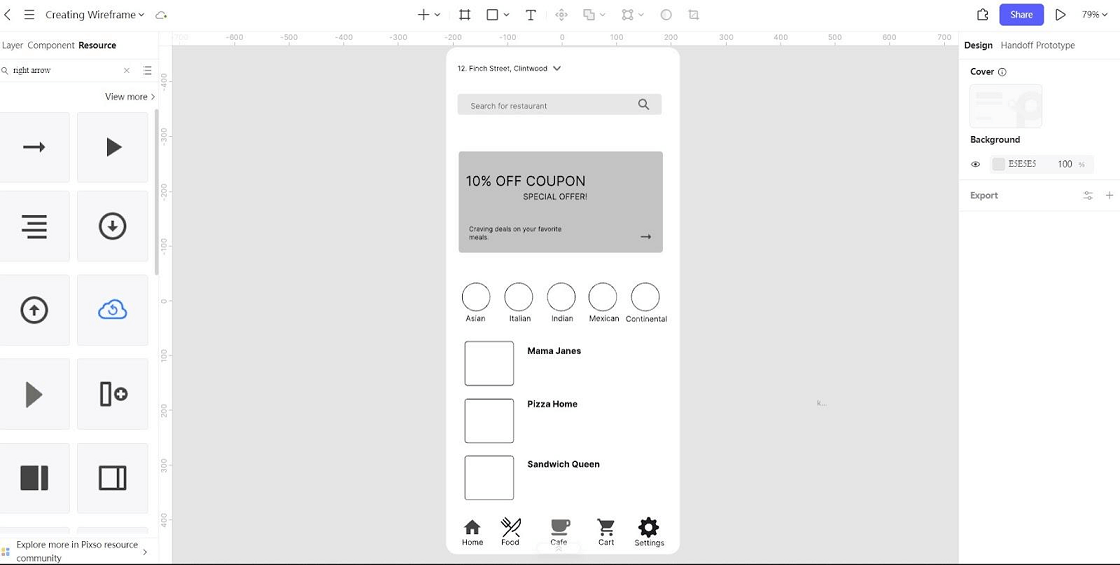
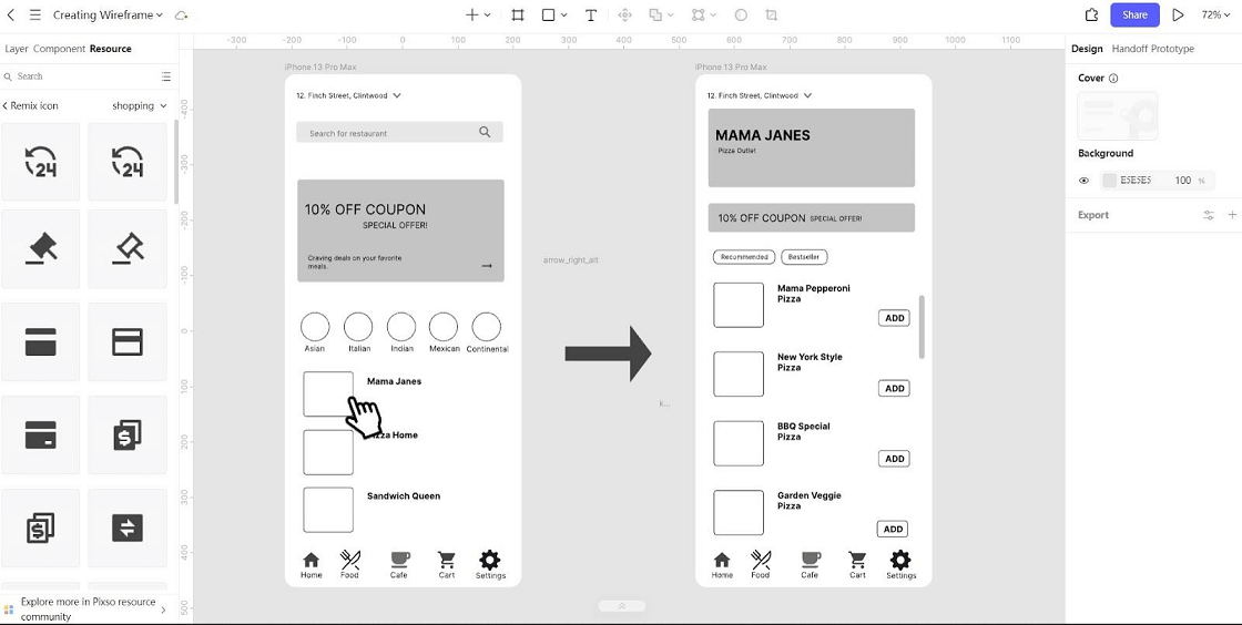
Choose a wireframe tool for mobile apps that lets you revise layouts and share the flow with reviewers. The five Pixso screenshots below demonstrate editor operations with an existing retail example. The room-booking exercise explains how to apply those operations to a different task; it is not the interface pictured in those screenshots.

Part 1. What Are Mobile App Wireframes?
A mobile app wireframe is a simplified representation of the information, controls and layout of a screen. It helps designers, developers and stakeholders discuss what a person needs to see and do. Several connected screens or annotated states are needed to explain a complete task.
Wireframes often use restrained colors and simple shapes to keep attention on structure. A static screen can explain what is present, but it does not demonstrate every interaction. Connect screens and annotate changes when you need to discuss behavior; styling alone does not turn a wireframe into a testable flow.
Part 2. Why Is It Important to Create a Wireframe for an App?
Wireframes give the team a concrete structure to inspect before detailed styling. In the room-booking exercise, that structure includes room capacity, available times, the selected slot and a clear result. Each of the following benefits depends on making those decisions visible.

1. It provides an overview of the app
A wireframe gives stakeholders a quick view of the proposed information hierarchy. They can check whether a room’s location, capacity and equipment are present and suggest a change before visual details distract from the task. It is an overview of the proposed flow, not evidence that every project requirement has already been met.
2. It supports the app development process
Use the wireframe to ask specific questions: where does the selected time remain visible, and what happens after a conflict? Designers and developers can discuss the same state and attach feedback to it. This can shorten clarification work, especially under a tight deadline, provided the decisions are recorded and carried into the next revision.
3. It is easy to make changes
Simple wireframes are relatively easy to revise because they contain fewer visual details and dependencies. Moving a booking summary above a primary action is easier before detailed imagery and layout rules are finalized. The saving comes from keeping the early artifact focused, not from two-dimensional graphics being inherently cheap to change.
4. It helps to lower business costs
Finding a missing state before implementation can avoid rework later. For example, a room-booking flow may look complete until someone asks what happens when the room becomes unavailable during confirmation. A wireframe makes that omission visible, but it does not guarantee lower costs or eliminate later iteration.
Part 3. How to Create a Wireframe for an App
1. What should you do before crafting a wireframe?
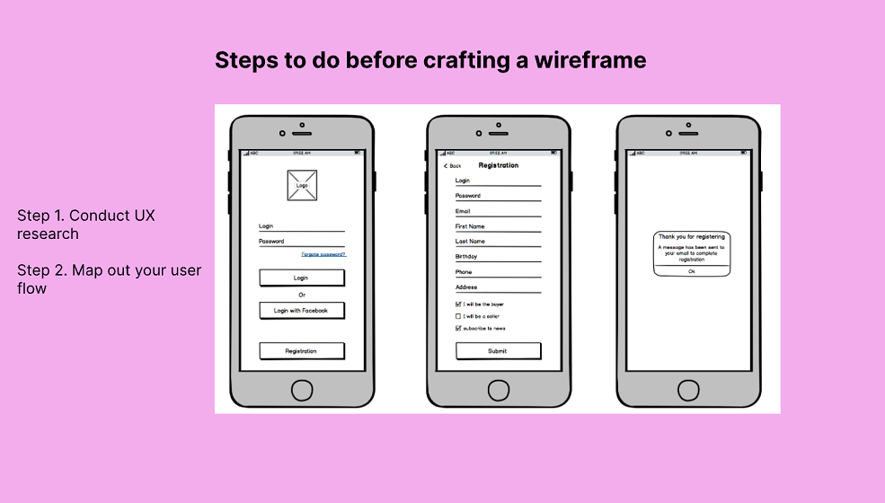
Step 1: Conduct UX research
Your very first step should be to conduct UX research. You will first need to know who your target audience is and the problems they face. Understand their pain points and behaviors to get a better understanding of how you will design your app wireframe. As a result, this helps to give you a clearer goal before you start sketching.
Step 2: Map out your user flow
Your next step should be to start mapping out your target user flow. This consists of a series of steps a user takes in their journey to achieve a goal. List out each step needed for the user to achieve their goal and it will give you an even clearer picture of what UI design elements you need to add to your wireframe.
2. What wireframe tool should you use?
Pick a tool that supports the work your team needs now: quick layout changes, readable notes, shared review and screen-to-screen connections. In Pixso, begin with simple frames and reusable elements. A community example can help you explore structure, but replace its placeholder information with your own task before reviewing it.
3. How to create a wireframe?
A complete wireframe task: reserve a meeting room
Use this brief while following the five illustrated steps: an employee needs a room for four people tomorrow from 10:00 to 11:00. The app must show suitable rooms, explain their equipment, collect a choice, and confirm the booking. If the selected slot disappears, the employee should be able to choose another room without re-entering the date and group size.
| Screen or state | Information to include | Decision it supports |
|---|---|---|
| Room list | Date, time, capacity and availability | Which rooms could work? |
| Room details | Location, equipment and selected slot | Does this room fit the meeting? |
| Review | Room, date, duration and attendee count | Is this the booking I intend to make? |
| Confirmation or conflict | Confirmed reservation, or unavailable slot with alternatives | Did it work, and what can I do next? |
Now translate those decisions into the wireframe:
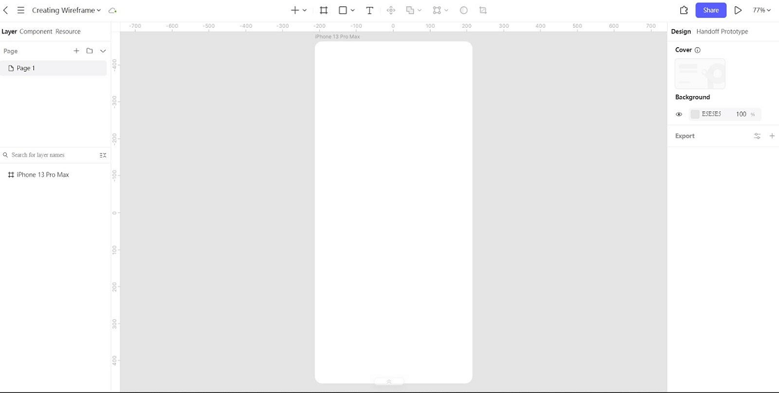
Step 1: Create a mobile frame
Create a mobile frame for a representative viewport. In the room-booking example, leave room for navigation and the main content instead of drawing the list edge to edge. Prepare a second, narrower frame later to see whether the same information still fits.
Step 2: Add shapes for your layout
Use simple shapes to place the room list, date controls and primary action. Group room name, capacity and equipment together so a reader does not associate details with the next card. Keep decorative photography out of the first decision: whether a room is suitable should remain understandable without it.
Step 3: Add UI design elements and patterns
Add the controls the task actually needs: a date choice, time range, room-card entry and booking action. Show selected, unavailable and unselected states. Familiar patterns help, but an unexplained icon cannot replace a meaningful label for an important action.
Step 4: Write your copy
Use realistic labels, room names and dates. “Book room” and “View availability” promise different results, so do not replace them with a generic button label. Include one long room name and a meaningful conflict message. Placeholder prose may be acceptable in a decorative area, but it should not hide information that drives the booking decision.
Step 5: Connect your other wireframes
Connect the list, details, review and result screens. Add a route back from review without losing the selected time. Include the conflict path and confirm that choosing an alternative preserves useful input. A presentation that advances only through the happy path cannot reveal these missing decisions.
Test the task before adding visual detail
Give a reviewer the meeting brief without naming the controls. Ask them to reserve a suitable room, then explain what was booked. Observe whether they notice the duration, understand equipment labels and recognize confirmation. If the prototype cannot simulate live availability, prepare a separate conflict state and make that limitation clear to the moderator, not as a hint on the user's screen.
Record a specific design change for each problem. If reviewers miss the capacity, move it into the room-card hierarchy; do not simply add more color. If they forget the date at confirmation, keep the date visible in the review summary. Revisit the narrow frame with the same content before turning the layout into a detailed UI.
Keep a small review record
After the first review, record the task, the state where the person hesitated, the evidence you observed and the next change. For example: “At review, the participant could name the room but missed the one-hour duration; place the duration beside the date and test again.” This is an illustrative finding, not a result from a conducted study.
Before adding color and imagery, check that the room, date, duration and group size remain visible at confirmation; the unavailable-slot path preserves useful input; and the narrow frame still presents the primary action without hiding the explanation. Those checks make the wireframe ready for the next design decision.
Turn the tested wireframe into a detailed UI
A useful set of wireframes lets the team follow a task from the first choice to a clear result, including what happens when something goes wrong. Build the room-booking sequence in Pixso, review it with representative users, and refine the information hierarchy before investing in detailed visual styling.