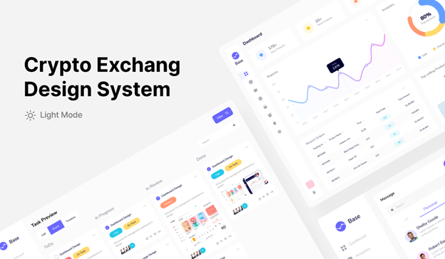
Scott
A mobile dashboard should not be a desktop dashboard squeezed into a phone. Start with the one decision a person needs to make on the move, show the few measures that support it, and give an exception a clear route to detail. For a store-operations manager, that might mean today's orders, shipped orders, and delayed orders—not every report available on desktop.
This guide uses that store-operations task to choose content, interaction, and states for a small screen. The banking and smart-home examples below show two different ways to group information; neither is a template to copy wholesale.
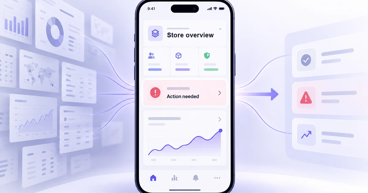
Why the mobile dashboard needs a different hierarchy
A desktop dashboard can support comparison across several charts. A phone is often opened for a faster check: “Is anything outside the expected range, and what should I do?” Carrying every desktop component onto mobile makes the small screen harder to scan and pushes the useful action below unrelated metrics.
Define the primary user and moment first. A store manager standing on the floor may need to identify delayed orders and open the affected list. A finance analyst reviewing a month-end report may need a wider comparison and should not be forced into the same mobile home screen. List the measures each person uses to decide, then separate immediate status, exceptions, and deeper analysis. Put the first two on the initial screen; make the third one tap away.
For the store example, show three compact numbers: total orders today, shipped orders, and delayed orders. “40 delayed” needs a comparison or threshold to have meaning. If the team considers more than 25 delayed orders to require attention, label the alert and let the manager open those 40 orders. Do not color a number red merely because it is large. The threshold and the business action belong to the product specification, not to visual decoration.
Design the first screen around the decision
Keep the summary small and make the exception specific
A summary card should answer what the measure is, which time range it covers, and whether the value needs action. “1,240 orders” is ambiguous without “today” and a defined time zone. Put the exception beside or immediately below the summary, not at the end of a carousel. If “Delayed orders” opens a filtered list, the list title and filter chip should repeat that scope so the user knows where the tap led.
Use color with a label or icon rather than as the only status signal. Contrast matters most for the measure, its unit, and the action—not for making every card bright. An accessible mobile dashboard is still usable at increased text size and zoom; a row of four tiny KPI cards that only fits at one font setting is not a responsive solution.
Choose the chart for the question, not for visual variety
A seven-day trend is useful if the manager needs to see whether delays are rising. Show a readable axis or a direct value at the selected point, identify the date range, and avoid stacking several tiny charts whose labels cannot be read. A bar chart may be better than a smooth line when the task is comparing discrete days. If a chart is decorative and cannot answer a question, move it to the detail view.
When data is late, identify the freshness of the value. “Updated 2 minutes ago” and “Data unavailable” are different states. A stale number with no timestamp can look current and prompt the wrong decision. If the underlying data source has a known delay, describe it where it affects interpretation rather than burying it in a generic footer.
Make filters and navigation reflect the actual scope
Mobile filters should expose the current selection, not simply hide controls in an unlabeled icon. If the manager filters delayed orders to one store, keep “Store 12” visible in the result view and provide a clear way back to all stores. A detail page should not silently reset the date range or status filter chosen on the overview. Test a return trip: overview → delayed orders → one order → back. Does the person still see the same context?
Keep primary actions in reach without covering data. A fixed action can help for a frequent task, but it must not overlap the last row, chart labels, or operating-system controls. Use familiar navigation patterns only when they match the app's structure; a familiar icon is not enough if its destination is unclear.
Work through the delayed-orders path
Sketch three screens with the same facts. The overview shows today's three measures and a prominent “40 delayed orders” alert. The second screen is an orders list already filtered to delayed items, with the active filter and date range visible. The third is an order detail with the reason for delay and the action the manager is actually authorized to take. If the manager cannot act, the screen should explain who can; do not promise a one-tap fix the product does not provide.
| Screen | Essential information | What to leave out |
|---|---|---|
| Overview | Today's scope, three key measures, delayed-orders alert, updated time | Full order table and unrelated reports |
| Filtered list | Active delay filter, affected orders, useful sort and search | Repeated KPI cards that no longer help choose an order |
| Order detail | Current status, cause, owner, permitted next action | Charts that do not explain or resolve this order |
Then draw the non-happy paths. With no delayed orders, explain that the filter found none and offer a route back to all orders. If the data request fails, say the list could not load and provide Retry without treating an empty response as a successful zero. If an order changes while the manager is viewing it, show the current status before offering an action based on stale information. These states are part of the dashboard's usefulness, not polish added after the main layout.
Two mobile patterns worth adapting
These two mobile app examples show different ways to group status and detail. Each also has a limitation worth noticing before adapting the pattern.
Banking: group related values, but watch density
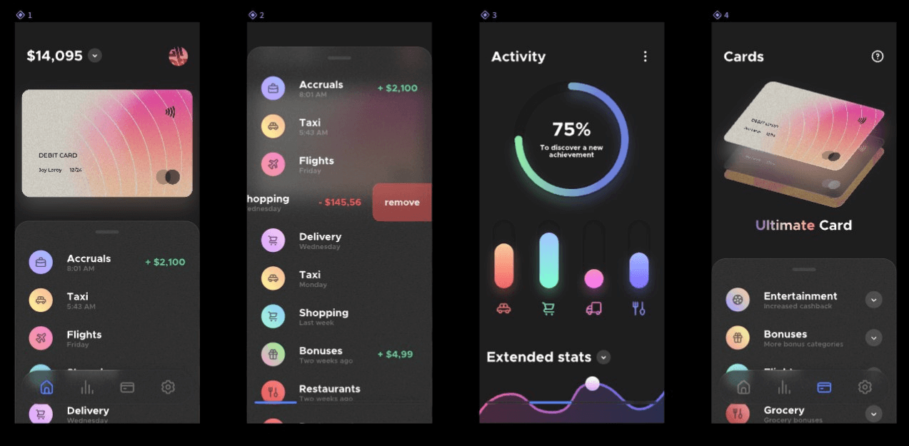
This banking set does not put every financial detail on one screen. Its home view leads toward activity and cards, which is a useful information-architecture pattern. It also illustrates a risk: several dense rows and charts become difficult to scan at phone width. In a real product, decide which balance or transaction needs immediate attention, check that labels remain readable, and expose the rest through a predictable detail path.
Smart home: make status and control easy to distinguish
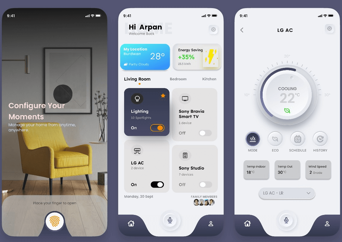
The smart-home example uses rooms and devices as the navigation structure. A room summary can answer “What is on?” while device controls live one level deeper. For your own dashboard, label whether a card reports state or changes it; a tap that toggles a device should not be confused with a tap that opens more information. The underlying safety and permission behavior must match the visible control.
Prototype the mobile decision in Pixso
In Pixso, create the overview, filtered delayed-orders list, and an empty or failed-load state as separate mobile frames. Reuse the same order-status colors and labels across them, then connect the alert to the filtered list in a prototype. The store operations data is content in the application being designed on the canvas; Pixso does not generate a live order report for this example.
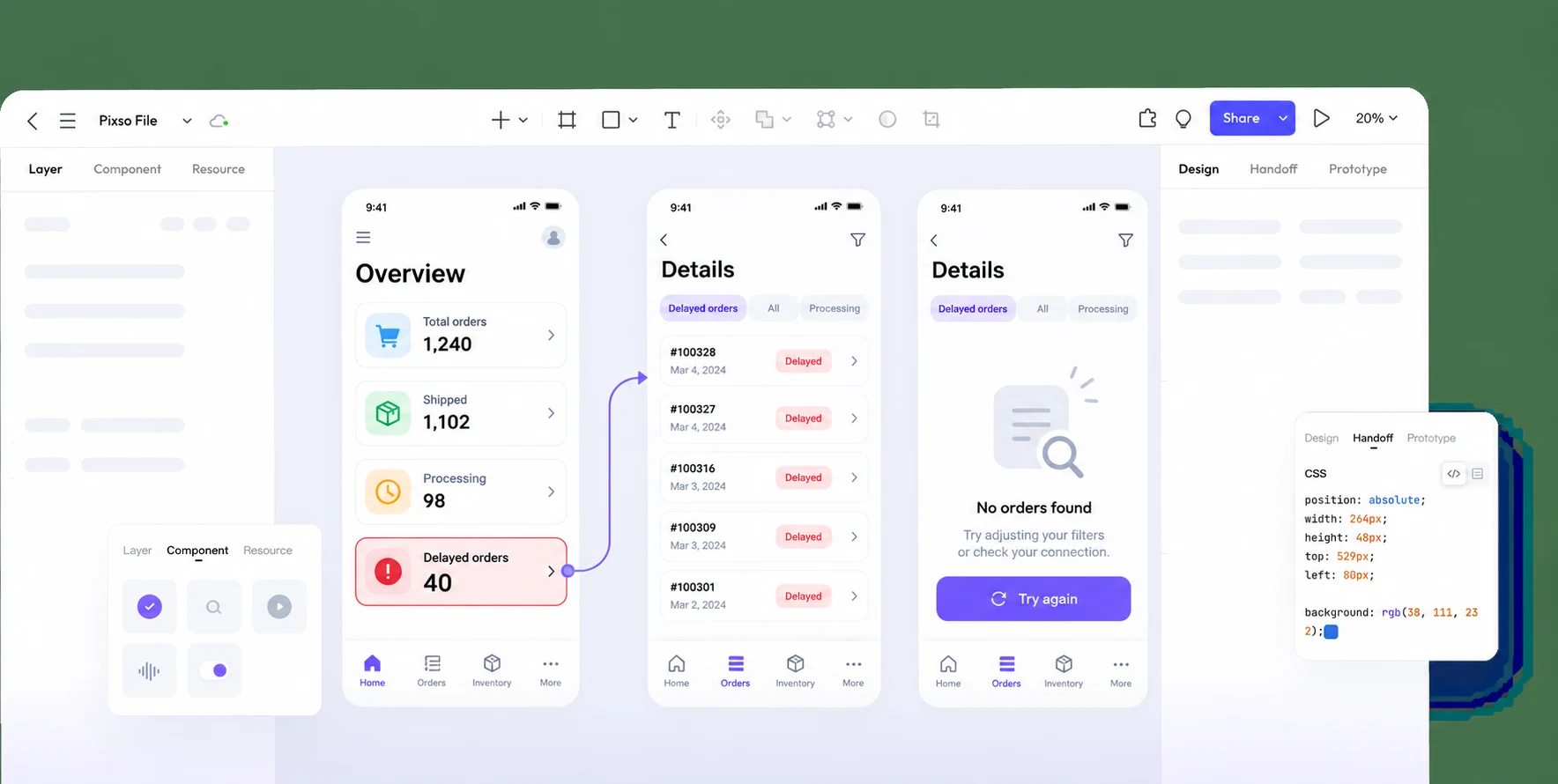
Have a reviewer answer three questions without guidance: Which number needs attention? Does tapping it show the right orders? What should happen if the list has no results or fails to load? If the answers depend on narration outside the screen, revise the labels, status, or navigation. Share the prototype with the product and engineering team alongside the definition of each measure, refresh interval, filter scope, and permitted action. Open Pixso to prototype the mobile dashboard.
![[Ultimate Guide] Adaptive Web Design VS Responsive Design](https://pixso.net/assets/media/adaptive-web-design-cover-adc36662b7b63061.webp)