Scott
When it comes to navigating a mobile app with ease, it is no surprise that the menu design helps a user massively in that department.
Users don’t want to get lost and puzzled seeing your user interface. Hence, the menu’s design helps users to give directions and navigate each screen of the app successfully.
This blog will provide an overview of the mobile menu design for helping the user to navigate with ease and increase user engagement with the app.
Part 1. Importance of Menu Design for Mobile Navigation
Undoubtedly, we know the user’s engagement and experience with the app is the top priority over anything else. As designers, it is important to understand that the menu plays a vital role in the user’s navigation and understanding of the app.
1.1 Menus establish hierarchy
When it comes to understanding the app’s content and all the detailed information, a mobile menu helps in adding that backbone structure. Thus, establishing some visual hierarchy and overview of the app.
1.2 Makes important information stand out
Thanks to the mobile menu’s design, it helps users to see the most important and desired pieces of information they want to see. As a result, it helps users to increase engagement with the app better and solve their problems.
1.3 Provides a comfortable experience
Last but not least, an effective mobile menu design helps to make a user’s navigational journey as simplified as possible. Users don’t need to repeat steps or scroll all over to find where they want to go.
Part 2. Types of Mobile Menu Navigational Designs
As you have understood the importance of designing a mobile menu for its navigational purposes, let us understand the different types of navigational menu designs you should be aware of as it is being used in most apps.
2.1 Tabber Menu Design
This is the most commonly used and classic navigational menu design that you find—especially in iPhone apps. Because of its simplistic and easy-to-develop feature, this bottom navigational menu design makes it comfortable for users to operate with only their thumbs. Its biggest plus point is it shows where the user is currently located in the app. However, if there are many location elements configured into the tabber menu, it can feel a bit redundant and not so pleasing to look at.

2.2 Rectangular Menu Design
This is another classic navigational menu design pattern and is different from the tabber. Often called grid navigation, it bundles all the menu locations together on the homepage where users can scroll and also select its contents. This is now becoming a less frequently used design pattern than it used to be, but still a pretty effective and clear navigational design to increase a user’s efficiency. However, implementing bright color schemes can tire out the user’s visual engagement with the app so there is a drawback to it.
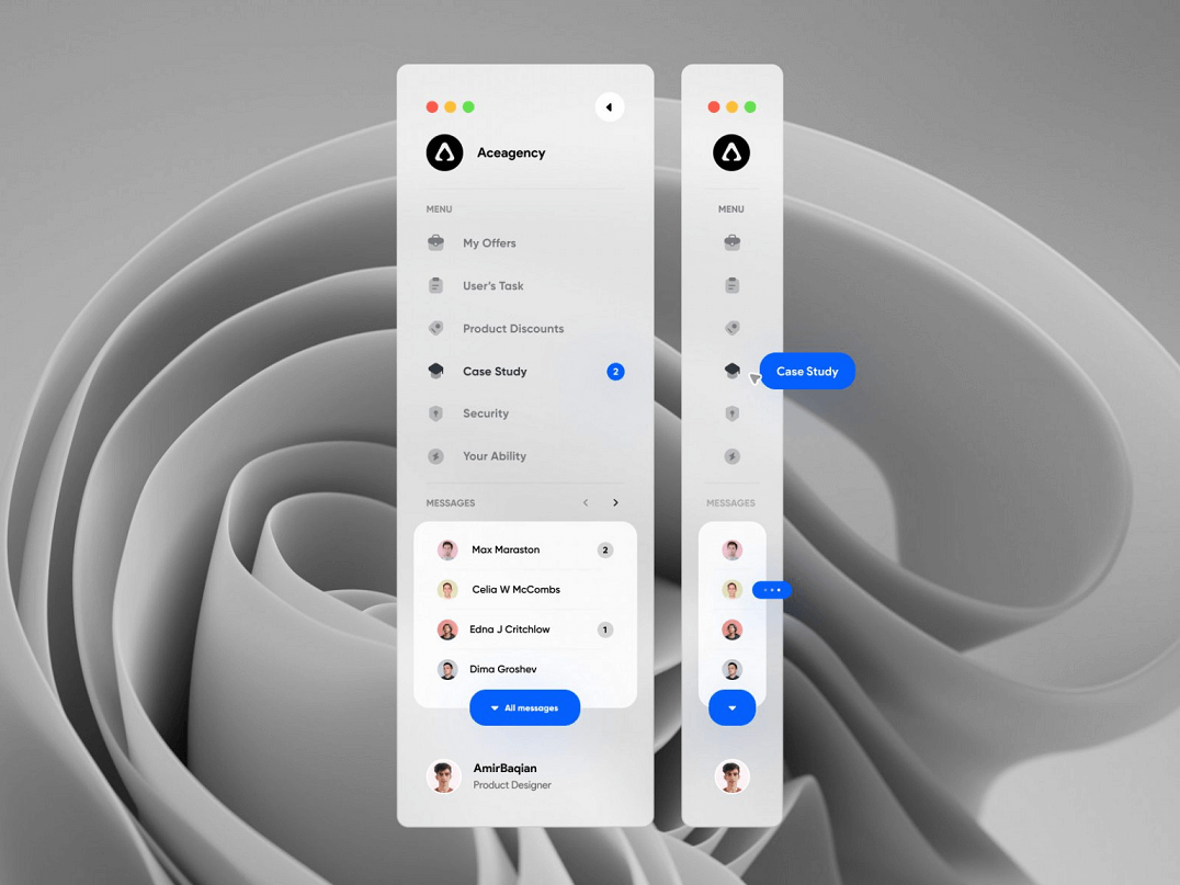
2.3 Drawer Menu Design
This design pattern involves arranging all the content items in a vertical manner and hiding the menu in a corner. Once you click on that hidden menu, it will automatically be expanded to display all menu content information. This design pattern helps to preserve space in the app and users can focus on their current location without any distractions. However, it makes users’ life difficult when switching between taps on the app.
2.4 Rudder Menu Design
The rudder navigational menu design involves a round element that resembles like a ship’s steering wheel and allows users to click on other menu items on either side of it to navigate the app. It is helpful when it comes to efficiency and highlighting important information.

2.5 Hamburger Menu Design
The hamburger menu is represented by three horizontal lines that depict a shape of a common hamburger. It is still an effective menu design pattern to use and is still seen frequently used in most apps. The hamburger menu design provides a drop-down list that shows all content information with ease.
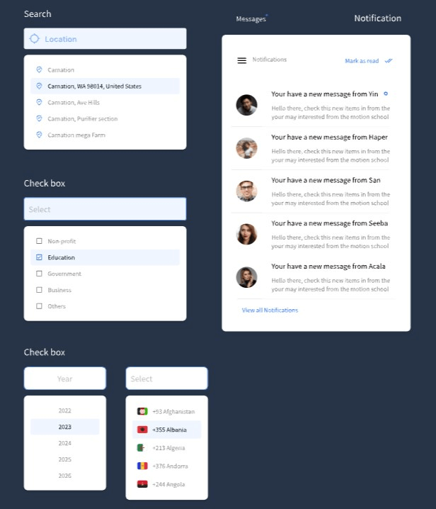
Part 3. Best Tool for Mobile Menu Design
When it comes to designing an effective mobile menu design for a simplified user navigational journey, you need an equally-effective design tool to assist with your creation. Pixso is an effective design and collaborative tool that allows designers to design unique navigational menus for mobile apps with ease.
What can you do with Pixso?
- Access to a wide range of advanced design tools for users to design all types of mobile menu navigational design patterns.
- Wireframing and prototyping feature so users can connect interactions from one design element to another and also across various different screens of the app.
- Auto layout feature where you can scale contents effectively throughout various mobile screen sizes and never compromise the quality of your menu designs.
- Collaborative tools for users in a team to work together on a project and make concurrent edits successfully in real-time.
- An exclusive design community to find more mobile menu design inspiration and transfer templates onto your own Pixso file.
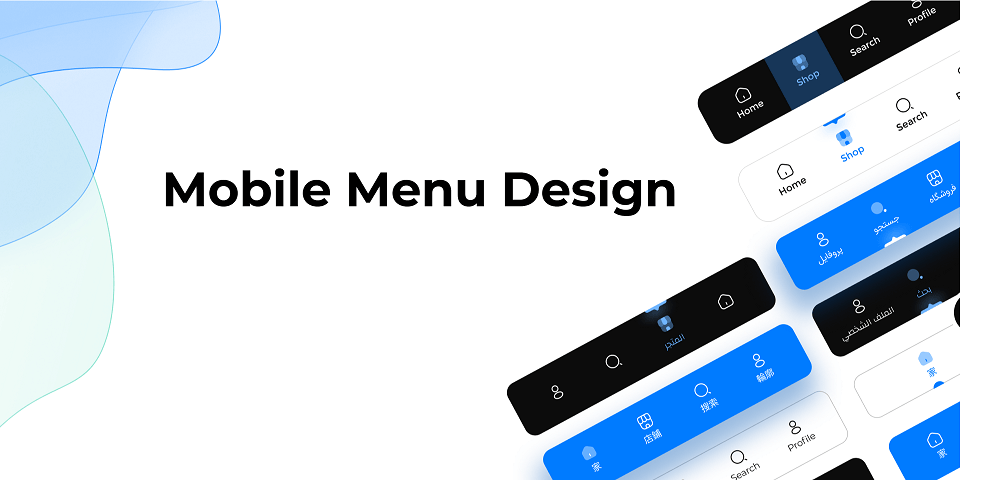
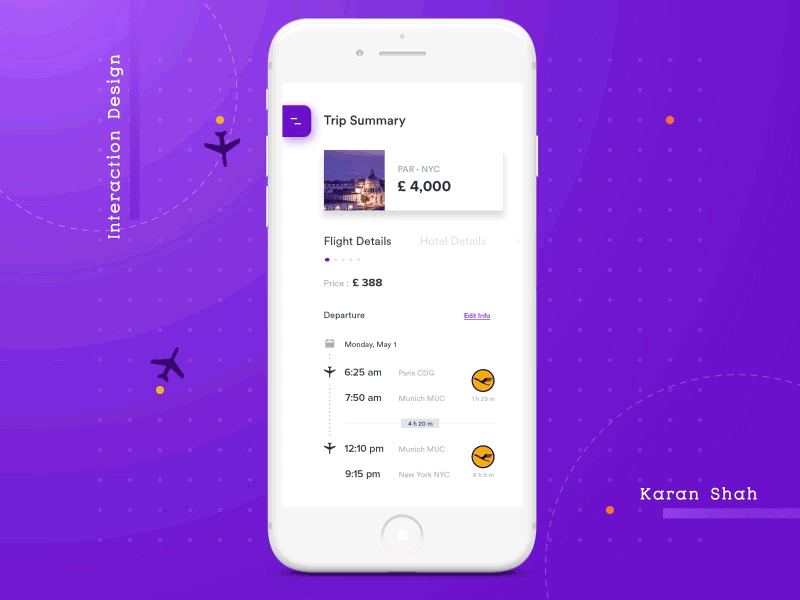
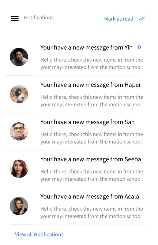
Mobile Menu Design Example
Design Your Efficient Mobile Menu Design with Pixso
A mobile menu design is crucial for providing users with the perfect navigational system and improving their experience with the app.
After all, you want your users to explore everything that your app has to offer, and what better way to implement an effective menu design for them so they won’t miss out on that?
Use Pixso today and start creating your well-thought and intuitive mobile menu designs with ease.