Scott
Mobile design starts with conditions
People use a mobile interface while standing, walking, waiting, switching between apps or dealing with a changing network. The screen may be narrow, the virtual keyboard may reduce the viewport, a notch may change the safe area and a person may need larger text or assistive technology. A mobile UI is therefore not a desktop layout squeezed into fewer pixels.
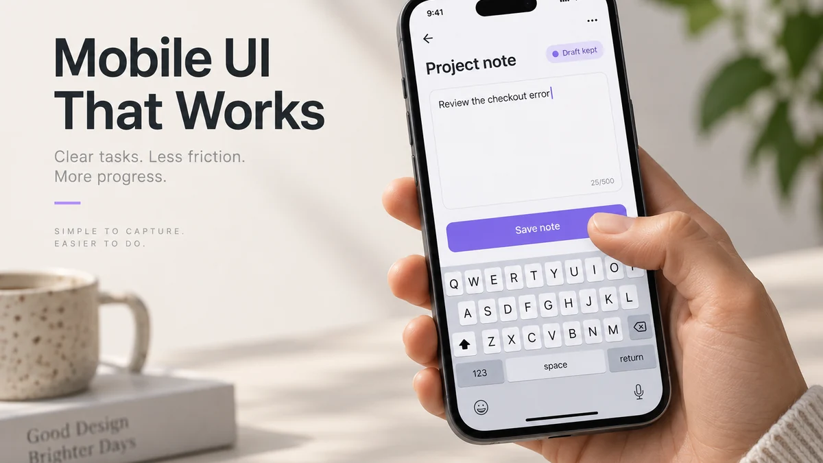
Mobile UI design is the work of making those tasks readable, reachable and recoverable on a small screen. Start with one task: a designer opens a project on a phone, writes “Review the checkout error” and saves the note. The keyboard, a long project title and a dropped connection each change what that person needs to see. Use this task to connect the layout, input and recovery decisions below.
1. Prioritize the task and the next action
Put the primary action and status where a person can find them without scanning every control. Secondary actions can move into a menu, a bottom sheet or a later step, but do not hide a critical recovery action just to preserve a clean screenshot. A mobile home screen should not be a gallery of equal cards when the person has one urgent task.
Map the note task before arranging the screen:
| Moment | What matters on screen | Design choice |
|---|---|---|
| Open the project | Know which project will receive the note | Keep the project name visible; move less-used project settings into a menu |
| Write the note | See the text and the save action with the keyboard open | Let the editor scroll; avoid an overlapping fixed footer |
| Save | Know the request is in progress | Show “Saving…” and prevent a second simultaneous submission |
| Connection fails | Keep the text and understand its status | Retain the note and distinguish unsent content from a confirmed save |
| Finish | Return to the right project | Show the saved note and a clear return action |
Review the map with a person who has not seen the product. If the first action needs a verbal tour, simplify the hierarchy before polishing icons.
2. Design for touch, focus and other input
Give controls enough target area and visible pressed or focus states. A person may tap with one thumb, a stylus or an assistive switch; a desktop keyboard may still be present when the same responsive web view runs on a larger device. Do not rely on hover or a gesture with no visible alternative.
Measure the active hit area, not just the icon. WCAG 2.2’s Target Size (Minimum) criterion generally requires at least 24 by 24 CSS pixels, with defined exceptions such as sufficient spacing; this is a minimum, not a recommendation to make every mobile control that small. Give the frequently used save action generous space and keep a destructive action out of its immediate tap area.
The note screen also needs a meaningful focus order: project context, note field, save action and return navigation. Provide a named button for an action that also has a gesture. A swipe-only exit may be hard to discover and gives some users no workable route back.
3. Handle viewport, orientation and safe areas
Test portrait and landscape, a small phone, a large phone or tablet and a responsive browser view. Define what reorders, collapses or remains persistent. Critical content should not sit behind a notch, home indicator or keyboard. Keep a bottom action reachable when the viewport height shrinks.
For the note editor, compare the keyboard-open and keyboard-closed layouts before fixing the save button to an edge. Keep the current line visible and allow the content to scroll when the note grows. If a bottom action overlaps the editor or an error, place it in the document flow or specify how it moves above the keyboard.
On the mobile web, the visible area can shrink without the layout viewport shrinking in the same way. MDN’s VisualViewport documentation explains this distinction. Record the intended behavior and verify it in the browsers the product supports; a fixed-size design frame cannot show all keyboard and zoom conditions.
4. Use content and navigation that fit a small screen
Mobile navigation should reflect task priority. A bottom navigation bar can expose a few top-level destinations; a menu can hold less frequent areas; a contextual action can stay near the content it affects. Do not choose a pattern because it is fashionable. Compare how quickly a person can find the task, understand their location and return.
Write labels that survive truncation and translation. Icons need accessible names and should not carry the only meaning of an action. A short screen title can clarify a modal or nested page, while an unnecessary title consumes space that could support the task. Test a long account name, a notification count and a locale with different word lengths.
5. Design input and recovery
Use the input type that matches the data: email, numeric, date or search. Tell the person what is required, validate at a useful moment and preserve safe input after failure. Avoid a full-screen error when a field-level correction is possible. If a request is slow, show status and give the person a way to wait, retry or leave without losing work.
Cover more than the happy path:
- Network unavailable before submission.
- Request timeout after the person taps once.
- Partial success where one item saves and another fails.
- Session expiry while the form is open.
- Permission change while the user returns to the app.
- Offline data that needs reconciliation later.
Write the recovery action to match what the application knows. If the save never left the device, say that the note has not been sent and keep the text available. If a request timed out, do not assert that saving failed: the server may have accepted it. Agree how the app checks the saved state or safely retries the same operation before displaying “Saved.”
6. Respect platform conventions without copying blindly
Use Apple Human Interface Guidelines and Material 3 as references for navigation, controls, typography and feedback. Document deliberate differences when a product needs a custom pattern. A platform convention can help people form an expectation, but it does not decide your information architecture, content or business rules.
Keep platform differences explicit when a product ships on multiple systems. Back behavior, permission prompts, text selection and system sharing may not be identical. A design review should state which behavior is native, which is custom and which is outside the product’s control.
7. Design for accessibility and content growth
Check headings, labels, focus, contrast, text enlargement, reduced motion and screen-reader announcements in the implementation. A color change alone cannot communicate a status. A toast that disappears before it can be read is not a reliable error path. Provide a static alternative when motion explains progress and respect the user’s reduced-motion preference.
Use a localization specimen early. Include accented Latin text, Cyrillic, Arabic, Japanese, Korean or other required scripts. Test a right-to-left screen if the product supports it, including icon direction and focus order. Do not fix expansion by silently shrinking the type or clipping a button label. Define whether content wraps, grows, scrolls or moves to another step.
8. Loading, offline and background states
For the note task, distinguish text still on this screen, a draft stored on this device and a note saved to the project. These are different promises. Keeping a value in an open field does not mean it will survive closing the tab, and a local draft does not mean collaborators can see it.
Show only the status the application can confirm. “Draft on this device” is appropriate when durable local storage exists; “Saved” should follow confirmation from the project’s data service. An offline hint can help, but do not block the workflow solely because a browser reports no connection: MDN notes that navigator.onLine is unreliable. Let the request result and the product’s retry strategy determine what happens next.
Review the note after switching apps, locking the phone and reopening the screen. Decide whether text survives each event, where it is stored and how the user resumes.
9. Prototype and test the complete path
Connect the screens that answer one decision: find a setting, complete checkout, recover from an error or share a file. Include the touch feedback, keyboard appearance, status and return path in the review. Do not prototype every navigation item if the question is whether the primary task is understandable.
Ask a reviewer to complete the task without a verbal tour. Record where they hesitate, which control they expect next and whether the recovery message helps. Test one-handed reach and a larger text setting when these conditions matter. A prototype does not prove production speed, accessibility API behavior or network resilience; those require an implementation check.
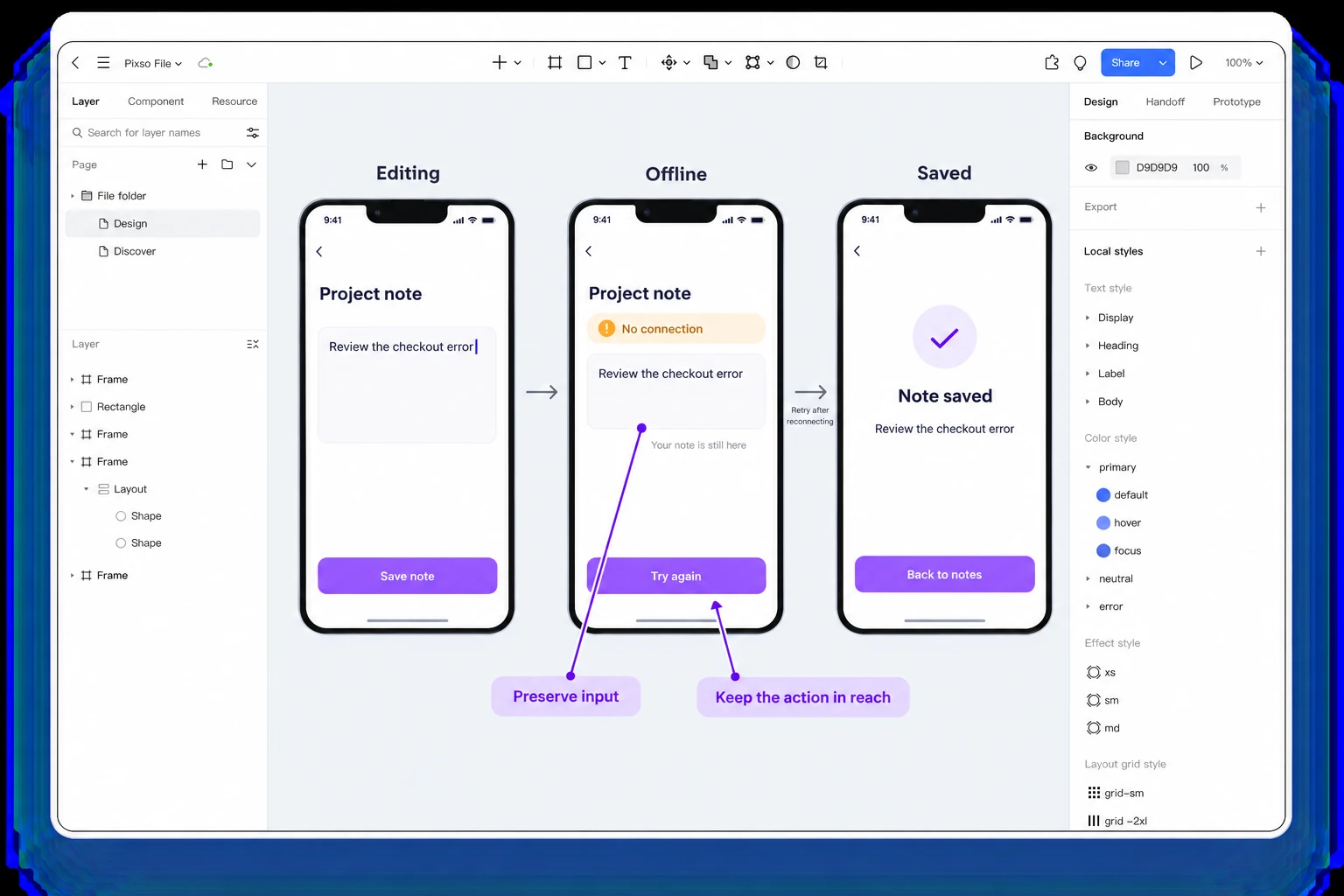
Try a note-saving task when reviewing mobile recovery. In Pixso, place the editing screen beside an offline state that keeps the note visible and a saved confirmation reached after the connection returns. Keep the primary action within reach and state when retry becomes useful. The design defines the intended recovery; the app implementation still needs to handle storage and duplicate requests correctly.
10. Build a device test matrix
Start with devices and conditions that represent the audience, not every model in a catalogue. Record the viewport, operating system, browser or app version, text setting, network and assistive technology used.
| Test | Minimum observation |
|---|---|
| Narrow phone | Primary action, wrapping and scroll reach |
| Large phone/tablet | Density and persistent navigation |
| Responsive desktop | Keyboard and focus order |
| Large text/zoom | Content and control reflow |
| Slow or offline network | Status, retry and duplicate prevention |
| Screen reader/keyboard | Names, order and state announcements |
| Reduced motion | Static equivalent and no forced animation |
Write a defect as a condition and impact: “At 200% text, the submit action is below a fixed footer and cannot be reached,” not “mobile layout feels bad.”
Decide what belongs on the mobile screen
A project dashboard may show activity, files, people and settings, but the note editor needs a smaller set: the project context, the note, its status and the next action. Preserve the context that prevents posting to the wrong place. Move unrelated activity out of the task instead of shrinking every element until it fits.
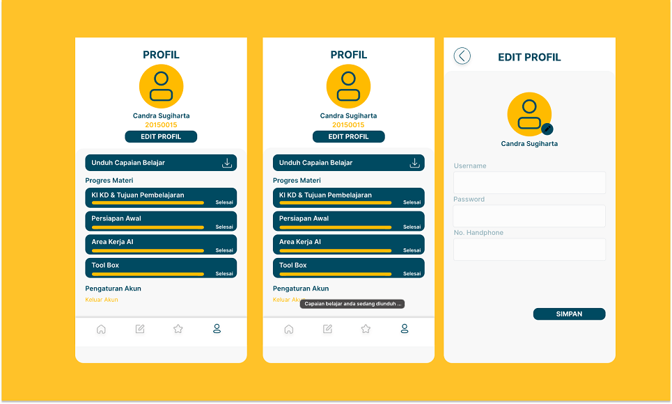
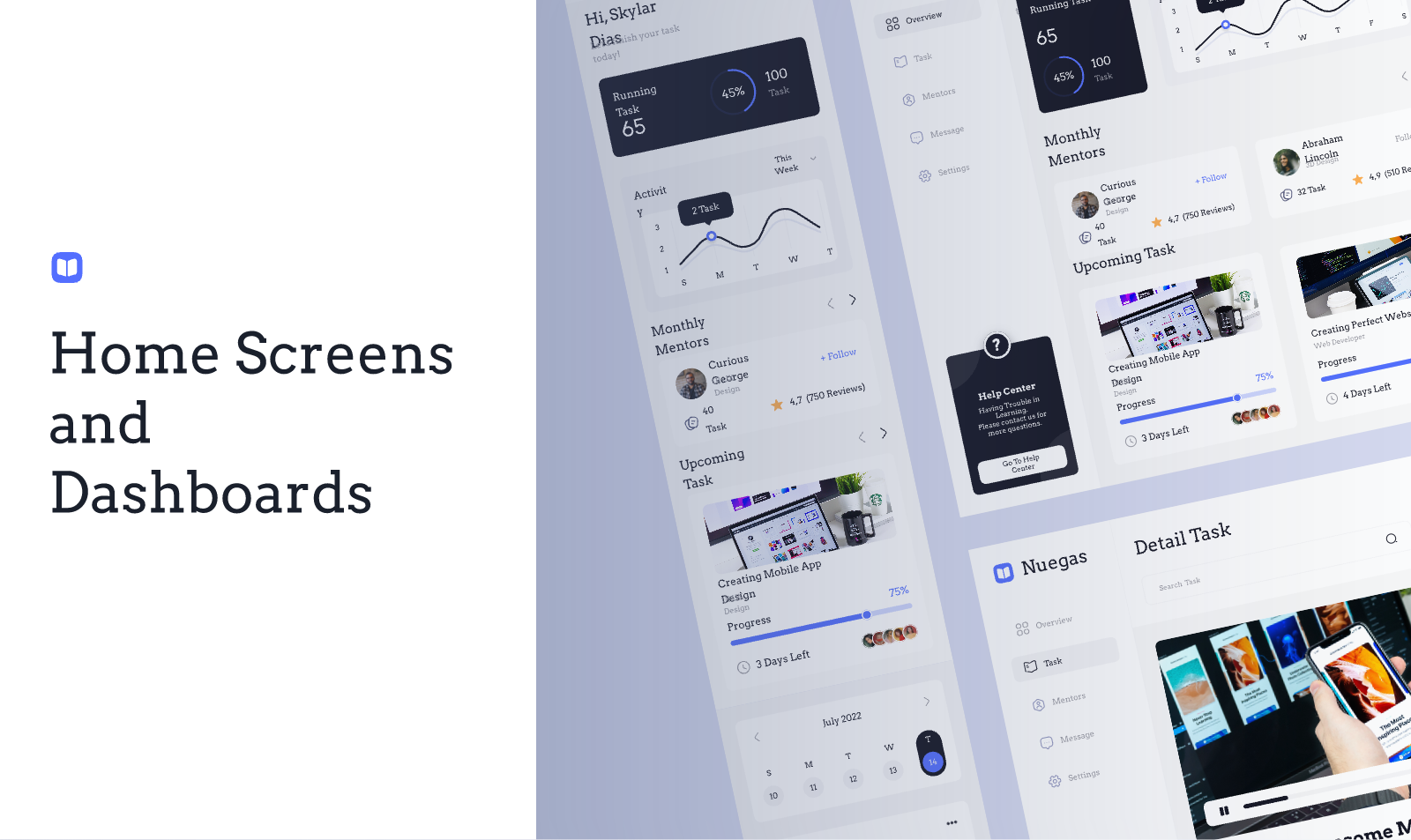
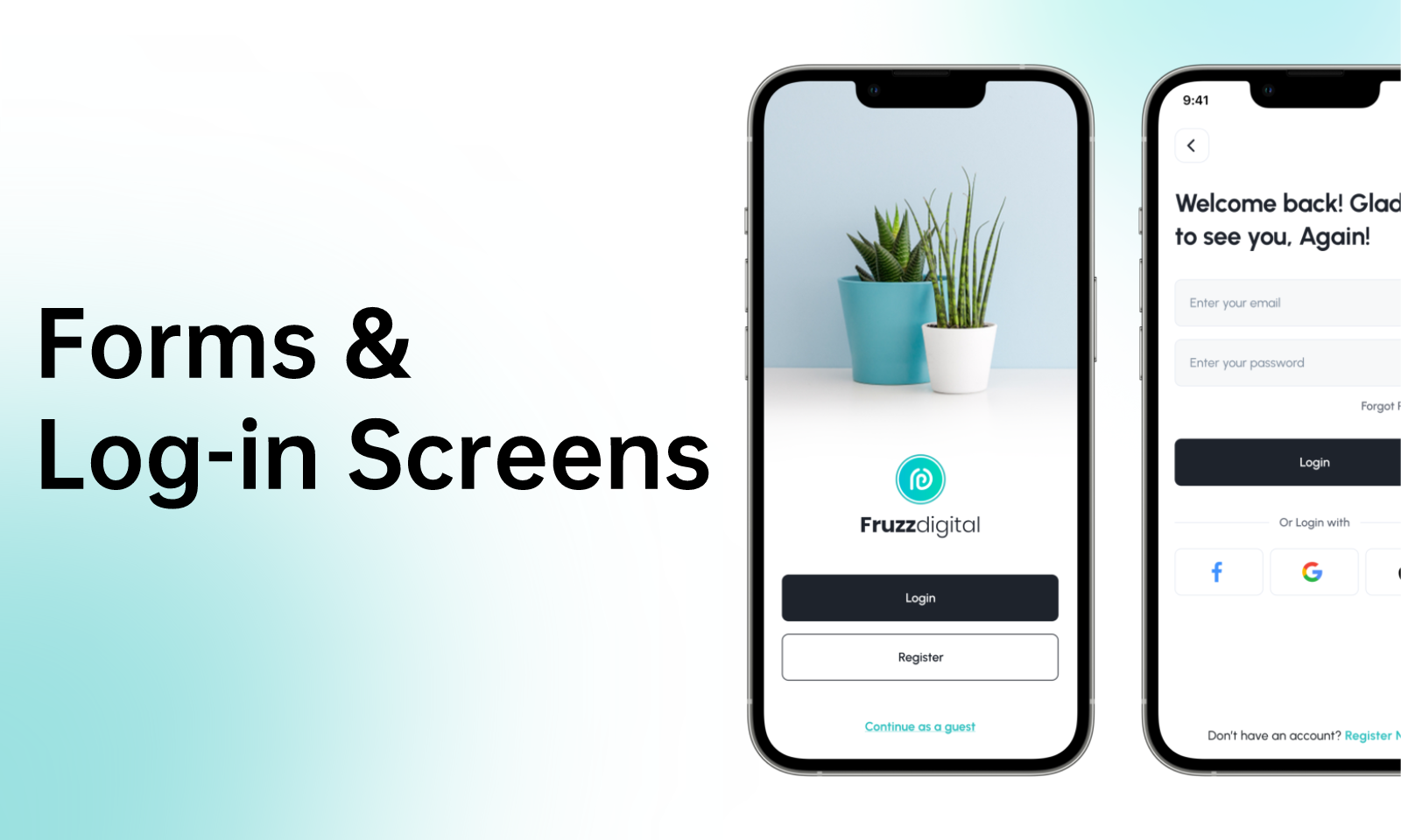
This is also how to use the older home-screen and sign-in examples above: examine the grouping and navigation pattern, then select the pieces your task actually needs. A mobile app does not automatically need a dashboard, a profile or a chatbot. Add a screen because it supports a user task, not because it appears in an example library.
Further reading and sources
- Apple Human Interface Guidelines
- Material 3
- WCAG 2.2
- MDN responsive design
- Pixso’s mobile app wireframes, responsive design, UI principles and prototyping pages.
A practical mobile review session
Give a reviewer a phone, a realistic task and no explanation of the interface. Start on a normal connection, then repeat after rotating the device, opening the keyboard, increasing text size and interrupting the network. Record the moment of hesitation, the state on screen and whether the person can recover. Repeat the same task with a screen reader or keyboard path when the product supports them.
The output should be a short list of conditions, not a device shopping list. “At narrow width, the save action is hidden when the error expands” is actionable; “the mobile design feels cramped” is not. Assign each issue to content, design, engineering or product and record the next verification date.
Avoid the small-desktop trap
Before reducing a desktop composition, identify the mobile task and remove information that is not needed at that moment. Move secondary details behind a deliberate disclosure, keep context that prevents a wrong decision and make the return path obvious. The result may share a design system with desktop while using a different order and interaction pattern.