Scott
Start a UI improvement with one task that people struggle to complete. Keep a copy of the current screen, identify the problem and change one relevant element at a time. The exercises below show what to look for and how to compare a change with the original.

1. Eight checks for an interface improvement
1. Use images to answer a question
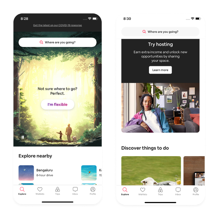
Action: Identify what the image tells a person that the surrounding text does not. If it is only decoration, reduce its prominence and avoid delaying the primary task.
Acceptance question: Check the actual narrow-screen crop, useful alternative text where appropriate, and the loading behavior. Can the person complete the task before large decorative media finishes?
2. Keep navigation legible over the background
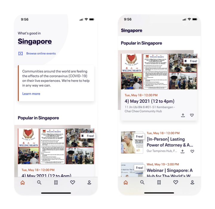
Action: Compare the header at the top of the page and after scrolling. If transparency makes links hard to see, use a consistent surface or another treatment that preserves contrast.
Acceptance question: At each responsive width and keyboard-focus state, can a person identify and reach the navigation? A solid header is a valid outcome of this review.
3. Show control boundaries and states
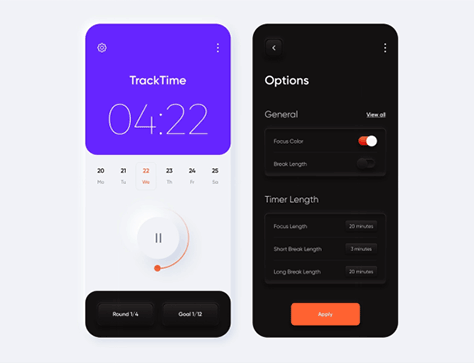
Action: Inspect a button or input against its surroundings. Soft shadows alone may not make a control or its state clear. Create the default, focus, active, disabled and error states that the task needs.
Acceptance question: Can a reviewer distinguish the interactive control and its current state without relying only on color or subtle shadow? Validate the implemented component using the WCAG 2.2 reference.
4. Test each supported theme
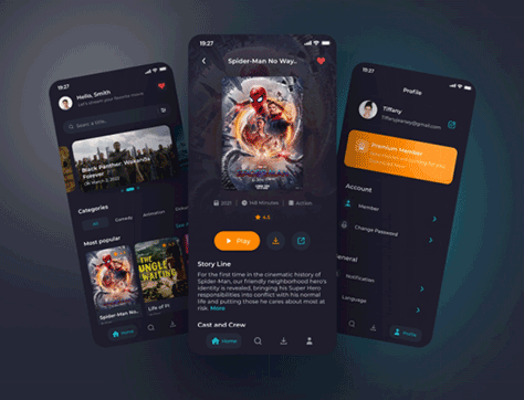
Action: Design light and dark themes as complete sets of text, surface and state rules. Do not just invert a screenshot or assume that dark mode is comfortable for every person.
Acceptance question: Review text, icons, error states, charts and images in both themes. Record any contrast or visibility issue rather than claim automatic eye-strain or battery benefits.
5. Give motion a purpose and a fallback
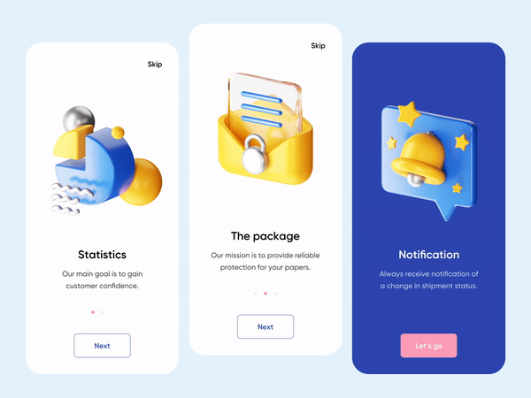
Action: Write down what a 3D view or animation explains. If it has no task-related purpose, compare the screen without it. Account for motion preferences and provide a usable static state where needed.
Acceptance question: Can people understand and operate the interface when animation is reduced or media is still loading? Measure download and processing cost in the implemented route.
6. Choose a chart for a specific data question
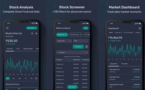
Action: Write the question first: comparison, change over time, composition or exact lookup. Choose labels, units, scale and a chart or table that answer it.
Acceptance question: Can a reviewer locate the requested value or pattern and explain the scale? Include empty, loading and error states; avoid decorative data that implies real measurements.
7. Check text over every part of a gradient
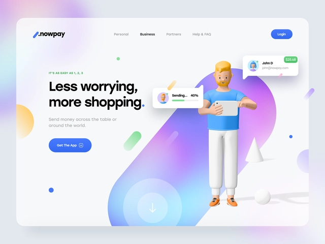
Action: Use the actual text and control positions over the gradient, including smaller screens and longer labels. Inspect where the lightest and darkest background areas meet content.
Acceptance question: Does the content stay legible over each relevant position? Simplify the background or introduce a stable surface if it does not.
8. Use corner shapes consistently
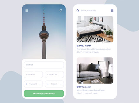
Action: Choose a small set of shape rules for related components, and distinguish a container from an interactive control through more than its radius.
Acceptance question: Do repeated components look and behave consistently? Do not treat rounded corners as evidence of trust, safety or guaranteed conversion.
2. Document the change in a shared file
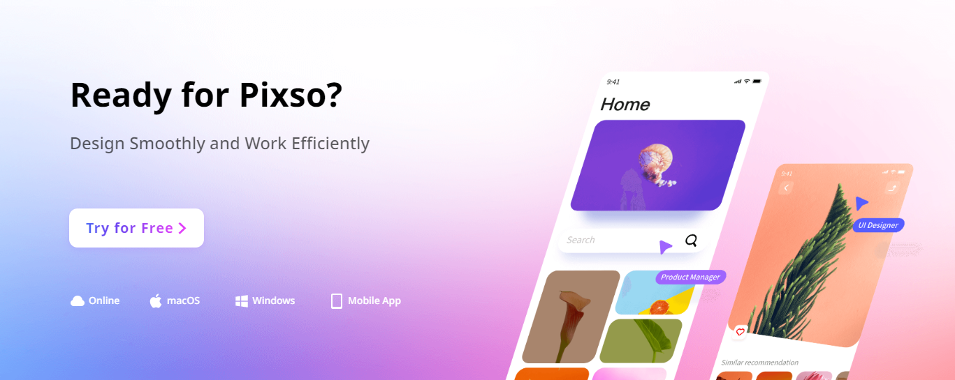
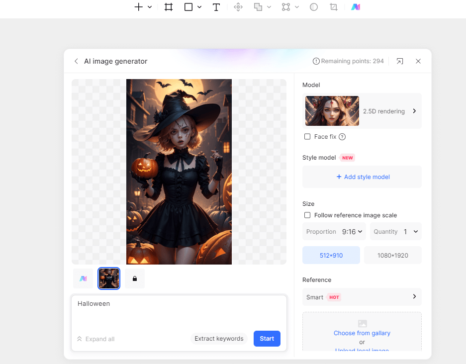
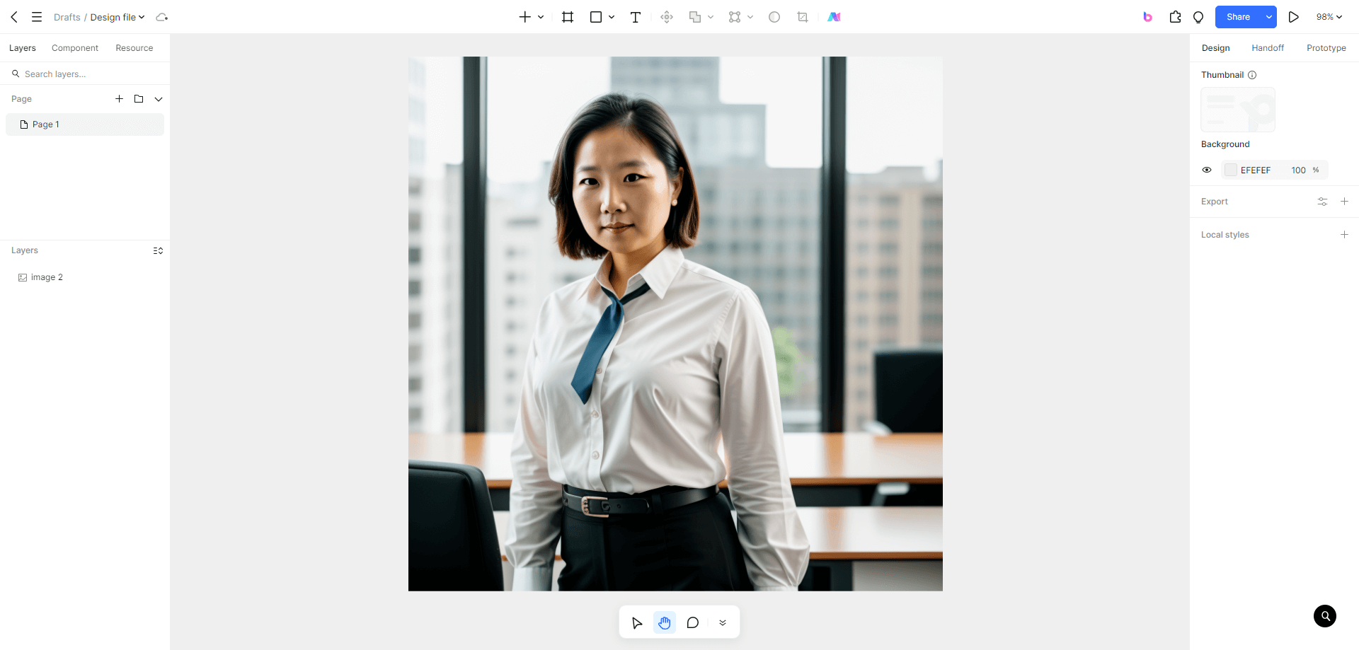
In Pixso, keep the original screen, revised version and review notes side by side. Use component variants for states and a prototype for the task sequence. Record unresolved implementation questions alongside the design rather than presenting a visually complete mockup as a finished product.
- Write the task and the observed problem. Separate an observation from a preference.
- Annotate what changed and why; keep other variables stable where possible.
- Ask a reviewer to attempt the task in the prototype and record confusion or missing states.
- Validate keyboard, assistive-technology behavior and performance in the implemented page.
- Use measured outcomes from your own evaluation to decide whether to retain the change.
3. Practice with the five credited examples
These images and credits are retained from the original collection. Use them as practice prompts for visual review, not as evidence that the concepts achieved a measured outcome.
Banking App by Arsan Ali
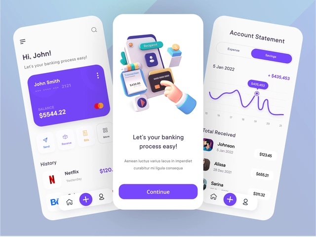
Identify the main action and the supporting information. Annotate which dimensional surfaces are clickable and which are decorative. Sketch a visible focus state for one action without changing the whole visual direction.
Gamers Dating App by Yehor Haiduk
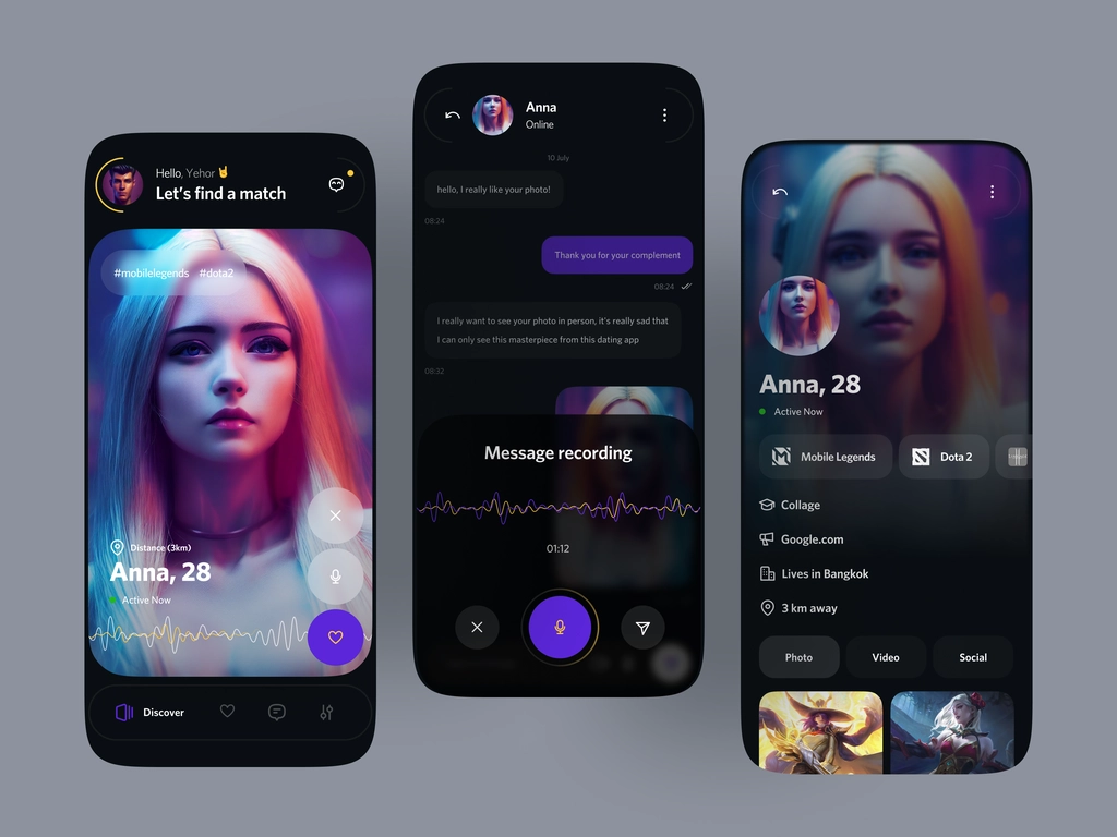
Inspect whether the main action remains identifiable beside the imagery. Mark areas where a longer profile name or another background crop could reduce legibility. Propose a stable text surface where needed.
EHR – System Urgent Patient Timeline by RonDesignLab
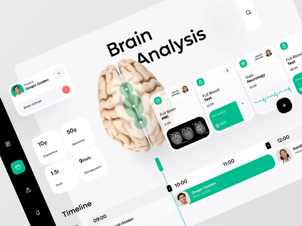
Review the visual grouping and chronology of this interface concept. Mark missing labels, states or context needed to interpret the timeline. This is an interface-review exercise, not clinical guidance or verification of a healthcare workflow.
Project Management Dashboard by AR Shakir
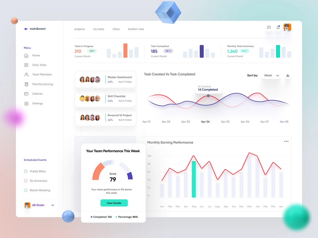
Choose one project-status question. Trace which chart, label or value answers it and identify any missing unit, time range or state. Propose an empty-state message that does not look like real data.
Admin Dashboard by HALO UI/UX
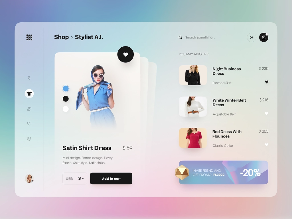
Identify the active navigation item, the current page and the primary action. Consider how the sidebar becomes reachable on a narrow screen and how focus would move when it opens.
4. Decide whether the change helps
Compare the original and revised screens on the same task. Keep the change if it makes the next action clearer or the content easier to read. If it only changes the appearance, decide whether that visual direction suits the product.
For the background to the original collection, read the historical review of 2024 UI patterns.