Music is beautiful. Everyone loves to listen to them, and many music streaming apps are looking to engage users to listen to their favorite and personalized playlists. As a UI designer, it is crucial to know how to design beautiful and convenient user interfaces for music players.
If you lack inspiration and don’t know where to start, this blog will provide you with a few examples to spark some ideas and also let you in on a secret on how you can design your music player UI to perfection. Let’s dive straight in.
Part 1. Why is the UI Important for Music Lovers?
As a designer, these are usually the screens you need to work on to provide users with the ultimate listening experience:
1.1 The home screen with minimalist design
First and foremost, the home screen is where users start their listening journey, and in most music-playing apps and websites, it should make it easy for the users to create an account and start listening to their favorite music right away. Having a home screen with minimalistic designs can help users not get complicated by the UI.
1.2 Provide music lovers with an identity
Next, the users’ profile screen of their personal accounts allows them to polish their identity and personalize their preferences. Moreover, it is also a fine way for users to embed their social links to other apps—especially another music streaming service.
1.3 Tagging along in their journey to find good music
The music search screen is crucial for users to quickly find what they are looking for. Ensure the UI is convenient for the users and allows them to filter their search based on their preferences and get their desired results instantly. For example, filters mean including the artists, genre, album titles, etc.
1.4 Keep playing all day long
It is no secret that the music player screen is the most engaged screen out of the app or website. Designers can provide intuitive and well-thought designs for backgrounds and other UI elements to make the player screen eye-catching for the listeners.
1.5 Adding songs to their personalized playlists
Users want their favorite tracks to be with them safe in their own playlists. Hence, the playlist screen should provide users with a detailed list of their favorite tracks that include the song name, artist, band, album, duration of the music, etc.
1.6 The power of the equalizer
Each user should be able to adjust the intensity of their music listening experience by using the equalizer and regulating it based on their mood.
1.7 An additional source of listening power
Some music streaming providers offer music stores and premium subscriptions for users to get access to additional songs or unlock extra features that boost their convenience. This page should follow a similar design to most e-commerce sites you find online.
Part 2. Music Player UI Examples That Can Inspire You
Here are a few music player UI examples that are designed with Pixso that can give you some inspiration for your next project:
2.1 Spotify UI Design
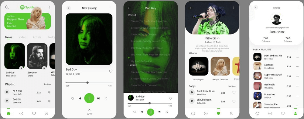
This is a mock-up of a Spotify UI. This design focuses on Spotify’s brand colors by establishing the green, black, grey, and white color palette throughout the UI screens.
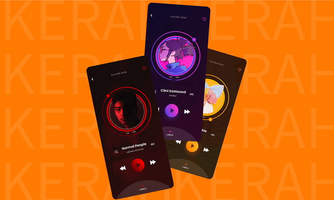
2.2 Trendy Music Player UI Design
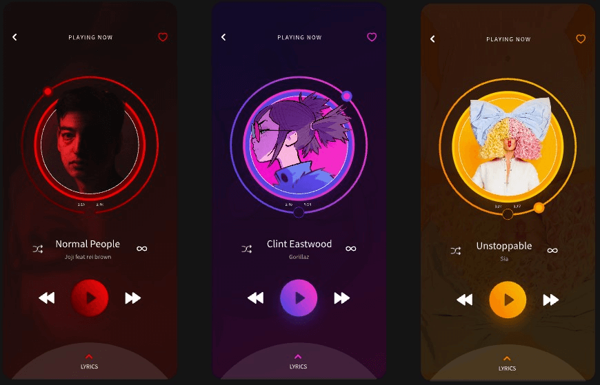
This music player’s UI provides different color themes for different music tracks. It also offers intricate designs that make the UI appealing for the user’s listening experience.
2.3 Amazing Music Player UI Design
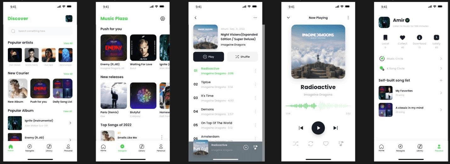
This music player offers fine details to each screen and its color theme is simplistic as it allows users to focus their attention on the information of the music tracks.
2.4 SoundCloud UI Design
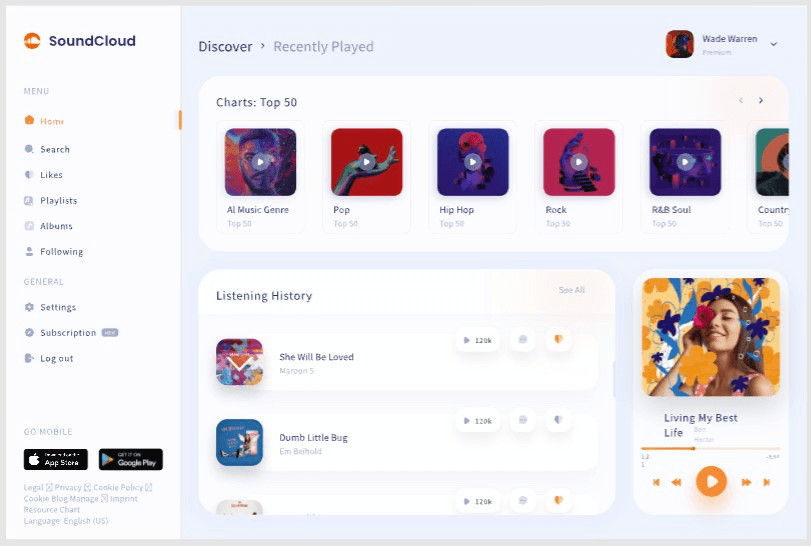
This music player is a desktop version and it shows how all design components from different screens can bundle into the home page and allows users to take control of their listening experience.
What is Pixso - Design Music Players with It
If you are looking for a design tool that will help to design your unique music player, then that’s where Pixso comes in. Pixso is a high-functional and collaborative design tool that allows designers to express their creativity and create their perfect UI designs.
Pixso offers:
- Advanced design tools so users can design each music player component accurately and express their creative designs in the canvas.
- Wireframing and prototyping capabilities so users can work on their music player UI project from start to finish.
- A canvas with no bounds and unlimited draft files so that users won’t run out of space to express their design ideas and rough work.
- A collaborative space with user-sharing tools so you and your team can also work on the project together in real time.
- A design community where you can find additional music player UI to get inspiration from much like the examples you saw above.
Part 3. FAQs About Music Player UI
Q1. How to design a music app?
Like most designers, first, get inspiration by going through different music app UI or experiencing the apps for yourself. You can find that most music apps follow a Spotify-like UI design and you can develop various screens that allow users with the ultimate listening experience.
Q2. Which music app has the best interface?
It is no surprise that Spotify will stand out as the best interface and many designers look for their UI to get inspiration and base their music player designs. Spotify grants access to a humongous music library for music lovers.
Help Users to Listen to Their Favorite Music
This blog has shown you the importance of designing a music player UI and also a few examples you can get inspiration.
Don’t hesitate any longer and start using Pixso today so that you can design music apps that can help users connect to their favorite songs.
