Scott
A useful popup supports one short task without making people lose their place. Show it when the task calls for an interruption, explain the action, and provide a clear way to cancel or close it. If someone can complete the task comfortably in the page, a popup may add friction rather than value.
For an interactive popup, plan the opening, editing, dismissal and return paths together. A clickable prototype in Pixso lets a team review those paths before implementation. The five examples below provide visual starting points; an invitation flow shows how to turn a good-looking popup into a complete interaction.
What Is Popup UI Design?
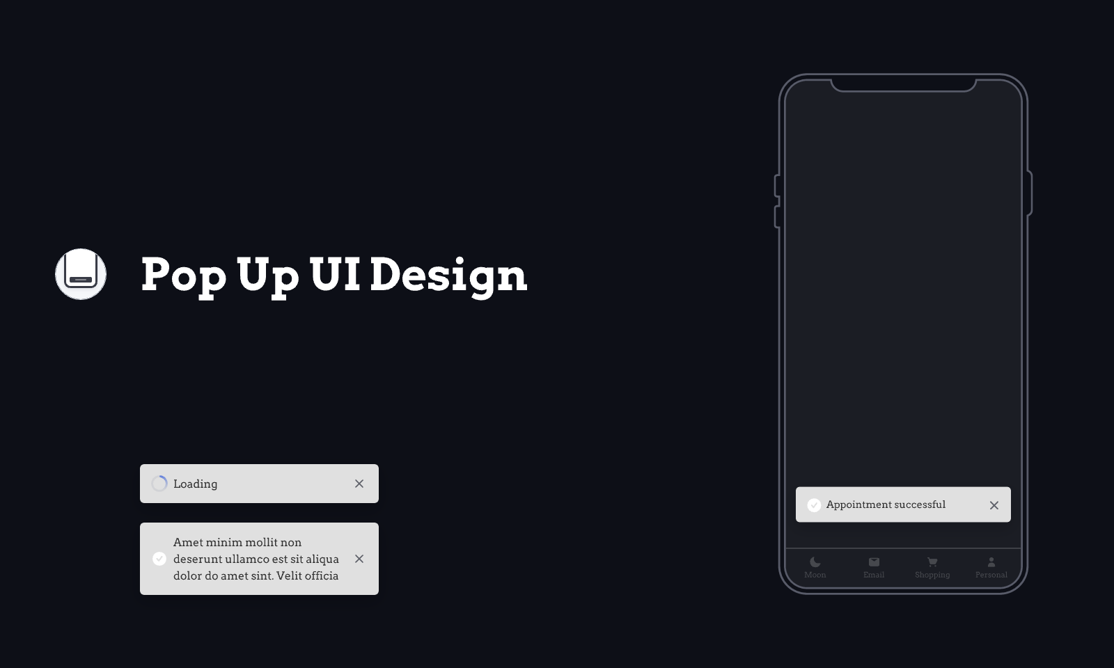
Popup UI design covers temporary interface surfaces that appear over, or alongside, the current page. A popup can collect a small amount of information, explain an unfamiliar feature, or ask for a decision. Its design includes when it appears, what happens behind it, how people interact with it and where they return afterward.
A modal dialog blocks interaction with the page underneath until it closes. A non-modal popover can provide contextual information or controls without taking over the whole task. These are not interchangeable: use a modal when the current action genuinely needs a focused decision, not simply because an announcement is important to the business.
For a brief message such as “Link copied,” use lightweight feedback near the action rather than a dialog that demands another click. For a long form with several independent sections, a dedicated page often gives people more room, a useful URL and a clearer Back route.
How to Create a Clear Popup UI
Seven principles for popup behavior and appearance
1. Keep the popup consistent with the rest of the interface
Reuse the product’s typography, field labels, button hierarchy and spacing. A popup should feel like part of the same task, not a separate advertisement. A short title such as “Invite a teammate” explains more than a generic “Get started.”
2. Use color and shape to establish hierarchy
Give the main action clear emphasis while keeping secondary actions readable. The close control must not disappear into the backdrop. Avoid making every button equally prominent: “Send invitation” and “Cancel” should be easy to distinguish without implying that canceling is a mistake.
3. Make the purpose and consequence explicit
Describe what the action changes. “Invite” should identify whom you are inviting and, where relevant, the access they will receive. A label such as “Continue” can work in a guided sequence, but a final action is clearer when it names the result.
4. Match the popup to the current task
A team invitation belongs after someone chooses to invite a colleague. An optional newsletter offer need not interrupt someone who has just arrived to read an article. Contextual relevance does not require identifying every visitor or assuming access to browsing history.
When a person dismisses an optional prompt, do not immediately open it again on the next screen. Decide whether and when the prompt is useful again, and preserve the person’s ability to continue their original work.
5. Preserve the user’s place
Opening a popup should not unexpectedly reset the underlying page or lose its selected item. After dismissal, return to the relevant control or a sensible next step. If a popup changes the page, make the updated result visible rather than leaving the person unsure whether anything happened.
6. Make closing and canceling predictable
Provide a visible close or cancel action. Decide what each exit means for entered data, including the close icon, Escape and a click on the backdrop. A backdrop click should not silently discard a long, partly completed form. Where there is a meaningful risk of loss, keep the form open or explain the discard decision.
The W3C modal-dialog pattern describes the keyboard behavior: move focus into the dialog, keep its Tab sequence within it, support Escape, and return focus appropriately after closing. Include these requirements in handoff; a visual mockup alone does not implement them.
7. Design for a small viewport and an open keyboard
A mobile popup is not just a scaled-down desktop card. Keep the heading, active field and essential actions reachable when the keyboard is visible. Let long content scroll inside an appropriate area without creating confusing nested scroll regions. A full-screen dialog can be a better fit for a substantial mobile task, provided its title and return action remain clear.
Worked example: invite a teammate without losing context
Imagine a project owner looking at the team list. They choose “Invite teammate,” enter a colleague’s email address and select Viewer access. The popup needs to explain that role before the invitation is sent, while keeping the original team list available behind it.
- Open: show the project name, email field, role control and “Send invitation.” Move focus to a useful starting point. Do not preselect a higher permission merely because it is more convenient.
- Validate: if the email is incomplete, identify the field and explain the problem. Keep the typed value so the owner can correct it. Do not label an address “already invited” unless the system actually knows that.
- Send: show a sending state and prevent duplicate submissions. Keep the chosen email and role visible so the pending action is understandable.
- Confirm: after the service confirms success, return to the team list with the pending invitation visible. “Invitation sent” is different from “Member joined.”
- Recover: if sending fails, keep the values available. If the outcome is uncertain, explain that uncertainty and let the person check the invitation list before sending again.
For this short flow, Cancel can discard the current unsent invitation and return to the team list. If the design later grows into multiple invitations with different roles, reconsider that behavior instead of keeping the short-form assumption.
Five popup UI examples to study
Read these examples for hierarchy, spacing and the relationship between message and action. A static image does not establish whether keyboard focus, error handling or permission checks work.
1. Data entry popup
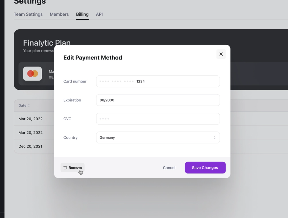
Kevin Dukkon’s data-entry design keeps the fields and actions visually separate. When adapting it, include the error state beside the affected field and decide whether the popup remains usable with longer labels or larger text.
2. Onboarding popup
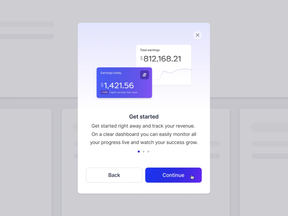
Diana Palavandishvili’s onboarding example gives a short step a clear Continue action and a way back. Optional guidance should also be dismissible, with a way to find the help later rather than forcing everyone through the same tour.
3. Project management popup
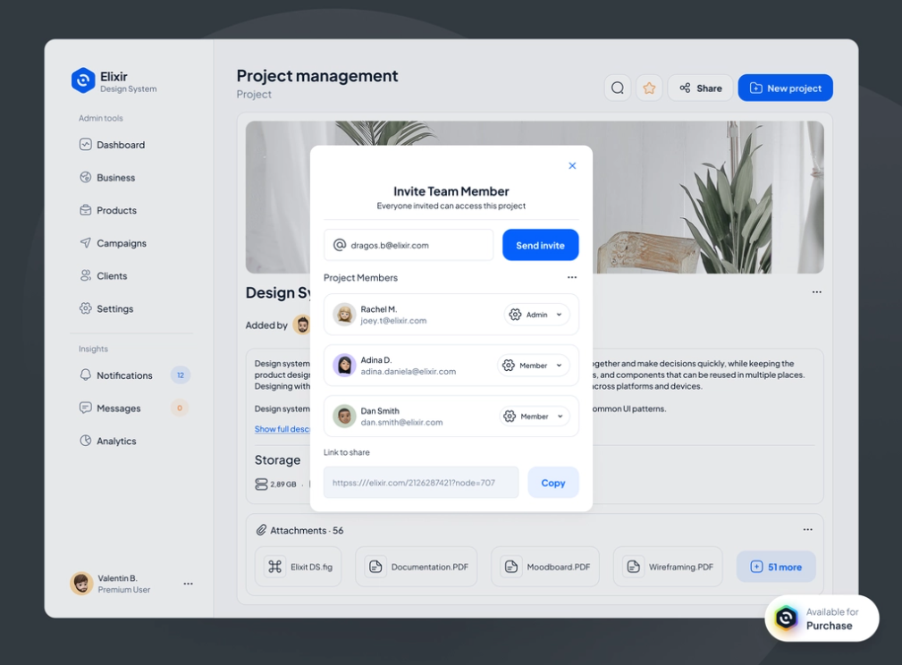
Bubu Dragos’s project-management example places email invitations, permissions and link sharing together. Those actions have different consequences. Explain who can use a copied link and keep its access level distinct from the role assigned to an individual invitation.
4. E-commerce popup
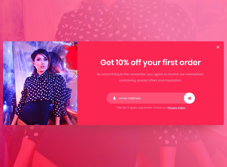
Ahmed Hamdy’s e-commerce example states the subscription offer and exposes a privacy link. The offer should remain optional: make the exit as understandable as the subscription action and avoid wording that shames people for declining.
5. Mobile popup
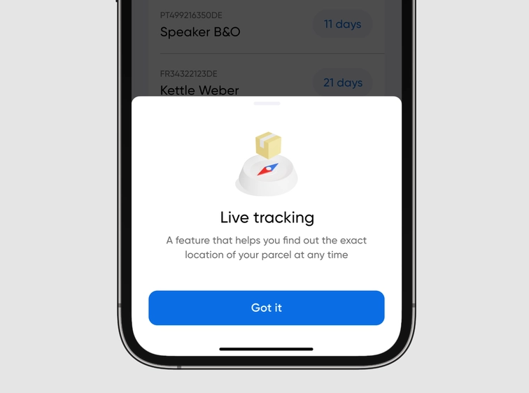
Dmitry Tomashevsky’s mobile design uses a compact composition. Evaluate the same layout with the longest realistic message and the device keyboard open; an uncluttered initial image is only one of the conditions the design must handle.
Build and review the popup flow in Pixso
Create the team list and invitation popup in one Pixso file. Reuse the email field, role selector and buttons, then prepare the invalid-email, sending and confirmed-result screens. Keep the same project and email in each state so reviewers can follow a single action.
Connect the main and cancel paths in the prototype, then ask a colleague to invite a Viewer and return to the team list. Observe whether they can explain the recipient’s access and whether the invitation has actually been sent. Use comments beside the relevant screen to record implementation requirements such as focus restoration and duplicate-submission handling.
Use a popup only when it helps the task
A popup earns its place when the action is short, the context matters and the return route is clear. Keep the message specific, dismissal predictable and results visible. If the interface needs more explanation or several competing tasks, move the work into a page instead of making the popup larger and harder to escape.