Scott
A profile page helps someone understand who a person is, what information is relevant, and what they can do next. A designer portfolio, team directory and social account need different components. Start by deciding who is viewing the page and which details that viewer is allowed to see.
In a collaborative UI design workspace, create both the owner's editing view and the visitor's view. Use the components and community examples below to decide what each audience needs to see and what should remain in account settings.
Part 1. Definition of a Profile Page
A profile page presents selected information about a person or account. It is not a requirement to publish every personal detail. The content should support the product's purpose: a colleague may need a role and team, while a prospective client may need project examples and a way to make contact.
If the product supports visibility settings, make the audience explicit. “Visible to your team” and “Public” are different promises. Design those settings with the actual access rules; hiding a field visually is not a substitute for protecting it in implementation.
Personalization should support that purpose. Let people choose useful details and preview their public profile without making every optional field look compulsory.
Part 2. What Are the Main Components of a Profile Page?
Now, let us go through the major components that make a credible user profile page:
1. Profile picture
An avatar can help people recognize an account, but a face photo need not be mandatory. Provide a useful fallback for missing images and check the crop before saving. The person should be able to identify the result without guessing how the full photo will fit into a small circle.
2. User name
Place the person's display name near the profile image so the two are easy to associate. A display name may be a real name or nickname; distinguish it from a unique account handle if the product uses both.
3. Cover photo
In some profile pages, you may find a cover photo that is a large picture displayed on top of the user’s profile page. The cover photo is a second picture after the profile picture that adds more personality to the user’s identity.
4. Summarized personal information
An “About” section should answer what this audience needs to know. For a designer profile, role, specialties and availability may be useful; a private home address is not a default requirement. Show a sensible text limit and check how a long but valid biography wraps on mobile.
5. Interests
Interests can help people find common ground in a social community. Include them when they support the product's purpose, and let users control which interests are visible.
6. Achievements
Relevant accomplishments can explain a person's experience. Give them enough context to be understood: a project role or qualification is more informative than an unexplained badge. Avoid making achievements a substitute for the work or details the visitor needs.
Design the owner view and visitor view separately
Consider a freelance designer who wants potential clients to understand their work. The visitor needs the designer's role, selected projects and a contact action. The owner additionally needs editing, visibility settings and a reliable preview of what will be public. Do not place every account setting on the public profile simply because it belongs to the same person.
| Information or action | Visitor view | Owner view |
|---|---|---|
| Display name and role | Clear identity near the avatar | Editable fields with a preview of long values |
| Project examples | Selected work with descriptive titles | Choose, reorder and remove items without deleting the underlying project |
| Contact | Only the contact method intended for this audience | Explain who can use it and what details become visible |
| Account email and security | Not automatically part of the profile | Separate account settings with appropriate access controls |
Make empty content understandable. An owner with no projects can see an invitation to add work; a visitor should not see an editing instruction they cannot act on. Decide whether an empty optional section disappears or communicates a meaningful absence. A missing avatar should not make the whole profile look like an error.
Specify editing beyond the ideal saved state
Show the current profile, editing, unsaved changes, saving, saved and failed-save states. If a biography exceeds a limit, keep the text available for correction. If the avatar upload fails, explain whether the previous avatar remains. Do not show a success message before the save is confirmed.
Cancel should have a defined meaning: discard only the current edits and return to the profile, or ask before discarding substantial changes. When the visitor view and editing view share components, compare their long-text and missing-image behavior rather than assuming both layouts will hold up.
Part 3. Build Profile States with Pixso
Create an owner view, visitor view and editing view in one Pixso file. Use the same name, role and project cards across them so reviewers can focus on what changes. Reusable components and Auto Layout help maintain shared spacing and structure; they do not guarantee that every screen size or every content length works.
Test a long display name, a three-paragraph biography, no avatar and one project with a long title. Add a separate failed-save state. Connect the editing and preview screens in a prototype and ask a teammate what a visitor would see after each change. Keep questions about actual permissions and save behavior next to the relevant screen for development review.
Part 4. Profile Examples and Layout References
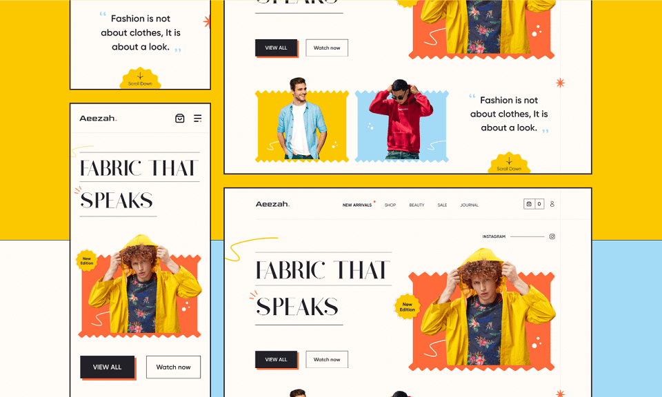
The first three community examples show mobile profile layouts. The fourth is a fashion storefront: it offers a useful reference for visual hierarchy when designing a creator profile, but it does not show profile editing or account controls.
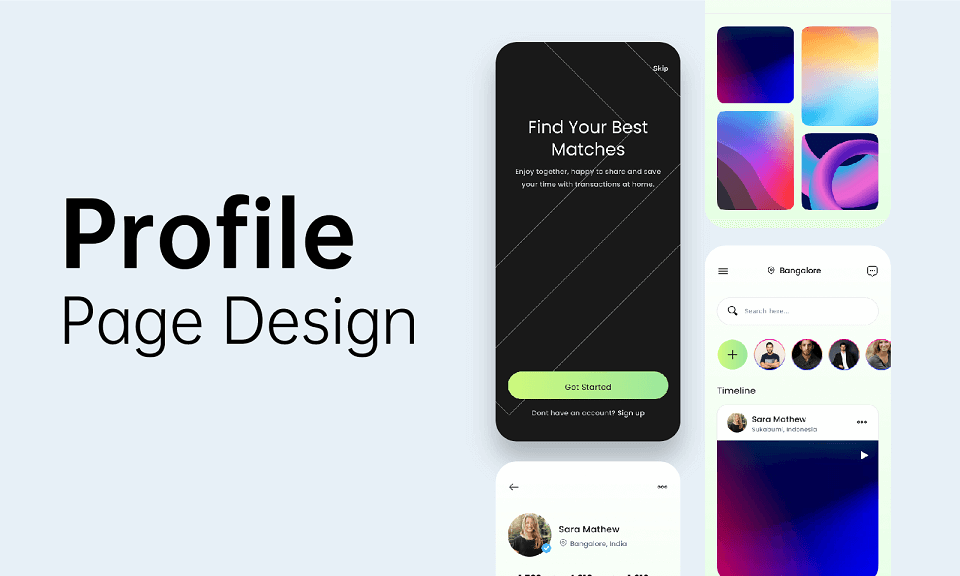
1. A set of mobile personal-profile layouts
This preview brings several profile layouts together: one gives photographs most of the screen, another puts contact actions below a large portrait, and another uses a compact avatar above a grid. The common decision is how quickly a visitor can connect the person with their content. For a portfolio, use the photo-grid direction when the work is the main evidence; use the larger identity area when recognition or contact is the main task. The collage is useful for comparing hierarchy, but inspect the individual frames before choosing text sizes or touch targets.
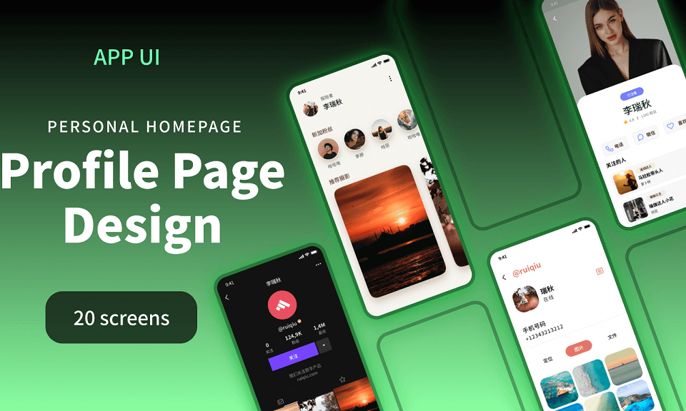

2. A photo-led creator profile with content tabs
The creator name, avatar and Following and Message controls sit above the content feed, so a visitor can identify the account and choose an action before scrolling. Video, Photo, Featured and Article tabs divide the work by format. That organization suits a creator with several kinds of content; a profile with only a few projects may not need four categories. The busy header puts white labels over photography, so test the contrast with different cover images and make the active tab recognizable without relying on color alone.
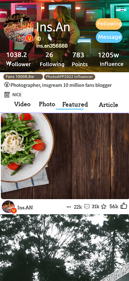
3. A video creator profile with subscription and chat actions
Subscribe and Chat are prominent in this layout, while the feed uses large video previews and visible playback controls. It suits a creator profile where watching, following and contacting the creator are separate tasks. The header contains several statistics and badges; decide which of those actually helps your audience before reusing the density. Keep the profile filters visually distinct from the app-wide navigation at the bottom, and choose which action should receive the strongest emphasis for a first-time visitor.
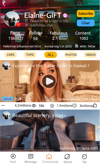
4. A brand-led layout reference for a creator profile
This fashion storefront uses large display type, vivid photography and a repeated View All action across desktop and mobile compositions. A designer profile can borrow its clear visual identity and emphasis on selected work, but should replace the shop navigation with the person’s role, projects and contact route. Notice how the narrow composition stacks the headline, image and actions instead of shrinking the desktop arrangement. The screenshot provides a layout reference; owner editing, visibility and failed-save states still need their own designs.
Design Your Personalized Profile Page…
Use the examples to compare identity, content and action hierarchy, not to copy every field. Your profile is ready for a stronger review when an owner can explain what will be public, a visitor can identify the person and their work, and a failed edit does not silently erase useful input.