Scott
A shopping cart is a review and editing space before checkout. People need to confirm the item, variant, quantity, and price, then understand what happens when any of them changes. A clean layout helps, but clear totals and recoverable actions matter just as much.
These ten examples highlight useful choices in cart layout, product details, and checkout placement. They also show where a static design needs more states before it is ready for development. For the wider page layout, start with the principles of responsive web design.
Part 1. Why Does Your Shopping Cart Design Matter?
A cart lets shoppers check what they have selected without starting the purchase again. Show the selected size or color next to each item, make changes easy to find, and separate confirmed costs from estimates. The design should support a confident decision rather than pressure people to move on before they understand the total.
The following choices make a cart easier to review and edit:
- Use product images
- Show the item count clearly on the cart icon and the cart page
- Remove visual clutter without hiding item details, costs, or editing controls
- Make the pricing as transparent as possible (include a breakdown of shipping charges, tax estimates, and other applicable costs)
- Make the cart easily editable for users
- Provide a relevant support route without covering the cart controls
- Make your icons easy to spot for users
- Use a mini-cart for quick review when useful, with a full cart available for more detailed editing
- Make the checkout action clear and distinguish it from continuing to shop
Part 2. Top 10 Shopping Cart Design Examples
These earlier site designs and design concepts illustrate choices in layout and content. When adapting them, specify scrolling, quantity updates, and error recovery as well as the visible cart.
1. Dollar Shave Club
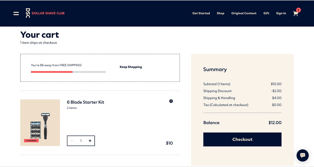
Dollar Shave Club separates the selected kit and quantity from the price summary. The useful detail is the cost breakdown: shoppers can distinguish the items from shipping and other charges. In your own cart, label estimates honestly and state when the final amount will be known.
2. Optimized column structure shopping cart design
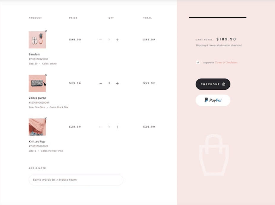
This two-column concept places products on the left and a compact summary on the right. That separation makes the roles easy to scan. If you make the summary sticky, specify when it starts and stops sticking, and ensure it never hides the final item or checkout control on a short screen.
3. Everlane cart preview design
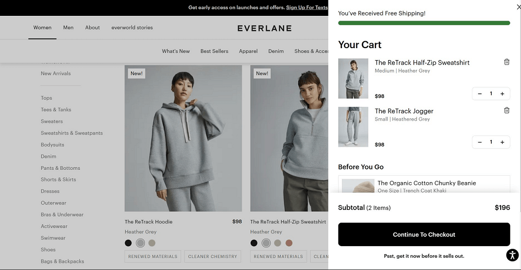
Everlane’s example shows a cart drawer at the right edge of the product page. A drawer can support a quick review while keeping the shopping context nearby. For narrow screens, provide enough room for variant names and quantity controls; the desktop arrangement should not simply be squeezed into a thin panel.
4. All-in-one shopping cart concept
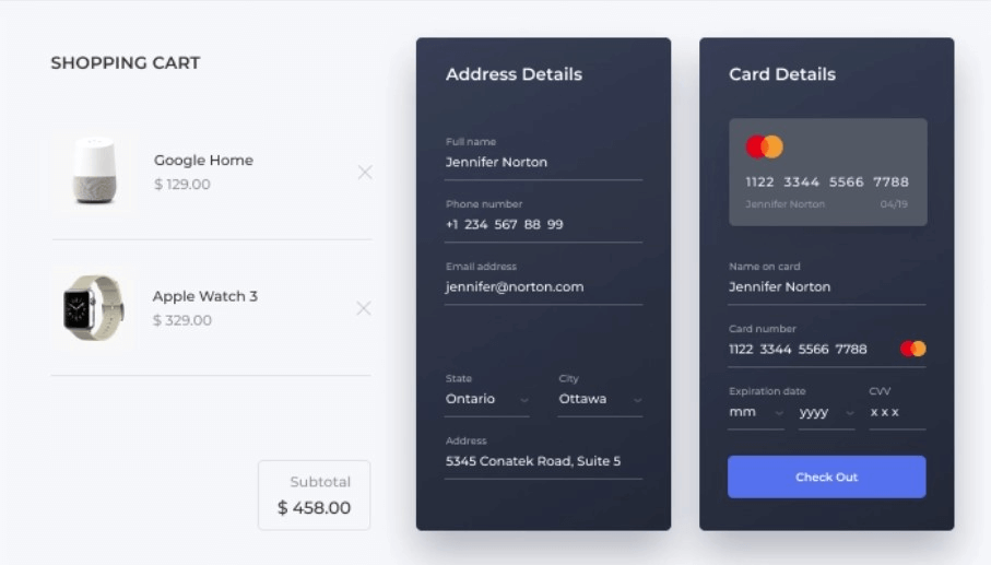
This concept brings cart items, shipping address, and payment details into one view. It can reduce the number of separate screens, but it also increases what must fit at once. Keep edit actions distinct, provide space for errors, and check that a mobile version has a clear reading order.
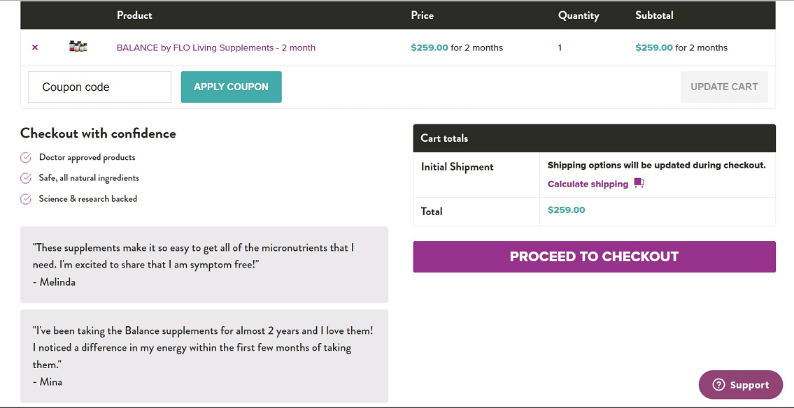
5. Flo Living - Checkout with confidence
Flo Living places a “checkout with confidence” area beside the cart. The layout shows how reassurance can sit near the purchase decision without replacing the item summary. Use relevant, verifiable information in that space; do not treat a testimonial as proof of a product outcome.
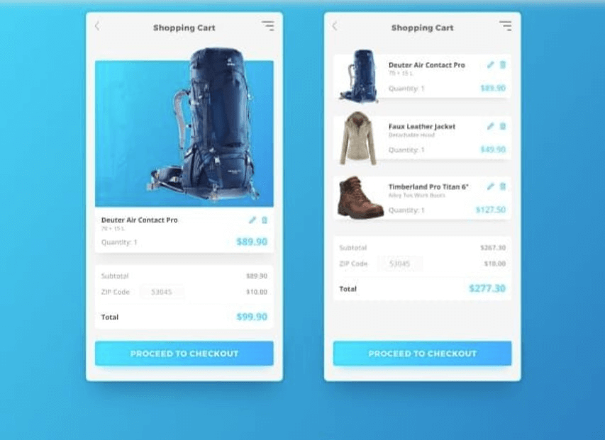
6. Refreshing shopping cart design
The two screens show a cart with one item and a cart with several items. That is a useful starting point for testing list growth. Also include long product names, different variants, and an unavailable item so the layout works beyond the cleanest sample state.
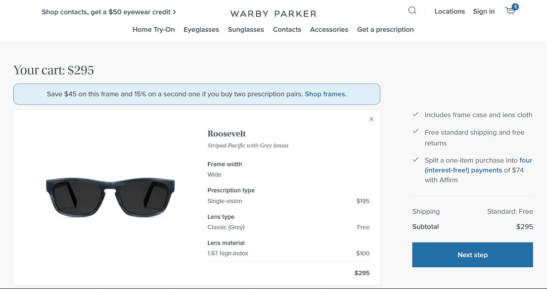
7. Warby Parker
Warby Parker’s screenshot makes frame details visible within the cart. Showing the chosen variant helps shoppers confirm they selected the intended product. Keep those details close to the image and price rather than making people reopen the product page to check them.
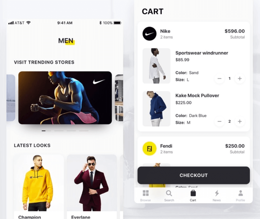
8. UI Design for Fashion App
The fashion-app example places the checkout action near the bottom of the screen and gives the item list its own space. If that action remains fixed during scrolling, reserve space for it and check the keyboard-open state. It should not cover quantity controls or error messages.
9. Solo Stove
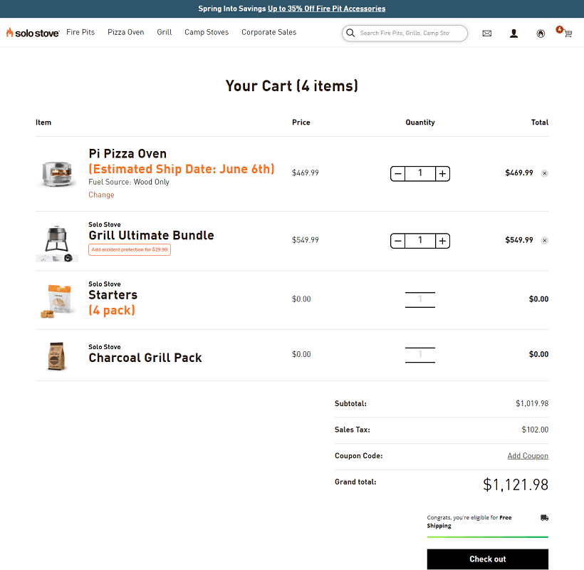
The Solo Stove screenshot presents multiple items with quantities, prices, and delivery information. Make included items and optional add-ons clearly distinguishable. A screenshot does not establish how the items entered the cart; do not automatically add a paid extra without the shopper’s agreement.
10. Shopping cart for grocery shopping
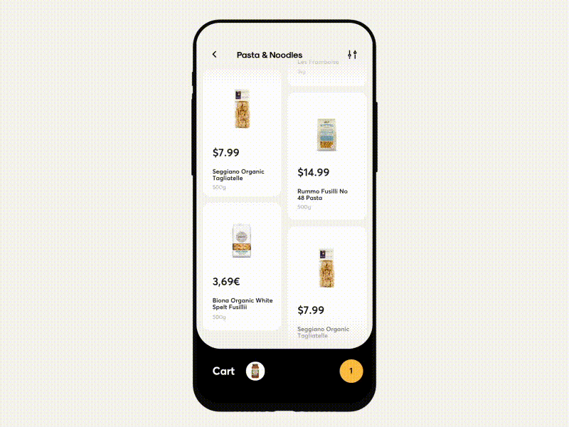
The grocery concept connects a product list with cart controls, supporting repeated small additions. Design the transition from “Add” to a quantity control and keep the cart count consistent with the item list. Specify how the cart opens and how each quantity change is confirmed.
What Happens When the Quantity Changes?
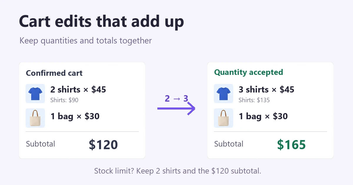
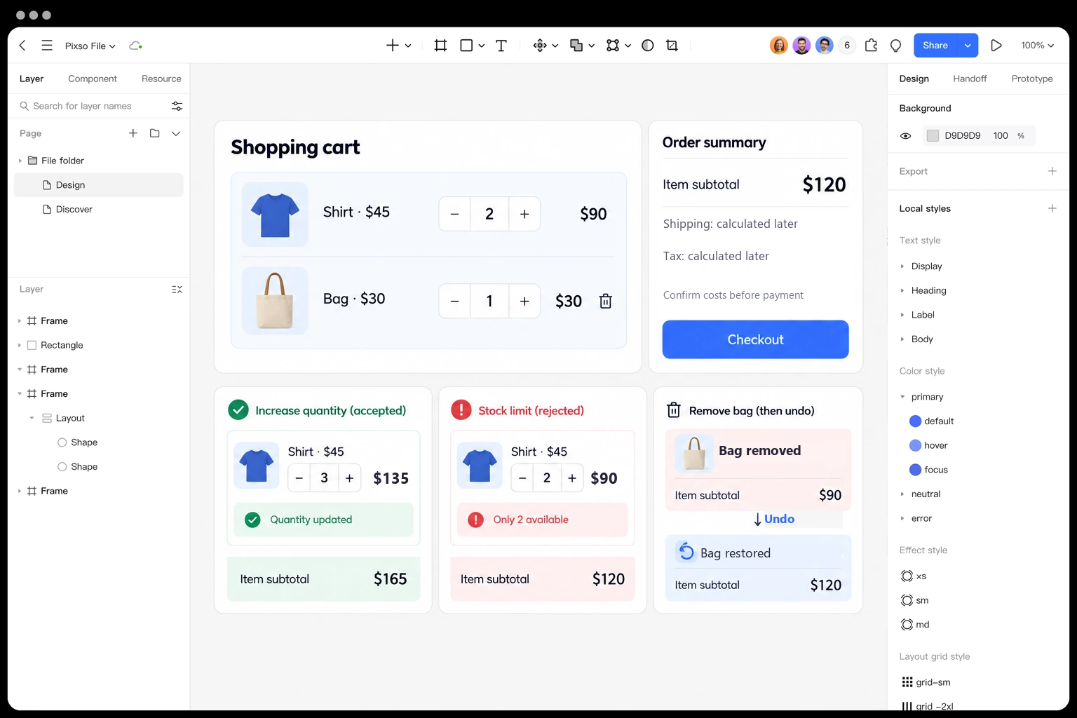
Use a concrete cart to design the states: two shirts at $45 each and one bag at $30 give an item subtotal of $120. Taxes and shipping are separate estimates until the required location and method are known. Every edit should keep the item row and summary in agreement.
- Quantity accepted: Changing the shirts from two to three makes the item subtotal $165. Show the new confirmed quantity and updated subtotal together.
- Update in progress: If confirmation takes time, mark the update as pending rather than showing a final total that may be rejected. Prevent accidental duplicate changes without making the rest of the cart appear broken.
- Stock limit: If only two shirts are available, retain or restore the confirmed quantity of two and explain “Only 2 available.” The item subtotal remains $120; do not leave a quantity of three beside the old price.
- Remove and undo: Removing the bag leaves $90. Offer an understandable Undo action that restores the bag and the $120 subtotal. If restoring fails, explain why instead of pretending the item returned.
Baymard’s quantity-update research describes how unregistered changes and unclear update controls cause confusion. The practical lesson is to make a change’s outcome visible, not require shoppers to guess whether the cart has saved it.
Include a network-failure state as well. Keep the last confirmed cart visible, identify the change that was not saved, and offer Retry. “Out of stock” and “Could not update” are different problems and should not use the same message.
Part 3. Design Cart States with Pixso Templates
Start with a cart row component in Pixso: product image, name, selected variant, unit price, quantity control, and Remove action. Add a separate summary component for item subtotal, estimated charges, and checkout.
Build the $120 cart example with reusable rows, then create the accepted update, stock-limit, and Undo states beside it. Auto Layout can keep spacing consistent as names wrap or messages appear, but desktop and mobile arrangements still need deliberate design decisions.
Make the prototype answer specific cart questions:
- Use shared text and color styles to distinguish confirmed values, estimates, and errors.
- Create narrow and wide layouts, including a long product name and an expanded error message.
- Connect quantity, Remove, Undo, and checkout states in a prototype so reviewers can follow the editing task.
- Review the same file with the team and record which values change together.
- Use the relevant community wireframe below as a starting point, replacing its sample products and labels.
- Hand off the expected states and transitions; a design prototype does not implement payment or inventory checks.
Relevant Cart Resources in the Pixso Community
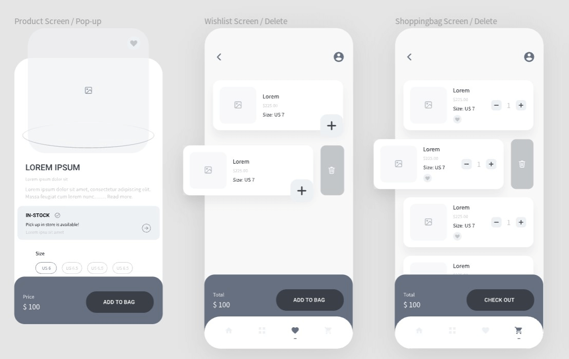
This wireframe resource includes product, wishlist, and shopping screens. Keep its useful row structure, then add the confirmed, pending, and failed-update states for your own store.

The second resource is a shopping icon set, not a complete cart template. Use a recognizable cart symbol for entry and pair editing actions with labels when their meaning would otherwise be unclear.
Design Shopping Cart Templates with Pixso
Choose a layout that keeps item details and costs readable, then design what happens after a change. The most useful prototype is not just a polished full cart: it also shows an update, a failure, and a way to recover.
Use these examples for layout ideas and the cart-state example for interaction decisions. Review whether someone can correct a mistake without losing the rest of the cart before refining decorative details.