Elodia
Good tags UI design makes a small label’s job clear before someone touches it. Start with its meaning and behavior, then decide on padding, icons, color, and shape. The examples below compare visual treatments and use a file-library exercise to test status labels, filters, and removable tags together.
What Are Tags
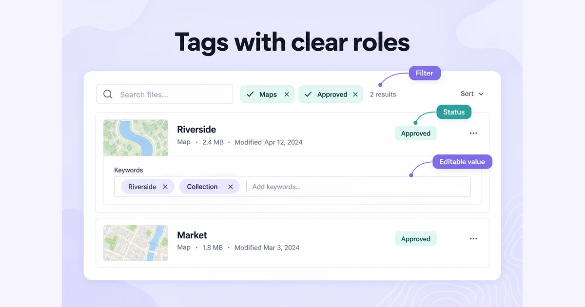
A tag is a short label associated with an item, often used as metadata for categorization or discovery. Its appearance does not tell you whether it can be clicked. An informational status label, a selectable filter chip, and a removable input token can look similar while requiring different behavior.
Tags may be assigned by a service or entered by its users; categories can also be editable, depending on the product. Define who can add, rename, or remove a label, and whether it describes an item, filters a collection, or represents a value in an input.
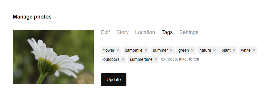
The GOV.UK Tag component is specifically a non-interactive status indicator. Android’s chip guidance describes several interactive chip types, including filters and inputs. These systems illustrate why a component’s name and contract matter more than its pill-shaped outline.
| Type | Example | Expected behavior |
|---|---|---|
| Informational label | Approved on a file card. | Communicates status; does not toggle or open anything. |
| Filter chip | Maps in a file-library filter. | Selects or clears a filter and exposes its state. |
| Removable input token | Riverside in a file’s keywords field. | Represents an entered value with a clear remove action. |
| Navigation link | A topic label linking to its collection. | Opens that destination and behaves as a link. |
What Is Tags UI Design
Tag UI design defines how labels look and behave when people categorize, filter, or group content. Consistent visual treatment helps people recognize related items, while distinct states explain which labels they can select or remove.

Basic Tags UI Design Principles
These principles help keep tags legible and predictable when labels vary in length or several controls appear together.
Short Length
Keep tags concise without removing the words that distinguish them. “Awaiting approval” is more useful than a vague “Pending” when several processes are possible. Avoid creating tags for information that already has a clear field or category; otherwise people must interpret two competing classifications.
Component Composition
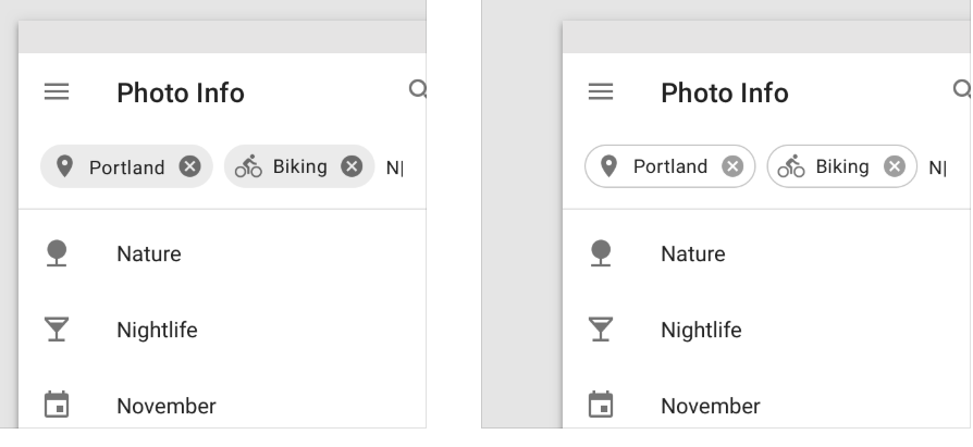
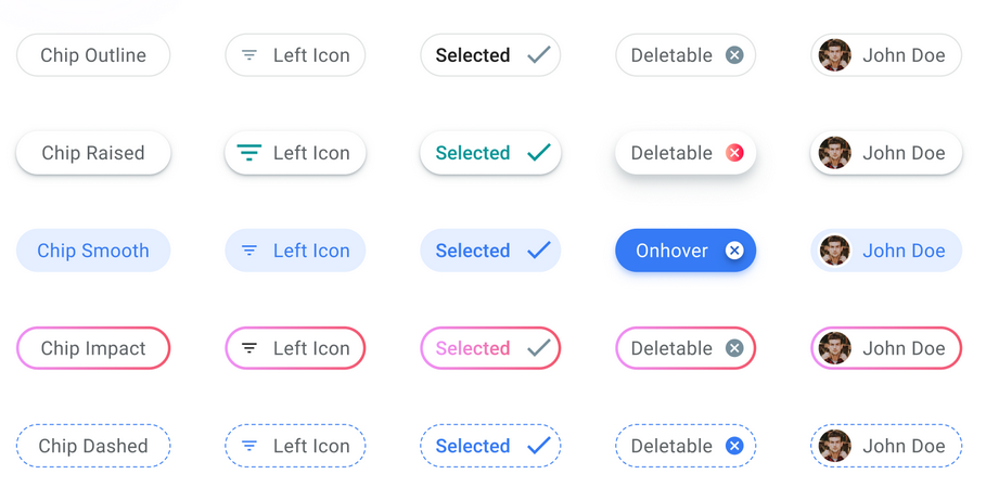
The components of a tag depend on its role: a label, an optional leading icon, and sometimes a remove control. A checkmark can reinforce a selected filter; an × can remove an entered value or clear an applied filter. Do not add a close icon to an informational status. The illustration below compares leading icons and removal affordances.
Sizes and Padding
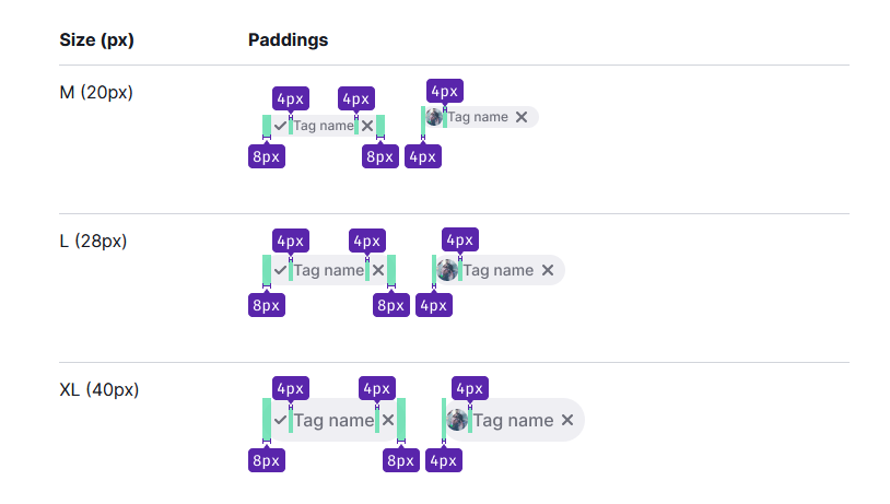
Consistent size and spacing help a group of tags scan as one component family. Use a repeatable padding rule around the label and icons, then allow longer labels to fit. The measurements in the illustration are examples of visual sizing, not a universal requirement or proof that a small remove control is easy to operate.
Curved Edges
Rounded and square corners can both work. Choose the shape that fits the interface and use it consistently; rounded edges do not establish whether a tag is interactive.
Theme
Make the label readable against its fill and the component recognizable against the page. Borders, filled backgrounds, and shadows are different visual treatments; choose them for the role and state they need to express. A selected filter should also have a non-color cue such as a checkmark.
Long Text
As previously stated, the length of tags should be kept short. What do you do when this text has to be long?
If a maximum width requires truncation, keep the complete label available to keyboard and touch users as well as pointer users. Prefer wrapping or expanding the label when its exact wording affects a decision. A tooltip that appears only on hover is insufficient on its own; the illustration below demonstrates truncation and needs these additional interaction paths.

Margins Between Tags
Use consistent gaps between tags and between wrapped rows. Keep separate remove actions far enough apart to avoid selecting the neighboring one. The WCAG target-size guidance sets a 24-by-24 CSS-pixel minimum for pointer targets, with defined exceptions including sufficient spacing. Evaluate the interactive target, not just the visible × glyph.
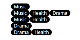
Below is an illustration of tags without margin.
Put the Roles Together in a File Library
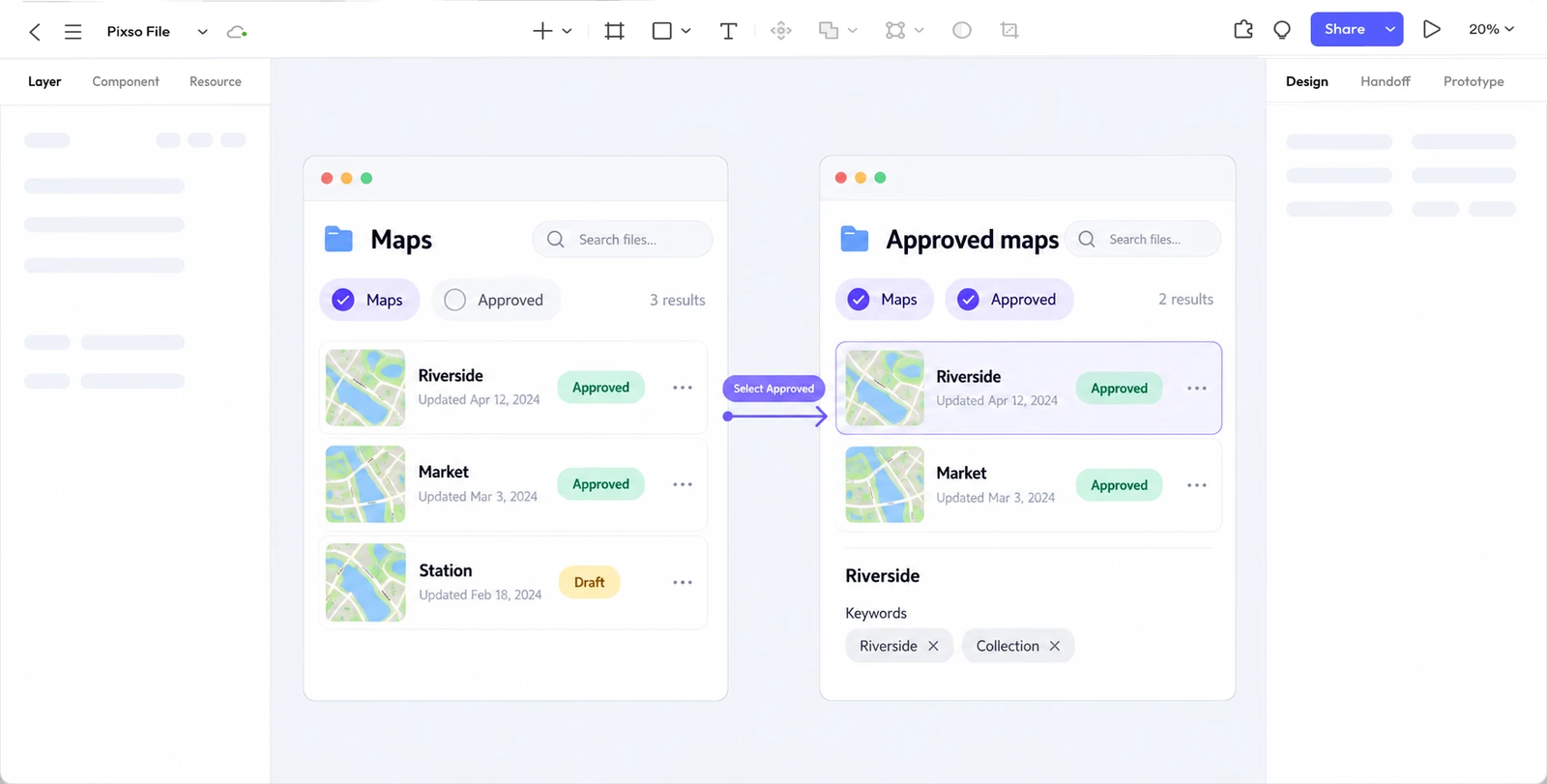
Use four fictional files to make the filter behavior testable. Riverside and Market are approved maps; Station is a draft map; Library is an approved illustration. File cards show their status as a non-interactive label. Above the list, “Maps” and “Approved” are selectable filters.
For this exercise, filters from different groups combine with AND: selecting Maps and Approved shows Riverside and Market. Clearing Approved leaves three maps. State the combination rule near a more complex filter builder, rather than making people infer it from disappearing results.
| User action | Visible result | Detail to preserve |
|---|---|---|
| Select Maps | Three files; selected Maps chip. | Label and selection state remain readable. |
| Select Approved | Two files; both filters selected. | File status labels still describe the files. |
| Clear Approved | Three maps return. | Maps remains selected. |
| Edit Riverside keywords | An input contains its existing keyword tokens. | Editing keywords does not change the global filters. |
| Remove a keyword | Only that keyword is removed. | Other keywords and the file’s status remain intact. |
Choose one clear interaction for a filter. A toggle-style chip can switch on and off when its main label is activated. An applied-filter token can use a remove action to clear an already selected constraint. Avoid combining indistinguishable main and close targets with overlapping hit areas.
In a web implementation, align keyboard behavior with the chosen control. A checkbox filter and a toggle button have different semantics; the WAI-ARIA button pattern explains exposing a toggle’s pressed state while keeping its label stable. Give a keyword’s remove button a specific name such as “Remove Riverside keyword.” Do not make users guess which token an unlabeled close button belongs to.
After removing a token, keep focus in a predictable place, such as the next removal control or the keyword input when none remain. When filters change results, expose the updated result count without moving focus away from the chosen filter. The coded interface needs assistive-technology testing; a visual prototype can establish the intended behavior but cannot certify it.
Long labels and many tags need a deliberate overflow rule. Wrap the group if the layout allows it, or reveal hidden tags through an explicit “Show 4 more” control. If a hidden tag is an active filter, make that fact visible. For zero results, keep the filters present and offer a meaningful way to clear one; an empty list should not hide the explanation for why it is empty.
Design and Test Tags in Pixso
Turn the component roles into reusable designs, then test them together in the file-library flow. A set of attractive standalone pills cannot reveal whether someone mistakes a read-only status for a filter.
Pixso’s prototyping tools can connect file-library frames with unfiltered, filtered, and keyword-editing states. Use a shared component for each role so the same status label or filter behaves consistently across the design.
Create normal, selected, focused, and disabled filter states with consistent color and text styles. Add separate keyword-token and status-label components. Preview a narrow frame with long labels and wrapped rows, then connect the filter choices to the two-file and three-file results described above.
Five Visual Examples of Tags UI
Study these reference designs for composition, spacing, and hierarchy. A screenshot does not verify keyboard behavior or the current version of the product.
File Card Tags
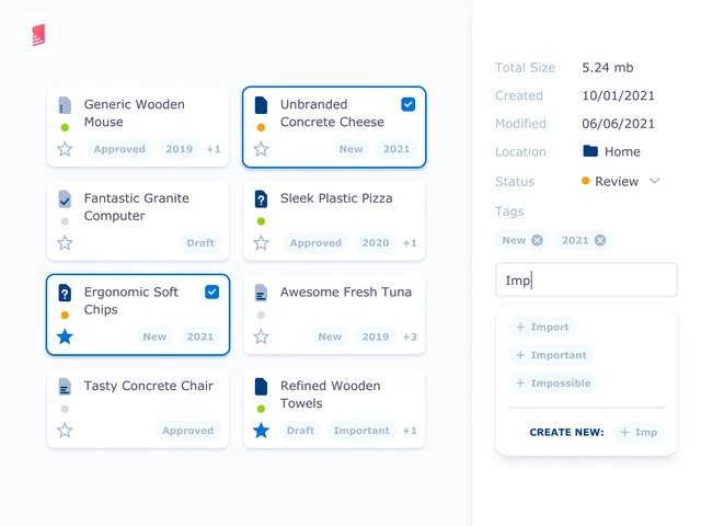
This tag UI features tags without icons. There is good padding and margin with light blue shade background and blue font color text.
Listing Quality Control Inspection by Usrnk1
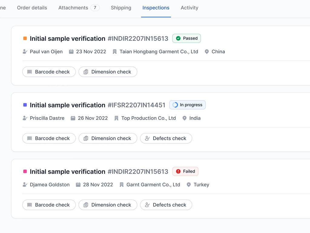
Two kinds of labels are visible in this inspection interface. Passed, In progress, and Failed statuses use text with distinct colors. The inspection-type labels have outlined treatments and leading icons. Their different appearances help separate workflow status from the kind of inspection; the screenshot alone does not establish which labels are interactive.
E-commerce shop by Diana Palavandishvili
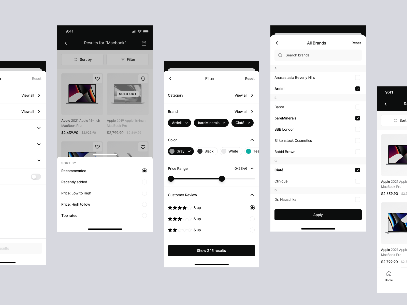
This black and white themed app interface is complemented with rounded filter tags. The tags are arranged horizontally and when unselected, possess a white background, black text and grey outline. When selected, they have a black background and white text.
Bookmark Management App by Ghani Pradita
The bookmark design uses colored label backgrounds that are lighter than their text. This keeps the category visible while giving the saved content the larger visual area. Check the actual text/background pairs before adapting the palette.

Rarible Community on Status
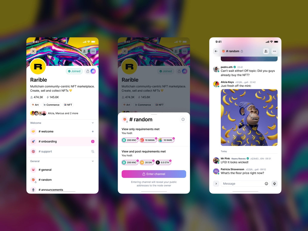
This community interface combines channel labels, small icons, and outlined pills. Compare their spacing and grouping, then define the behavior of each label before adapting the treatment to another product.
Bonus: Rich Tags UI Resources in Pixso Community
When exploring Pixso community resources, look for a component whose purpose matches your task: a status label, filter, or keyword input. Check its states and long-label behavior before bringing it into a project.
Review the resource’s usage terms and availability, then adapt the labels, spacing, and visual styles to your interface. A resource that looks complete may still need focus, overflow, removal, and empty-result states.
Invite a teammate to find the approved maps, remove only one filter, and edit a file’s keywords. If they click the file’s status label expecting to filter, or remove the wrong token, revise the affordances in the component family before reusing it elsewhere.