Travel is a growing industry and despite the recent pandemic, travelers are still looking to reach destinations for business or pleasure. With multiple itinerary transactions going through every second, it is mainly due to the convenience of well-designed travel apps.
Travel apps are the go-to place for travelers when they pick up their phones from their pockets and look to book their desired destination. However, many travel apps can have a lot of clutter that can often confuse the user's navigation. Eventually, making they disregard the app and switch to another competitor's travel app.
This blog will illustrate a few travel app UI design case studies—giving insight into some of the beautiful travel apps in the design community.
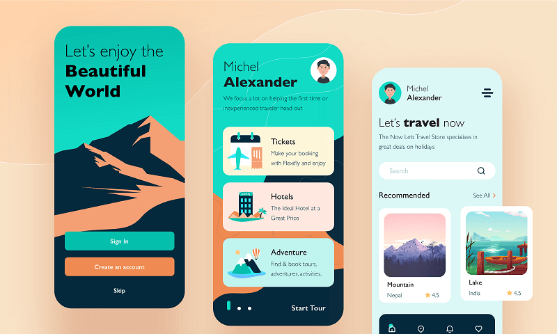
Part 1. Top 5 Travel App UI Design Case Studies
To get a good grasp on some of the most trending and effective travel app UI design, here are the top 5 travel app UI case studies:
#1 YOGO - Trip Planner App
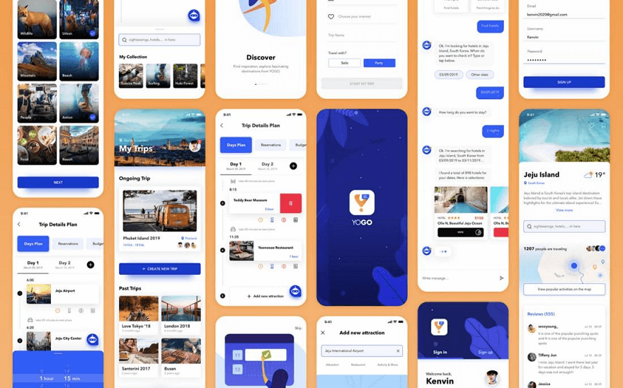
YOGO is a trip planner app that allows users to schedule trips efficiently by getting suggested itineraries for different destinations all over the world. It has a simplistic design where the home page displays featured trips and provides users with different suggestions to plan where their next destination might be. In addition, it has a gamified touch to it with users able to complete tasks and receive badges at each level and personalize their profiles by adding travel pictures, stories, etc.
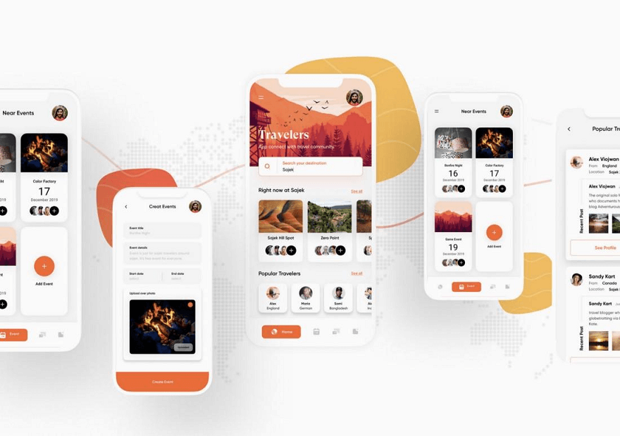
#2 Travellers App
Referred to as the “Ultimate Travel Companion”, the Travellers app carries all the information a typical traveler would need. This includes providing information on accommodation and also local events. It keeps users updated—thus, making this app a useful information source. It has a consistent dark orange and white theme throughout the app—making it a wise choice for establishing brand identity.
#3 Travel Tickets App
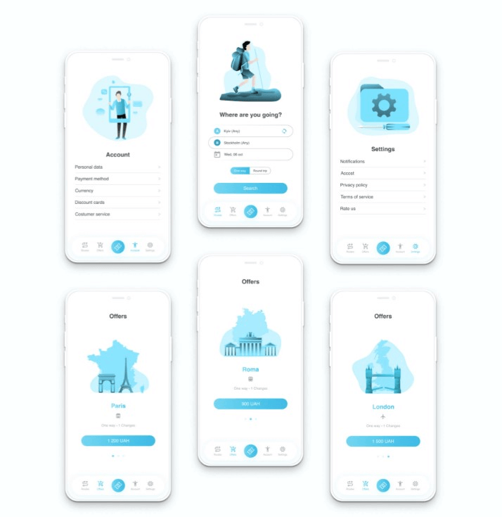
#4 Spot Hunter App
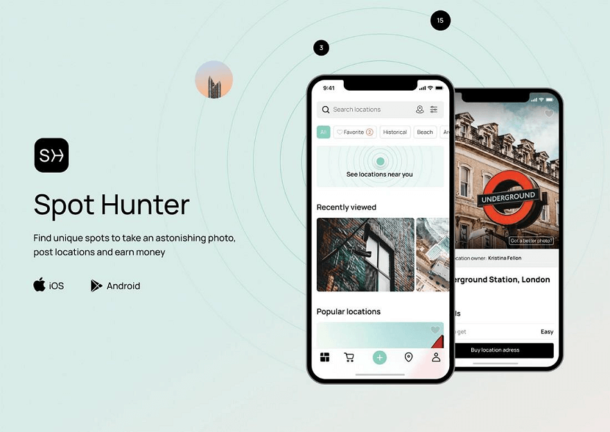
This unique case study showcases an app that everyone can use to find unique spots in any location, post photos of the location, and earn money. You heard that right! Users can share photos and get money from every location sale. The app UI design focuses on imagery and has a simplistic UX copy to assist users through each screen.
#5 Cya On The Road Travel App
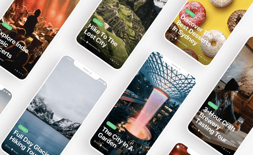
This travel app provides users or travelers to explore all locations of their trip and use an interactive map feature to keep track of every route. You can find all design components in this case study—including wireframes. It utilizes a color theme that symbolizes nature and excitement to get on the road and travel to favorite destination sites.
Part 2. Design Stunning Travel Apps with Pixso
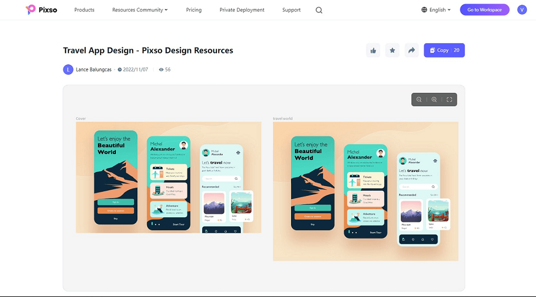
These travel app case studies might have tempted you as a designer to go design a unique travel app of your own or even one you may require for your projects. A good place to start designing travel app UI is on Pixso.
Pixso is a free collaborative design tool that you can use without any limitations and design your travel app UI with ease. Its main features are:
Added design functionality
Pixso offers a variety of design tool options to create intricate designs which are highly recommended when designing travel apps. You can start designing everything from scratch like wireframes, and components, and prototype your designs to make a meaningful user flow.
Enhanced design workflow
With Pixso, you can get everything done in one app. You do not require to download any apps to preview prototypes and can edit everything on the web version. Pixso also supports importing various design files from Figma to Sketch. As a result, this helps designers like you to maximize your workflow when dealing with multiple design files and rearranging components all over the canvas.
Built-in auto layout feature to make designs scalable
Most importantly, Pixso has a built-in auto layout feature so designers can scale their content on different screen sizes. This is important when scaling your travel-up UI design for different smartphone sizes and also designing a web version for them. Eventually, you do not need to waste hours and hours making sure your designs are responsive.
Team collaboration is Pixso’s motto
Pixso is a great collaborative tool that provides built-in sharing tools similar to giants like Adobe and Figma. No matter the size of your team, you can enjoy the benefits of working collaboratively and ensuring your projects are achieved as a unified group.
A community for inspiration
Pixso has a design community that provides inspiration to many designers—beginners and veterans. You can dip your hands in the Pixso community and explore various travel app UI templates to use as inspiration and base your designs from there.
Part 3. FAQs - Travel App UI
Q1. How features should a travel app design include?
Typically, a travel app should act as a travel planner that guides users to book their favorite destination sites. There should be booking services that display different types of transportation available and include navigational services along the way. Having additional features such as a travel log, review, weather forecasts, local destination news, etc., helps to create an effective travel app.
Q2. How do travel apps make money?
Travel apps make money by getting sponsorship deals from hotels, revenue from ads, and also affiliate marketing. There are also other ways travel apps can make decent money but these are the major sources of their income.
Q3. How does a travel app work?
Travel apps act as travel guides—displaying reviews and ratings from different travelers and location sites. Travel apps help display a wide range of information regarding ticket costs, booking schedules, and other additional information that provides value for busy travelers.
Design Your Unique Travel App UI Design…
Travel apps are essential for travelers to look to reach their desired destinations. The app design should provide convenience and ease of getting to that location.
As a UI designer, use your creativity to design a travel app UI for fellow travelers using design tools like Pixso today.


