Scott
Eight UI principles applied to one checkout
Good UI design makes the next action understandable, keeps important information visible and helps people recover when something goes wrong. Eight useful principles are clarity, hierarchy, consistency, feedback, control, content, accessibility and recovery.
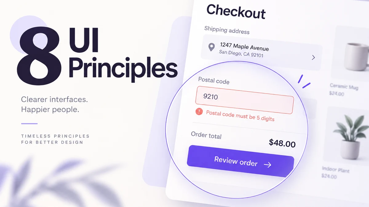
Consider a checkout with a full name, street address, postal code and order total. The shopper enters an invalid postal code and sees “Something went wrong” above a vague “Continue” button. Improving this screen takes more than changing its color. Each principle below addresses a different part of that same decision: what happened, what can be corrected and what the button does next.
1. Clarity: say what the interface is for
At the start of a task, a person should be able to name the page or object and the next action. Use a heading that describes the purpose, labels that match the user’s language and a primary action whose result is understandable. Avoid internal terms and vague buttons such as “Continue” when the product can say “Save address” or “Review changes.”
Clarity is not the same as adding more text. Put help close to the decision, remove decorative instructions that repeat the heading and write errors that explain the correction. Ask a reviewer who has not seen the file to state the task and next step in one sentence. Their answer is more useful than a team member’s familiarity with the interface.
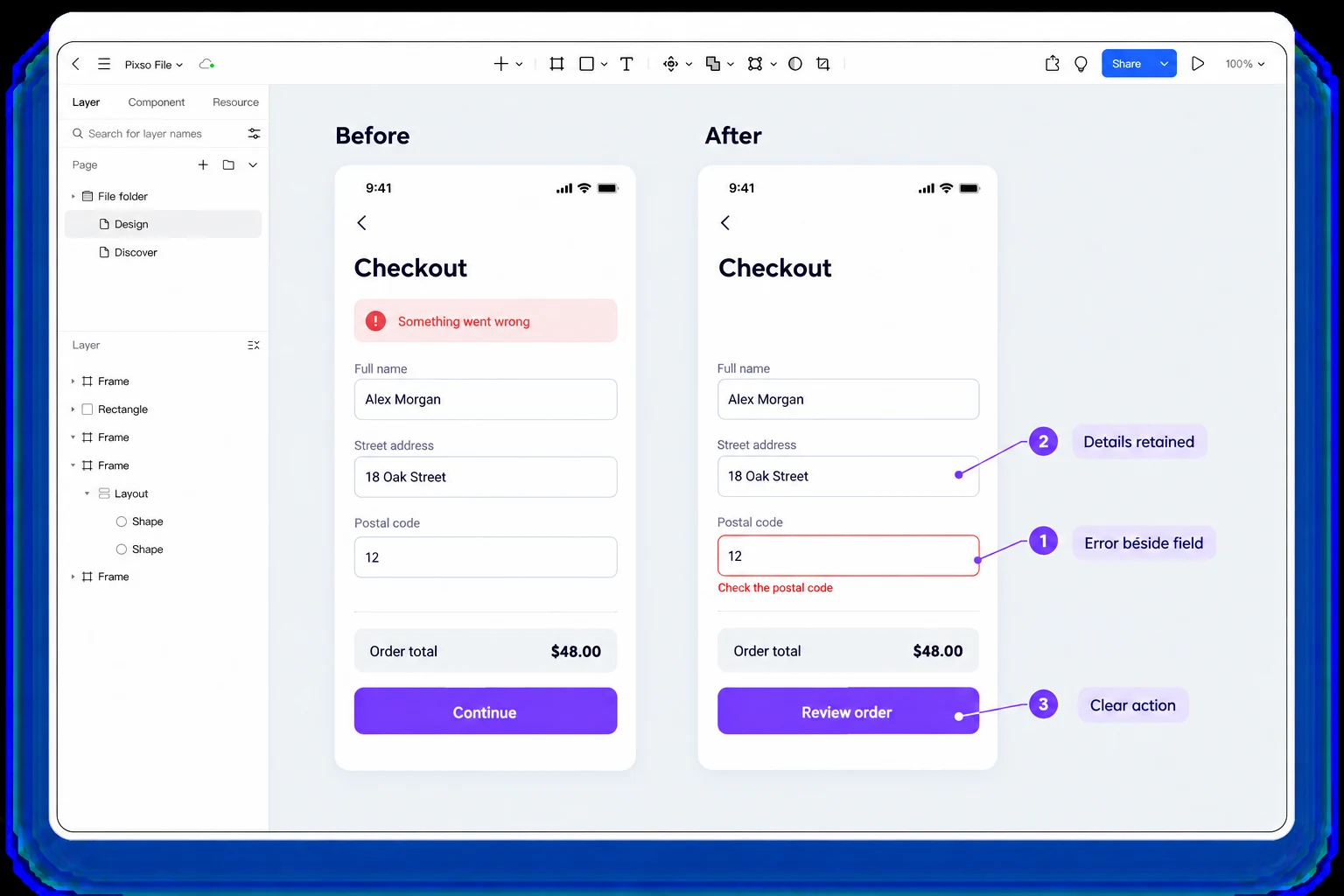
On the checkout form, “Continue” leaves the next step open to interpretation. “Review order” says that another review screen follows, while “Place order” means the purchase is being committed. Choose the label from the actual next action, not from the space left inside the button.
2. Hierarchy: order the decision
Visual hierarchy tells a person what to notice, read and do first. Use grouping, whitespace, typography, contrast and placement to reflect the task order. A large decorative headline should not compete with a critical status or action. A dashboard should not give every metric the same weight when one value drives the decision.
Test hierarchy at the actual viewport and with realistic content. A long section heading, an expanded error or a translated label can change the order. Check focus order and reading order as well; a visual layout that looks logical can be confusing to a keyboard or screen-reader user.
Give the order total, delivery choice and primary action a clear relationship. A promotional banner should not be more prominent than a cost the shopper must approve. When the postal-code error appears, the message must enter the reading order beside the field without pushing the total or next action out of reach.
3. Consistency: repeat meaning, not every pixel
Consistency helps people transfer learning from one screen to another. Reuse labels, component behavior, focus states and content conventions when the meaning is the same. Keep an exception intentional and document why it exists. A different color or icon should signal a meaningful difference, not a one-off preference.
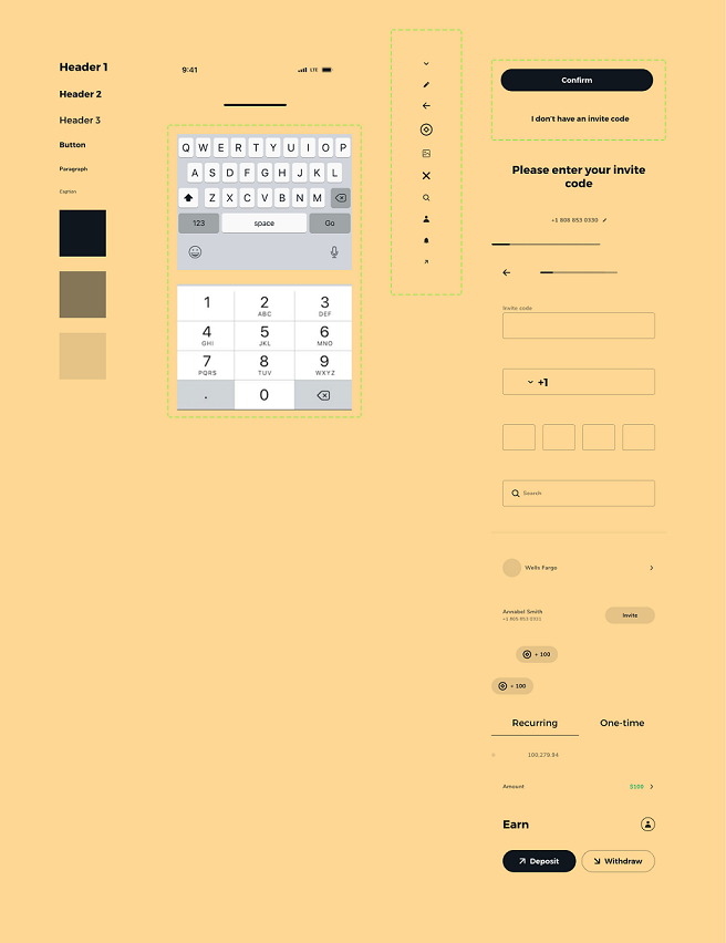
Design systems help a team publish repeatable components, but a library does not make a product consistent by itself. Check the source of truth, state names, variants and implementation behavior. Review content consistency too: a destructive action should not be called “Delete” in one place and “Remove” in another unless the consequences differ.
Use the same visible label and error placement for the postal-code field in checkout and in account settings. The fields may have different widths, but an error should not appear below one field and only in a disappearing toast on the other. Compare the meaning and behavior before standardizing the pixels.
4. Feedback: show what changed and what is pending
After an action, the interface should indicate whether it was accepted, pending, rejected or completed. A save action may need a status near the object; a long request may need progress; a validation error needs a message that remains available until corrected. Avoid a spinner that does not explain whether data is loading or saving.
Feedback should be perceivable without color or motion alone. Announce important status changes to assistive technology and provide a static alternative when motion is reduced. Keep the user’s focus where it helps them continue. A toast that disappears before it can be read is not a reliable recovery path.
After the shopper activates “Review order,” distinguish a request still running from a field that needs correction. Keep “Check the postal code” visible beside the field until the error is resolved. If the address is accepted, advance to the order review instead of leaving the same button looking ready for another identical submission.
5. Control: preserve agency and recovery
Users should be able to cancel, undo, edit or leave a task when it is safe to do so. Warn before a destructive or irreversible action and explain the consequence. Do not use disabled controls with no reason; explain the requirement or allow the action and return a useful error.
Control also applies to inferred or automated behavior. Make personalization, suggestions and AI output editable and reversible. Tell people which data or setting affects the result. A system may restrict an action for security or policy, but the interface should state the boundary and give a legitimate next step.
Let the shopper edit the delivery address from the order-review screen without re-entering unrelated details. Returning to the cart should not quietly place the order, and an optional marketing signup should not be required to proceed. Real control comes from those working choices, not from presenting an exit that discards the work without warning.
6. Content: use the user’s language and real values
Words are part of the interface. Labels, examples, empty states, errors and confirmation copy should describe the user’s object and consequence. Replace internal jargon, vague adjectives and filler. Use realistic values so line wrapping, density and numeric formatting are visible.
Content needs localization planning. Include a long translation, accented text, punctuation and required scripts in the design specimen. Decide whether a button wraps, grows, scrolls or moves to another step. Do not truncate a critical error simply to preserve a screenshot. Record plural, date, currency and right-to-left rules when they apply.
Write “Postal code” or the appropriate local label, not an internal field name such as “destination identifier.” When the selected country requires a particular format, include a usable example near the field. Keep delivery charges and the order total in the shopper’s currency format, and update the total when the delivery option changes.
7. Accessibility: make the task operable and perceivable
Use WCAG 2.2 as a baseline for contrast, keyboard access, focus visibility, text enlargement, target size and status communication. Add semantic names, meaningful heading order and alternatives for non-text content. A prototype can represent focus and labels, but implementation needs to be tested with the actual accessibility tree.
Check the same task with a keyboard, a screen reader, large text and reduced motion. A color palette that passes a ratio check may still fail when a status is communicated only by color. A visually obvious icon may have no accessible name. Treat accessibility as a product requirement, not a final polish step.
For the postal-code error, combine a visual cue with text, programmatically associate that text with the field and make the correction reachable by keyboard. W3C’s form-notification guidance shows field-level feedback and linked error summaries. Enlarging the message must not make the checkout action unreachable.
8. Recovery: design the interruption, not only the success
Every important task has ways to fail: invalid input, timeout, network loss, permission change, empty data, conflict or partial success. Model these states beside the happy path. Explain what happened, what remains saved and what action is safe. A retry should not duplicate a payment or create two records.
Recovery copy should match the cause. “Try again” is insufficient when a user must update permission or choose a different file. Preserve safe input and return focus to the place that needs attention. Include a support or escalation path when the person cannot recover alone.
An invalid postal code and a payment timeout need different recovery paths. The first asks for a correction while retaining the rest of the address. The second requires the application to establish whether payment was accepted before inviting another attempt. “Try again” cannot substitute for knowing whether money changed hands.
A worked critique: checkout form
Start with the same fields and entered values in two checkout versions. In the revised version, keep the address, put a specific correction beside the postal-code field and name the next action “Review order.” The table connects possible problems to design changes; use a task review to find which ones actually affect your checkout:
| Observation | Principle | Proposed change |
|---|---|---|
| Submit says only “Continue” | Clarity | Name the result or next step |
| Error appears at the top after scrolling | Feedback/recovery | Keep field message and summary linked |
| Delivery total is visible only after submit | Hierarchy/content | Show cost before the decision |
| Button is unreachable at large text | Accessibility | Reflow the footer and test focus |
| Retry creates duplicate request | Control/recovery | Define an idempotent action and status |
Do not solve every observation with a larger button or brighter color. The change should address the user’s decision, state or recovery path.
Compare two versions of the same checkout form in Pixso. Keep the fields and entered values unchanged so the review stays focused on the error location and action label. Move the postal-code message beside the field, retain the address and replace a vague Continue button with Review order. Record the agreed changes beside the screens for implementation review.
How to choose between competing improvements
Fix problems that block or mislead the shopper before polishing optional details. An error message that names the wrong field takes priority over an uneven icon. A total that appears only after commitment takes priority over a more elegant card shadow.
When two improvements conflict, compare their effect on the task. A fixed footer can keep “Review order” visible but may hide the postal-code error at large text sizes. Try the same form with the footer in the document flow and compare whether the shopper can see both the correction and the next action. The better choice is the one that preserves that task at the supported sizes.
How these principles relate to usability heuristics
The eight principles here organize a practical UI review; they are not a replacement numbering for Jakob Nielsen’s ten usability heuristics. Nielsen’s original heuristic framework includes system status, consistency, user control and error recovery, which support several of the decisions in the checkout example.
Use the framework to notice likely problems, then inspect the actual task. A rule such as consistency will tell you to compare two error patterns, but the checkout’s content and behavior determine which pattern should be kept.
Further reading and sources
- WCAG 2.2
- WAI-ARIA Authoring Practices
- Material 3 foundations
- Pixso’s UI design process and design system examples.
When the same interface needs a different decision
A checkout used once a year should explain more than a control panel used every hour. A new shopper may need a full delivery description; a repeat shopper may benefit from a saved address they can review and change. Both designs can be clear and consistent without showing the same amount of information.
Revisit the checkout when its conditions change—for example, adding a country with a different address format or a payment method with a delayed confirmation. Carry forward the useful components, then update the content, states and recovery that the new condition affects.