Scott
Few people recognize the hard work that goes into good design. Creating a ubiquitous logo, or a look-and-feel that is instantly recognizable takes a lot of work. And, usually, there will be a style guide behind it all. A quick internet search reveals that many household names have published their guides, so you can see how much thought has gone into them.
Creating a UI style guide is an important step to ensuring that you have a consistent visual language throughout your apps. It helps ensure not just that your apps are accessible, people will know how to use them, but that they also reinforce your brand identity.
It takes work, possibly a lot of work, to create your style guide, but it is an effort that will pay for itself, and done well, will continue to serve you, and your brand, for a long time.
Part 1. UI Style Guide: What is it?
Your style guide should be a resource that informs the design process. At their best, it means that even a design novice would be able to create something that looks like it belongs in your app or on your website. It will cover things like typeface, color use, spacing, layout, and even language, and terminology. It ensures consistency throughout, creating a unified experience for the user and avoiding jarring changes that detract from the experience.
Part 2. What Sections Should Be Included in a UI Style Guide?
There is no one-size-fits-all style guide, and each style guide should reflect the needs, design, and values of the brand. Some might even be automatically generated, like a Figma style guide template that contains the elements that have been used in a design. However, UI style guides will typically contain several key elements, and it’s worth thinking about them all, even if they aren’t immediately relevant.
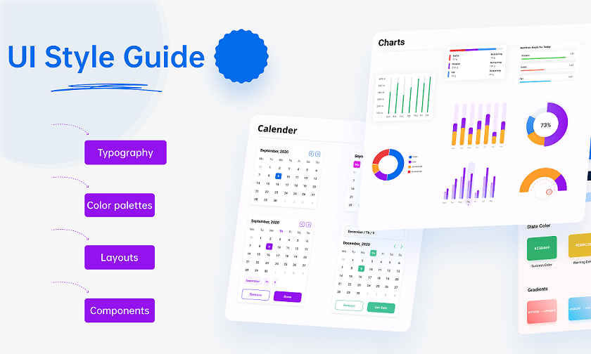
1. Typography
A typography section should detail the typefaces used, including details like when and how to use different weights or faces. This should aim to ensure consistent usage of text, whether on controls or presented in views to read.

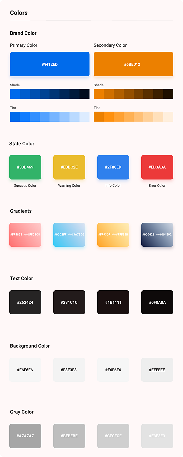
2. Color palettes
Color is a key part of the branding and also navigation. Precise colors should be identified for particular uses, such as highlighting headings or controls, but the palette should also identify the balance, ensuring that colors are used wisely and to attract attention, not distract.
3. Layouts
A section on layouts should be included in the UI style guide, this will ensure that the app has a consistent interface, but also provide constraints on the designer to avoid cluttered interfaces. They may, for example, include restrictions on spacing, demanding thoughtful, focused design.

4. Components
The style guide should include examples of components and how they interact with the user. These will be a key part of the design language, helping the user by providing consistent actions and designs, so they know what is expected of them and what to expect when they take an action.
Part 3. How Do I Create a Style Guide UI?
It is possible to create a guide automatically. For example, a Figma style guide template can create a UI style guide from your design. However, in most cases, it’s better to create the style guide first, so it can inform subsequent design.
Perhaps the easiest way to develop it is during prototyping. Consider early mock-ups, and look at what elements do and do not work. Working collaboratively on early designs can allow an exchange of views, whether it’s swapping typefaces or adjusting spacing. When the elements that work have been identified, they can be included in the UI style guide, ensuring that any additional designs are consistent.
Part 4. 5 Best UI Style Guide Examples
Many style guides are publicly available, so it might be that a brand or app you love can, with a little search, be your inspiration. If not, here are five style guides to check.
1. Mozilla
Although best known for the Firefox browser, the Mozilla foundation has a range of products, including the Firefox OS. Their style guide covers everything, including their OS, making it a great example to learn from.
2. Apple Human Interface Guidelines
Apple’s guidelines cover the design for all their products. They are not proscriptive on design elements like color palette but do include many elements that will help you think about and develop your own guide.
3. Yelp
One of the world’s most popular review sites, the design thoughtfully reflects its food-based purpose. Even a non-designer will appreciate seeing how they have put together an intuitive UI style guide that reflects their brand while making use of their apps and sites easy.
3. Salesforce
As one of the world’s biggest enterprise applications, one of Salesforce’s strengths is the market for third-party add-ons. Their style guide provides guidance on how developers can create add-ons that maintain the flow from Salesforce, without losing the developer’s individual look.
4. Spotify
Spotify’s guidelines are quite text-heavy, but this gives them an opportunity to explain why they have made certain rules about using their content. Even if you aren’t thinking of aggregating from other sites, or developing a service that allows it, their rules will help you think about how and why you display elements, and how they relate to other content.
Part 5. Bonus: A Free Collaborative Design Tool
Now you are inspired to create a UI style guide, what’s the best way to start? Pixso is an ideal service, and for many people, it won’t cost them anything!
Pixso is a collaborative design tool and, like apps in Adobe’s Creative Cloud or Figma, it contains all the functions you need to take designs from the first dot on the page to a final, pixel-perfect prototype. However, as well as containing all the tools you would expect, its powerful collaboration means it’s perfect for developing a UI style guide.

Cloud-based, you can work with fellow designers anywhere in the world, putting together a design and perfecting it. And its responsive design tools make it easy to iterate until you have everything exactly how you want it to be. With Pixso, putting together your style guide will seem easy.
Conclusion
Although the perfect design might come naturally, it’s a risky approach. And it means that future apps will have to have the same amount of luck. Thinking about your visual style before you begin is now common practice because, although it might be difficult, it saves time and effort in the long run.
The best way to develop a UI style guide is to work collaboratively, developing designs and iterating them until they reflect the brand image and the app’s purpose. The old-fashioned way to do that would have been on paper in a studio. But with modern cloud-based tools like Pixso, it’s now possible to work with people around the world, perfecting designs quickly and easily, and developing a style-guide that means everyone who works on the app knows exactly what it needs to look like.


