On this page

Scott
Useful UX design principles turn a vague goal such as “make booking easier” into decisions about information, actions, and feedback. Start with the user's task, make choices understandable, and show what happened after each action. The UX design workflow in Pixso connects those decisions to screens and prototypes your team can review.
The Interaction Design Foundation defines UX principles as "fundamental points of advice for making easy-to-use, pleasurable designs as we select, create and organize elements and features in our work." Design principles, therefore, form the heart and soul of UX design. Consequently, as new designers, you must learn these guidelines and consider aligning your design practice with them.
The eight principles below use a running example: booking a design consultation. The visitor needs to choose a service, find a suitable time, understand the fee, and know whether the appointment is confirmed.

8 Must-know UX Design Principles
- Meet the users' requirements
- Recognize your position in the design process
- Recognize accessibility
- Typography has a great impact
- Feedback is valuable
- Utilize the right tools for efficiency
- Understand user testing in theory and practice
- Employ neat information architecture (IA)
Detailed Study of UX Design Principles
Meet the Users' Requirements
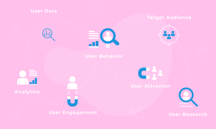
First of all, UX design concepts are to concentrate on users throughout the design process. The phrase user experience makes it apparent that your effort has to enhance your users' experience with your product or service.
The user comes first (always). This is one of the most prevalent basics of UX design. UX designers must put themselves in the users' shoes and design for their demands. While designers often have high standards and strive to give the finest appearance and experience, the same ambition for perfection may cause them to lose empathy for the user's point of view.
The finest UX designs maintain the users in clear focus, meaning you'll need to lay aside your personal preferences as a designer. Instead, spend more time knowing users' pain areas, preferences, and views. This is precisely why design teams generally invest time and effort in getting to know the consumers in the beginning phases of the design process.
Recognize Your Position in the Design Process
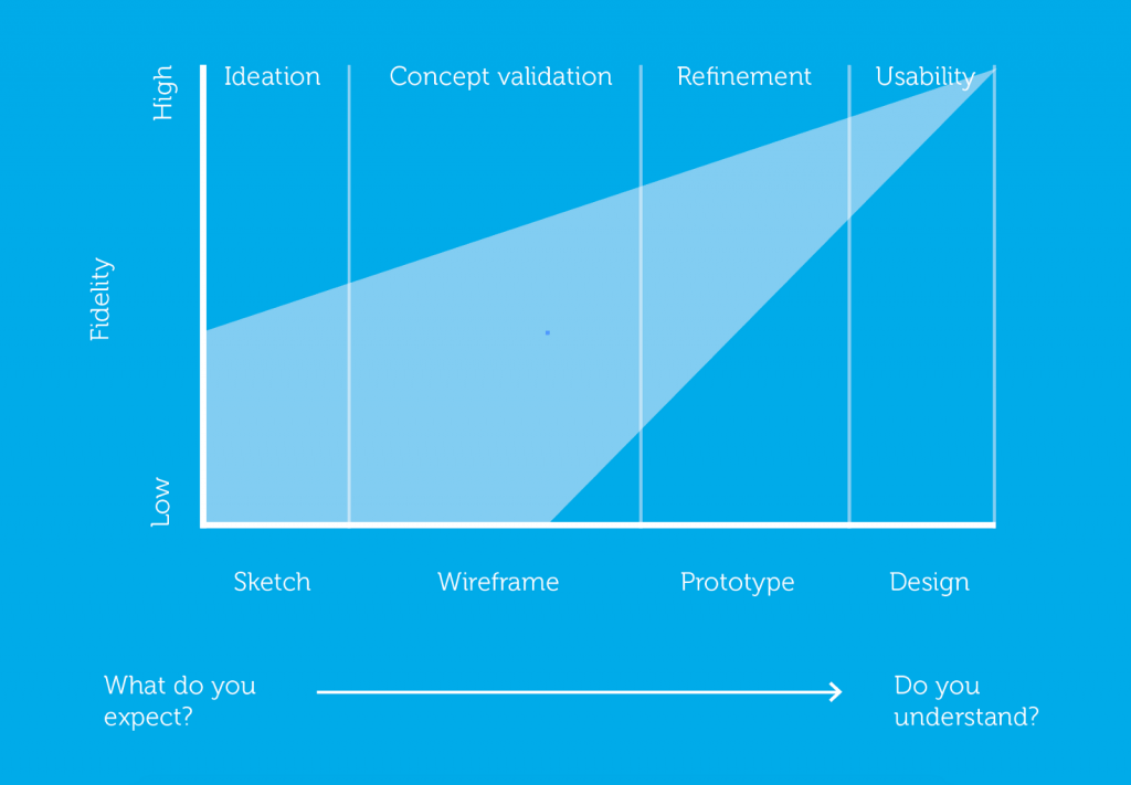
The design process might be intimidating for rookie UX designers who are just beginning their internships or are in junior roles. Knowing your role in the process is important for several reasons because creating involves a lot of labour.
Choose methods appropriate to the question at each stage; the same tool may support more than one stage. Second, understanding your design phase enables you to formulate the appropriate user research questions. For example, there is no purpose in testing a button's colour while you are still deciding where it should go in the design.
Recognize Accessibility

Designing with accessibility in mind is one of the fundamentals of UX design that is becoming more and more crucial. Simply put, a designer must ensure their creation is useful to as many people as possible. This implies that your design must also be usable for those with limitations.
Sufficient text contrast helps people with low vision read the screen. Blind users also need meaningful names, structure, and interaction support through assistive technology; contrast alone does not provide that. Include keyboard access, visible focus, and understandable error messages in the design decisions, and test their implementation.
Typography Has a Great Impact
The font you choose is just as significant as the text you employ. Typographic decisions may greatly influence how readers understand the words you employ, enhancing or obstructing the message. Additionally, typography may enhance UX in a variety of ways.
As you contemplate a typographic hierarchy, for example, it may enhance accessibility and make the design more user-friendly.
It isn't an exaggeration to claim that the typeface you choose may make or break the UX design. Typography has a big influence on how people read and understand any written content. In addition, it may alter how usable and accessible a product is.
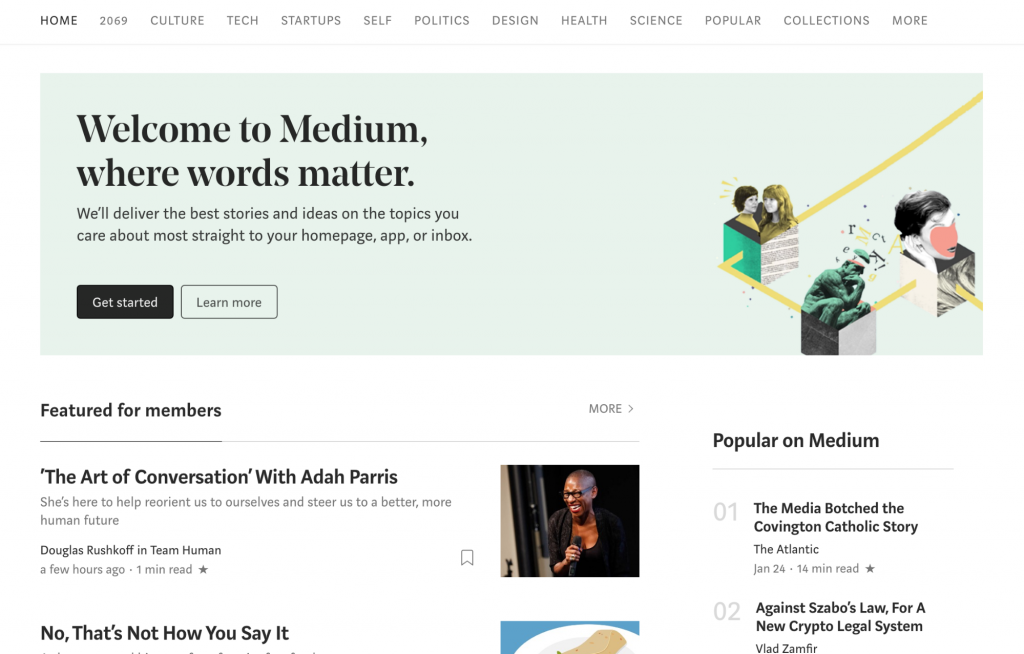
For a UX designer, taking typographical hierarchy into account improves the usability of a design. The Medium screenshot illustrates the use of distinct title, summary, and body styles to establish a reading hierarchy.
Feedback Is Valuable
Design should, by its very nature, be interactive. For a user to know that their instruction has been received when they click on anything, the product must respond. The development of human-machine communication depends heavily on feedback.
Make the response fit the action. A pressed state acknowledges a click; a loading state explains a wait; a confirmation states what succeeded. Do not use animation or color as the only explanation of an important outcome.
Utilize the Right Tools for Efficiency
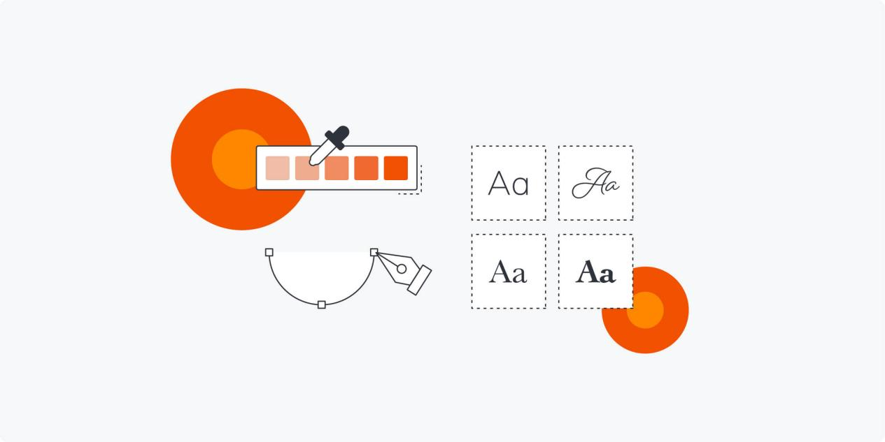
Remembering the UX design idea of selecting the appropriate tools for the job is important. It's about having a capable prototyping tool and giving the design team the necessary equipment. You may use different tools that suit different aspects of your design process or ease the burden by choosing an all-in-one tool like Pixso.
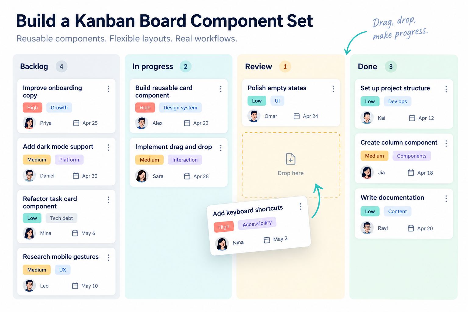
Use a design tool to make the relevant states visible together. For booking, a reusable slot control should distinguish available, selected, and unavailable times. The tool helps the team communicate those decisions; it does not guarantee that every usability or accessibility issue has been solved.
Understand User Testing in Theory and Practice
Any UX design approach must include user testing as a crucial step. It often entails assessing a digital product or service using various research techniques. UX designers offer their work to actual users and evaluate the results to see how people respond to it.
In a usability session, ask a participant to complete a realistic task with the prototype and observe where they hesitate, misunderstand, or fail to recover. Avoid explaining the intended route while the person is trying it: that would hide the navigation problem you need to see.
An A/B experiment compares variants with a defined outcome and suitable live traffic; it is not a substitute for watching someone try an early prototype. Choose a method for the question you have rather than treating all research methods as interchangeable.
Interviews explore experiences and needs. Card sorting informs grouping and labels. Usability tests examine task completion and obstacles. Session recordings show observed behavior in an implemented service, but do not by themselves explain a person's reasons.
Employ Neat Information Architecture (IA)

IA could be difficult to convey to fresh UX designers. Information architecture is the design of a framework that organizes a website, application, or other project for its users. It leads to the development of:
- Navigation
- Metadata
- Sitemaps
- Hierarchies
- Categorizations
Information architecture assists users in comprehending what they are seeing and locating the information they seek. For instance, a designer is essentially doing information architecture when he draws up a top-level menu to assist consumers in understanding where they are on a website.
Apply the eight principles to one booking task
Suppose a visitor wants a 30-minute consultation next Tuesday after 14:00. The service has a stated fee, and the visitor may need to reschedule. Use that brief to make each principle concrete.
- User needs: put duration, fee, time zone, and rescheduling conditions near the selection. Do not require the visitor to start checkout just to discover whether the service fits.
- Design stage: first compare the order of service and time selection. Polish illustrations after the route makes sense; a polished screen cannot settle an unresolved task sequence.
- Accessibility: identify unavailable slots with text or a clear state, not color alone. Keep a visible focus treatment and specify how a keyboard user selects a slot.
- Typography: separate service name, time, price, and supporting conditions. Check a long service name on a narrow screen without hiding the fee below an unrelated illustration.
- Feedback: selecting a time highlights that slot; submitting the form shows a waiting state; confirmation appears only after the booking is accepted. A spinner is not a confirmation.
- Tools: reuse the same slot and field components across screens. Annotate the unavailable, error, and confirmation states beside the flow so review is not limited to the ideal screen.
- Testing: ask a participant to book within the time constraint and then explain what they believe has been reserved. If they mistake a selected slot for a confirmed appointment, revise the feedback.
- Information architecture: keep the service, time, contact details, and summary in recognizable groups. When the visitor returns to change the time, preserve unrelated information that remains valid.
Resolve a conflict rather than applying a rule blindly
Showing every available slot reduces navigation but can overwhelm a small screen. Grouping slots by day makes scanning easier but can hide availability. A useful compromise is a clear date selector, a short list of times for that day, and a visible next available date when the day is full. The principle is not “always show less”; it is to expose the information needed for the next decision.
Test one failure route as well as the successful booking. If the chosen time becomes unavailable before confirmation, explain what changed, retain the contact details, and offer another time. Do not make the visitor re-enter the whole form.
Use Pixso to Practice UX Design Principles
Build the booking flow as connected frames in Pixso: selection, contact details, summary, waiting, confirmation, and unavailable-time recovery. Place comments beside the specific screen or element under discussion, so “this is confusing” can become a precise change to a label, state, or transition.
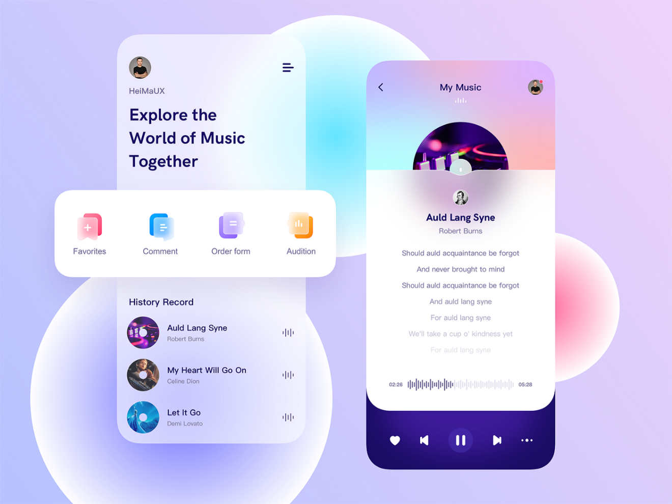
Review a defined task rather than asking whether the screen looks good. Watch whether the person notices the fee, understands the selected time zone, and can tell a draft selection from a confirmed booking. Revise the affected screens, then replay that route.
Keep the design principle connected to an observable outcome: the visitor understands the choice, completes the intended action, or recovers without losing necessary work. That gives the team a better basis for revision than personal preference alone.