Web app design is the process of creating a website application that offers a smooth user experience (UX) and satisfies users' basic demands with a simple, attractive user interface(UI).
Every web application's primary objective is to make completing one or more tasks easier. Users of web applications enter with different expectations, as opposed to visitors to traditional content websites.
In this article, we’ll bring you the full review of web app design, including its development history, methodology, trends and a high-quality tool for it. Keep reading.
Development of Web App Design
The first web apps were created in 1989, following in the footsteps of web design. Many things changed throughout this time. Things were initially quite gloomy because screens were literally dark, and there weren't enough monochrome pixels accessible. Designs were made by symbols and tabulation.
Java applets were the first attempt to make the web real-time. Yahoo Messenger was one of the first applications for people who had grown up before the 1990s. Real-time functionality framework, Flash, and ActiveX plugins were introduced after the adoption of Java applets and were used by both consumers and businesses.
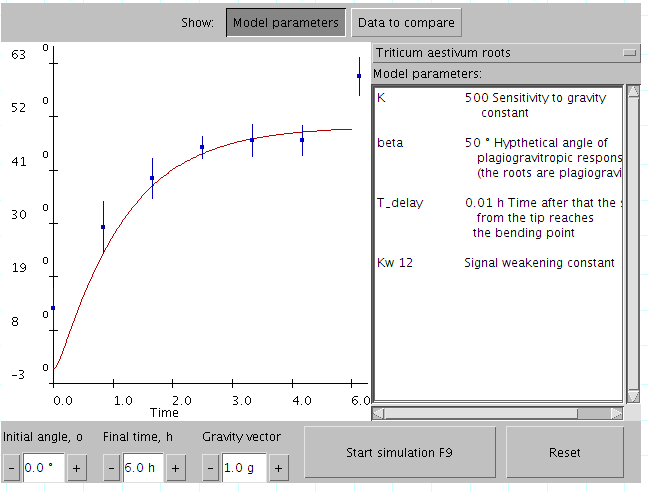
Image from Wikipedia
Sun and Netscape teamed up to deliver their browser's Java runtime and Netscape package in 1995. The era of interactive web applications officially began with this. The same year, Future Wave Software began developing an animation program called Futuresplash Animation, and Netscape released a new scripting language called JavaScript.
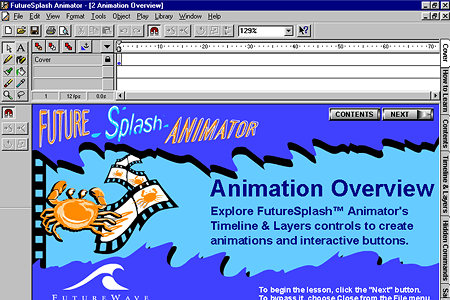
Image from Web Design Mueum
After that, the web app develops in at a high speed and in more forms.
Must-follow Principles of Web App Design
Simplicity
Simplicity is the best approach when it comes to the user experience and usability of your web app. Here are some strategies for designing for simplicity.
Color
Color can convey messages and arouse emotions. You may affect how your customers behave toward your brand by choosing a color scheme that works for it. Limit the number of colors to no more than five. Colors in harmony are really effective. Pleasant color combinations boost user satisfaction and improve client engagement.
Type
The use of typography in your online application is crucial. It grabs the audience's interest and serves as a visual representation of the brand voice. On the website, typefaces should be readable and employ no more than three different fonts.
Imagery
Every visual element utilized in communication is an image. This encompasses all kinds of graphics and still photography, illustration, and video. The company's brand personality should be expressed through every imagery, which should also convey the essence of the business. The majority of the initial information we consume on websites is visual; thus, it's critical to use high-quality photographs as a first impression to give visitors a sense of professionalism and credibility.
Navigation
Web apps use navigation as their wayfinding system so that users may interact and find what they're looking for. Maintaining visitors on a website requires good navigation. If a website or web application's navigation is difficult, users will give up and look elsewhere for the information they need. The goal is to keep navigation clear, easy to use, and constant throughout each page.
F-shaped Pattern Reading
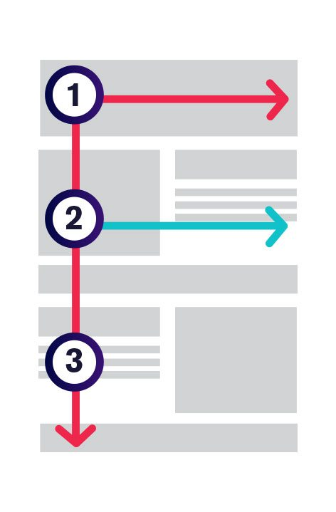
The F-based pattern is the most popular pattern used by users to scan content on a website or application. According to eye-tracking studies, people tend to focus mainly on the top and left portions of the screen. The F-shaped layout corresponds to how we naturally read in the West (left to right and top to bottom). A well-built web app will follow a reader's natural tendency to skim the page.
Visual Hierarchy
The grouping of items according to importance is known as a visual hierarchy. Size, color, images, contrast, font, whitespace, texture, and style are some ways to do this. Creating a focal point, which directs viewers to the location of the most crucial information, is one of the visual hierarchy's most critical roles.
Content
Both the design and the content of an effective web app are excellent. Great content may attract and influence visitors by turning them into clients using captivating language.
Grid-based Layout
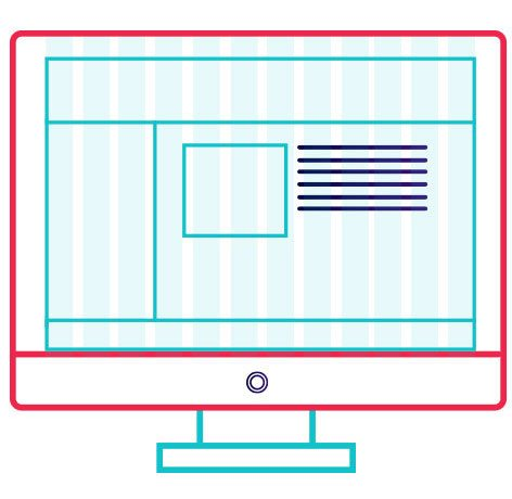
Grids support design organization and content organization. The grid makes the page look neat and aligns the elements on the page. The grid-based layout produces a web app with a nice appearance, which organizes content into a fantastic, rigid grid structure with columns and sections that feel balanced and impose order.
Friendly for Mobile
More people are browsing the web on their phones or other gadgets now. It's crucial to think about designing your web application with a responsive layout to adapt to various screens.
Custom Web App Design Based on Needs
Custom web application development allows you to create one-of-a-kind web applications suited to your unique company requirements.
Due to web applications’ vital role in generating revenue for eCommerce, developing your own unique web application is essential. However, when obeying rules above to design your web app, don’t forget that every web has its own features and target audience. Therefore, you need to research these aspects and then design accordingly.
Top Web App Design Tool - Pixso
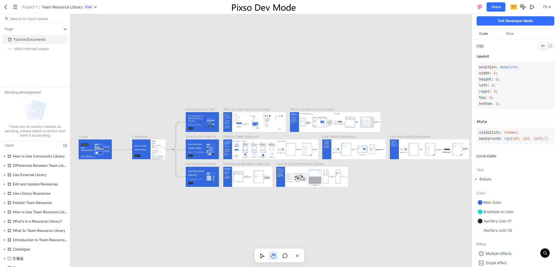
Among the best tools for designing web apps, Pixso stands out. With Pixso, you can develop a web application from concept to completion.
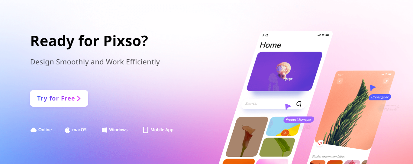
Pixso is an all-encompassing platform for product design collaboration that includes all crucial components of prototyping, UI/UX design, and design delivery for operating experiences based on cloud browsers.
Pixso enables you to seamlessly switch between design and prototype presentations without constantly synchronizing designs to external platforms. If you are in a design team, then Pixso will be the one suits you best. The real-time collaboration makes teamwork another experience. Smooth and efficient.
The design process is more straightforward and more enjoyable using Pixso. The design process is easy, starting with idea mapping and ending with creating high-fidelity prototypes.
Web App Design in the Future
Many of these trends may already be present online, but they are most likely to spread widely in the years to come. Here are some of the most popular web app development trends for 2023.
You can take them into consideration and design your app based on these trends to be the first runner.
- Progressive Web Apps (PWAs)
- Single Page Application (SPA)
- Accelerated Mobile Pages (AMP)
- Voice Search
- AI-Powered Chatbots
- Architecture Without Servers
- Motion UI
- Internet of Things (IoT)
- Mobile-First Development
- API-First Development
- Blockchain Technology
[2023] 5 Best Examples of Web App Design
Vinted
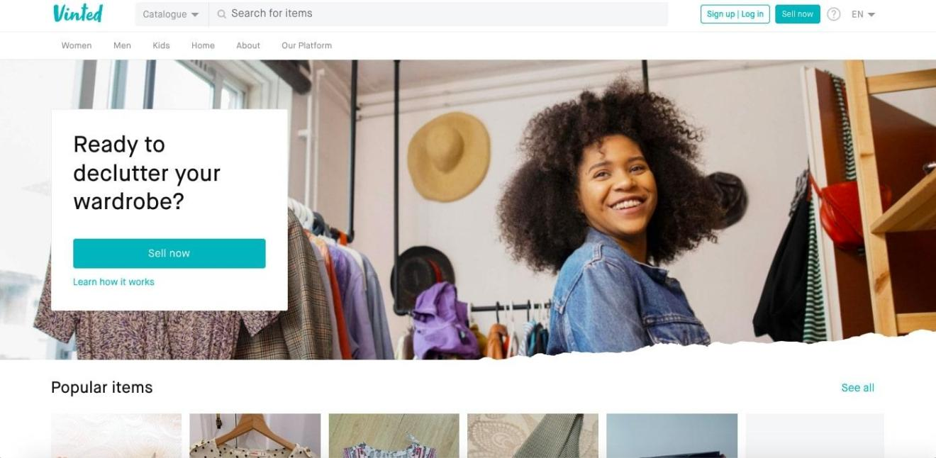
Vinted is an online marketplace where you can buy and sell secondhand and vintage clothing and accessories.
They do a fantastic job of considering both of these user objectives in their web app design without complicating things. Above the fold is a solid call-to-action that encourages visitors to either start selling or learn more about the platform.
Filters and search options help Vinted structure its listings so users can easily browse.
Reed
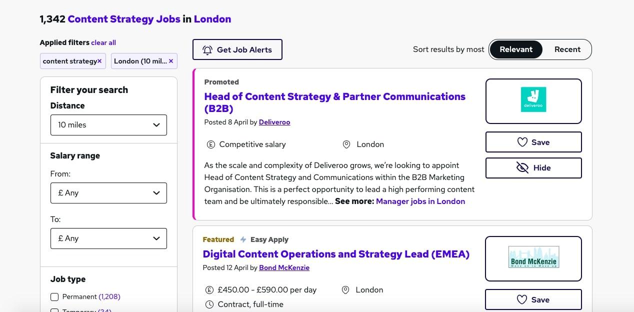
One of the biggest online career marketplaces in the UK, Reed.co.uk, connects individuals with employment possibilities and provides training programs and career guidance to both recruiters and job seekers.
Despite having over 1000 jobs to sort through, consumers may easily browse the job market on Reed because of the excellent UI design. You can easily find the information you want from its huge datebase thanks to the hierarchical dashboard UI design.
Zencastr
With the help of the online podcasting tool Zencastr, users may record and edit podcasts directly on the website.
The recording interface on Zencastr is easy enough for people without prior production knowledge to use.
The user-friendliness and simple navigation of Zencastr's web app make it amazing.

The Plum Guide
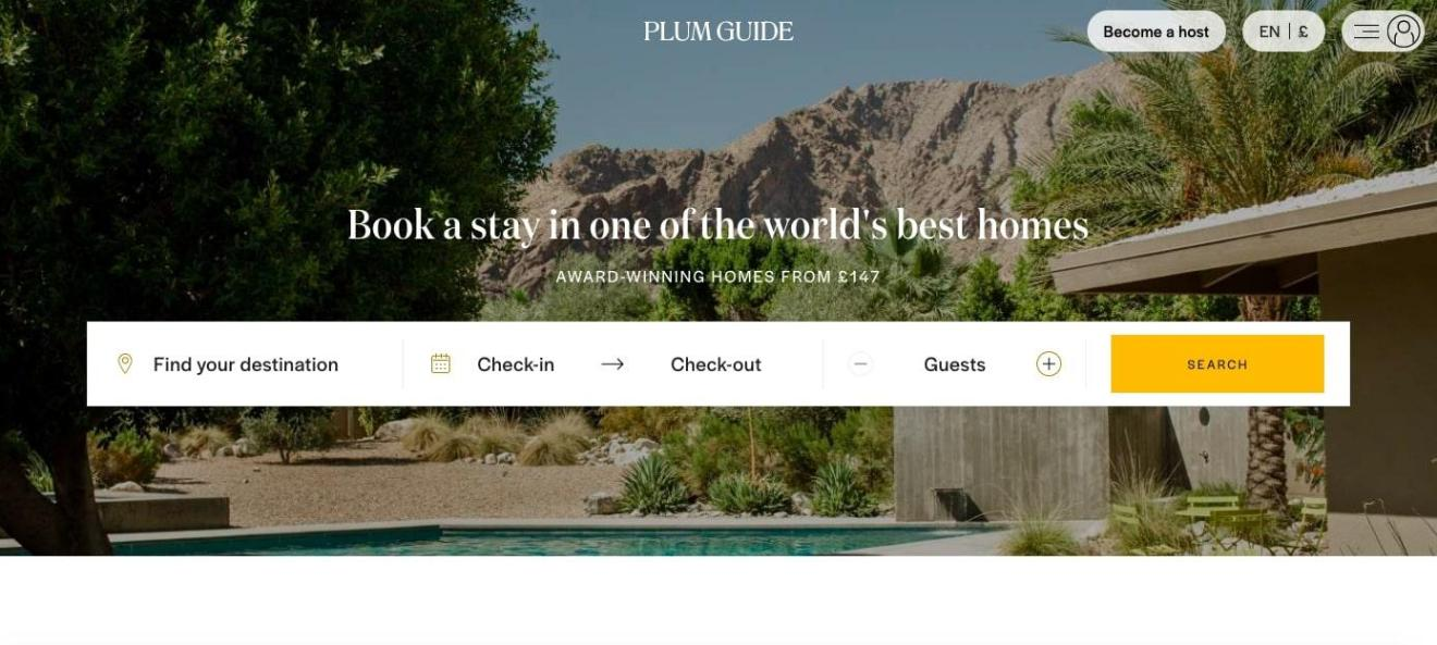
The Plum Guide platform for premium vacation rentals handpicks the best available properties. Customers can use their search engine to browse and reserve award-winning residences worldwide, and hosts can advertise and rent out their properties.
The Plum Guide establishes credibility with its users by utilizing design features like the quote and partner icons above.
Its dynamic listings help to further build consumer trust. Users can explore interactive parts on property highlights and neighboring can't-miss experiences in addition to interactive sections that describe standard rental information like rules and check-in times.
Skyscanner
Skyscanner's internet travel firm allows users to look for and book flights, hotels, and rental cars.
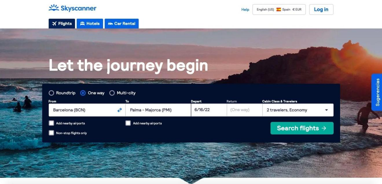
The top menu of Skyscanner's website is uncluttered and straightforward, and the main search bar is prominently displayed. By grace of Skyscanner's web app design, users can easily switch between currencies and languages.
The app's UI also looks excellent on mobile devices; the top menu has been moved, the background image has been removed, and there is more white space throughout. Thanks to these enhancements, users now find it simpler to interact with the UI and obtain the things they desire.

