
Sherry
A website feedback button gives visitors a way to report a confusing screen, a broken action, or a missing piece of information while the experience is still fresh. It works best when people can tell what the form is for and what will happen after they submit it.
For example, someone tries to export a report and gets no file. A useful form can capture what they expected and what happened instead. A generic “How was your experience?” score is less useful for diagnosing that specific failure.
The examples below cover placement, wording, and submission states. Use interactive prototyping to check the path from opening the form to confirmation before building the collection and routing system.
Part 1. What Is a Feedback Button/Widget on a Website?
A feedback button is a labeled control that opens a feedback form or takes visitors to a feedback page. It may appear at the page edge, near the footer, or beside a relevant task. Its location should make it available without covering the task people came to complete.
A design tool can help you design the form and its interactions. Collecting submissions on a live site also requires an implemented form or integrated service, validation, error handling, and a destination for responses. Adding a button alone does not provide that system.
Part 2. What Does a Feedback Button Do? What Are the Benefits of Using It?
A feedback button usually opens a small form with a focused question. A rating can be useful when you know what is being rated, but it should not replace the description needed to understand a failed task.
A user-initiated button lets visitors decide when to comment. A prompted invitation asks for attention and therefore needs a suitable moment, an obvious way to dismiss it, and limits on repetition. Do not interrupt payment or cover an error message with another request.
Here is how feedback buttons can be useful on your website:
You are putting users first
An accessible feedback route lets people describe a difficulty in their own words. Its value depends on someone reviewing and acting on the responses, not merely on the presence of a form.
Ease of visibility and use
A visible text label such as “Give feedback” is easier to interpret than an unexplained icon. Keep it reachable on a narrow screen without overlapping chat, cookie controls, or the main call to action.
Provides efficient communication
A form can capture context while visitors are still on the page. It does not replace urgent customer support: if someone needs help with an account or payment, show the appropriate support route and explain whether the feedback form receives individual replies.
Captures problems close to the task
A report sent from the affected page can be more specific than a general complaint. Ask for only the context the team needs, and tell people before automatically attaching page details or screenshots. Do not assume a feedback form will stop public criticism.
Provides constructive solutions
Repeated reports can reveal confusing labels or failed paths worth investigating. Treat them as signals, not a representative survey of everyone: people who choose to send feedback may differ from people who do not.
Part 3. Some Advice on Designing a Feedback Button
Three choices matter before visual styling: when the request appears, what the button promises, and how much effort the response requires.
1. Know your embedding positions
Place feedback near the relevant task or in a consistent page-level location. After a completed task can be a reasonable point for an invitation, but a persistent optional control also lets someone report a failure before completion.
Check the entire viewport, including sticky navigation and cookie notices. A right-edge tab can work on a wide layout and still obscure content on a phone. A normal-flow footer link is less intrusive when immediate visibility is not essential.
2. Align the design to your brand
Use the site’s button and form styles, but keep feedback visually secondary to the main task. Maintain readable text, a clear keyboard focus indicator, and a recognizable close action. An emoji can support a rating label; it should not be the only explanation of what that rating means.
3. Be clear with what you want to ask
Ask a direct question related to the task: “What were you trying to do?” followed by “What happened instead?” If you request an email address, explain why and mark it optional unless replying is essential to the purpose of this form.
Keep feedback separate from support requests in the copy. The GOV.UK feedback component guidance, currently a trial component, is a useful reference for explaining purpose and avoiding disruption; it is not evidence that one placement will perform best on every site.
Design the complete export-problem report
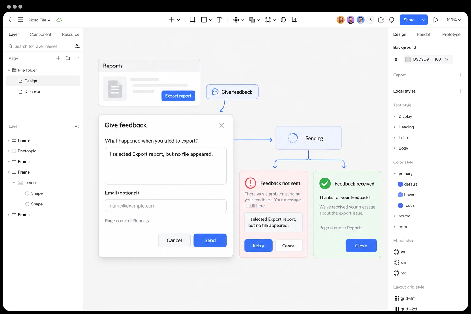
Suppose a user clicked Export report but received no file. Prefill a short page context only if it is appropriate and disclosed. Ask “What happened when you tried to export?” and provide an optional contact field. If screenshots are allowed, explain how to avoid including personal or confidential information.
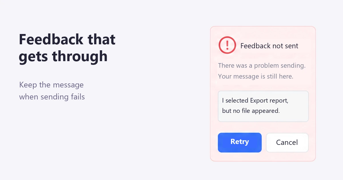
While sending, keep the entered text visible and prevent accidental duplicate submissions. If sending fails, say that the feedback was not sent, preserve the draft, and offer Retry. A confirmation should appear only after the receiving system has accepted the message; “Thanks” must not conceal a failed request.
The success message can say “Feedback received. Your report will help us investigate export problems.” Add “Need help now?” with the support route when appropriate, rather than promising an individual reply that the team cannot provide.
In Pixso, place the closed button, open form, failed submission, and confirmation beside one another. Connect them in a prototype and review whether the same task context carries through. This gives a developer and the response team something specific to discuss: what is sent, what is retained after failure, and who handles it.
Part 4. Three Feedback Button Patterns
These three existing pattern illustrations show different ways to offer feedback. Choose the placement according to the page task, then design the full form and recovery states—not just the closed button.
1. Slideout tab
The illustrated tab reveals its label on hover. For an accessible version, make “Feedback” visible or otherwise clearly identifiable without hover, and let people activate it with a keyboard or touch. Hover can add emphasis, but it should not be the only way to discover the action.
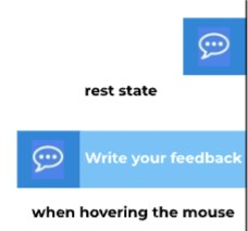
Keep the action understandable before interaction.
2. Collapsible slideout message
A small invitation can ask whether visitors want to give feedback before opening the form. Do not show it at random or repeatedly after dismissal. Choose a relevant moment, let “No” close it immediately, and keep the page usable while it is present.
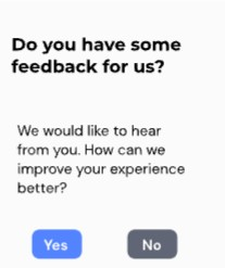
Let the visitor dismiss the invitation and continue the task.
3. Footer feedback bar
A footer message offers feedback without interrupting the main content. It may be less visible than a floating tab, so it is better suited to optional page feedback than urgent help. If the bar is fixed, leave enough space that it never covers the final links or focused control.

Place the invitation where it does not cover page content.
Part 5. FAQs About Feedback Buttons
Q1. How do I create a feedback page for my website?
Design the questions, validation, sending state, failure state, and confirmation first. Then implement the form with a developer or a suitable feedback service and connect it to the team that will review responses. A visual prototype cannot collect real submissions by itself.
Q2. Is the feedback button the same as the survey widget?
Not exactly. A button is an entry point; a survey is a set of questions. A feedback button can open a short survey or an open-text form. Choose the questions for the information you need rather than treating the two as completely separate technologies.
Make Feedback Worth the Effort
Ask for information someone can provide in a short response, keep their text if sending fails, and give the message a clear destination. The interface should make contributing easy without suggesting it can solve every support problem.
Prototype a feedback flow in Pixso and review the problem-reporting experience from the visitor’s point of view.

![[Full Guide] Expand Collapse UI Design](https://pixso.net/assets/editorial/20261006/refresh-6665/refresh-6665-en-accordion-shipping-hero-8f07cac4a9ce.webp)