Scott
The website layout has evolved over the years, partly in response to design trends, and partly as the science that is behind them has developed. However, even the most casual internet user will have noticed many sites share a look.
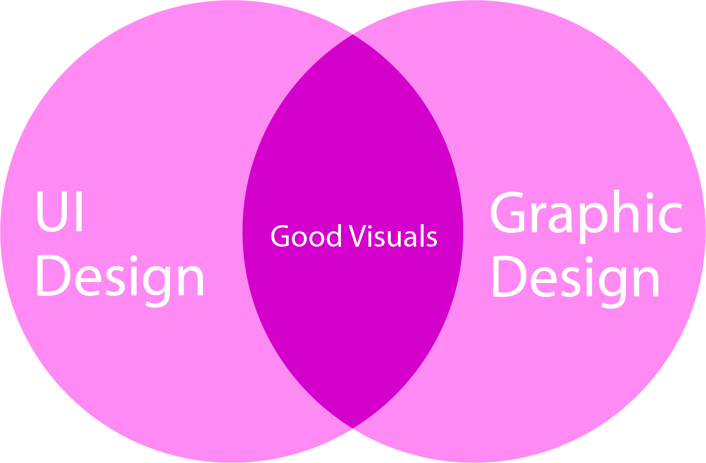
There is, clearly, a desire for websites to look great. But they also have to be good for their purpose, and a good web layout design should reflect the site’s purpose. A shopping site will look different from a magazine site, for example, and each will have different features.
Understanding what is behind website layout is the first step to creating a design that’s right for your site.
Part 1. What Is a Website Layout?
Perhaps the easiest way to think about website layout is to forget about computers and think about traditional newspapers. Text is split into columns to make the lines easier to read. Visual features like pictures and dividers help split the stories up. While headline size and position on the page imply the importance of the story.
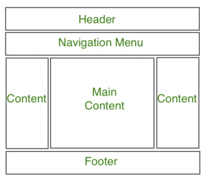
Source: GeeksforGeeks
Similar principles apply to website layout. The space given to headings will indicate importance. Images and white space help to draw attention to specific elements. And the location of content within a page will affect the amount of attention it gets.
Layout, in other words, defines the hierarchy within the site, and done well ensures that visitors can find the important content and navigate the site quickly. When people make a judgment about a site in a few seconds, a good web layout design can make the difference between them staying or going.
Part 2. The Most Common Website Layout Options
Every website is unique, but there are some structures that you will see time and time again. If you are looking for website layout ideas, while not an exhaustive list, here are some common designs you are likely to see.
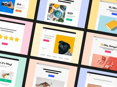
1. The grid
Almost all websites will have a grid, even if you can’t see it. Some, however, are more obvious, with content arranged in columns and rows. It’s frequently used in shopping sites, where products appear in a grid, making browsing easy for the visitor.
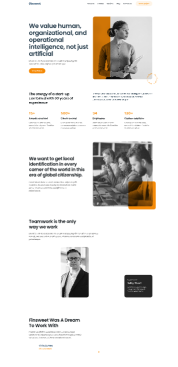
2. The zigzag
Often used where lots of content features on a single page, this website layout uses a template but swaps elements around. For example, swapping the position of the text and image for each item. It helps to separate content, but also prevents visual boredom as people scroll, forcing them to slow and refocus attention.
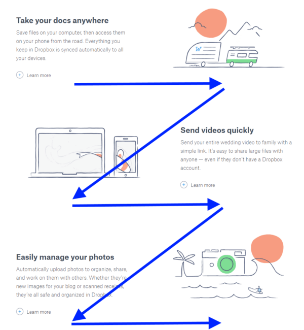
Source: Nick Babick
3. Card-based
Like the grid, cards are good for retail or portfolio sites. However, since the cards can be of different sizes, they break the grid layout. The changes can help slow visitors as they cannot quickly scan the cards. And it encourages interaction, inviting clicks and views on the linked content.
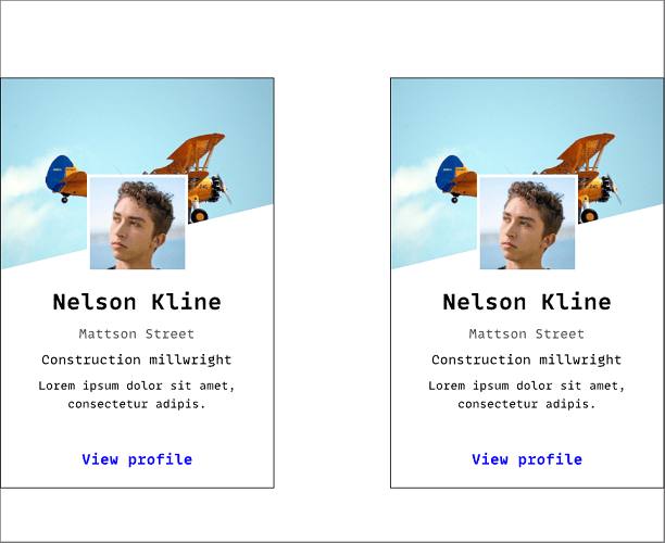
4. The featured image
A common approach is when a site is about a single person, group, or product. It uses a large single image, taking up a significant amount of screen space. Frequently used with a lot of white space, limited text, and simple navigation, it retains the focus on the website’s subject throughout.
5. The one-page layout
Using tools like JavaScript, these will feature elements that change as the visitor scrolls. It may be as simple as parallax scrolling, but may also include features like animations and reveals. They are very effective when there is a simple message and call-to-action.
Which website layout should you choose?
These are only a few website layout ideas, there are lots more, and with the potential to mix and match designs extends the possibilities even further. Your choice, however, should be driven by your content.
Think about the story you want to tell, and then select or design a layout that helps you tell it in the best way.
Part 3. The Rules of Page Layout Design
Like all design, website layouts will often follow similar rules that, once you know them, you will see everywhere. It can sometimes be good to break rules, but generally, try to think about the following when you are designing.
1. Use a grid
The first rule, because a grid should guide how you place all your elements, setting things like margins and spacing. Once in place, it will ensure layouts always look even and balanced.
However, although the grid should come first, you should always bear in mind the other rules when designing it.
2. The rule of thirds
Anyone who has an interest in photography will know the rule of thirds. People are naturally drawn to imaginary horizontal and vertical lines dividing a page or image into thirds, and especially to the intersections of those lines.
Use this rule to draw attention to specific elements, and to balance the page.
3. Have a hierarchy
People will tend to follow a visual hierarchy. For example, reading in descending order of typeface size, regardless of positioning. Use tricks like size and color to guide and draw visitors’ eyes to your advantage.
4. Use white space
Good web layout design will use white space effectively, balancing the page and drawing attention to key elements. Too little white space leaves a page looking cluttered. And while lots of white space can create a minimalist vibe, it should not leave visitors feeling there are things missing, or struggling to find what they want because the space hasn’t been used effectively.
5. The law of odds
Notice how this list finishes on a fifth point? And notice how often lists have an odd number of items. Psychologically, odd numbers feel more complete. And this rule crops up in lots of places, think about the rule of thirds, for example. You can use it effectively with your website layout, not just in lists, to create a sense of completeness, and sometimes incompleteness, for visitors.
Part 4. 5 Great Page Layout Design Ideas
#1 The full-screen image
Generous internet bandwidth and connections have made this a popular approach. Visitors are greeted with an image, or video, that takes up their full browser window. They will usually have relatively little overlaid text, typically focusing on a call-to-action.
Netflix is an example of this, with a backdrop featuring a diverse selection of their content, the short text is a clear message of what they offer, and how you can get started.
#2 The hero
The hero shares some similarities with the full-screen image website layout. However, instead of a background, it will feature large images focused on a specific product. Accompanied by supporting text, it leaves no doubt what the focus of the website is about.
Apple uses the hero layout heavily, focusing on imagery of their products, while the text provides detail. It’s a great layout to promote a product while also offering key information.
#3 The single column
The single-column web layout design is all about simplicity. Essentially, all the content is kept within a single column, focusing the visitor's attention. It is often seen with text-focused websites, such as blogs. But combined with imagery can make a striking website.
The nature of the design means that careful thought needs to be given to the order and flow of content since the viewer is restricted to scrolling. However, it is a useful website layout idea for building arguments or knowledge.
#4 Magazine layout
The magazine layout takes its inspiration from the print industry and, unsurprisingly, is popular with traditional media websites, like The Washington Post or BBC News. The layout helps focuses attention on the main story, which will be given most of the page space, but the areas around will be used to highlight related or featured content.
These are ideal for sites that have a large content library they are keen to promote. However, they can be a challenge to design for the huge variety of screen sizes in use.
#5 The F layout
A common design on shopping sites, the F layout is attractive, but also owes a lot to eye-tracking technology. The name refers to the way that people tend to naturally view pages and assign importance, essentially following an ‘F’, looking at the full width along the top, but focusing increasingly to the left of the page as they go down.
One of the reasons this makes it good for shopping sites is that the left can be used for navigation and filtering, helping people find more, while key products can be placed in the attention areas to the top.
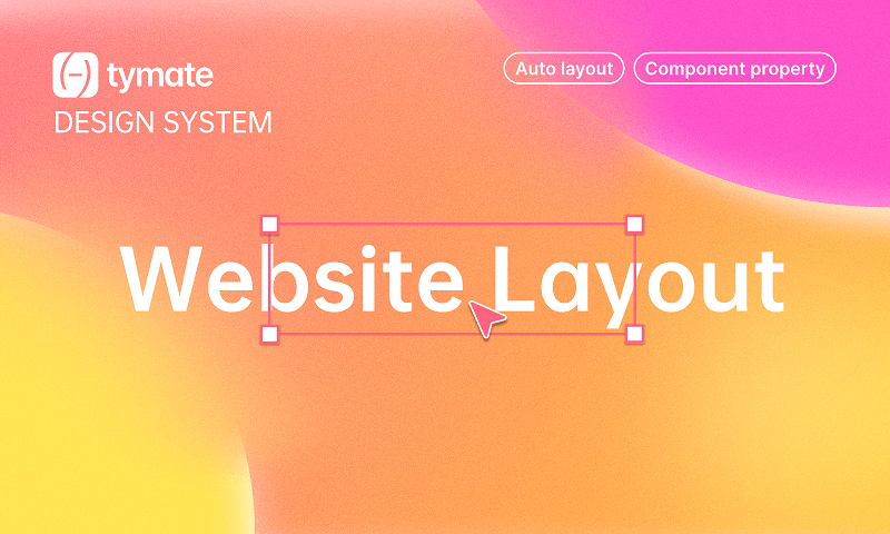
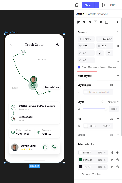
Bonus: Use Pixso's Auto Layout for Your Design Files
Pixso is a free Figma alternative that make you design smoother. As a new-generation design tool, it features the auto layout function. Moreover, it supports the import and export of .fig, .xd, .sketch, .zip files.
Part 5. In Conclusion
With modern web layout design, the limit may only be your imagination. However, while it might be tempting to include every feature imaginable on your website, less can often be more. Look around at other websites you like for ideas, thinking about what makes them effective, and what they do, and don’t, do.
Websites can be award-winning in their own right but, really, they should only serve a purpose. Whether that’s showcasing work, selling a product, or offering a service. The website layout should be designed with that aim — and only that aim — in mind.