Scott

The short answer
Wireframes answer structure questions, mockups answer visual questions and prototypes answer selected behavior questions. They are not a compulsory ladder. Choose one based on the decision, the audience and the cost of being wrong. A rough screen can be interactive; a polished screen can remain static. A team can return to a wireframe after a prototype exposes a structural problem.
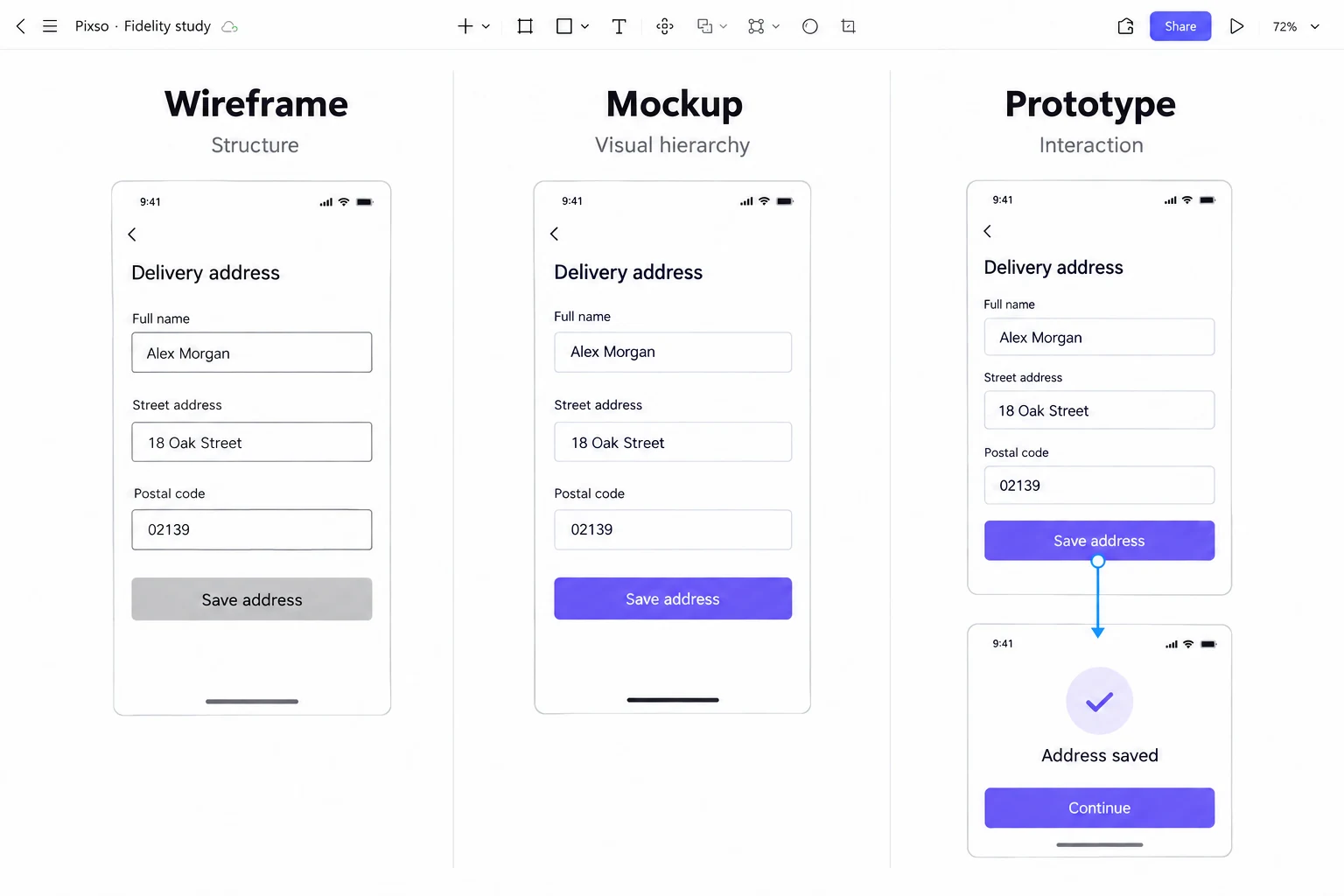
For a delivery-address form, a wireframe answers where the fields belong, a mockup answers how clearly the labels and errors read, and a prototype answers what happens after “Save address.” Keeping the task and content unchanged makes the difference easier to see. Visual detail and interaction are separate choices, so even rough wireframes can form a working prototype.
A decision table
| Deliverable | Best question | Include | Do not infer |
|---|---|---|---|
| Wireframe | Are the structure and task sequence understandable? | hierarchy, labels, states, annotations | visual polish or production performance |
| Mockup | Do the visual direction and content density work? | type, color, imagery, component states | complete behavior or accessibility |
| Prototype | Can someone try the selected task and recovery? | linked screens, triggers, feedback, stop condition | production speed, code quality or full usability |
The table is a starting point. If a question involves network, accessibility APIs, real data or performance, build a thin implemented slice. If the structure is uncertain, avoid investing in a visual treatment that makes a bad layout expensive to change.
What is a wireframe?
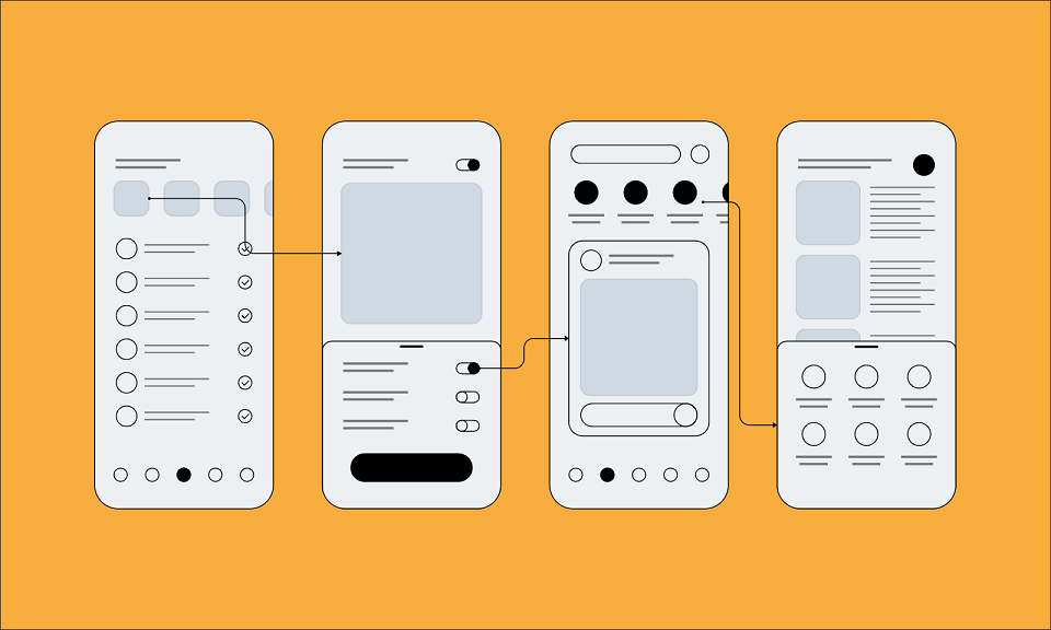
A wireframe represents the arrangement of content and controls on a screen. It focuses on information hierarchy, navigation and the actions needed for a task. Include realistic labels and important content, but do not spend unnecessary time on final styling. A limited palette can keep the review focused, yet black and white is not a requirement.
Use it for structural uncertainty
Use a wireframe when the placement of content, navigation or sequence of screens is still uncertain. Draw two alternatives with the same fields and ask which one helps the user decide first. Add annotations for behavior a static screen cannot show: what happens when a field is empty, where focus returns after an error and what happens after a timeout.
Make the structure specific enough to discuss
Use labels such as “Full name,” “Street address” and “Postal code” rather than three identical placeholder lines. Reserve space for a field error and show the save action. If the question is one page versus two steps, use the same fields in both versions. Otherwise reviewers may prefer one because it contains less information, not because its structure is better.
What is a mockup?
A mockup shows the intended visual appearance of an interface, including typography, color, imagery, spacing and component states. It is usually static. Use realistic content to judge line breaks, hierarchy and density. A mockup can compare visual directions or document a design-system decision before the behavior is connected.
Use it for visual and content questions
Choose a mockup when the team needs to evaluate whether a heading is prominent enough, whether a form feels dense or whether an image supports the content. Keep the target viewport and content context visible. A beautiful mockup with placeholder text can create false confidence if the real translation or error is twice as long.
Use content that can break the layout
Put a long street address and a two-line postal-code error into the styled screen. Keep the field label readable after an entry is made, and compare the normal, focus and error states together. A mockup can show whether the error looks like part of the field or an unrelated notice. Connecting that correction to the next screen is a separate interaction decision.
What is a prototype?
A prototype represents selected behavior so people can try a task or discuss an interaction. It may use rough screens, polished designs, paper or code. Build only the interactions needed to answer the question. Connect a success path, one realistic error and a return path when recovery is part of the decision.
Use it for behavior and recovery
Prototype finding a setting, moving through checkout, cancelling an action or recovering from an invalid field. State what the prototype intentionally leaves out. Ask a reviewer to complete the task without a verbal tour and record hesitation, expectation and whether feedback is understandable.
Choose the interaction the review needs
A linked-screen prototype is enough to discuss whether “Save address” leads to a clear confirmation. To study how people enter and correct unfamiliar addresses, use an approach that lets them supply their own text and encounter the relevant validation. A code prototype may be the better choice for that question. GOV.UK’s prototyping guidance distinguishes quick sketches from realistic code interactions and explains why prototype code still needs separate production work.
Choose by the decision flow
Use this sequence:
- Structure uncertain? Start with a wireframe and compare task paths.
- Visual hierarchy uncertain? Create a mockup with real content and states.
- Interaction or recovery uncertain? Build a focused prototype.
- Implementation constraint uncertain? Build a thin vertical slice with real data or APIs.
- Evidence changed? Return to the smallest artefact that can express the new question.
This avoids a common waste pattern: polishing a screen before the team agrees on what the screen must help someone do. It also prevents a false choice in which a wireframe is treated as a “lower-quality” version of a mockup. Fidelity is a decision about evidence, not a measure of design skill.
One address form, three different design questions
Wireframe: where do the fields belong? Compare one page containing all delivery details with two steps that separate the address from its review. Keep the field list identical. A short address may fit comfortably on one page; extra delivery instructions may make a review step more useful. Discuss the content and navigation cost before styling either version.
Mockup: can the details be read and corrected? Apply the type scale, spacing and field states to the chosen structure. Add a long address and the message “Check the postal code.” If the message wraps, grow the field group rather than shrinking the text. The important output is a readable normal and error state, not just a more attractive form.
Prototype: does the next action make sense? Connect “Save address” to “Address saved,” then add a route from the invalid entry back to editing. Ask someone to explain what they would do next without narrating the flow for them. If they believe the address was saved while the form still shows an error, revise the feedback before adding unrelated interactions.
Record what the review can answer and what needs a different kind of work:
| Artefact | Evidence gained | Still open |
|---|---|---|
| Wireframe | Information order and recovery location | Visual contrast and implementation |
| Mockup | Density, type hierarchy and component states | Network and focus behavior |
| Prototype | Task sequence, feedback and return path | Real data, APIs and accessibility tree |
The team can stop after a wireframe if the structural question is answered. It should not build all three simply because a process template says it must.
Use one address form to compare the three deliverables in Pixso. The wireframe answers where the labels and action belong; the mockup adds the intended typography, spacing and color; the prototype connects Save address to a confirmation. Keep the same content across all three so reviewers can see which question each version answers instead of mistaking visual polish for working behavior.
Use tools according to the work
Choose a tool by the work it needs to support: editing layouts, reusing components, simulating behavior, collecting feedback or handing off inspectable decisions. Keep the source and prototype close enough that a change to a field state does not leave a second, contradictory version.
Pixso’s prototyping workspace lets you connect selected screens and share the route for review. Use the prototype to discuss the transitions that matter to the task, and carry the agreed behavior into the implementation notes.
Invite reviewers for the question in front of you
Bring content and product into the wireframe discussion when required fields or task order are still changing. Review the mockup with design-system and localization contributors when the uncertainty is label length or component states. Bring engineering into the prototype review when saving, validation or permissions depend on a service.
A useful invitation names the task and decision: “Try adding a delivery address and correcting the postal code. We need to decide whether the correction and saved confirmation are understandable.” That gives a reviewer something to attempt and keeps unrelated preferences out of the first discussion.
Handoff boundary
Handoff starts before the last pixel. Name frames, states, content assumptions, assets, behavior notes, analytics events and unresolved questions. Make it clear whether a visual is a decision, an example or a placeholder. A developer should not have to infer whether a prototype transition represents a real loading state or a presentation shortcut.
For the address form, hand over the country-specific field rules, exact error copy and intended focus behavior with the screens. State whether the saved confirmation represents a real service response or a linked-screen transition that still needs implementation. Keep the approved source and prototype entry point easy to find, and restrict access to unfinished test services that could be mistaken for a live product.
Can a wireframe also be a prototype?
Yes. A wireframe describes visual structure; a prototype lets someone try selected behavior. Link two rough address screens, or change paper screens when a participant taps a button, and the result is a low-fidelity prototype. Adding interaction does not require final color, imagery or typography.
The opposite is also true: a polished mockup can remain static. High visual fidelity says how much the screen resembles the intended appearance, not whether its buttons work. Choose detail and interaction separately, according to what the next review needs.
Further reading and sources
- WCAG 2.2
- Figma prototyping guide.
- Pixso’s wireframe examples, low-fidelity wireframes, prototyping and wireframe tools comparison.
Failure modes to avoid
Polishing too early. A team spends days on color and illustration before it agrees on the information order. Return to a wireframe and test the task with realistic content. Prototyping a tour. Every screen is linked, but no one can say what question the prototype answers. Remove unrelated links and define a stop condition. Calling a screenshot accessible. Contrast may be adequate while focus, names, reflow or error announcements fail. Test the implemented component with the relevant input methods. Treating “high fidelity” as “high evidence.” More pixels do not prove a better decision. Add only the detail that changes the question being evaluated. Letting the artefact become the source of truth. A prototype can drift from the component or content source. Link the file, state the version and update the handoff when the behavior changes.
Do you need all three in an agile team?
No. If the team already has an accepted address component and only the order of two fields changes, an annotated wireframe may be enough for that decision. If a new error state changes the behavior, add a focused prototype. If the work is only a typography adjustment, compare representative mockups with the affected content.
Preserve the deliverables that still explain a decision and update the one that changed. Producing three separate files for every small change can create more synchronization work than useful clarity.
A handoff packet template
Include the source link, version, task brief, state map, prototype entry point, component/state list, content assumptions, asset list, accessibility notes, analytics events and unresolved questions. Add the evidence that led to the selected direction and the condition that would trigger another iteration. A concise packet lets a new contributor understand both what the design is and why it is shaped that way.