In today's digital world, apps have truly permeated every aspect of our lives. From the moment we wake up and check our smartphones to when we unwind in the evening using various applications, they are constantly around us. Among countless apps competing for attention in busy app stores, a great app icon is a must. It serves as the unique visual identity of your app, enabling users to recognize it instantly and effectively drawing them in. In this detailed guide, we'll guide you through an 8-step process to master app icon design.
What Is an App Icon?
An app icon is far more than a simple visual element. It is like the face of the app, representing its identity and functionality in a compact and recognizable package. It has the power to convey the essence of the app in an instant. For example, a colorful icon with a camera symbol clearly indicates a photography or photo-editing app.
App iconography studies how the design components of apps icon, such as colors that can trigger different emotions, shapes that might imply certain meanings, and typography that needs to be both clear and in line with the app's style, all interact to communicate with users. This helps designers create more effective and engaging app icons.
Why App Icon Is Important?
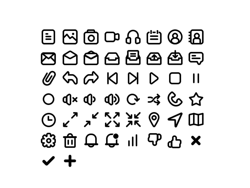
1. Guide Design
Understanding the functionality of apps icon provides a foundation for making informed design decisions. For social apps like Facebook, the use of blue color represents trust and connection, combined with a simple circular shape symbolizing unity among users. In utility apps such as calculators, a gray color palette with rectangular shapes gives an impression of functionality and precision. These examples show how different apps utilize design elements according to their nature. This way, the icon becomes an accurate visual representation of the app's essence.
2. Grab Attention
App icons act as the initial gateway to attract users. For instance, a food recommendation app might use a bright red color associated with appetite and a plate icon filled with delicious-looking food images. A travel planning app could feature a colorful world map with prominent landmarks. Such designs quickly draw users' attention and make them eager to explore further.
3. Stand Out
In today's highly competitive app marketplace, differentiation is key. An app icon can make or break an app's discoverability. Take a language learning app as an example. It incorporates a globe with letters swirling around it, paired with a bright and inviting color scheme and a friendly, easy-to-read font. These unique elements make it instantly recognizable and appealing, effectively luring in users seeking an engaging learning experience.
Key Elements of a Good App Icon
App iconography plays a crucial role in determining the success of your icon. It guides us in analyzing and selecting the most appropriate elements. Let's explore the key aspects within the realm of app iconography that contribute to a good app icon.
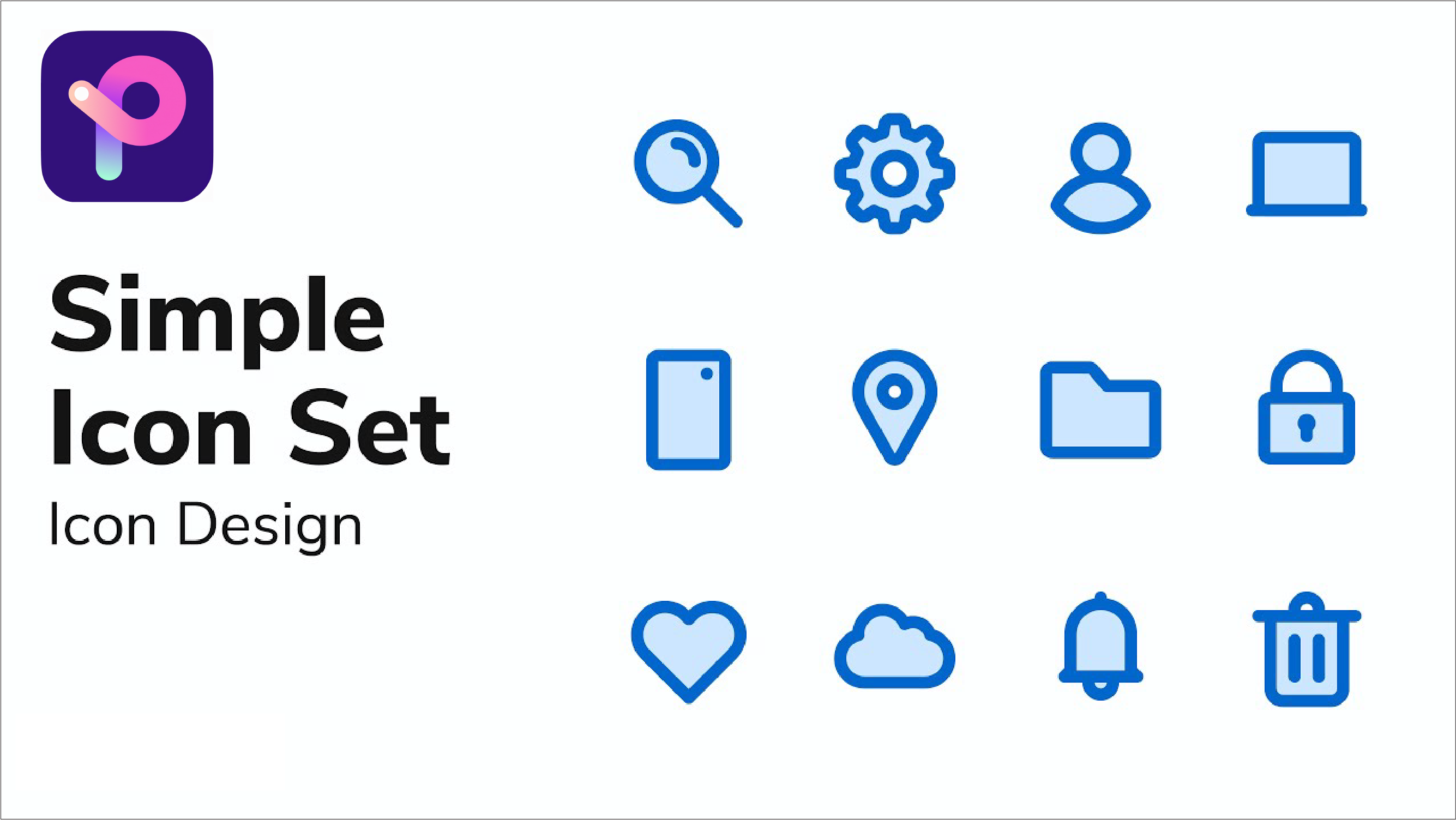
1. Color Selection
Picking colors for your app icon is vital. A well-chosen, harmonious palette makes an instant visual splash. Think of colors that fit your app's brand or stir the right emotions. Certain colors have specific psychological effects. For example, blue often conveys calmness and reliability, while yellow can evoke a sense of energy and optimism. Considering the app's usage time, if it's mainly used at night, darker and more soothing colors might be preferred to avoid eye strain.
2. Shape and Symbolism
Shapes matter a lot in making your design unique. Some innovative apps use irregular shapes like a cloud for a weather app to give a unique and intuitive feel. Or a heart shape with a plus sign for a healthcare app to symbolize care and improvement. These shapes stand out and enhance user recognition.
3. Typography
When text is in your icon, font choice is crucial. It has to be clear even small, as icons are seen on tiny screens. Also, it must suit your app's style. For instance, a kids' app could utilize a whimsical and playful font to attract its young audience, while a business app would opt for an elegant and sophisticated typeface to convey professionalism. Good typography is a must for a good icon.
How to Design an Icon for Your App?
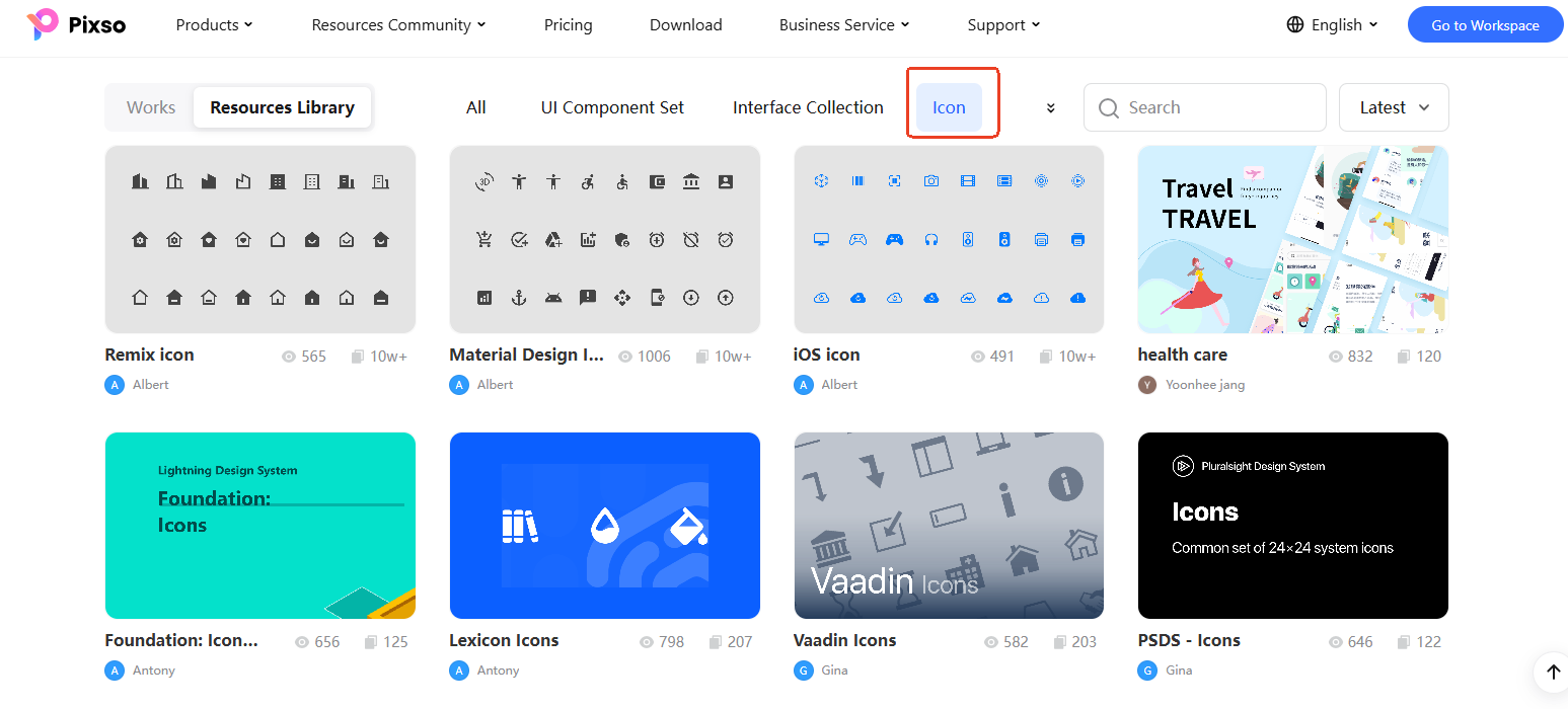
Step 1: Ideation Sketching
Before diving into digital work, take a pencil and paper. Sketch various ideas considering your app's features, target users, and the mood you want to convey. You can look at trendy fashion designs for inspiration if your app is related to fashion. Or observe modern architecture for ideas if it's a design app. Keeping an eye on cultural events and incorporating relevant elements can also spark creative ideas. This is the essential starting point of the design process.
Step 2: Choosing the Right Sketch
Review your sketches carefully. Consider elements like simplicity, uniqueness, and how well it represents your app's core function. The chosen sketch should have the potential to be transformed into an icon that stands out in a crowded app store. Look for the idea that has the most potential to be transformed into an eye-catching icon.
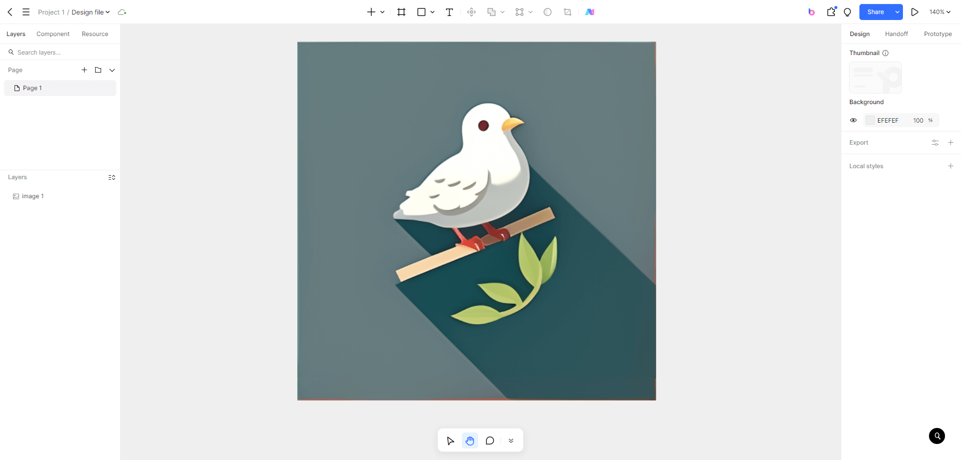
Step 3: Importing to Pixso
Open the tool and easily import your chosen sketch. Its interface is designed to be user-friendly, enabling you to start using it effortlessly. You'll notice its intuitive layout, which allows you to quickly familiarize yourself with the tools. The import process is straightforward, and you can start working on your design in no time.
![]()
Step 4: Color Adjustment
Use color palette tools to fine-tune the colors precisely. Match the hues to your app's brand identity or the emotions you aim to evoke. You are free to explore various color combinations until you discover the most suitable one. With precise color controls, you can create a harmonious and impactful look that grabs users' attention.
Step 5: Shape Refinement
Utilize shape editing features to smooth out and reshape the elements. You can adjust the curves, corners, and proportions to make the icon more visually appealing and recognizable. Make the icon more aesthetically pleasing and in line with the latest design trends. You can easily manipulate the shapes to achieve the desired result.
Step 6: Adding Details
Adding details like shadows and highlights can really improve your icon. These elements add a sense of depth and make it seem more 3D. You can control the strength and direction of the shadows and highlights to create a realistic appearance. For example, a soft shadow on one side can give the impression of light hitting the object. With the help of proper design tools, you can smoothly incorporate these final touches into your icon design. This way, your icon will stand out among the many apps.
Step 7: Typography Integration
When adding text to the icon, choosing the right font is crucial. It must be clear and readable even when shrunk down for small screens. Consider the app's genre and target audience. For a gaming app, a bold and dynamic font might work, while a productivity app calls for a clean and simple one. Utilize the preview feature to assess how different fonts interact with the overall design. And look closely at details like letter spacing and weight.
Step 8: Testing and Finalizing
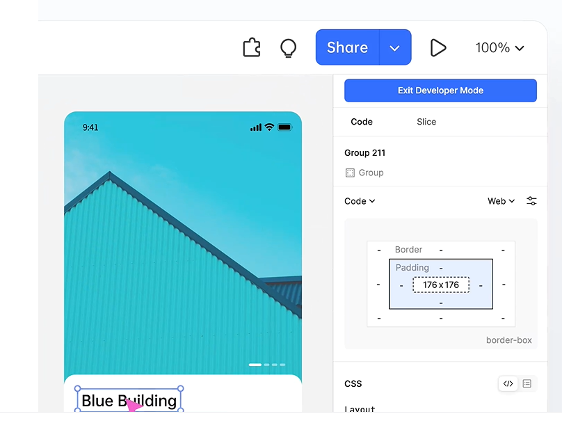
Evaluate your icon's display on diverse devices and different screen resolutions. Share it with friends, family, and potential users for feedback. Common user feedback may include complaints about color contrast or icon complexity. If the contrast is low, adjust the colors to make them more distinct. If it's too complex, simplify the design by removing unnecessary details while still maintaining the key features. Incorporate people’s suggestions to perfect the icon before finalizing it. With Pixso's easy sharing and preview options, this process becomes more efficient.
Final Thoughts
Designing outstanding apps icon is not easy work. But if you follow these 8 steps and understand the details of making app icons, you're on the right track to create a look for your app that will attract users and last a long time. Remember, your app icon is like the door to your app's world. Therefore, invest the time and energy required to make it truly remarkable. When you start this creative journey, think about using tools like Pixso. It can boost your design work and help you get that special icon. With each careful change you make, you get closer to an icon that will make your app shine in the competitive app market.
