Scott
Crafting responsive interfaces shouldn't feel like wrestling with a chaotic jigsaw puzzle. Yet, every product creator eventually faces the exact same structural dilemma: how do you make elements scale flawlessly across varying screen sizes without completely breaking the entire page flow? The ongoing debate between constraints and auto layout has been a hot topic in creative circles for years. Knowing exactly which layout logic to apply is the ultimate secret to building scalable, stress-free products. In this comprehensive guide, we are going right down into the weeds of responsive behavior. We will break down when to use which method, how they fundamentally differ from one another, and how modern workspaces can make the entire structural process completely painless for you and your development team.
Part 1: The modern demands of responsive adaptability
Let's just be completely real for a second. Absolutely nobody wants to design the exact same screen six different times just to fit various breakpoints. It is a massive waste of time and budget. The current landscape of modern ui design heavily demands strong responsive adaptability. We are talking about the holy grail of our industry: design the component once, and let it scale everywhere gracefully. Whether you are dealing with complex grid systems, dynamic list items, or fluid content containers, you need to drastically lower your multi-screen maintenance costs.
Beyond just resizing static boxes on a canvas, we also have to deeply consider the inevitable handoff process. When visual layout rules don't align perfectly with actual CSS Flexbox or CSS Grid logic, developers end up completely guessing your original intentions. This creates a massive delivery gap, leading to endless, frustrating back-and-forth messages on Slack. What teams desperately need is absolute design-dev seamless synergy. Furthermore, as we look forward at the operational trends for 2026, our digital tools must natively support advanced capabilities. We need AI-assisted layout structuring, deep internationalization support like automatic LTR and RTL text flipping, and multi-device seamlessness right out of the box. Sticking to outdated methodologies simply creates operational bottlenecks.
Part 2: Why Pixso is the ultimate workspace for modern layouts
If you are actively trying to tackle these massive workflow challenges, you need to look at Pixso. I have seen countless product teams struggle with bloated, legacy software that makes responsive behavior overly complicated and incredibly frustrating to manage. Pixso steps in and immediately solves the core pain points of scaling interfaces by providing a workspace that feels wonderfully intuitive, incredibly fast, and deeply connected to frontend development reality.
First off, the platform offers an environment where spatial rules are crystal clear and insanely easy to debug. This drastically lowers your overall maintenance and collaboration costs because your colleagues don't have to spend thirty minutes trying to untangle your messy layer groups. It is highly design system friendly. Pixso effortlessly supports dynamic component reuse, allowing you to build massively scalable systems without breaking a sweat over broken components.
More importantly, Pixso completely eliminates the notorious handoff friction that plagues most agencies. Because its internal layout engine perfectly mirrors actual code logic, everything you build translates flawlessly for your engineering counterparts. You can export precise layout rules, spacing tokens, and clean code snippets directly from the right-hand panel, ensuring that visual delivery accuracy is always sitting at one hundred percent. And when it comes to keeping up with crucial 2026 trends, Pixso is already leading the charge. With powerful AI-native empowerment, it can help automatically structure your wireframes, intelligently assist with spatial organization, and seamlessly adapt to localized layout shifts without requiring manual adjustments.
Part 3: Getting back to basics: what is constraints in design?
If you hang around junior creatives or bootcamp graduates long enough, you will inevitably hear someone ask: what is constraints in design exactly? It sounds like a highly technical, intimidating term, but the underlying concept is actually quite straightforward once you visualize it properly.
To properly answer what is constraints in design, think about pinning a large paper poster to a physical wall. If that wall suddenly gets wider, where does the poster stay? Does it stay exactly three inches from the top left corner, or does it somehow stretch with the drywall? In a digital workspace like Pixso, spatial rules dictate exactly how child layers respond when their parent frame is manually resized. You can tell a primary action button to stick rigidly to the bottom right corner of a modal, or you can tell a large hero image to scale proportionally both horizontally and vertically as the browser window expands.
When you finally figure out what is constraints in design, you realize it is entirely about setting specific, rigid boundaries. You are permanently anchoring an element's position relative to its immediate container. This logic is entirely spatial. It does not care whatsoever about what text or content is inside the box; it only cares about where the box lives in relation to the invisible borders around it. Mastering these design constraints is your absolute first step toward stopping elements from wildly flying off the screen during a responsive resize preview.
Part 4: The dynamic magic of auto layout
Now, let's talk about the real heavy hitter in the creative workspace. If pinning things to digital walls is the old, reliable way, auto layout is the modern, highly dynamic engine driving the modern internet. Essentially, it is CSS Flexbox translated perfectly into a visual, drag-and-drop interface. Instead of manually pushing pixels around and guessing distances, you define the strict spatial relationship between sibling elements.
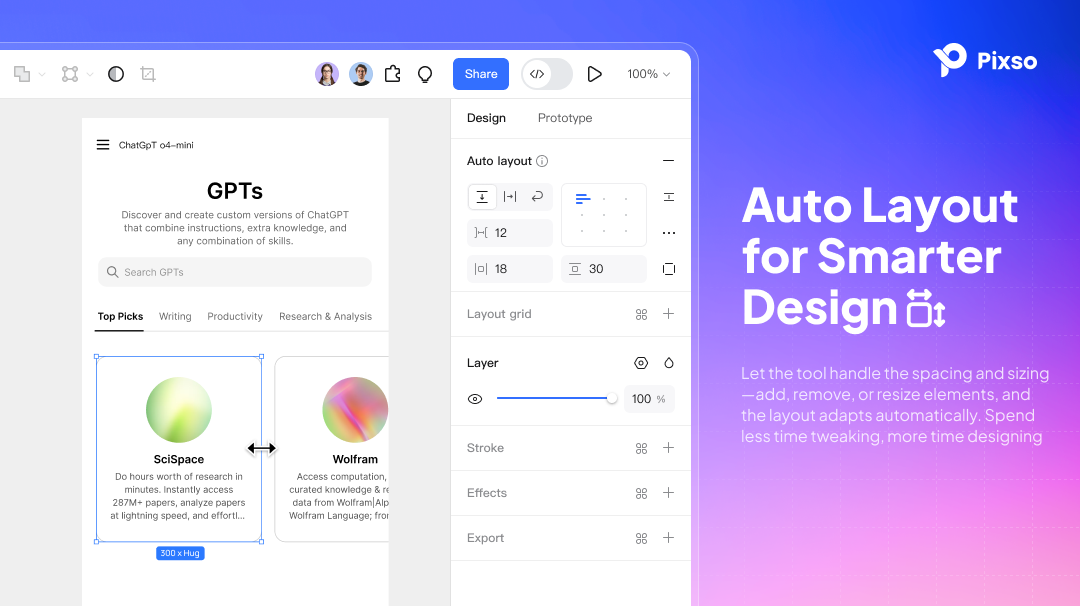
Think about a standard text button on a landing page. If you suddenly change the word "Buy" to "Add to Shopping Cart," a statically drawn box simply won't change its physical size. The new text just bleeds awkwardly over the right edge. But with auto layout applied to that frame, the button automatically expands its width to hug the new text perfectly, while maintaining the exact pixel padding you defined earlier. The content inside actively drives the size of the overall container. This makes it an absolute necessity for any serious ui design project today, because it handles dynamic content like messy lists, wrapping paragraph text, and responsive feature cards completely effortlessly. It essentially forces your files to behave exactly like a coded website.
Part 5: Making the call: when to use which?
This brings us to the core user need that so many professionals struggle with: clear contextual decision-making. You need a fast, reliable mental standard for knowing exactly when to pull which lever. Mixing them up is usually what leads to broken files and frustrated colleagues.
You should absolutely use constraints when you are dealing with fixed or light responsive scenarios. Think about a floating action button on a mobile app screen. It just needs to stay docked in the bottom right corner, no matter how tall the particular phone screen happens to be. Or think about a simple top navigation bar where the hamburger menu is pinned to the right side and the brand logo is pinned to the left side. Applying proper design constraints here is incredibly lightweight, mathematically stable, and perfectly suited for atomic components that need strict spatial boundaries without wrapping logic.
Conversely, you should immediately reach for auto layout when you are facing dynamic or complex responsive structures. If you are building a SaaS pricing card where the bulleted list of features might grow from three items to ten items depending on the tier, you need the card to push its bottom border down automatically. It is purpose-built for dynamic component reuse. Whenever the content dictates the height or width of the parent, or when you need a row of descriptive tags to wrap neatly to the next line when the screen gets too narrow, you absolutely must use this feature.
In a healthy, mature design system, these two concepts actually work together beautifully in tandem. You use dynamic spacing for the overarching page structure, while utilizing specific design constraints to stabilize the tiny atomic elements inside those larger flex containers.
Part 6: Step-by-step: building a responsive card in Pixso
Let's put all of this structural theory into actual practice. I am going to walk you through exactly how to build a highly responsive user profile card in Pixso, intentionally combining both layout techniques to show exactly how they complement each other in a real-world scenario.
Step 1: Set up the base container
Open your Pixso file and hit the 'F' key to draw a brand new frame on your blank canvas. Rename this frame to "Profile Card" in the layers panel. Immediately go over to the right-hand properties panel and click the plus icon next to the flex layout section. Set the structural direction to vertical, the spacing between items to 16px, and the padding to 24px all around. You now have a mathematically perfect, dynamic container ready to accept content.
Step 2: Add dynamic content layers
Inside that new frame, type out a placeholder name for your user layer, and duplicate it to create a secondary text layer for their corporate job title. Because the parent frame has flex properties enabled, these text layers stack neatly on top of each other without any manual dragging. Try typing a really long, multi-line job title; you will quickly notice the parent frame automatically grows taller to accommodate the extra text. This is the exact flexbox logic in action, saving you from having to adjust the background box manually. Set the width of these text layers to "Fill Container" so they stretch across the card.
Step 3: Introduce absolute positioning
Now we need an "X" icon in the top right corner to act as a close button for the card. If you just drop the icon in normally, the vertical stacking rules will force it down into the content flow, completely ruining your layout. Instead, select the icon and click the "Absolute Position" button located in the right-hand panel. This action pulls the icon completely out of the structural flow, allowing you to freely drag it to the top right corner of the card.
Step 4: Lock it down with anchor points
With the close icon still selected, look closely at the spatial rules panel on the right side. Set the horizontal anchor to "Right" and the vertical anchor to "Top." Now, if you resize the width or height of the entire profile card, that tiny close icon will stay perfectly glued to the top right corner, completely unaffected by the text dynamically flowing and expanding inside the main body.
Step 5: Inspect for developer handoff
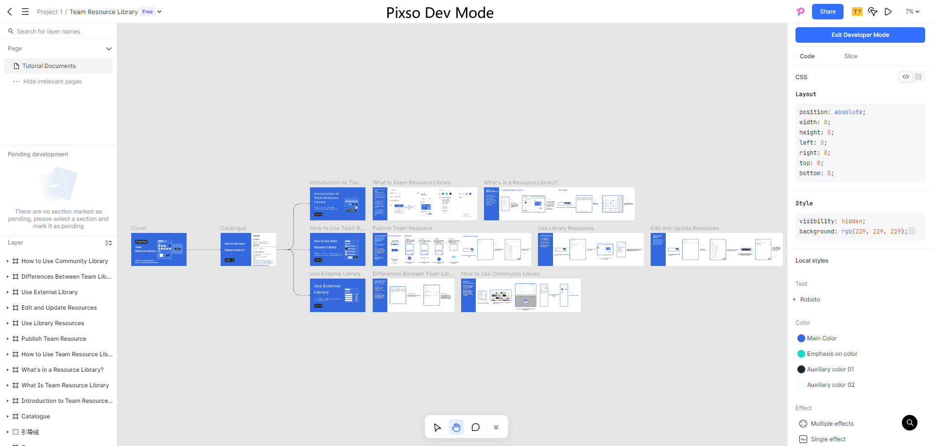
Finally, click over to the "Handoff" or "Code" tab located in the right sidebar. Pixso automatically translates your entire visual setup into pristine, production-ready CSS. It clearly displays the Flexbox properties for the main card structure and the absolute positioning properties for the close icon. Your frontend developer can literally copy and paste this exact logic into their stylesheet, completely eliminating any guesswork or visual discrepancies.
Conclusion
Mastering responsive interfaces definitely doesn't have to be a frustrating trial-and-error process that eats up your entire afternoon. By truly understanding the distinct roles of these structural features, you can build adaptable, scalable digital products with total confidence. Use standard constraints for strict, localized pinning, and lean heavily on auto layout for complex, content-driven growth. Modern, robust platforms like Pixso seamlessly blend these two distinct methodologies, offering an environment that perfectly mirrors backend development logic while significantly reducing your long-term maintenance overhead. Stop fighting constantly with manual pixel resizing, embrace the smarter workflow, and let intelligent layout systems do all the heavy lifting for your next big product launch.