Elodia
Ever wonder how the visually striking banners you see everywhere on the internet are created? Banner design is like making a miniature masterpiece that needs to catch people's attention right away. It combines strategy with art, and today we will explore in detail how to do banner designs that are genuinely distinctive.
Why Designing Banners is Important
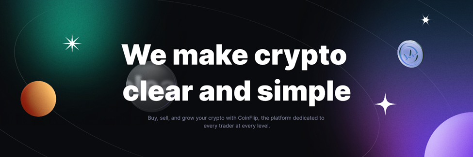
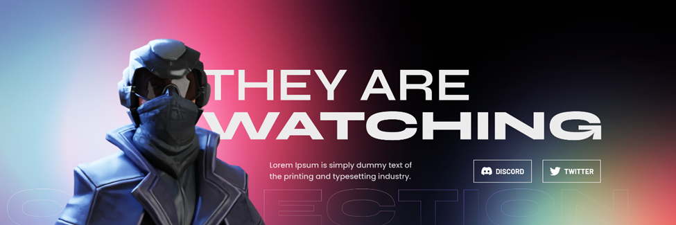
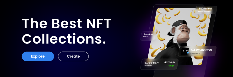
Think of banners as the online version of billboards. It's usually the initial element that catches people's attention when they access a website, social media profile, or application. A well-crafted banner serves as an inviting, attention-grabbing host. It can attract readers, spark their curiosity, and set the tone for what they will find on the page.
For instance, if you run an online store that offers trendy fashion items, your banner might display your latest collection. This is your chance to leave a mark and encourage guests to linger and explore. A badly crafted banner, conversely, represents a missed opportunity. It might also serve as a closed sign, steering individuals away instead of welcoming them in. Next, we will check how to do banner designs in detail.

How to Do Banner Designs?
Purpose: The North Star
Before you even start designing a banner, you need to know its purpose. It's similar to deciding where you want to go before embarking on an adventure. Do you want to promote a new product, direct traffic to a specific website, or raise brand awareness? When you have a clear purpose, everything else in your banner design will fall into place.
For example, if you're advertising a limited-time offer, your banner should exude urgency. To ensure that people understand the urgency of the situation, you may utilize bold colors, large letters, and countdown timers. However, if your goal is to raise brand awareness, you should prioritize your logo, brand colors, and a catchy tagline that reflects your firm's personality.
Audience: Know Your People
Understanding your audience is like to having the key to a treasure trove. You must know who you are designing the banner for. Are they youthful, technologically savvy millennials? Perhaps they're older, more traditional customers?
If you're aiming for a younger demographic, consider using modern, edgy designs with lots of bright colors and stylish graphics. However, if the target population is older, a more traditional, clean style with plain wording may be more effective. For example, a cosmetics brand aimed toward teenagers may employ a banner featuring a youthful, stylish model and bold, fun-looking typography. A financial services company aimed at pensioners would most likely go for a more refined, understated look.
Message: Keep it Clear
Your banner needs to convey a message, and it has to be crystal-clear. There's no room for confusion. It's like shouting a simple, important instruction in a noisy room. You want your message to stand out.
Use brief, effective sentences. Avoid jargon and convoluted wording. When promoting a new smartphone, instead of saying "The device boasts a high-resolution, multi-pixel camera system," you may say "Take amazing photos with our new high-resolution camera phone." Also, ensure that the message is appropriate to your objective and target audience.
Design Elements: The Visual Appeal
This is where the fun really begins! The design elements of your banner are like the ingredients in a delicious recipe. You've got colors, typography, images, and layout to play with.
Colors: The hues can influence the atmosphere of your banner. A vibrant, warm hue such as orange can express energy and enthusiasm, ideal for a sales campaign. Cool hues such as blue can convey a feeling of trustworthiness and dependability, ideal for a financial organization. However, take care not to employ an excessive number of colors. It's similar to adding too much seasoning to a meal. Typically, 2-3 primary colors are most effective.
Typography: The font you select serves as the voice of your banner. It may be confident and strong, or gentle and refined. Ensure it's readable. You don't want anyone straining to see your message. And avoid using too many different fonts. Typically, one or two additional fonts suffice. Pixso provides a vast selection of fonts, allowing you to easily modify the size, style, and alignment with just a few clicks.
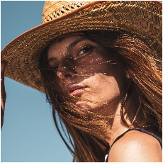
Pictures: A picture can define the success or failure of a banner. It needs to be of excellent quality and pertinent to your communication. If you're marketing outdoor equipment, a stunning image of an individual trekking in the mountains would be an excellent option. You can utilize your own images, or you can find numerous stock photo sites available. Edit, resize, and apply effects to ensure the images seamlessly integrate into your banner layout.
Design: The design refers to how all the components of your banner are arranged. It must be structured and clear to comprehend. Utilize grids to maintain order. Position the key elements, such as the central message and call-to-action, in noticeable locations. Pixso's design tools enable you to craft sleek grids, and you can freely move elements around to find the most appealing arrangement.
Call-to-Action (CTA): The Push
A call-to-action is like a gentle (or not so gentle) nudge to your audience. It tells them what you want them to do. Do you want them to click a link, sign up for a newsletter, or buy a product? Make your CTA stand out. Use a different color, a bold font, or an arrow to draw attention to it. And make the CTA text clear and action-oriented. Instead of "Learn more," say "Discover our amazing product now!"
Tips for Designing a Banner
After understanding how to do banner designs, we will introduce some tips for designing a banner now.
Keep it Simple
Remember, less is more. A cluttered banner is like a messy room. It's overwhelming and hard to focus on the important things. Strip away any unnecessary elements. Keep the design clean and straightforward.
Test and Refine
Don't just create a banner and call it a day. Test it out. Show it to friends, colleagues, or even potential customers. Get their feedback. It's like tasting a dish before you serve it to guests. You might find that the colors are too bright, or the CTA isn't prominent enough. Use this feedback to refine your design.
Be Original
Stand out from the crowd. Don't copy what everyone else is doing. Think outside the box. It's like being the only one wearing a unique outfit at a party. Your banner should have a unique selling point, whether it's a creative design, a fresh message, or an innovative use of colors.
How Pixso Can Help with Designing Banners
Pixso is an amazing design tool that can take your banner designs to the next level. Its vector-based editing capabilities mean your designs will look sharp and clear, no matter how much you zoom in. The real-time collaboration feature is a game-changer. You can work with a team of designers, or get feedback from clients, all in one place. And with its extensive library of design resources, including icons, shapes, and templates, you'll never run out of inspiration.
In conclusion, knowing how to do banner designs is a valuable skill for any designer. By understanding the key elements and following these tips, and with the help of a great tool like Pixso, you'll be creating stunning banners in no time. So, roll up your sleeves, get creative, and start designing those eye-catching banners!