In the realm of UX design, line spacing—also known as leading—holds substantial weight in determining the readability and overall aesthetic of your text. Proper line spacing can distinguish between a comfortable reading experience and a frustrating one. In this blog, we'll explore the significance of line spacing, delve into its historical context, and provide essential guidelines to ensure your typography is functional and visually appealing. Additionally, we will discuss how to effectively manage type line height for web design, including the website line height standard.
Understanding Leading and Its Historical Context
Source: Linkedin
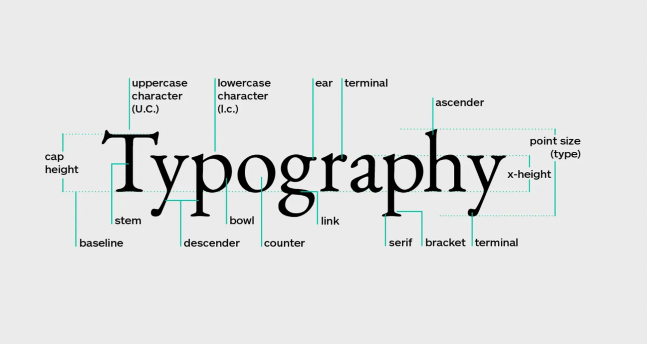
1. Defining Leading in Typography
Leading is the vertical spacing between lines of text, determined by measuring the distance from the baseline of one line to that of the next line. This spacing is crucial as it impacts how easily a reader can navigate text. If the leading is too tight, the text can appear cramped, making it difficult to read. Conversely, if the leading is too loose, it can disrupt the flow of reading.
2. The Evolution of Line Spacing Practices
Historically, line spacing practices have evolved alongside advancements in printing technology. In the early days of printing, leading was physically added between lines of type to enhance readability. With the advent of digital typography, designers gained more flexibility to manipulate leading, allowing for more nuanced control over text appearance. Today, understanding the historical context of leading helps designers appreciate its role in UX design, especially when considering type line height for web applications.
Selecting The Best Line Height for Web Design
1. Determining an Appropriate Base Size for Text
Choosing a base font size is the first step in establishing a solid typographic system. A good rule of thumb is to set your base size between 16px and 18px for body text, as this range generally offers optimal readability across devices. Once the base size is determined, you can then adjust spacing accordingly to ensure a harmonious layout.
2. Developing a Hierarchical Scale for Headings
Headings play a vital role in breaking up text and guiding readers through your content. Establishing a clear hierarchy using different font sizes and line heights enhances both comprehension and aesthetics. For instance, larger headings should have tighter spacing, while subheadings may benefit from looser leading to creating a distinct visual separation.
3. Managing Different Sizes of Body Text
Different types of content may require varying line heights. For instance, quotes or captions might necessitate tighter leading, while longer paragraphs should feature looser spacing to aid readability. By adjusting spacing based on the context and importance of the text, designers can create a more engaging reading experience. This is particularly important when determining the appropriate type line height for web design and ensuring compliance with the website line height standard.
Essential Guidelines for Effective Line Spacing

- Choose the Right Design Software
Utilize software that allows for precise control over typography settings. Programs like Adobe InDesign, Sketch, or Figma provide features to adjust leading easily, ensuring that your text is spaced correctly.
- Implement Looser Leading for Body Text
For body text, a leading value of 1.5 times the font size is often recommended. This extra space helps the eye move smoothly from one line to the next, enhancing overall readability.
- Adjust Line Spacing Based on Typeface Variations
Various typefaces possess distinct features that influence how easily text can be read. For example, serif fonts generally require more leading than sans-serif fonts due to their intricate details. Always test various typefaces with your chosen spacing to find the best combination.
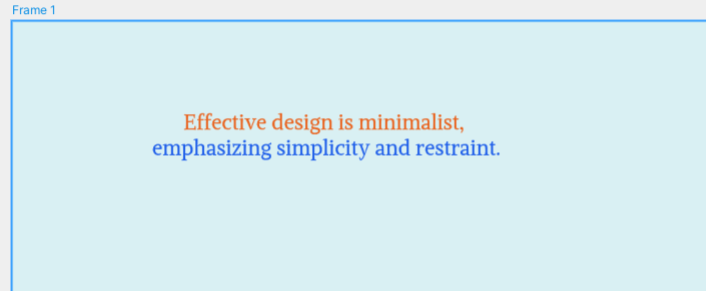
- Increase Leading for Colored Text on Non-White Backgrounds
When using colored text or backgrounds other than white, it's essential to increase the leading. This extra space helps prevent the text from blending into the background, making it easier to read.
- Apply Tighter Leading in Headlines
Headlines often benefit from tighter leading, as they are intended to grab attention and create visual impact. A leading value slightly less than the font size can create a cohesive look that enhances the headline's prominence.
Visual Comparisons: Good vs. Bad Line Spacing
Understanding the impact of line spacing through visual examples can significantly aid designers in making informed decisions. This section presents clear comparisons between effective and ineffective spacing, demonstrating how these choices affect readability and overall design.
Example 1: Body Text
Bad Line Spacing: Tight Leading
Visual Representation:
Tight Leading (1.0 line-height):

Issues:
- Cluttered appearance
- Difficulty in distinguishing between lines
- Increased eye strain
Good Line Spacing: Optimal Leading
Visual Representation:
Optimal Leading (1.5 line-height):

Benefits:
- A clear distinction between lines
- Comfortable reading experience
- Improved comprehension
Example 2: Headings
Bad Line Spacing: Tighter Leading in Headlines
Visual Representation:
Excessive Leading (1.8 line-height):

Issues:
- Disconnection from body text
- Diminished impact of the headline
Good Line Spacing: Tighter Leading for Impact
Visual Representation:
Tighter Leading (1.1 line-height):

Benefits:
- Cohesive look
- Enhanced visual hierarchy
- The natural flow of content
Example 3: Colored Text on a Non-White Background
Bad Line Spacing: Inadequate Leading for Colored Text
Visual Representation:
Insufficient Leading:
Issues:
- Merging into the background
- Difficulty in reading
- Confusion for the reader
Good Line Spacing: Enhanced Leading for Clarity
Visual Representation:
Increased Leading:
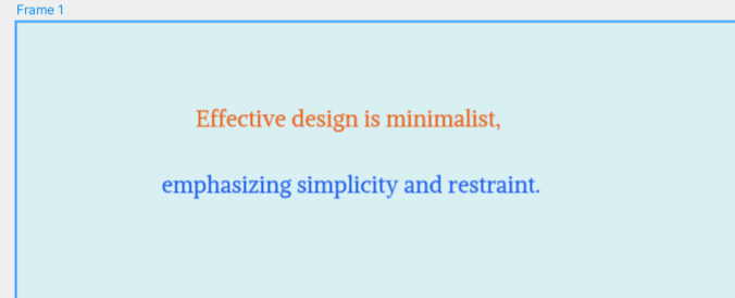
Benefits:
- Clearer and more readable text
- Enhanced visual appeal
- Standout message against the background
Conclusion of Visual Comparisons
Through these examples, it's clear that effective line spacing plays a critical role in design. Designers must pay attention to how leading affects their typography choices, ensuring that text is not only aesthetically pleasing but also functional and accessible. By implementing the right spacing techniques, designers can create engaging and user-friendly content that resonates with their audience.
Final Thoughts
Mastering line spacing is an essential skill for any UX designer. By understanding the importance of leading and applying the essential guidelines outlined in this blog, designers can enhance the readability and aesthetic appeal of their text. Start your design journey today with the confidence to create engaging and accessible typography!


