Scott
Have you ever downloaded an application, tried to create an account, got stuck in a confusing loop of error messages, and immediately deleted it? That frustration is the direct result of a poorly planned user journey. Many product teams rush straight into visual design, skipping the foundational logic entirely. This guarantees broken experiences and incredibly costly development revisions. To prevent this, UX designers must meticulously visualize every single step a person takes to achieve a desired goal. In this comprehensive guide, we will break down exactly how to craft a highly effective user flow diagram. We will show you how to eliminate friction, account for complex edge cases, and leverage a modern platform to map out intuitive digital experiences rapidly.
Part 1: The true cost of skipping the logic phase
Before pushing a single pixel on an artboard, product teams need to understand the fundamental difference between macro and micro planning. A user journey map is a broad, high-level visualization. It tracks the emotional state of your customer, their offline context, and their touchpoints across multiple channels, from seeing a social media ad to reading a promotional email. It is highly contextual.
However, once that person actually opens your application, you need something much more rigid. This is where the user flow diagram takes over. It is a hyper-specific, logical flowchart that dictates exactly how a person moves from screen A to screen B. It tracks the exact buttons they click, the decisions they make, and the system responses they trigger.
When designers skip this micro-mapping phase, the consequences are disastrous. They fall victim to the "happy path bias," designing only the perfect scenario where the customer types everything correctly and the internet connection never drops. But the real world is messy. What happens if a credit card is declined? What happens if the user clicks a forgotten password link that expired yesterday? Without a proper user flow diagram, these edge cases are completely ignored until a developer asks about them weeks later, forcing the design team to scramble and patch together a broken interface at the last minute.
Part 2: Enter Pixso Whiteboard – The ultimate logic workspace
To map out these complex scenarios without losing your mind, you need the right infrastructure. Drawing boxes and arrows manually in presentation software is an incredibly frustrating, time-consuming task. You need a dedicated user flow diagram tool that is specifically built for user experience logic. This is where Pixso enters the picture as an absolute game-changer for UX professionals.
Pixso is a comprehensive product design platform that houses everything from wireframes to high-fidelity UI. But before you get to the UI, you start in Pixso Whiteboard. This infinite, responsive canvas is the perfect sandbox for your initial brain dumps. You can grab digital sticky notes to quickly jot down user goals, pain points, and necessary steps.

What makes Pixso the ultimate user flow diagram tool is its speed. It features a rich, one-click shape library and intelligent connectors that automatically route themselves around obstacles. When you drag a decision diamond across the screen, the arrow stays firmly attached and bends neatly, ensuring your map never turns into an unreadable bowl of spaghetti. Because it sits natively within the Pixso ecosystem, you eliminate the massive headache of using a disjointed tech stack. You do not have to pay for a separate whiteboard tool, export a messy PDF, and then import it into your UI software. It all happens in one unified, flawlessly synced cloud environment.
Part 3: Mastering standard symbols and visual hierarchy
A user flow diagram is essentially a blueprint for your software. Just like architectural blueprints, it must rely on a universally understood language. If every designer makes up their own shapes, developers will be completely lost. To maintain a clear user journey, you must strictly adhere to the five standard mapping symbols.
First, use a pill shape (or rounded rectangle) to indicate the Start and End points of a specific task. Second, use standard rectangles to represent a specific Page or Screen the person is looking at. Third, use a diamond shape to represent a Decision point. This is where the path splits based on an action, such as a system checking if a user is logged in (Yes/No). Fourth, use a parallelogram to represent Data Input, like typing an email address or uploading a file. Finally, use one-way arrows to indicate the strict directional flow of the user journey map. You should never use two-way arrows; the progression must be entirely sequential. Keep it strictly to one task per flow to avoid cognitive overload.
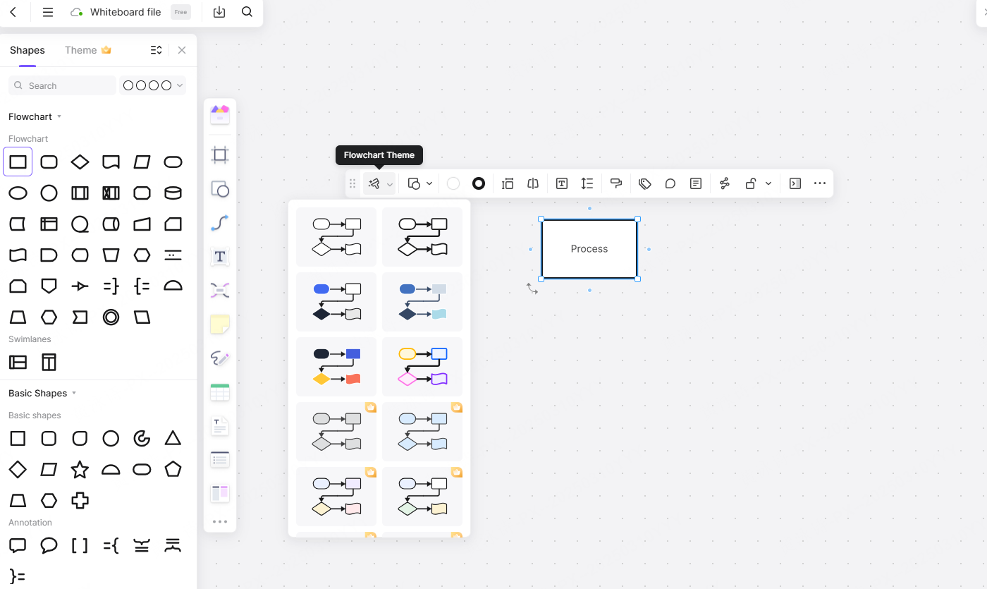
Beyond shapes, Pixso allows you to establish a pristine visual hierarchy. You can use semantic labels and strict color coding to make the map readable at a glance. For instance, you might color all login-related steps blue, checkout steps green, and error states red. By grouping related actions into clearly labeled structural frames, anyone from a junior developer to a non-technical stakeholder can zoom into the Pixso canvas and instantly understand the underlying logic of the feature.
Part 4: Complete scenarios, rapid drawing, and AI power
As mentioned earlier, a map is utterly useless if it only shows the happy path. A professional user flow diagram must achieve full scenario completeness. It must cover the primary route, absolutely every decision branch, all error and exception handling, and multiple entry and exit points. If someone can access your checkout page from the homepage banner, a marketing email, and their profile settings, your map must visually account for all three of those unique entry doors.
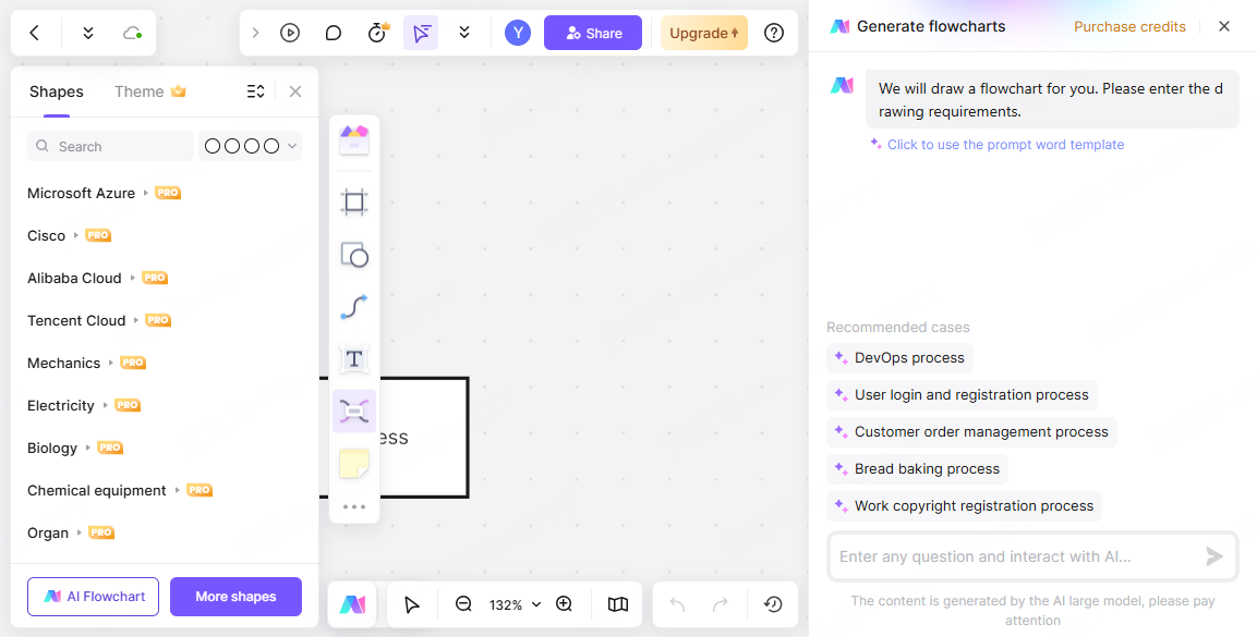
Mapping all of this manually used to take days. Pixso reduces this to hours, if not minutes, through extreme automation. The platform provides high-frequency layout templates so you don't have to start from scratch. The auto-layout formatting instantly aligns your messy boxes into a perfect, mathematically even grid.
More impressively, Pixso integrates deep AI empowerment to speed up your workflow. You can literally use a text prompt to outline a basic sequence, and the AI will generate the initial flowchart structure for you. The intelligent system can even suggest missing branches or offer flow optimization advice, acting as a second pair of expert UX eyes to ensure your logic is airtight and compliant with basic usability standards. This allows you to generate robust, edge-case-ready maps at ten times the normal speed.
Part 5: From abstract logic to interactive UI
The traditional workflow usually hits a massive brick wall once the flowchart is finished. The UX designer hands a static image to a UI designer, who then has to interpret those abstract boxes into actual interface screens. Pixso completely destroys this wall with its seamless flow-prototype-UI linkage.
Because Pixso Whiteboard and Pixso UI exist in the exact same workspace, the transition is flawless. You can place your finalized logic map right next to your UI artboards. As you begin designing the actual screens, you can link them directly back to the steps on your whiteboard. Furthermore, Pixso allows you to convert these paths into interactive prototypes with a single click. You can bind interactions, animations, and transitions to the logic you just mapped out.
This tight integration ensures that component reuse is maximized and two-way synchronization is maintained. If a stakeholder realizes the user journey map is missing a crucial age-verification step, you update the whiteboard logic, and the UI team immediately sees the gap that needs to be designed. Additionally, Pixso supports extensive cross-device adaptation. You can map out how a complex flow behaves differently on a mobile viewport versus a desktop browser, utilizing responsive canvas views to ensure the experience remains fluid regardless of the hardware being used.
Part 6: Closing the team loop and developer handoff
No product is built in total isolation. The success of your planning phase relies entirely on how well you communicate that plan to the rest of the organization. As a cloud-native user flow diagram tool, Pixso creates a perfect team collaboration loop. Multiple designers, product managers, and copywriters can jump into the whiteboard simultaneously. You can see real-time cursors flying across the screen as the team actively debates the friction points of a checkout process.
When it is time for review, stakeholders can drop precise, targeted comments directly onto a specific decision diamond, rather than sending vague feedback in a separate email. Pixso also maintains strict version tracking and permissions control, ensuring that nobody accidentally deletes a crucial payment gateway branch without authorization.
Ultimately, this all leads to a highly developer-friendly handoff. Engineers absolutely despise guessing games. When they look at a messy, undocumented UI file, they are forced to make assumptions about how the software should behave when things go wrong. By providing them with a comprehensive, color-coded, edge-case-heavy map created in Pixso, you eliminate communication gaps. The logic is crystal clear. Pixso further supports this by offering automated redlining, specification exports, and task synchronization. The developers can see exactly what needs to be built, the exact paths the data must take, and the specific UI screens attached to those paths, dramatically speeding up the coding phase.
Conclusion
Mapping out the precise steps your customers will take is not just a preliminary administrative task; it is the absolute foundation of a successful digital product. When you skip the logical mapping phase, you build software that is inherently confusing, frustrating, and prone to endless technical bugs. By adopting a strict methodology that accounts for every edge case, decision point, and visual hierarchy, you ensure your product is actually a joy to navigate. Utilizing an advanced, unified platform like Pixso removes all the tedious manual labor from this process. It bridges the massive gap between abstract whiteboard planning and high-fidelity interactive design. Stop guessing how your audience will interact with your application. Build a crystal-clear roadmap today, align your entire product team, and watch your user retention metrics soar.