Scott
A compelling digital experience begins with deliberate visual choices. Color is a foundational communication layer in digital product design: it anchors brand identity, guides visual hierarchy, and shapes user navigation. Whether you are designing an enterprise SaaS dashboard, an e-commerce storefront, or a creative portfolio, building a structured, accessible color system is essential for usability and aesthetic consistency.
Below is a curated collection of 10 modern website color schemes complete with copyable HEX values, semantic token structures, and WCAG 2.2 accessibility ratings, followed by dedicated web color tools to help you test, generate, and implement cohesive UI palettes using Pixso.
1. Linear-Inspired Dark Theme (Developer Tools & SaaS)
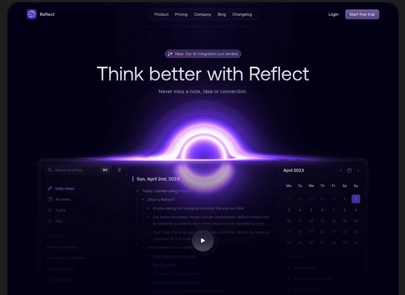
This scheme draws inspiration from modern developer utilities and engineering-centric SaaS platforms. It pairs a deep obsidian canvas with subtle slate containers and focused violet accents to create a distraction-free, high-precision environment.
Implementation Tip: In dark themes, avoid pure black (#000000) surfaces. Using layered dark slates (#0D0E11 to #18191E) allows subtle drop shadows and border strokes to communicate component elevation clearly.
2. Modern Corporate and Fintech
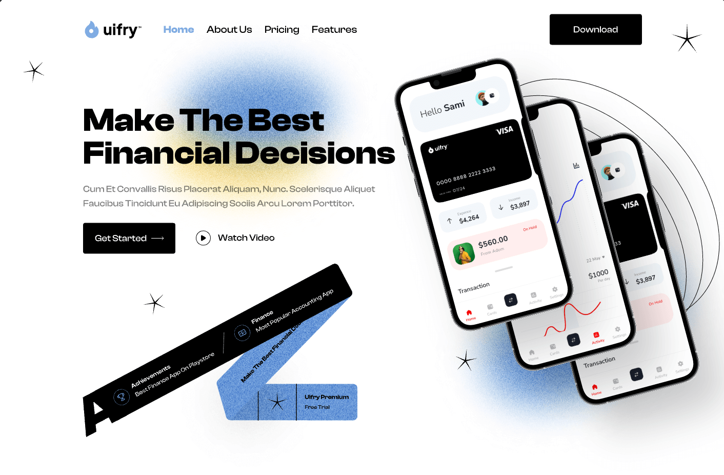
Designed for wealth management dashboards and B2B financial services, this palette combines structured deep navy with generous white space and dynamic yellow accents to highlight key metrics without visual clutter.
3. Trustworthy Legal and Executive Consulting

Commonly utilized by corporate legal advisory firms and executive consultancies, this palette balances authoritative deep navy with warm gold and amber accents for a structured, approachable presentation.
4. Vibrant Coworking and Community Platform
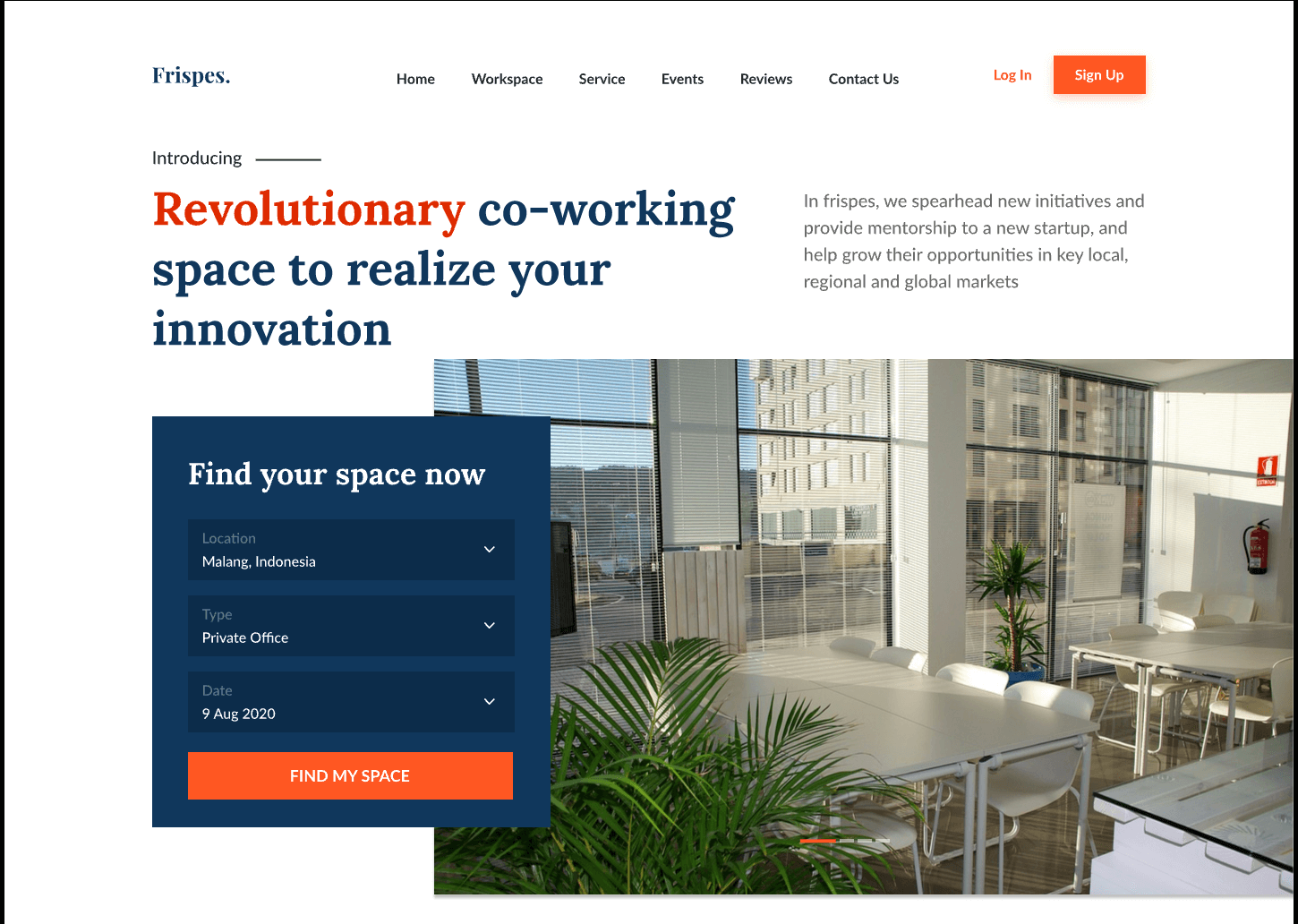
Geared toward flexible workspace platforms and collaborative team hubs, this scheme pairs high-energy tangerine with dependable slate navy to convey both community flexibility and operational reliability.
5. Intelligent AI Tech Gradient
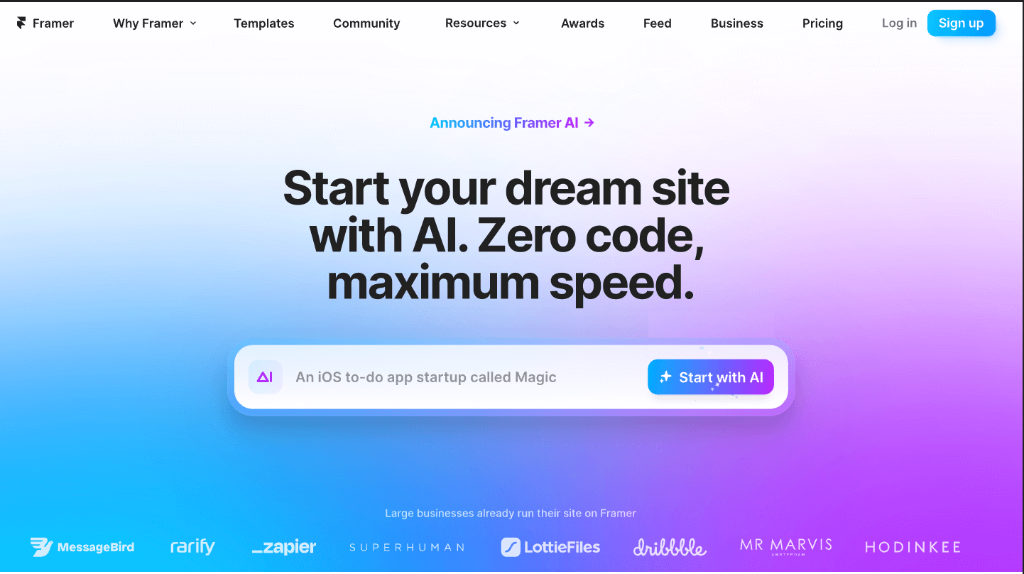
Artificial intelligence tools and automation platforms often employ luminous neon gradients against dark backdrops to signify modern computing power and fluid workflows.
6. Futuristic Web3 and Digital Assets
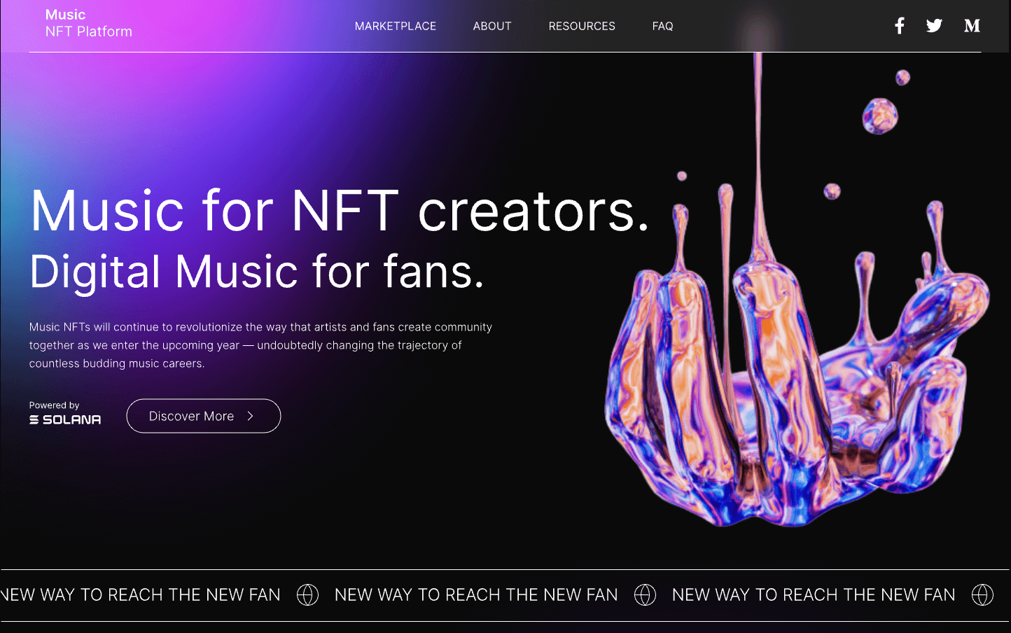
Designed for creative platforms, digital asset exchanges, and interactive media hubs, this high-contrast palette combines deep midnight black with vibrant neon magenta and electric violet.
7. Minimalist Warm Lifestyle and E-Commerce
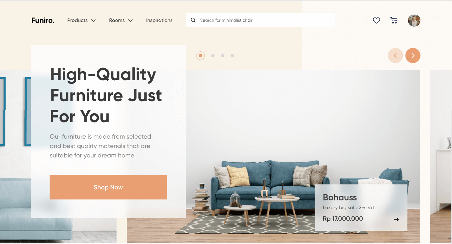
Ideal for sustainable retail, lifestyle goods, and editorial portfolios, this palette replaces stark, sterile cool whites with gentle linen neutrals and earthy terracotta accents to encourage relaxed, unhurried browsing.
8. Harmonious Multi-Color Data Dashboard
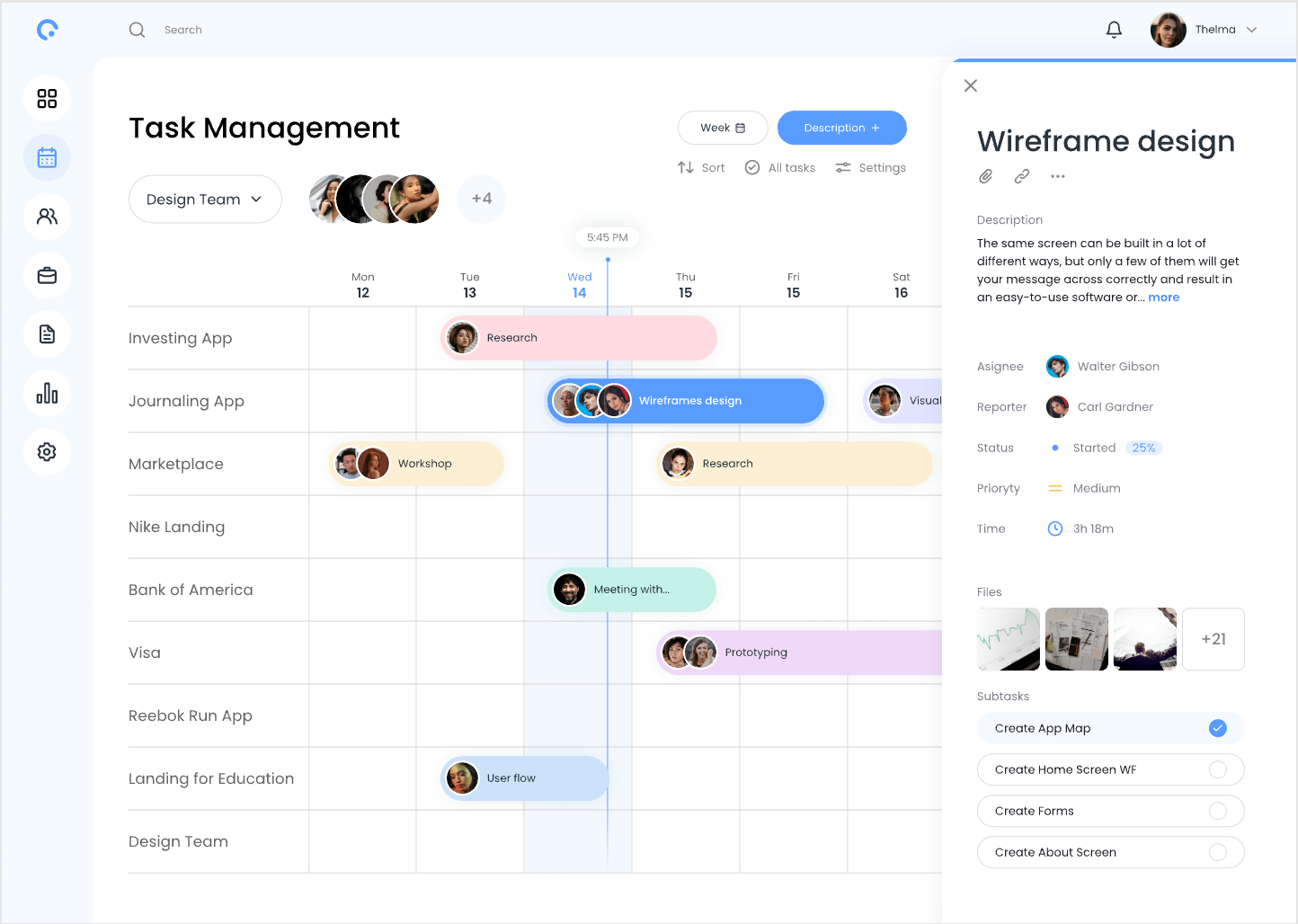
Complex SaaS platforms, analytics portals, and calendar interfaces require distinct categorical colors to separate statuses and task priorities without creating visual chaos.
9. Calming Healthcare and Wellness
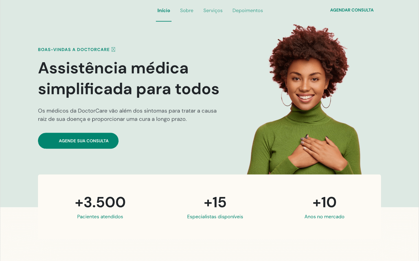
Digital health portals, wellness platforms, and clinical booking systems benefit from a soft sage and clinical cream palette that provides a clear, comforting atmosphere for patients and practitioners.
10. Fresh Organic Beauty and Skincare
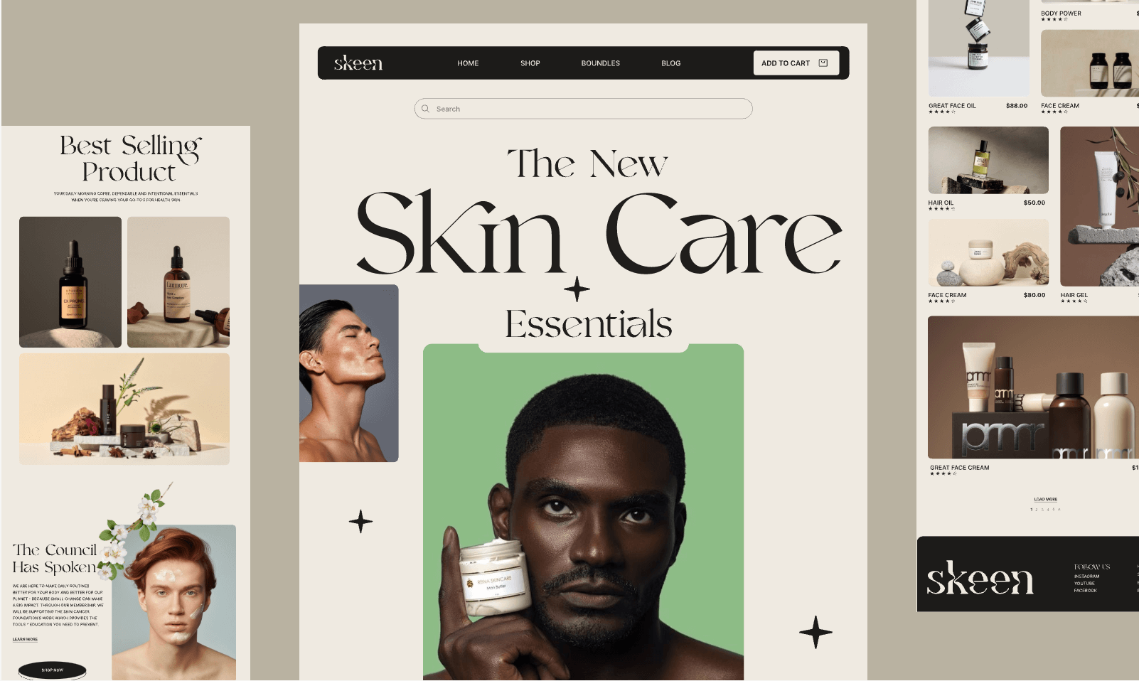
Tailored for luxury cosmetic brands and botanical skincare lines, this palette balances warm alabaster surfaces with botanical olive greens and high-contrast typography to project understated elegance.
Recommended Web Color Design Tools
Exploring color schemes provides strong aesthetic inspiration, but integrating colors into scalable design systems requires dedicated tools for palette generation, token governance, accessibility checks, and UI drafting.
1. Pixso — Cloud Collaborative Design System Platform
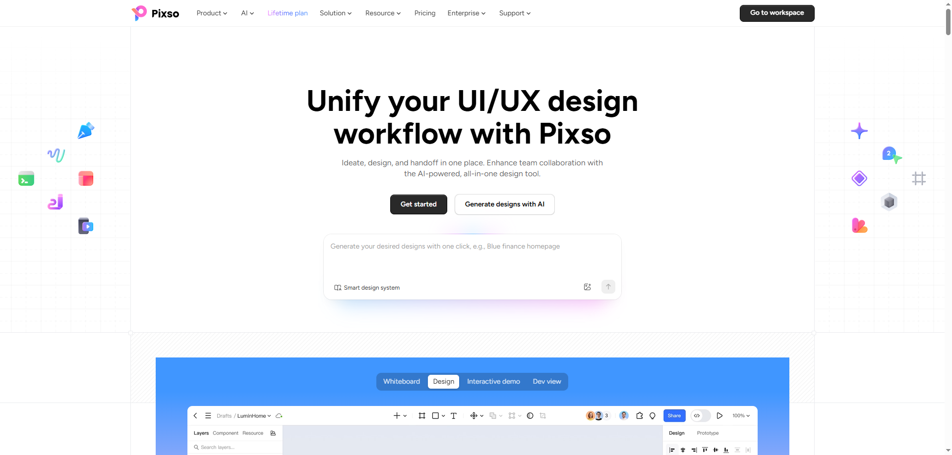
Pixso is an all-in-one collaborative UI/UX design tool tailored for building scalable design systems. It enables product teams to:
- Define and manage centralized Color Styles and Design Tokens that update dynamically across components.
- Build seamless Light and Dark Mode variable collections with automatic token mapping.
- Run real-time WCAG accessibility contrast plugins directly on canvas layers.
- Inspect, copy, and export design tokens into CSS, SCSS, and front-end component formats.
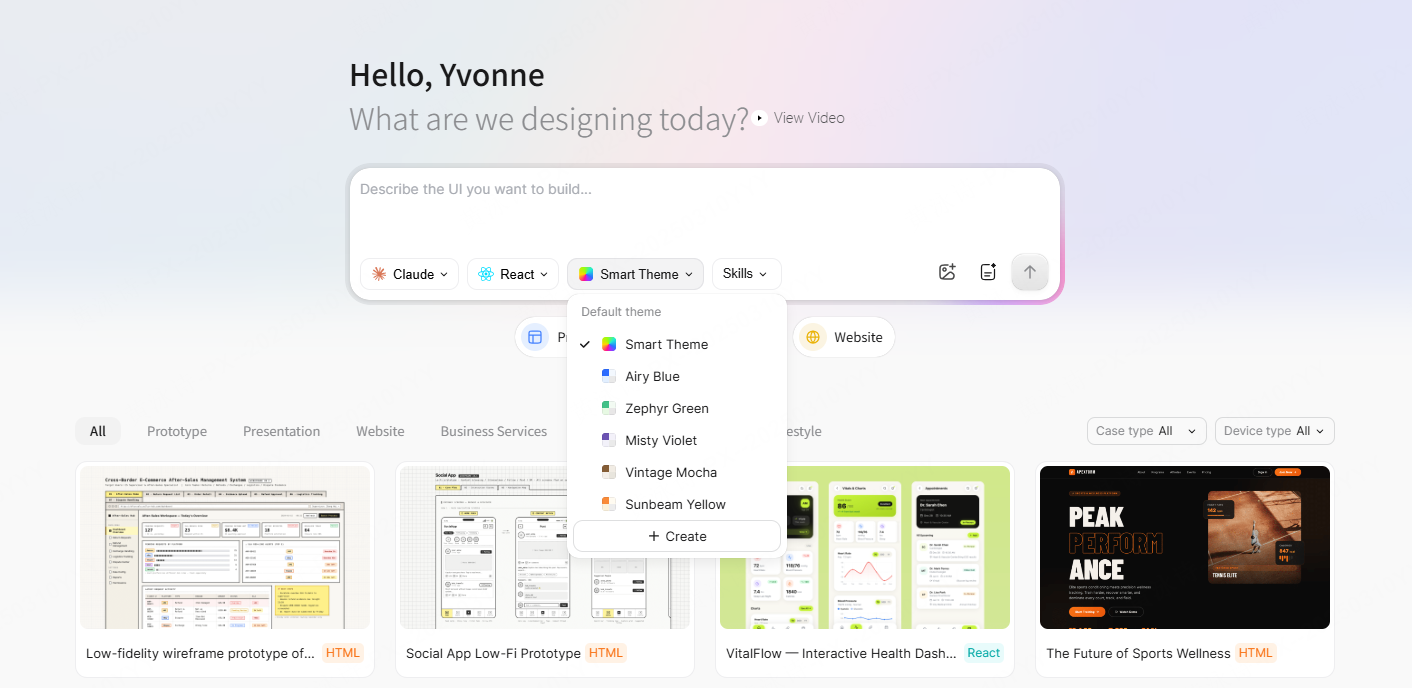
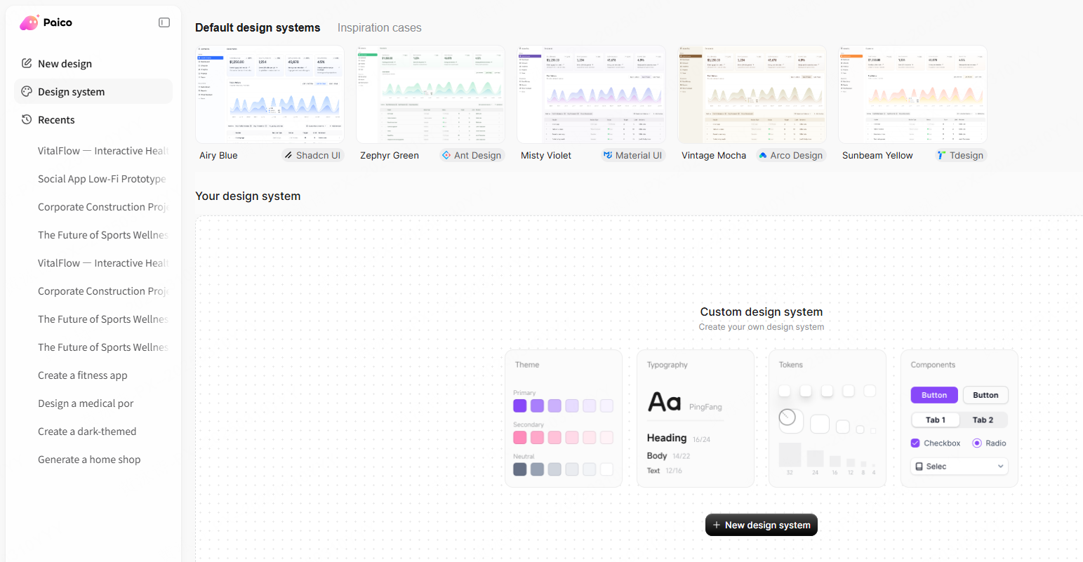
2. Paico — Generative UI and Front-End Component Accelerator
Paico helps teams transition from visual concepts to functional layout scaffolding. Designers can generate UI layouts from natural language prompts, preview adaptive theme styles, and export structured React and HTML code baselines for development sprints.
3. Coolors.co — Fast Palette Generation & Color Blindness Simulation
A widely used palette generation tool that lets designers lock favorite shades, cycle through harmonized palettes, simulate various forms of color vision deficiency (such as deuteranopia and protanopia), and export hex codes across JSON, SCSS, and SVG formats.
4. WebAIM Contrast Checker — Normative WCAG 2.2 Compliance Testing
The industry-standard contrast evaluation tool for testing foreground and background HEX values against WCAG 2.2 Level AA and AAA compliance thresholds for regular text, large display headings, and graphical user interface components.
5. Realtime Colors — In-Situ Website Palette Testing
A browser-based prototyping tool that lets you test customized background, surface, text, and accent combinations directly on a live, responsive mockup page before finalizing your design system variables.
Frequently Asked Questions (FAQ)
Q1. How do designers verify website color schemes for WCAG 2.2 compliance?
Web accessibility compliance is evaluated under the W3C WCAG 2.2 Recommendation:
- Level AA Contrast (Criterion 1.4.3): Regular text (below 18pt / 24px regular, or below 14pt / ~18.5px bold) must maintain a minimum contrast ratio of 4.5:1 against its background. Large-scale text requires at least 3:1.
- Non-Text Contrast (Criterion 1.4.11): UI components (such as input borders and icon buttons) and interactive states (hover and keyboard focus rings) require a minimum 3:1 contrast ratio against adjacent surfaces.
- Use of Color (Criterion 1.4.1): Color must not be used as the single visual indicator for state, errors, or navigation links. Always pair color with text labels, icons, or underline patterns.
Note on APCA: The Accessible Perceptual Contrast Algorithm (APCA) is an experimental perceptual contrast method developed within the WCAG 3 draft. While APCA offers valuable insight into font weight and spatial frequency readability, WCAG 2.2 remains the official compliance benchmark.
Q2. What is the 60-30-10 rule and how does it apply to web UI design?
The 60-30-10 rule is a classical visual proportion heuristic:
- 60% Dominant Color: The overall canvas, main background, and primary negative space.
- 30% Secondary Color: Structural surfaces, cards, sidebars, and body typography.
- 10% Accent Color: High-priority focal points, such as primary action buttons, notification badges, and active tab indicators.
In complex enterprise dashboards, product teams treat this proportion as a flexible baseline, adjusting surface allocations to maintain clear visual hierarchy across dense data screens.
Q3. How should product teams organize color tokens for light and dark modes?
Scalable design systems utilize semantic color tokens rather than hardcoded hex values. For example, a token named color-surface-primary points to #FFFFFF in light mode and shifts to a slate tone like #18191E in dark mode. When configuring dark modes, designers adjust accent lightness and saturation to maintain comfortable contrast ratios and avoid visual halation on low-luminance displays.
Q4. How does the Von Restorff isolation effect support conversion hierarchy?
The Von Restorff (isolation) effect shows that an item that visually contrasts with its surrounding environment is more likely to be noticed and remembered. In UI design, reserving a distinct, high-contrast accent color exclusively for primary call-to-action buttons helps users identify key interaction paths quickly, preventing critical conversion buttons from blending into decorative brand elements.
Summary
Selecting an effective website color scheme requires balancing brand aesthetics, visual hierarchy, and rigorous accessibility standards. Whether you are building high-precision developer tools, vibrant community platforms, or serene e-commerce storefronts, defining semantic color tokens early ensures design consistency from initial wireframes to production code.
To build, test, and manage your next website color system, start designing in Pixso and explore AI layout generation with Paico.