On this page

Scott
To make a product prototype, choose one question to answer, sketch the shortest path that answers it, connect the necessary screens, and watch someone try the task. Add visual detail only when it helps you evaluate that question. A prototype can be a paper sketch, a simple clickable flow, or a more realistic model; it does not have to be an almost-finished product.
For a digital interface, interactive prototyping in Pixso lets you connect the screens and share the path with your team. The example below follows a booking flow from choosing a time to receiving confirmation.
Part 1. Things You Must Know Before Creating Product Prototypes
Start with the level of detail your question needs. A rough layout can reveal whether people find an appointment time. A more realistic screen is useful when you need to evaluate date formatting, price information, or the wording of the final action. Moving from low to high-fidelity prototyping is one approach, not a compulsory sequence for every project.
1.1 What is a product prototype?
A product prototype is a model used to explore and evaluate an idea before committing to its implementation. It represents selected aspects of the proposed product: its structure, appearance, behavior, or a technical mechanism. The model needs enough detail to answer the current question, rather than every feature of the finished product.
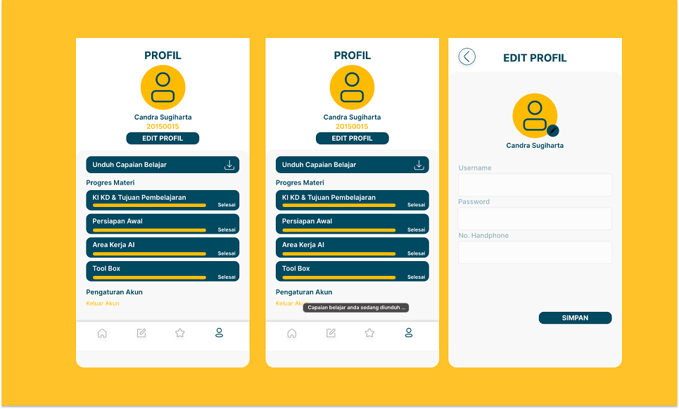
A physical prototype might use inexpensive materials to test shape or reach. A digital prototype might connect drawn screens to test navigation without a working server. A coded proof of concept can investigate a technical constraint. These models serve different purposes, and none is automatically production-ready because it looks convincing.
1.2 Why is it necessary?
Prototyping makes an uncertain design decision concrete enough to examine. Instead of asking whether a booking page looks good, you can observe whether someone notices the appointment duration, chooses a suitable time, and understands when the booking becomes final.
Testing an early model can reveal problems while the design is still inexpensive to change. Later prototypes can explore finer details, but usability testing is not a single final checkpoint. The implemented product still needs its own accessibility, performance, security, and functional testing.
Part 2. How to Make a Product Prototype
Use one continuous example: a person wants a 30-minute online consultation on Wednesday after 16:00. The design question is whether they can choose a suitable time and distinguish selecting it from confirming the booking. For this example, available times are 16:30 and 17:00 in the time zone displayed on the page.
First, create your rough sketches and outlines.
Draw a service summary, a date-and-time selection screen, a review screen, and a confirmation screen. Keep the service name, duration, time zone, and selected time consistent. You do not need a complete account area or payment flow to answer this question.
Second, build the primary path.
Place the information needed for each decision before the action that commits it. Label the step after time selection “Review booking” and the final action “Confirm booking.” This gives you a specific distinction to evaluate. Use wireframes while you are still deciding the structure; add realistic type, color, and spacing when their effect matters.
Third, add one meaningful alternate path.
Include a screen where 16:30 becomes unavailable before confirmation. Keep the selected service and date, explain that no booking was created, and offer 17:00 as another choice. This tests whether someone can recover without starting over. The prototype shows the planned behavior; it does not check a live schedule.
Fourth, ask someone to complete the task.
Give the situation, not the button sequence: “You want a half-hour online consultation on Wednesday. You are free after 16:00. Book a suitable time.” Observe where the participant hesitates, what they expect after choosing a time, and when they believe the booking is complete. Do not tell them to press “Review booking,” because discovering that action is part of the task.
Finally, revise the decision that caused the problem.
If the participant stops after selecting 16:30, inspect the selection feedback, button label, and confirmation step. Changing all three at once can make the next observation harder to interpret. Revise the most likely cause, repeat the same task, and compare what the participant does. Keep observations separate from explanations you have not yet confirmed.
Make the prototype answer one decision
A useful prototype has a clear boundary. Choose what you need to learn, then build enough of the experience to make that judgment possible.
| Decision | Minimum path | Evidence to collect |
|---|---|---|
| Can people finish the booking? | Service, time selection, review, confirmation | Hesitations, wrong turns, and the point at which they believe they are finished |
| Is the unavailable-time message understandable? | Chosen time becomes unavailable, alternative time, confirmation | Whether they understand that no booking exists and can continue without re-entering the service |
| Can the team implement the agreed behavior? | Approved states, preserved information, and recovery routes | Availability rules, server responses, accessibility requirements, and open engineering questions |
Keep secondary screens out until they answer a question the existing path cannot answer. A short complete scenario is more useful than a large click-through with dead ends.
Part 3. Build and Share the Booking Prototype in Pixso
Create a frame for each booking screen in a Pixso design file. Reuse the service card and main button so the labels and spacing remain consistent. Start with simple shapes and text; an attractive illustration is not necessary to find out whether people understand the booking sequence.
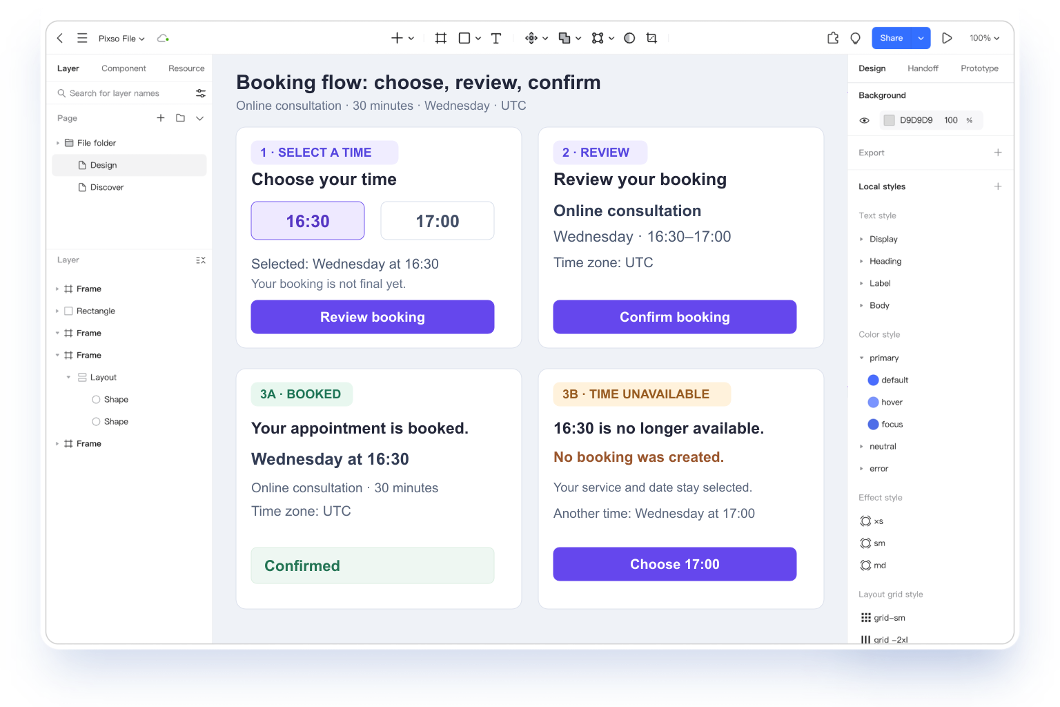
- Connect the primary actions. In the prototype settings, connect the service action to time selection, the review action to the summary, and confirmation to the completed screen. Include a way back to change the chosen time.
- Prepare the alternate scenario. Connect a separate branch to the unavailable-time screen. Use the same service and date so the change in availability is the only new condition.
- Play the flow from its starting frame. Follow every action you expect a participant to use, including returning to time selection. A connection drawn on the canvas is not enough to show that the whole path is reachable.
- Share the intended starting point. Set the file or prototype access needed by the reviewer. Put the task and the specific question beside the link, then collect comments at the screen where the problem occurs.
Keep keyboard behavior, focus movement, and any server-dependent rules next to the relevant frame. A visual prototype can communicate these requirements, but it cannot establish that the finished application implements them correctly.
How many screens should a first prototype include?
Include the screens needed for the primary task and the alternate path that matters most. The booking example uses four main screens plus an unavailable-time state. That is enough to evaluate its question; a different task may need fewer or more. Add a screen when it contributes a decision, not to make the prototype look complete.
Move forward when the next decision is clear
Use what you observe to decide whether to change the structure, refine the presentation, or move the agreed behavior into implementation. Keep the useful screens, record the unresolved questions, and test the next uncertainty. The value of a prototype comes from what it helps the team learn and change.