Scott
For a long time, fintech teams basically had to pick a side. Lock everything down and watch users bail during onboarding. Smooth out every step and quietly hope nothing goes wrong. Neither worked particularly well, and both missed the actual point. The fintech app design work that holds up today doesn't try to balance security against UX, it treats them as the same problem. This guide covers how that plays out in practice, from authentication logic to copy decisions to the tools that make it all manageable.
Part 1. Where Fintech teams usually get stuck
The tension in fintech ui design is less about technology than it is about perception. Users want to feel like their money is safe. They also want to check their balance in two taps. These aren't mutually exclusive, but they're easy to design as if they are.
One common trap is security theater, slapping padlocks on screens, burying users in consent checkboxes, requiring re-authentication for actions that carry almost no real risk. It looks thorough. It drives abandonment. The other trap is the opposite: shaving friction so aggressively that the app starts to feel weirdly casual about money, which quietly erodes the confidence users need before they'll do anything meaningful in it.
What both approaches have in common is that they treat security as a separate layer sitting on top of the product. When it's bolted on, it feels bolted on, to designers and to users. Getting it right means designing security into the experience from the start, not adding it afterward.
Part 2. How Pixso fits into Fintech design work
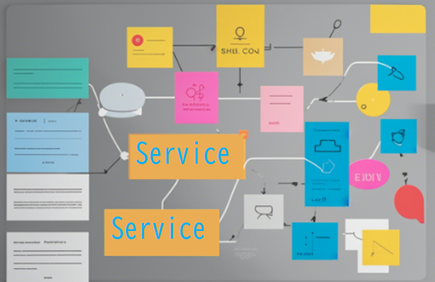
This is probably a good place to mention Pixso, because the practical side of fintech app design, managing component states, keeping security patterns consistent, handing off specs to engineering without losing information, gets complicated fast, and the tool you're working in matters more than people usually admit.
Pixso is a collaborative UI design platform, and it's built for the kind of complexity that financial products actually involve. Multiple security states, biometric prompt variants, dark and light mode components, platform-specific layouts, accessibility requirements that need to be baked in rather than checked at the end, Pixso handles all of this without the usual version-control headaches.
Pixso AI is worth calling out specifically. It can generate component variants, propose layout structures, and move a rough concept to a testable prototype faster than traditional design workflows allow. For fintech teams working against tight shipping timelines, that acceleration shows up in real ways, earlier user testing, more iteration cycles, fewer design decisions made by default because there wasn't time to explore alternatives.
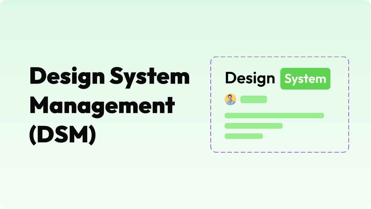
The component library structure in Pixso is also well-suited to fintech work. Security badges, consent modals, biometric prompts, transaction status screens, these can all be built as tokenized, standardized components that stay consistent wherever they appear. When a compliance requirement changes (and in fintech, it will), you update the component once. It propagates automatically. Nobody has to hunt through forty screens to find every instance.
Dark and light mode support works at the token level, not as a post-hoc color swap, which matters when you're trying to make financial data readable across different contexts and user preferences. Auto-layout and responsive frames translate directly to engineering specs, closing a lot of the interpretation gap that usually eats time in handoff.
For teams trying to figure out how to design a fintech app with a small team and real deadlines, building around Pixso early means the design system can scale with the product rather than becoming technical debt.
Part 3. Making security visible—Without making it annoying
Here's something that gets underestimated in fintech app design best practices discussions: users don't experience security, they infer it. If the signals aren't there, they assume the security isn't either.
That doesn't mean every screen needs a badge or a disclaimer. It means putting the right signals in the right moments. Opening a new account is one of those moments, users are already primed to pay attention. Telling them clearly what's encrypted, what you're storing, and what you're not is valuable here in a way it wouldn't be mid-session. Before a large transfer goes through, a brief note that the recipient details look consistent with past transactions costs almost nothing and does genuine reassurance work.
The copy side of this is underrated. "Your data is protected with 256-bit AES encryption" communicates nothing useful to 95% of users. "Only you can see this, not our support team, not anyone at the company" communicates exactly what people actually want to know. Banking app ux that gets this right tends to use security language that answers the question users are actually asking, not the question engineers think they should be asking.
Transparency in process-heavy flows matters a lot too. KYC verification, identity confirmation, fraud review holds, these all create anxiety when they happen silently. Showing users where they are in the process, telling them when background checks are running, and giving them a visible transaction history they can actually audit turns opaque processes into something that feels managed rather than mysterious.
Part 4. Matching security intensity to actual risk
Checking a balance and wiring money to a new recipient are not the same action. Banking app ux that treats them identically, same authentication overhead, same friction level, is solving the wrong problem in both directions.
Risk-adaptive authentication is the practical answer. Low-stakes, routine actions get silent background verification: device fingerprinting, behavioral consistency, location signals. The user does nothing. High-stakes actions, large transfers, adding a new payee, changing account settings, trigger explicit step-up authentication. The user confirms with biometrics or a secondary factor, and they understand why.
Biometrics should be the default for step-up wherever the platform supports it. Not because Face ID is cryptographically superior to a good password in every scenario, but because it's faster, it's familiar, and users subjectively experience it as more secure. That subjective experience matters a lot for whether people actually use an app for significant transactions.
The design detail that often gets missed here is the prompt itself. A step-up request that appears without context just feels like an error. One that says "This is larger than your usual transfers, please confirm with Face ID" lands completely differently. Users who understand why they're being asked to verify don't experience it as friction. They experience it as the app paying attention.
Part 5. Onboarding, transactions, and where friction actually costs you
The fintech app design best practices around onboarding have shifted pretty significantly in the last few years. The old approach, collect everything upfront, verify it all before letting the user do anything, produces measurable abandonment and doesn't actually serve compliance goals better than a staged approach.
Progressive KYC spreads verification across the first several sessions, collecting what's needed for each feature tier rather than front-loading everything. A user can see their account balance and receive transfers before they've completed full identity verification. Additional features unlock as verification progresses. This structure gets users to their first moment of value faster, which is the single strongest predictor of whether they'll complete the full onboarding flow.
Transaction flows are another area where every additional screen needs justification. The core payment experience should be: pick a recipient, confirm the amount, authenticate, done. That's it. Smart defaults saved payees, remembered amounts, preferred currencies, reduce the number of inputs required on repeat transactions. Progress indicators and clear error messages with specific recovery paths matter more in payment flows than almost anywhere else in the product, because the stakes feel higher and user anxiety is already elevated.
On permissions: context is everything. A location access request that fires when the app opens cold gets denied by most users. The same request attached to an obvious, immediate benefit, "allow location to find nearby ATMs", gets accepted. Fintech ui design that sequences permission requests to moments of apparent relevance consistently outperforms apps that batch permissions at launch.
Part 6. Privacy controls that feel real, not performative
GDPR, CCPA, PSD2, and whatever comes next set a legal minimum. Treating them as a ceiling is a mistake, both for user trust and for the long-term defensibility of the product.
The UX opportunity in privacy isn't compliance documentation, it's giving users actual visibility into what you're storing and why. A data dashboard where someone can see their stored information, download it, or delete it sounds like a feature nobody uses. And most users don't. But knowing it exists changes how they feel about the product in a way that shows up in retention data.
Data minimization also has a UX dimension that often goes unconsidered. When users are asked for information they can't explain the need for, they hesitate. When the app asks for only what's obviously necessary, and explains why in plain language, the permission grant rate goes up. Less data collection, handled more transparently, tends to produce better outcomes than more data collection buried in a privacy policy.
This is somewhere Pixso's component approach genuinely helps. Consent flows and permission management screens built as standardized components stay consistent across the product and can be updated in one place when regulations shift, which in financial services, they will.
Part 7. Design systems and accessibility: The unglamorous work that ships products
Fintech ui design at scale runs on a design system. Without one, authentication components drift between screens, dark mode implementation becomes inconsistent, and every new designer on the team has to rediscover decisions that should already be codified.
A fintech design system that's actually useful covers the unglamorous stuff: authentication states (locked, pending, error, success), biometric prompt patterns, alert hierarchies, transaction status indicators, and consent modal variants. Each component should carry its accessibility requirements built in, ARIA roles, minimum touch target sizes, contrast ratios for both modes, not as a separate QA pass but as part of the component definition.
WCAG 2.1 AA compliance is genuinely non-negotiable in financial products. People with visual impairments, motor difficulties, or cognitive differences use banking apps regularly, often as their primary way of managing money. "Something went wrong" is not an error message. Form fields with placeholder text but no visible label are not accessible. These aren't edge cases, they're failures that affect real users.
Pixso's design token system makes maintaining compliance across a growing library significantly more tractable. Checking contrast ratios at the token level and propagating changes consistently is a different experience from hunting through component files manually after a brand color update.
Conclusion
The fintech apps that earn genuine user loyalty aren't the ones that made the boldest security promises or the smoothest onboarding flow in isolation. They're the ones where security is built so deeply into the experience that users feel it without thinking about it. Every decision in this guide, from copy tone to authentication logic to component architecture, is ultimately in service of that goal. Pixso makes the execution more manageable. The strategy has to come from understanding what users actually need when they open a financial app: to feel like someone thought about them.