Scott
Design tokens are becoming the foundation of modern design systems. By turning design decisions into reusable variables, they help teams maintain consistency, accelerate workflows, and easily adapt to different themes and platforms.
I. What are tokens?
Introduction to tokens
Design tokens are name and value pairings that represent repeatable design decisions.
Purpose:
Streamline workflows, boost design velocity, maintain consistency, enhance collaboration, build adaptable interactive designs and ultimately scaling design quality.
Key Advantages:
- Dynamic Reuse: Assign various design properties like colors, numbers, text, boolean.
- Theme Switching: Instantly switch between design themes.
- Automatic Updates: Automatically updates all uses of a design token, saving time and simplifying design system management.
Note: Tokens in Pixso are currently in Beta. Data compatibility risks may exist. We recommend limiting widespread use until we've further refined this feature. Thank you for your understanding.
Use Cases
Use cases for tokens:
• Switching between light and dark modes, or other themes
• Switching between different layouts
• Switching languages
• Applying tokens in typography
This file will focus primarily on the design use cases, but tokens will also be used to create more dynamic prototypes in the future.
II. Start with a collection
Token collections
A collection is a set of related tokens, such as primitive or semantic colors, or spacing values from your design system.
Collections may contain a single or multiple token types: color, number, text, or boolean.
Where to begin
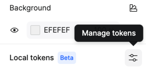
Deselect everything on the canvas by pressing esc or clicking on the canvas.
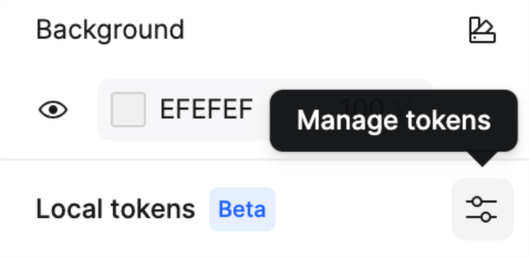
Find the Local tokens section in the right sidebar and click the settings icon to open the tokens modal.
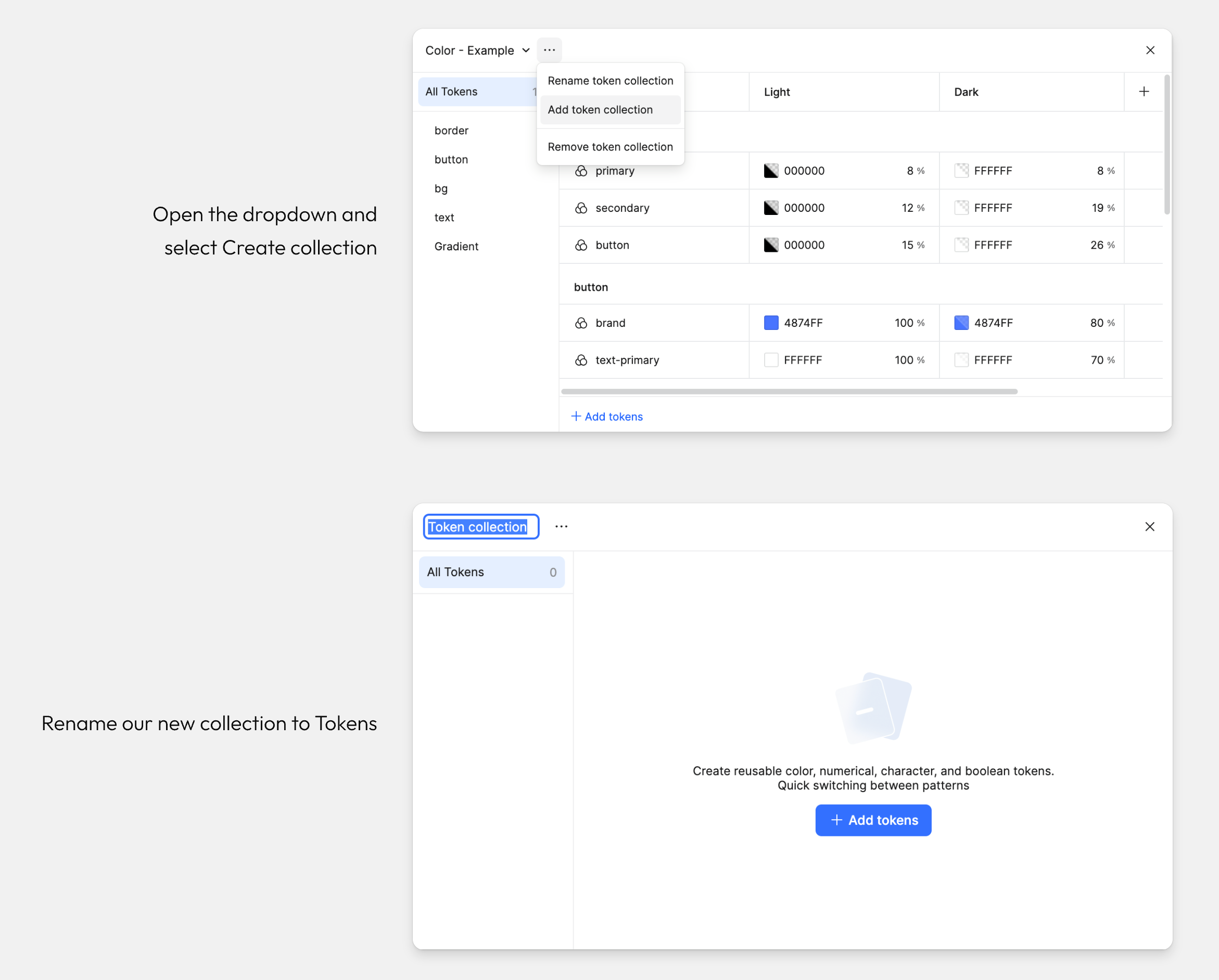
Create a new Collection
Let's create some new tokens.
Deselect everything on the canvas by pressing ESC or clicking on the canvas and open tokens mode from the right panel.
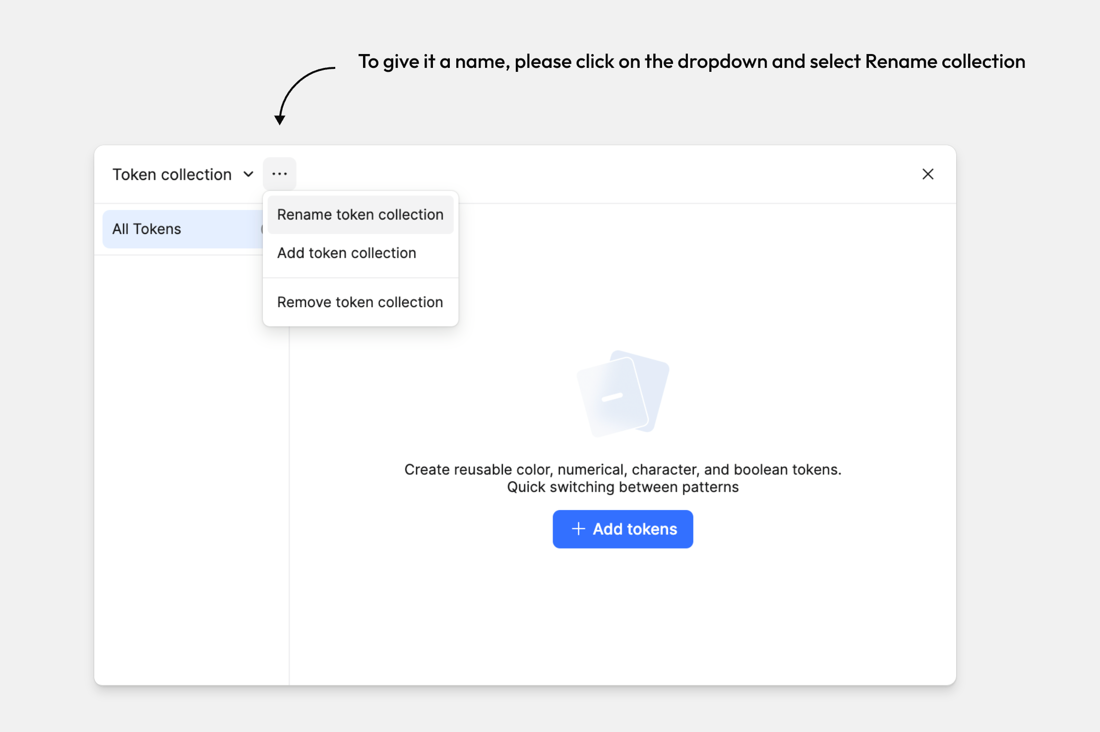
Open the dropdown from the More button next to the current collection name, then select Create Collection.
Let's name our new collection Tokens.
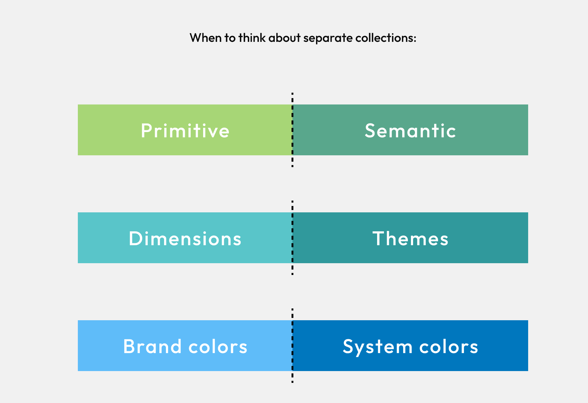
When to create a new collection
We can create asmany token collections as we like. When to create separate collections can depend on the needs of your system, such as:
To distinguish between primitive tokens and semantic tokens
To separate dimensions and themes
To differentiate between a set of brand colors and system colors
III. Token types
Introduction to token types
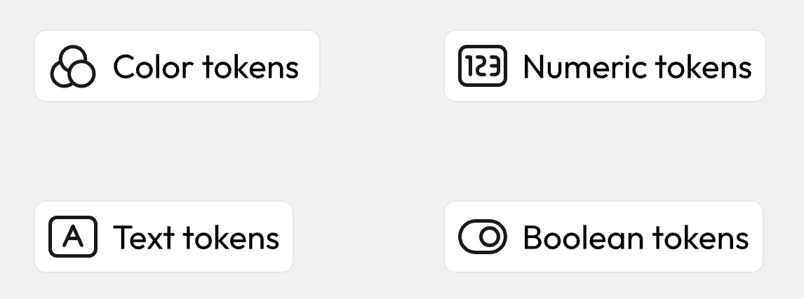
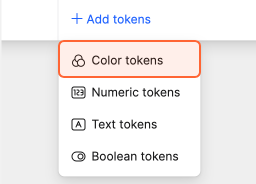
You can create four types of tokens: Click the Add tokens button in the Token Mode, then select a token type:
Color tokens
Numeric tokens
Text tokens
Boolean tokens
Tokens can be applied to different layers and objects using fields, which we'll cover later in this file.
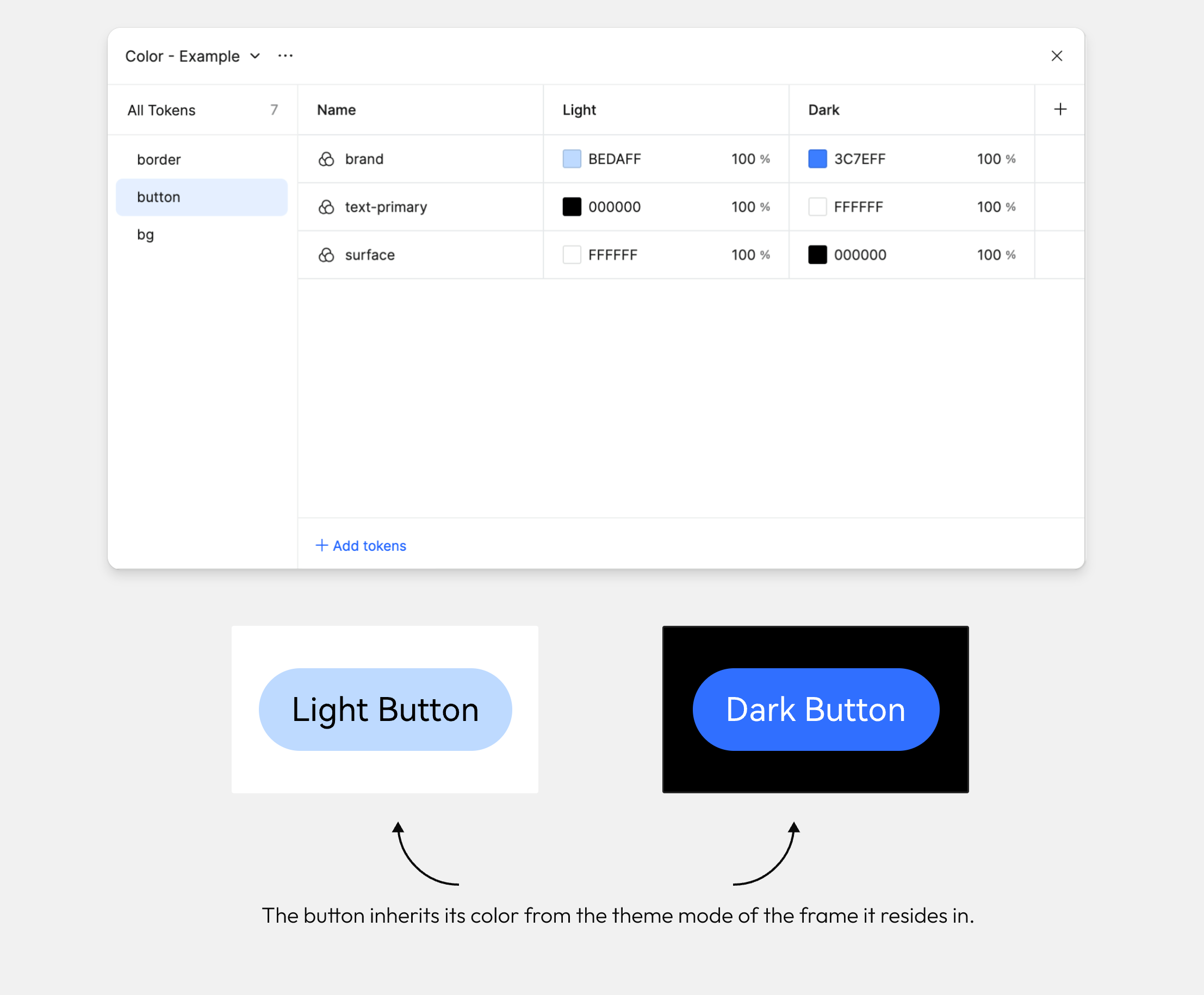
Color tokens
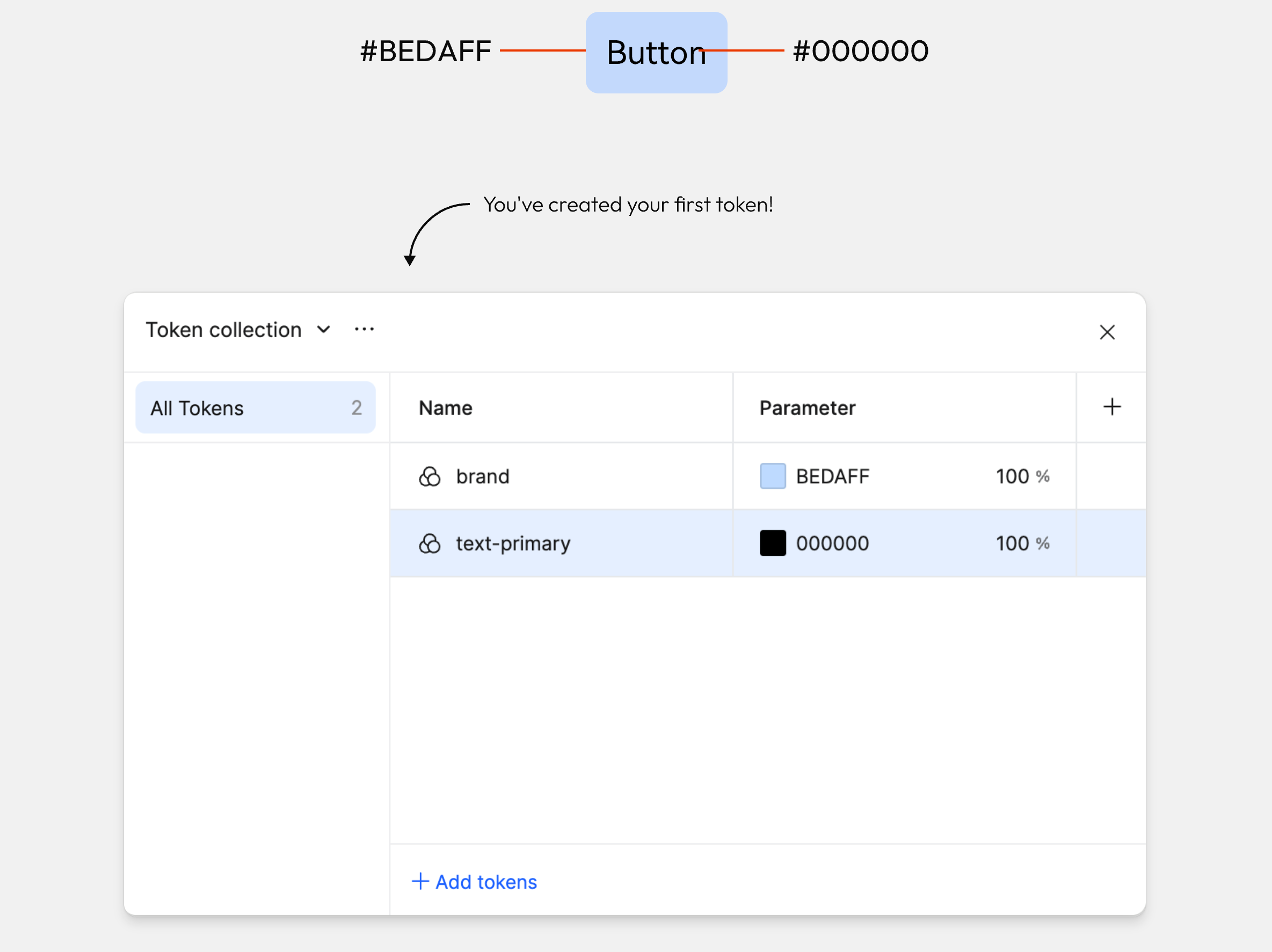
Color tokens can be applied to the solid fill or stroke of an object. Let's create our first token for the background color of this button.
With the tokens panel opened, click Add tokens and select color.
Change the name of your token to brand and the value to #BEDAFF.
Create another token for the text and stroke of the button.
Numeric tokens
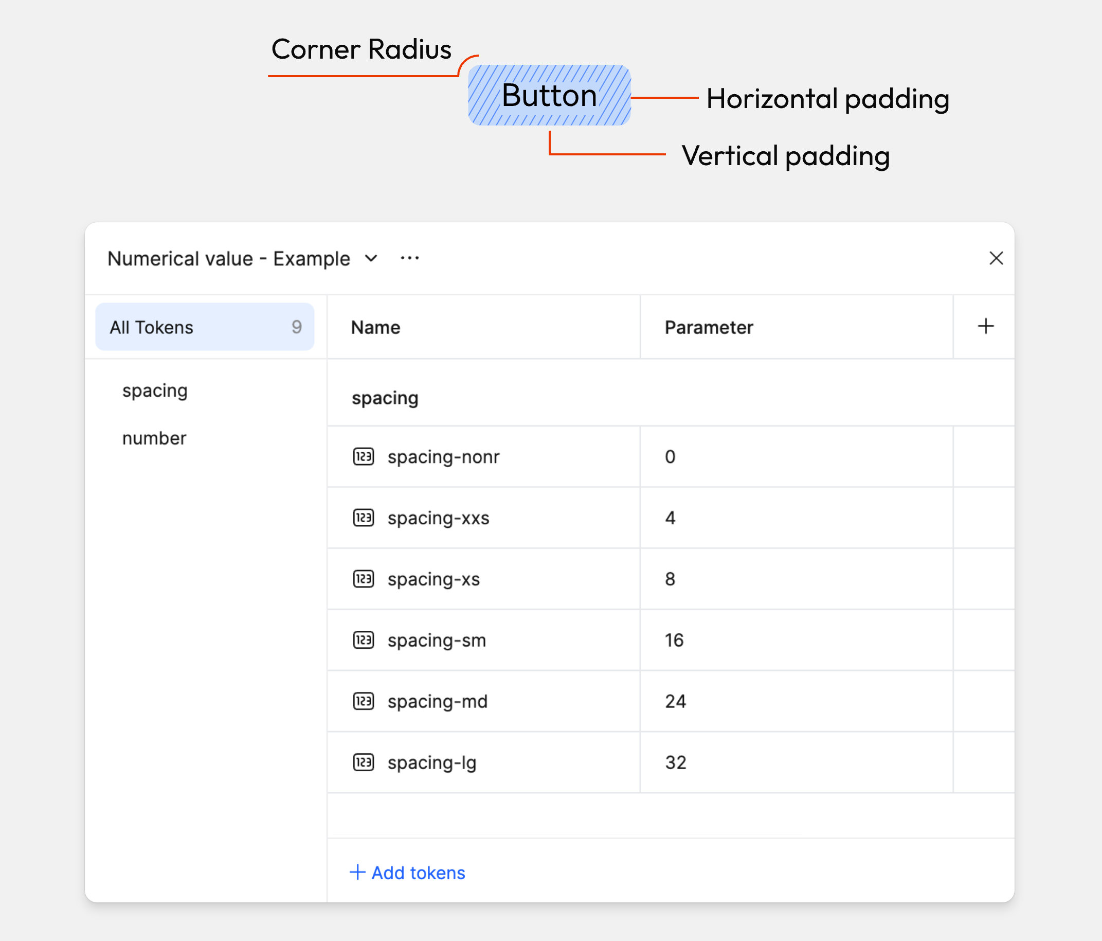
Numeric tokens can be used to define dimensions such as width and height, spacing, padding, and radius.
Let's create tokens needed for the button's padding and radius. Numeric tokens are created the same way as colors.
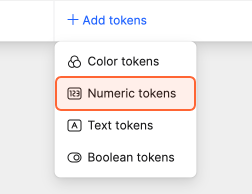
Click Add tokens and select number from the dropdown.
Update the tokens name and value.
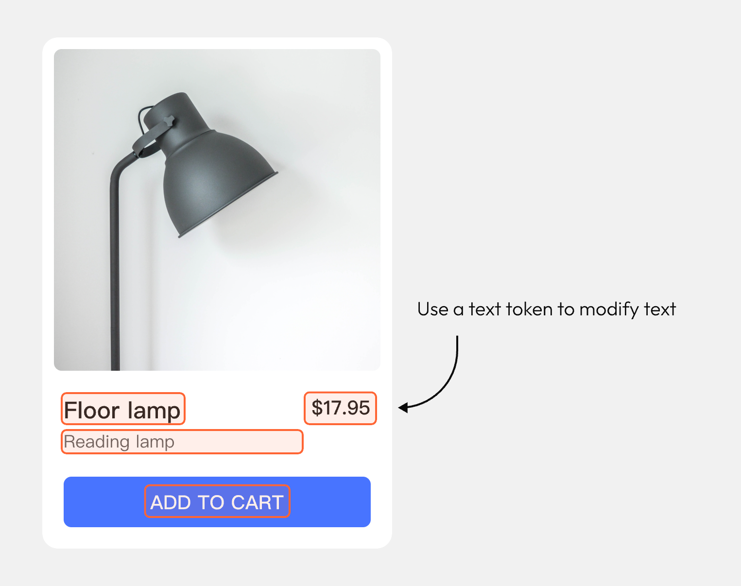
Text tokens
Text tokens can be applied to text layers and using text tokens can be helpful for repeated content and localization.
Click Add tokens and select Text tokens from the dropdown.
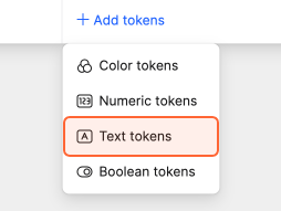
Update the tokens name and value.
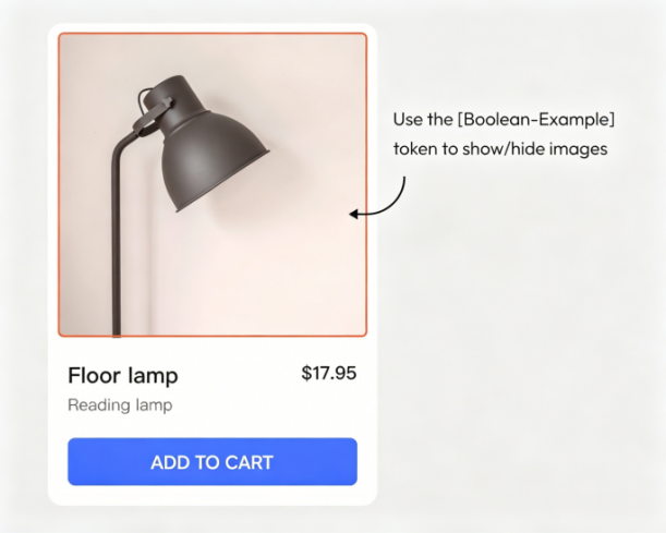
Boolean tokens
Boolean tokens are used to switch layer visibility.
Click Add tokens and select Boolean tokens from the dropdown.
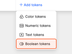
Update the token name and value.
Alias a Value
When defining tokens, you can create custom values or choose tokens from existing libraries. The latter is also called aliasing a value.
If multiple tokens use the same color and the color needs updating, we only need to update the source instead of manually updating every instance of this color.
To alias a value, click the fill box, open the panel, and switch to the Tokens tab.
You can pick from collections that are local to the file or from published libraries that are enabled.
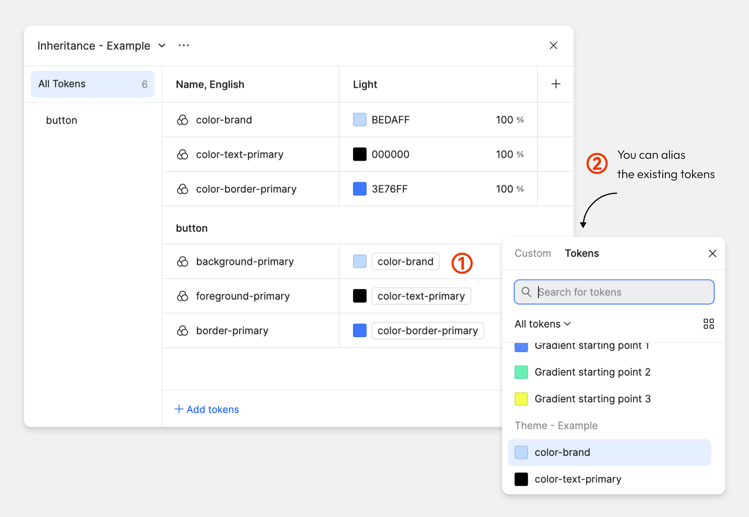
Make an alias of a color token
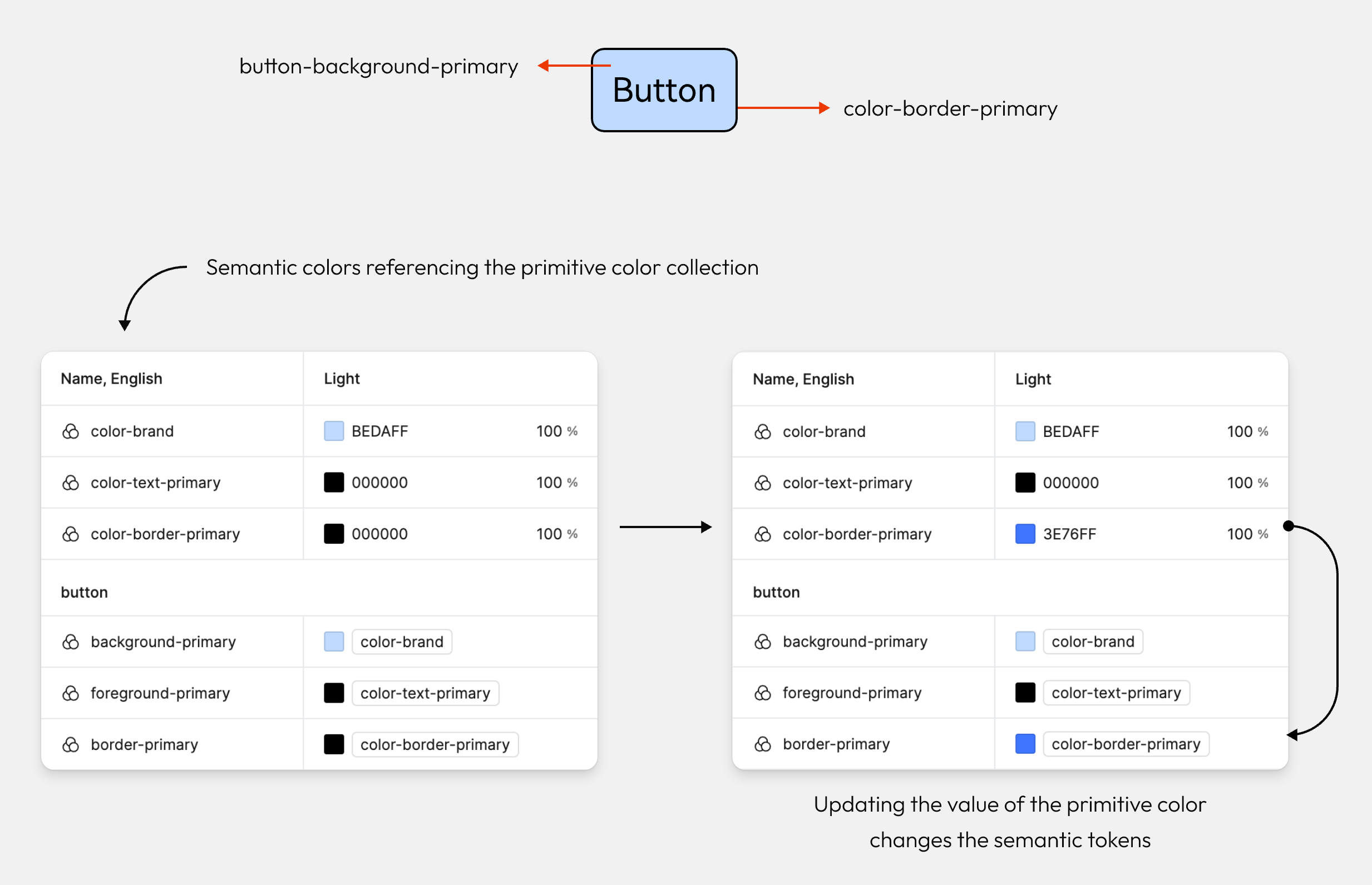
Let's use aliasing to create semantic colors.
Create a new color token, give it a semantic name like button-background-primary and alias our primitive tokens color-brand.
Repeat that for the border and text colors of the button.
Change the value of a primitive token to see how the semantic token automatically adjusts.
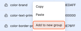
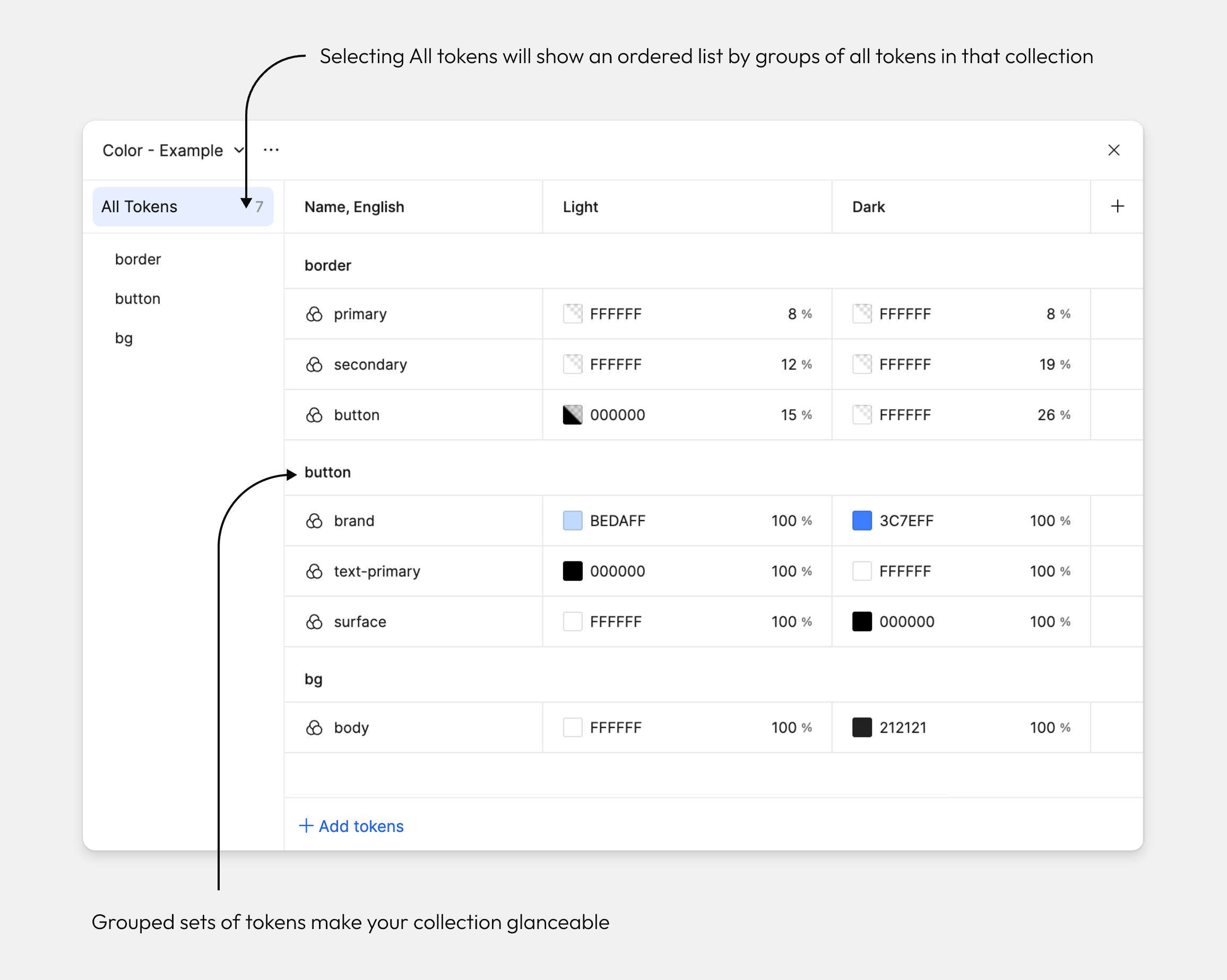
Groups
Keep multiple sets of tokens inside a collection neat and tidy by grouping them together.
Select a token by clicking anywhere in that row.
While pressing CMD (Mac) or Ctrl (Windows), select the tokens you would like to group. You can also press and hold the Shift key to select a range.
Right-click your selection and select New group with selection from the dropdown.
IV. Edit tokens
Scope of token application
You can set recommendations for which tokens can be applied to which properties to enable precise and efficient token application.
Hover over a color token or numeric token and press the settings icon.
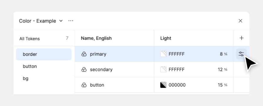
Switch to the Scoping tab at the top of the modal panel, then select the applicable property types in the list.
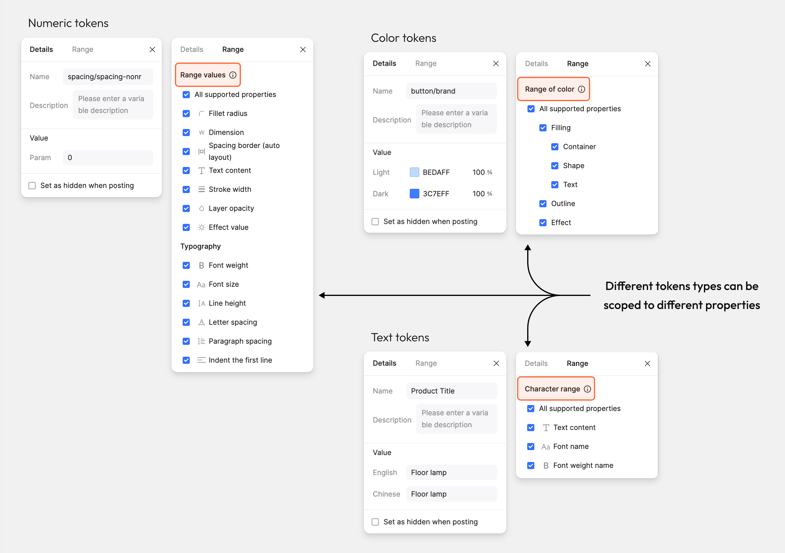
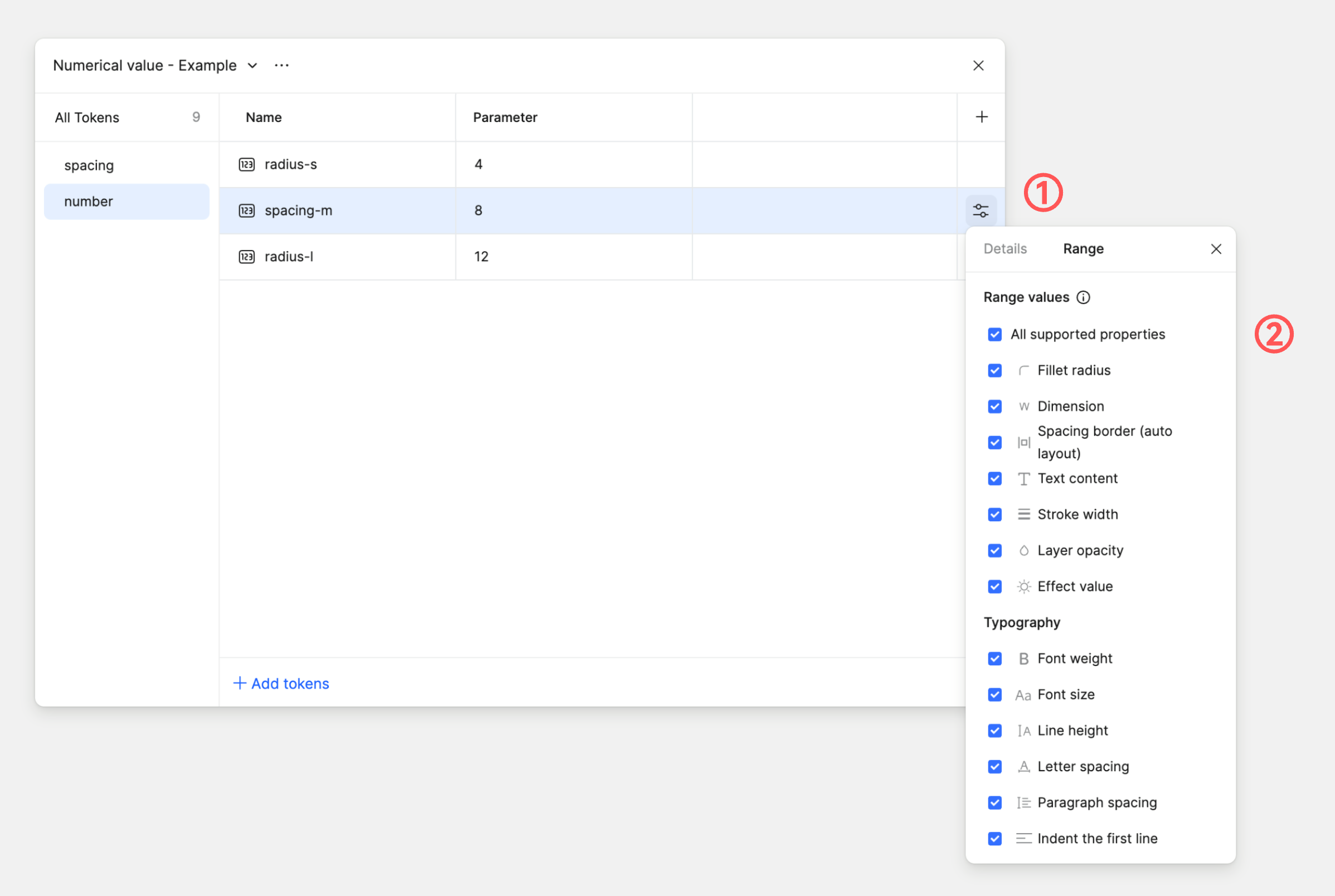
Scope of numeric tokens application
Let's scope the tokens you created for paddings and corner radius.
Hover over your radius token and click the settings icon.
Deselect Show in all properties and select only Corner radius.
Repeat these steps for your spacing tokens, selecting only Space Between (Auto layout) instead.
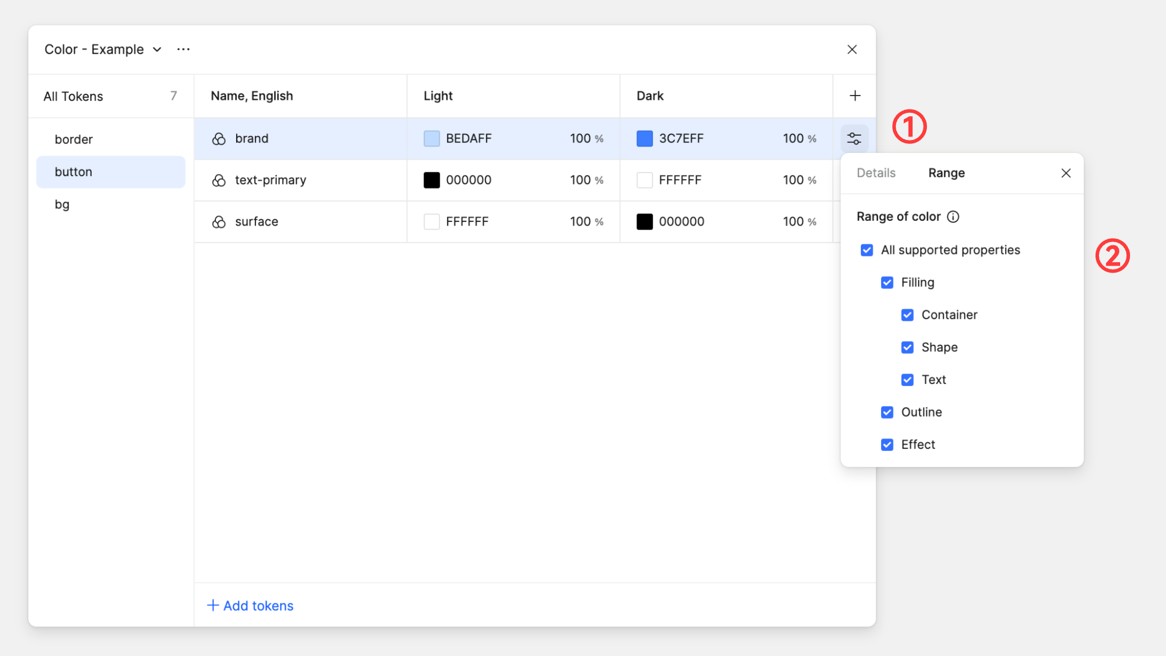
Scope of color tokens application
Scoping color tokens works the same way as numeric tokens.
Hover over a color token and click the settings icon.
Deselect Show in all properties and select only Stroke.
V. Add modes
Introduction to modes
Modes allow designs to change when used in different contexts.
Color tokens: used for switching between color themes, like light and dark.
Text tokens: used for switching between languages or content, like localizing language.
Numeric tokens: used for switching between spatial changes, like different device sizes.
Boolean tokens: used for switching between layer visibility, like to show a warning if a product is almost sold out.
Add a new mode
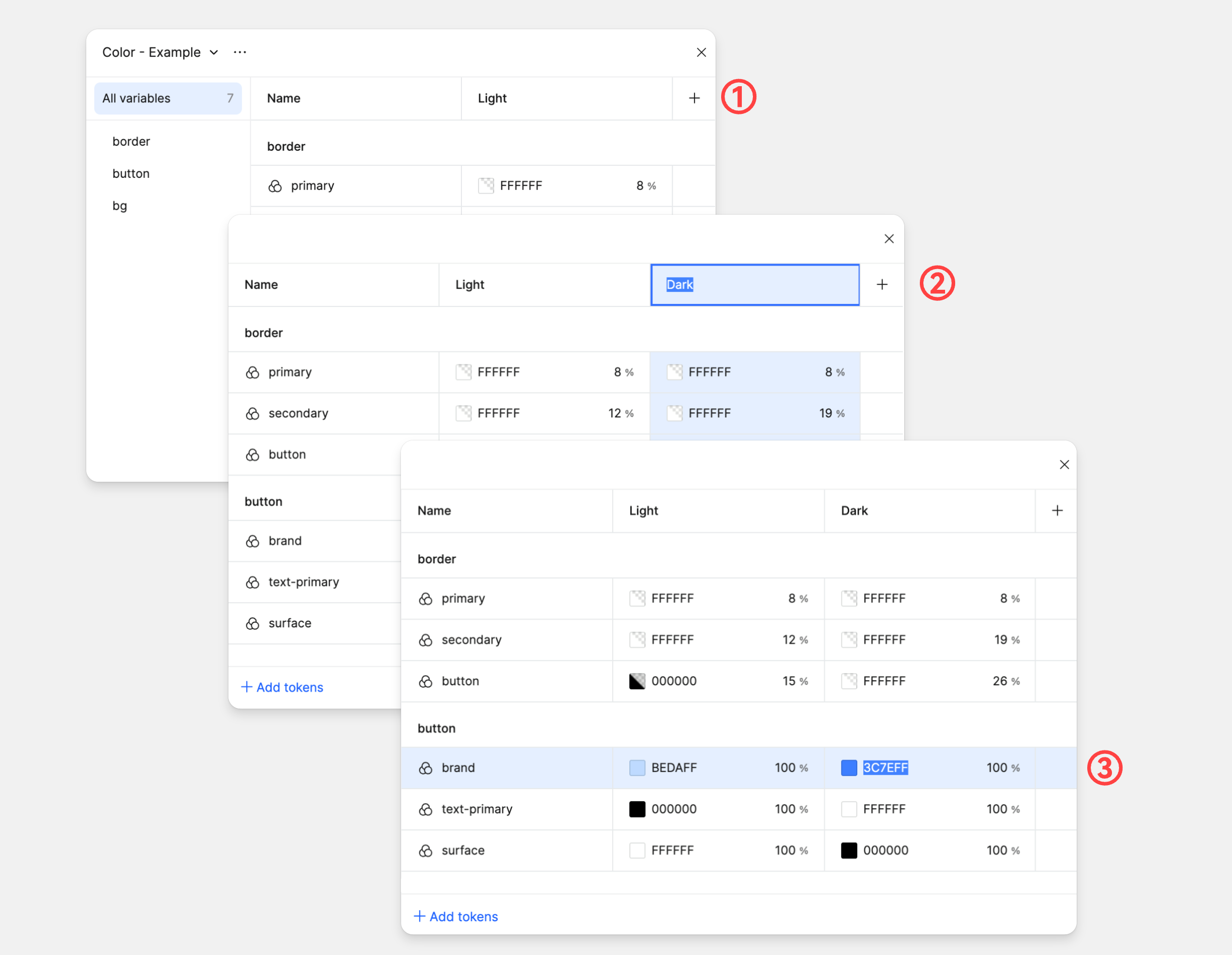
Let's go back to our tokens panel to set up light and dark modes using color tokens.
Click the + plus button in the column header. Pixso adds a new mode with initial values matching the first mode.
Let's rename the first column to Light and the second column to Dark.
Then, update dark mode values for the color-brand, color-text-primary and color-border-primary tokens.
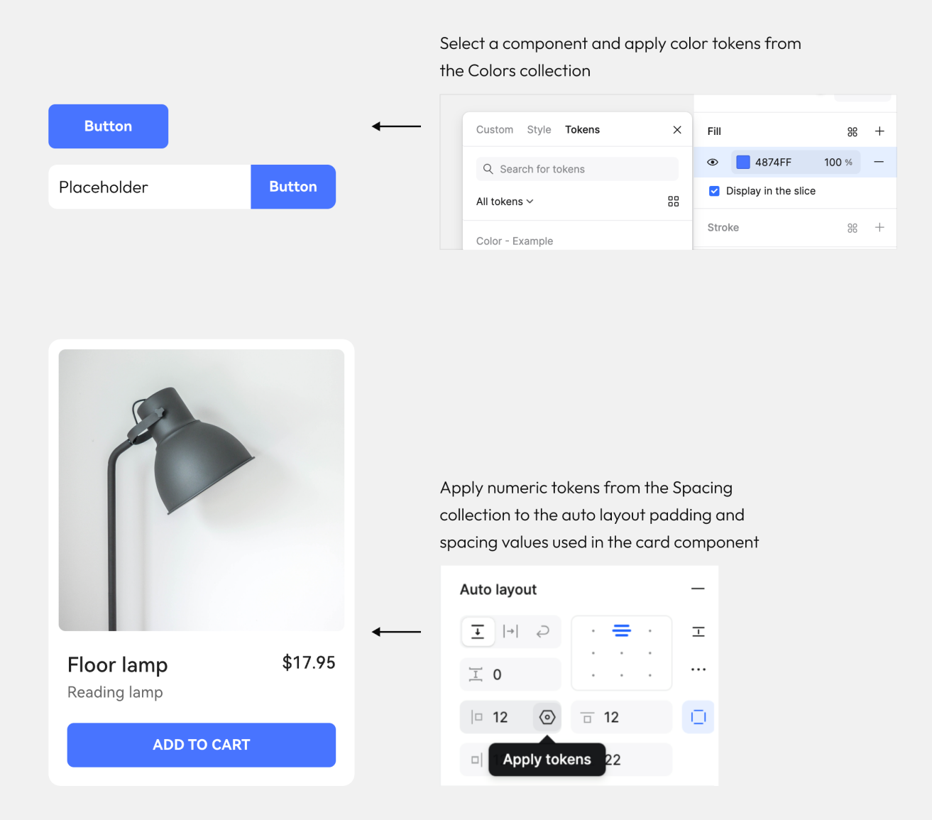
VI. Apply tokens
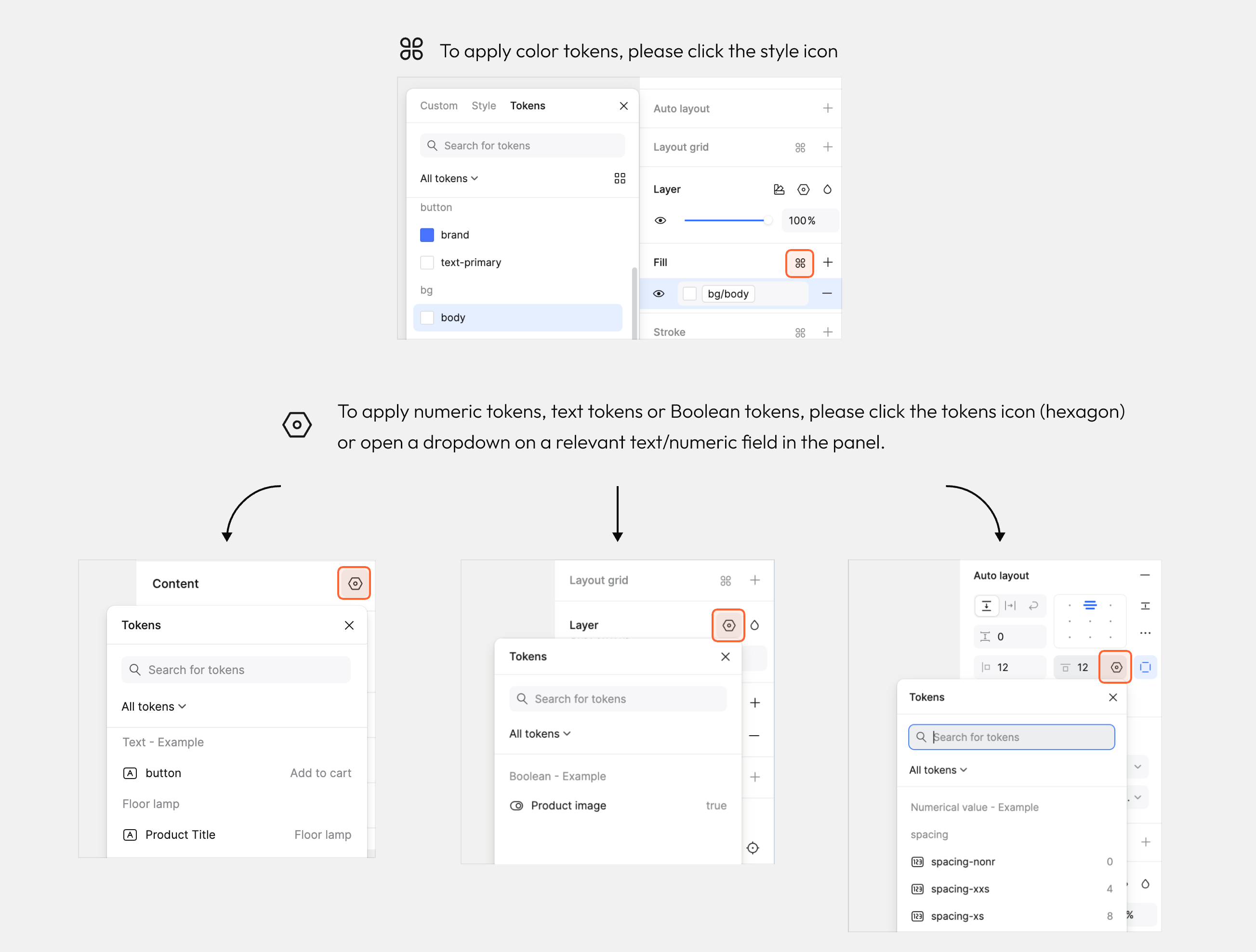
How to apply token types to objects
We can apply tokens by selecting layers or objects on the canvas and using the right sidebar.
Depending on what type of tokens you're using, it will be applied from different parts in the Design panel.
Tokens inside components
Let's build components with local tokens.
We'll use the 'Colors' and 'Spacing' token collections to shape these components.
Methods for applying tokens in text
You can bind text tokens either to text where you are managing content centrally, or you can apply text tokens to typographic elements such as font family and font weight.
Applying text tokens to selected text will affect its content.
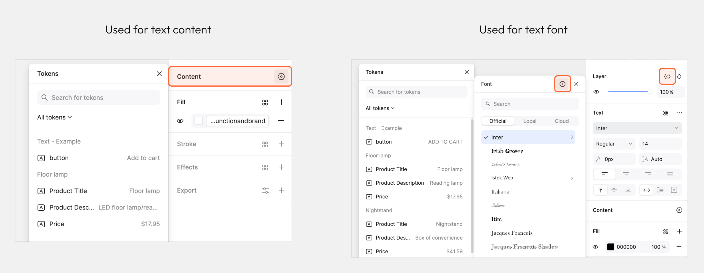
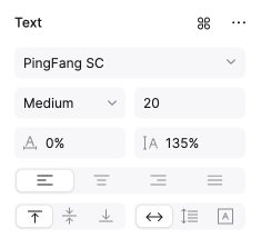
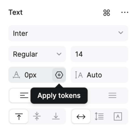
Tokens in Typography
Tokens for typography can combine both Text token and Numeric token types.
To the right is a table of all the values you can apply these in the Text panel, and what values are supported.
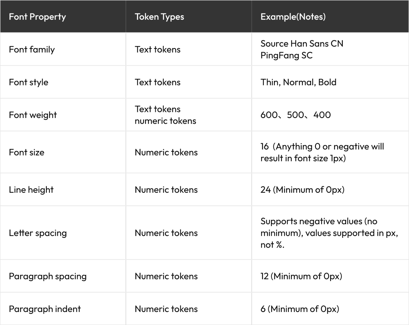
Tokens for Typography
You can bind a token to typographic properties within your design systems. Pixso supports the following properties:
1. Font family
2. Font size
3. Font style
4. Font weight
5. Line height
6. Letter spacing
7. Paragraph spacing
If you are applying a font weight alone you can use either a Text token or a Numeric token. If you
are applying a style and weight (e.g. Bold Italic), then use a Text token.
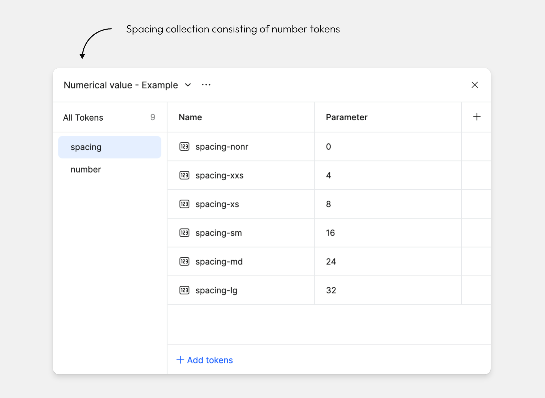
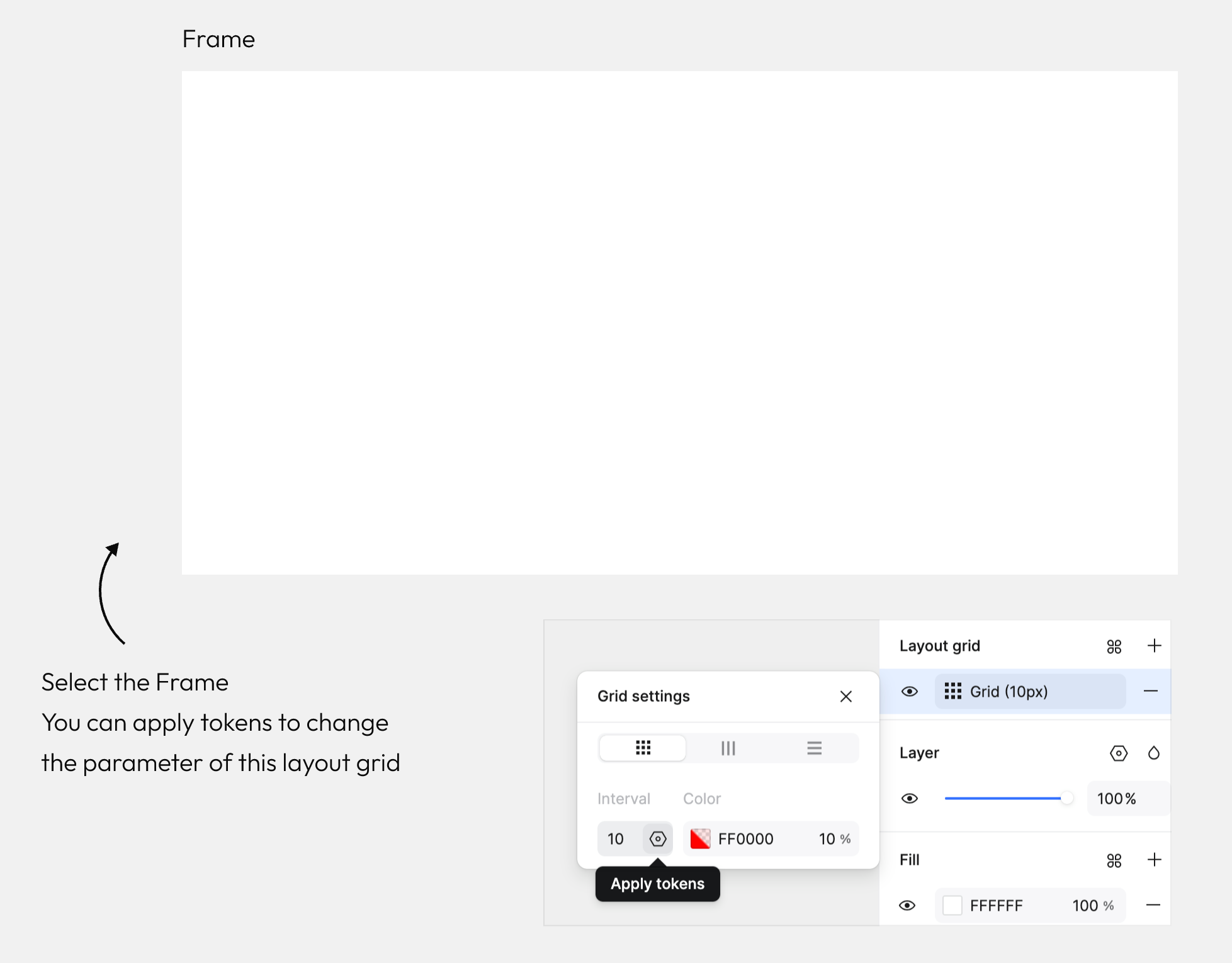
Tokens for Grid
We have set up a token collection titled [Grid - Example]. There are numeric tokens for:
- Grid amount
- Grid gap
- Column width
Tokens for Effects
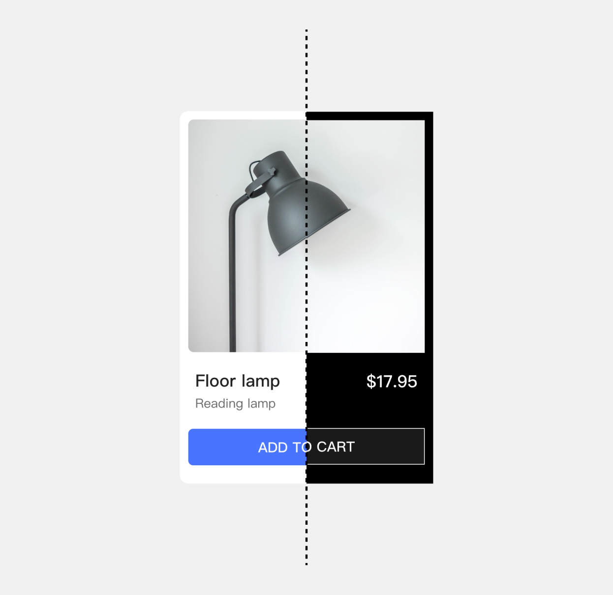
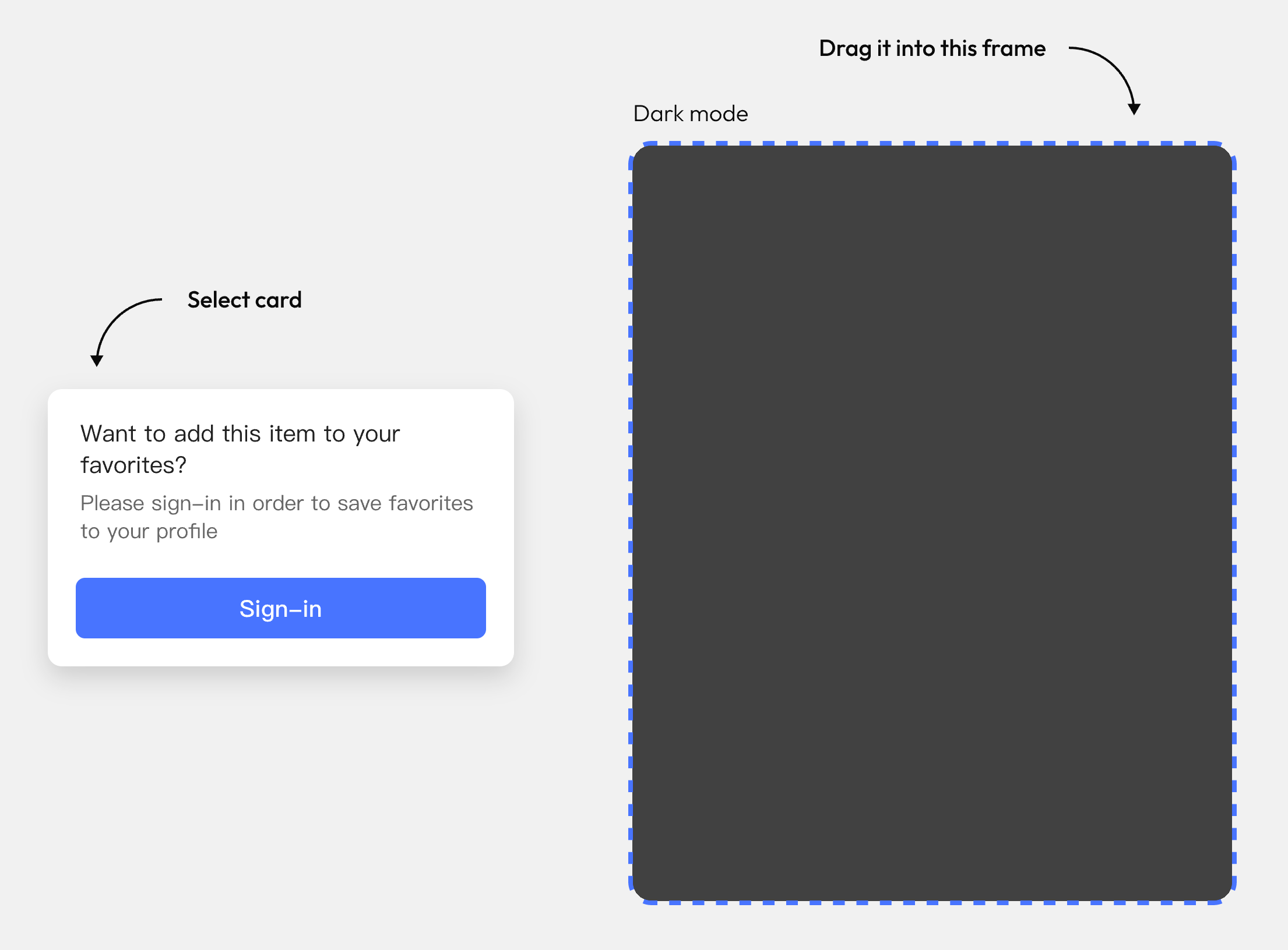
You can also apply tokens to effects. In this example we're going to bind some tokens to the values in a drop shadow.
Select the card and drag it into the adjacent frame.
You'll notice that the shadow disappears.
This is because these shadow parameter tokens have been bound to the effect styles and exist only in the light mode.
Tokens for Gradients
You can also bind color tokens to gradient stops.
Select the frame on the right and open the Fill.
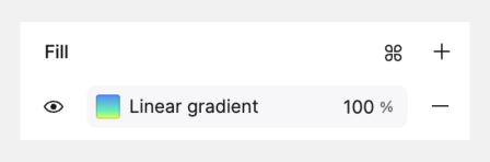
In the color settings panel, select the gradient start-point.
Switch to the "Tokens" tab from the color list, search "gradient" and select gradient-start.

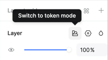
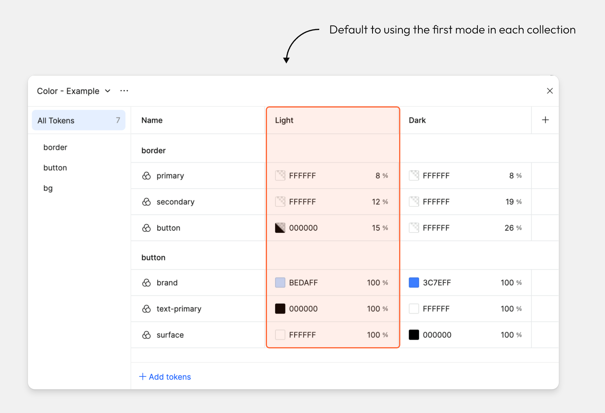
VII. Inherit and set modes
Modes are inherited by default
For designs using tokens, the mode will initially be set to Auto and default to using the first mode
in each collection.
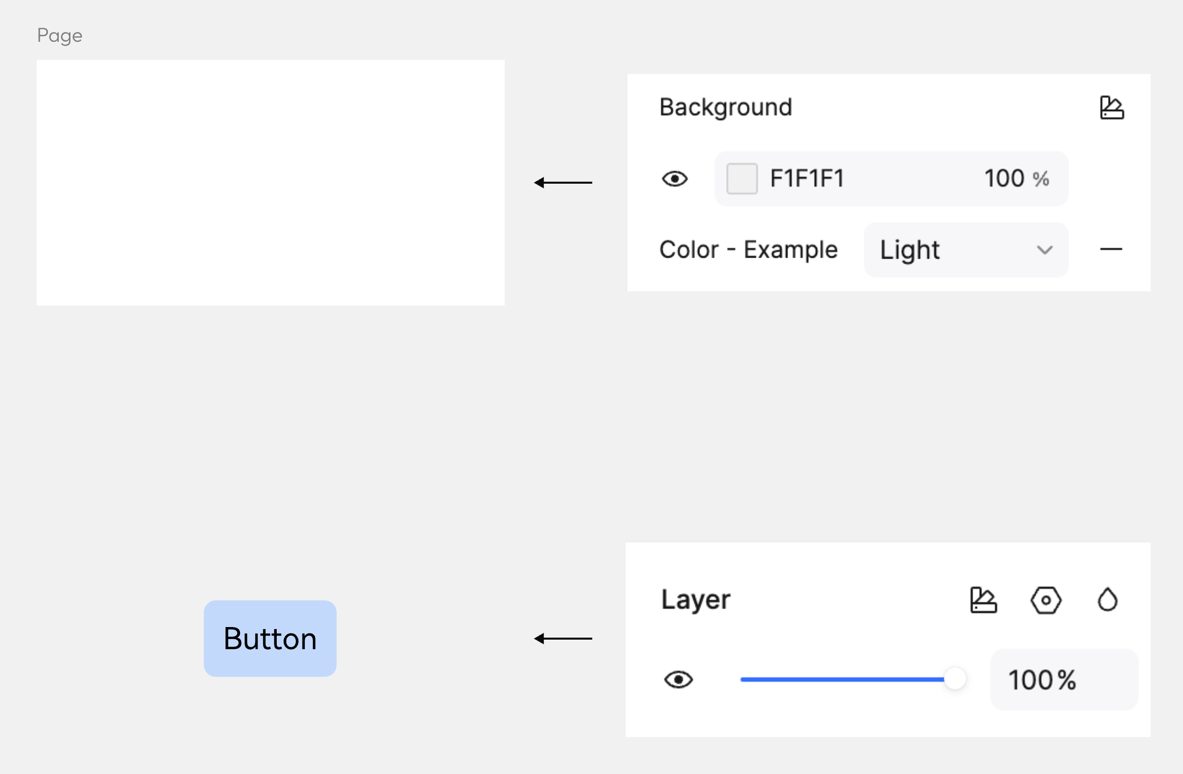
You can specify a mode by clicking the modes icon in the Page or Layer sections of the right sidebar.
Modes can be defined at multiple levels
You can select a specific mode to be used at the page or layer level.
For any object that has its mode set to Auto, it will inherit the mode setting from its parent.
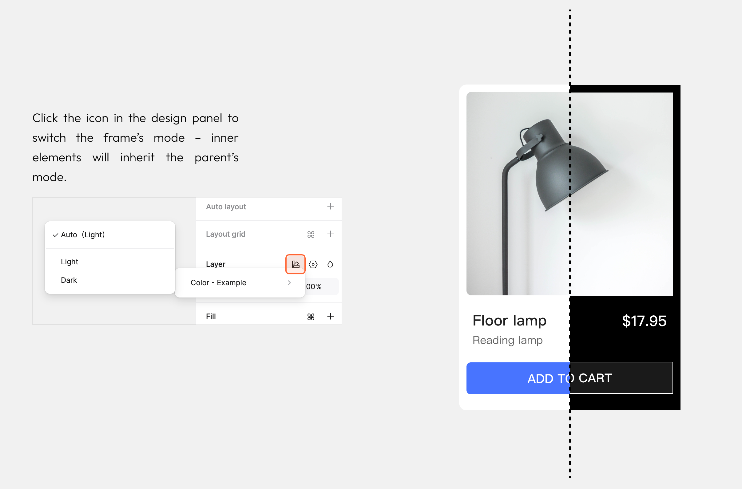
Inherit the mode from the frame
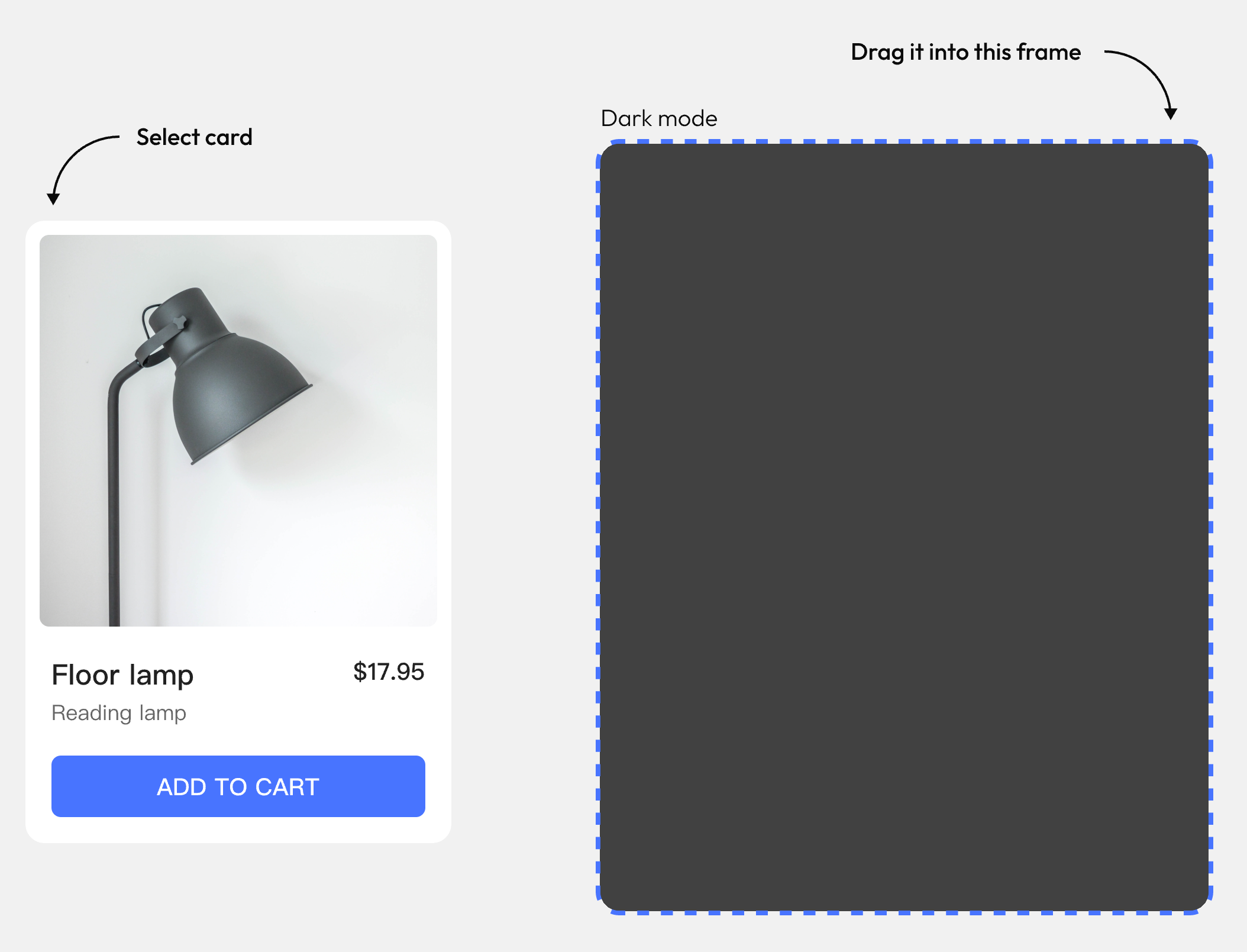
This card instance's mode is set to Auto, so it will inherit its parent's mode.
Drag the card instance into the dark mode frame to see it automatically adapt.
Set the mode on a parent frame
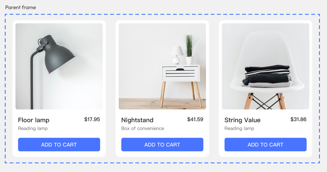
Let's switch the language in our product cards.
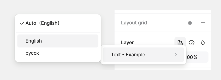
Select the parent frame of the product card and change the text mode from Auto to English or Russian.
Switch between frames with different modes
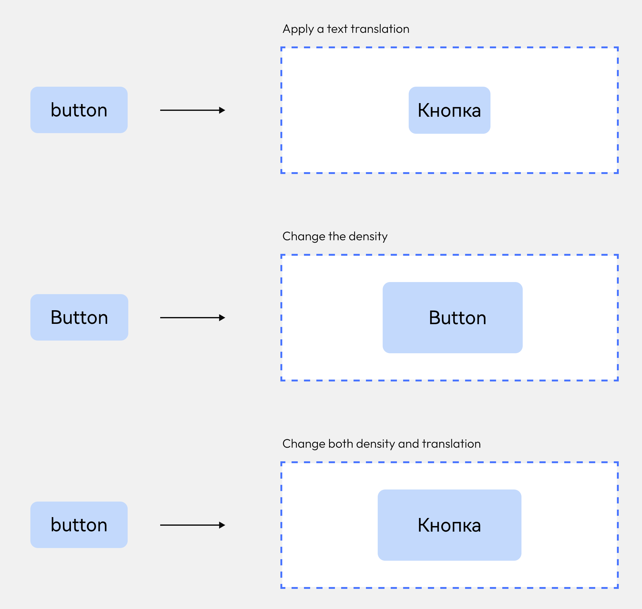
Let's see what happens when we drag an instance of our button component into different frames that have modes set.
VII. Cloud tokens
Publish cloud tokens
Similar to the library publishing workflow, local design tokens can be published to the cloud for easy sharing within the team.
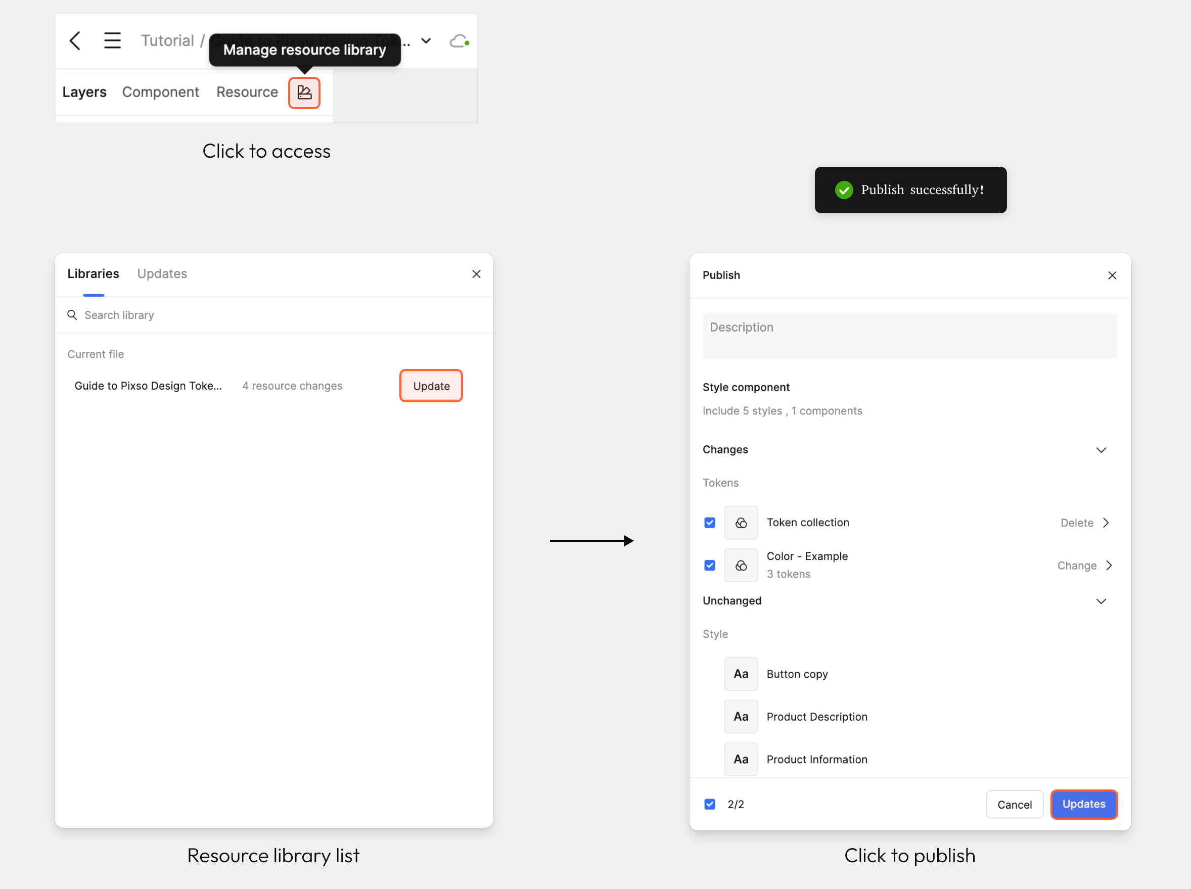
- Click the library managemen icon in the left sidebar to open the library list modal.
- Click the current file to view the modal displaying the list of tokens pending update.
- Click the Publish button. The library will start uploading, and a success Toast notification will appear once publishing is complete.
Using cloud tokens
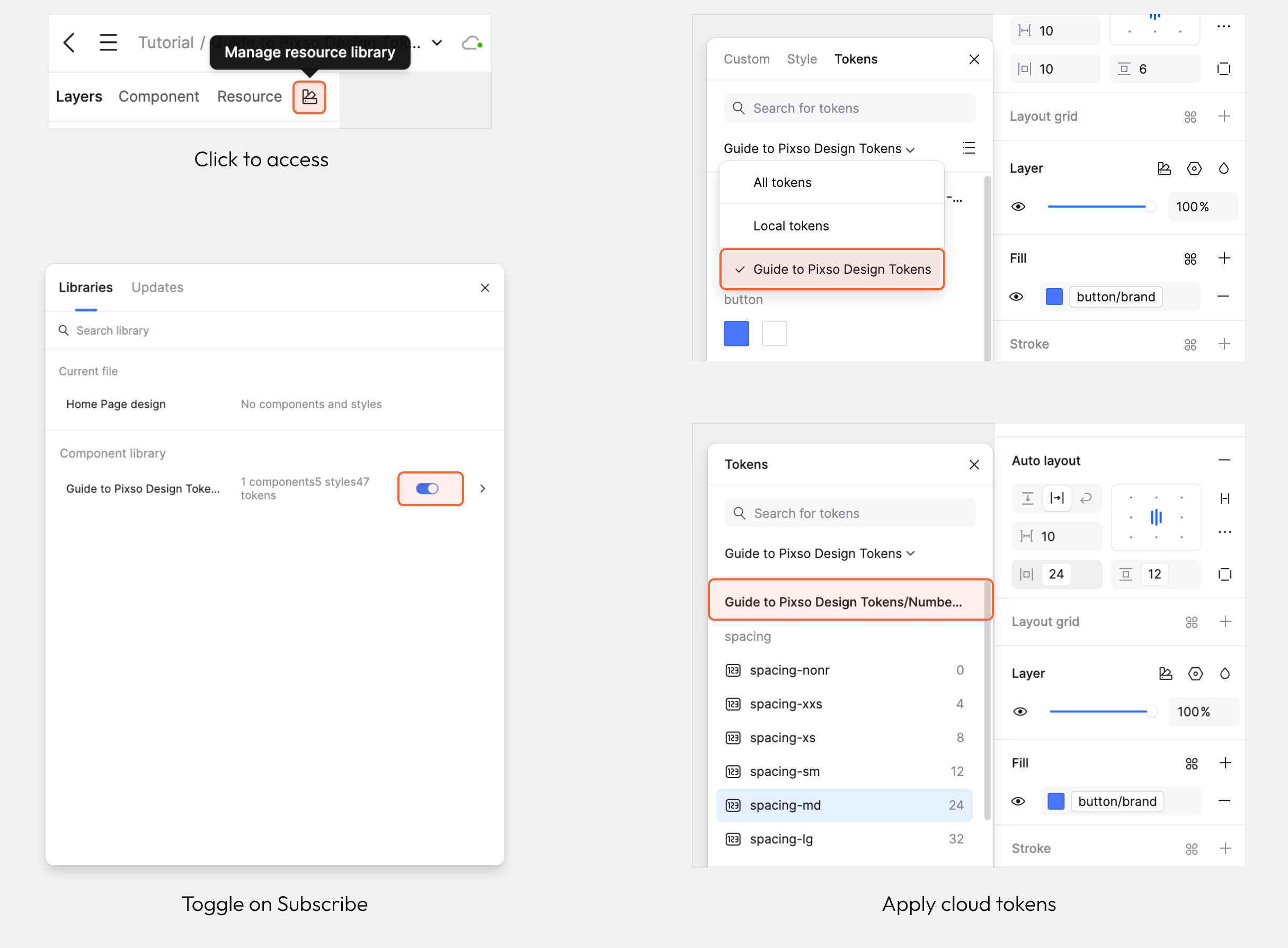
Once local tokens are published to the cloud, collaborators can subscribe to the library to use these cloud tokens.
- Click the library management icon in the left sidebar to open the library list modal.
- Locate the library you need to use, then toggle on its Subscribe switch.
- After enabling the subscription, you can apply the variables from this library in the corresponding properties panel in the right sidebar.
IX. Additional considerations
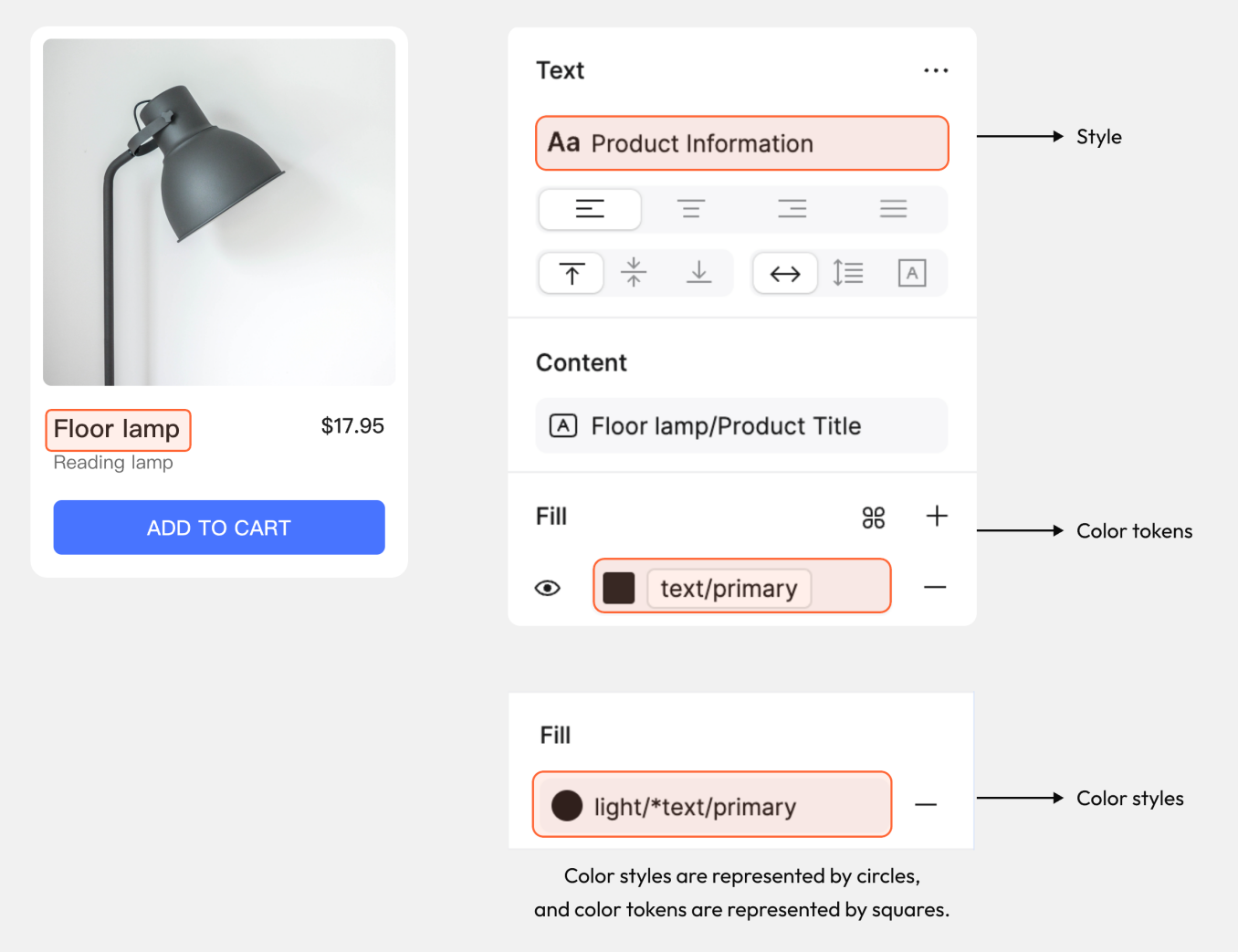
Apply styles and tokens together
TVokens can be used for the color fill while styles are used for the font, size, and additional type settings.
Conclusion
As design systems continue to evolve, design tokens play a critical role in scaling consistency and efficiency. Even in its early stage, Pixso’s token system already unlocks smarter, faster, and more adaptable design workflows.