Scott
Most healthcare apps are built by people in their twenties and thirties, tested by people in their twenties and thirties, and then handed to patients who are sixty-five and older with chronic conditions, presbyopia, and no patience for UI that makes them feel stupid. The gap is predictable. It's also almost entirely self-inflicted. Good healthcare app design for older adults isn't some specialized niche; it's just what happens when you take accessibility seriously before the product ships rather than after complaints roll in. This guide is about how to actually get there.
Part 1. What is an app in healthcare, really?
The term gets used loosely, so it's worth pinning down. What is an app in healthcare? At a minimum: medication management tools, telehealth platforms, chronic disease trackers, post-discharge follow-up apps, appointment schedulers, mental health check-ins. Ask a hospital system the same question and you might also hear remote monitoring integrations, caregiver coordination platforms, insurance navigation tools. The cleaner working definition is probably this: what is an app in healthcare, stripped to essentials, is any digital product a patient, caregiver, or clinician uses to manage health-related information or decisions outside a clinical setting. The category keeps expanding, remote monitoring integrations, caregiver coordination tools, insurance navigation platforms. What nearly all of them have in common is that users are opening them while stressed, sometimes scared, occasionally in physical pain. They are not browsing for fun.
That context changes what "usability" means. A clunky checkout flow in a shopping app costs a company a sale. A clunky medication confirmation screen in a health app can cost a patient a correct dose. A hard-to-find emergency contact button isn't an oversight, it's a safety failure. UX problems that produce mild frustration elsewhere become genuinely consequential in healthcare, which is why healthcare ux design for older populations operates under a different standard than most product design work. Generic UX principles, lifted and applied without modification, tend to produce healthcare apps that technically function and practically fail the people who need them most.
Part 2. Why your tool choice matters more than you'd think
Before the design principles: a word on tooling, because healthcare app design is one of those domains where working in the wrong tool doesn't just slow you down, it shapes the decisions you end up making, often badly.
Pixso is a collaborative UI design platform, and it's built for the kind of product complexity that healthcare work actually involves. That's not marketing language, there are specific reasons it fits this domain better than a generic design tool.
Accessibility compliance in healthcare isn't optional, and it isn't a one-time audit. Pixso bakes accessibility into the design token layer, which means contrast ratios get set once and enforced everywhere, across every component that inherits those tokens. When WCAG thresholds change, or when a clinical reviewer asks for higher contrast on confirmation screens, you update the token, not forty individual files.
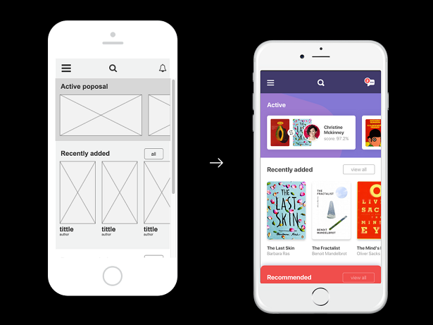
The component library structure matters too. An elder-friendly library, oversized touch targets, pill reminder patterns, emergency action buttons, high-contrast form fields can live as standardized, tokenized components in Pixso. Every new screen that draws from that library inherits the same decisions automatically. Teams don't rebuild these patterns from scratch for each flow, and they don't have to remember to check them manually.
Pixso AI is worth naming specifically. Generating accessible component variants one by one large-text versions, high-contrast states, simplified alternatives, is the kind of work that eats days. Pixso AI can produce variants from a base component or a written description, moving from rough concept to testable prototype faster than traditional workflows allow. For teams figuring out how to design a healthcare app against a real shipping deadline, that acceleration has a compounding effect across the whole project.
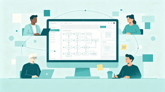
Healthcare projects also involve more reviewers than most: UX designers, developers, product managers, clinical advisors, compliance teams, sometimes patient advocacy groups. Pixso's real-time collaboration means everyone is working on the same source of truth rather than emailing file versions back and forth. Comments thread on specific frames. Handoff specs generate automatically. The coordination overhead that typically bogs down multi-stakeholder health projects shrinks considerably.
If you're still working in disconnected tools on a product this complex, consolidating around Pixso early is worth the switching cost.
Part 3. The actual challenges: What elderly users are dealing with
"Designing for elderly users" is easy to say and easy to underspecify. In practice it means designing for a population with a wide range of overlapping, non-binary limitations—not a single idealized older user.
| Challenge | What It Looks Like in Practice |
|---|---|
| Vision changes | Presbyopia, reduced contrast sensitivity, slower adaptation between light and dark environments |
| Motor changes | Reduced fine motor control, tremor, slower tap response, difficulty with small touch targets |
| Cognitive changes | Shorter working memory, longer processing time, less tolerance for ambiguous labeling |
| Technology familiarity | Highly variable—some users are digitally fluent, others aren't, and the app has to work for both |
| Emotional state | Health anxiety, fear of making mistakes, distrust of systems that feel impersonal or opaque |
The table is useful but don't read it as a checklist. A seventy-two-year-old managing her own diabetes via a mobile app might be technically confident but have significant contrast sensitivity loss. Another user might have perfect vision and real difficulty with multi-step flows. Healthcare ux design for this population works best when it's designed for the most constrained plausible user rather than an average because what helps the hardest case almost never hurts the easier ones.
When teams ask how to design a healthcare app that holds up across this range, the most useful answer is usually: watch real elderly users actually use your prototype, then go fix the ten things that immediately become obvious.
Part 4. Visual design: More than just bigger fonts
Bumping the font size to 18pt and calling it accessible is where a lot of teams stop. Healthcare ux design that actually holds up under real conditions goes considerably further and contrast is usually where the gap shows up first.
Contrast is the variable that matters most and gets underweighted most often. WCAG AA requires a 4.5:1 contrast ratio for body text, a reasonable minimum, but for healthcare apps serving elderly users, the AAA threshold (7:1) is more appropriate. Many older adults have contrast sensitivity loss that doesn't show up on standard vision tests but significantly affects legibility in real conditions: dim rooms, screen glare, post-cataract surgery vision. Hitting 7:1 on text, form labels, and status indicators isn't over-engineering; it's accounting for actual visual range.
Simplicity beats visual richness every time in this context. Subtle gradients, layered information, and decorative type choices might look polished in a design review. In production, they add visual noise that slows older users down. Every screen element should justify its presence. Whitespace is doing work, it's what lets users locate the next action without having to parse the whole screen first.
One rule worth making absolute: color should never be the only way information is conveyed. A red alert that relies purely on color fails colorblind users, and color perception shifts with age in ways that make red-green distinctions less reliable. Pair color with an icon, a text label, or both.
Pixso's token system enforces these decisions at the source. Contrast thresholds live in the token, not in individual components, so there's no drift between screens.
Part 5. Interaction design: Where simplicity becomes a safety issue
Six taps to log a medication dose isn't just annoying, it's a meaningful increase in the probability that the log doesn't happen. Healthcare apps for elderly users need interaction patterns that account for physical and cognitive changes without being condescending about it.
Keep core flows to three steps. Logging a medication, booking an appointment, reaching a provider, these should complete in three steps or fewer. Anything beyond that requires clinical justification, not just UX convenience.
Touch targets should be genuinely large. Apple and Google both recommend 44×44pt as a minimum. For users with motor changes or tremor, that's still too small—60×60pt or larger is a more honest floor. And target spacing matters as much as target size. Large buttons placed too close together still produce tapping errors.
Assume nothing about gesture fluency. Multi-finger swipes, long-press menus, drag-to-reorder, these are patterns that feel intuitive to people who grew up with smartphones. For many elderly users, they're invisible. Either replace them with explicit tappable controls or offer them as optional shortcuts beside visible alternatives.
Make undo obvious. If a user accidentally confirms a double dose or deletes a health entry, the recovery path needs to be immediate and unmissable. Confirmation dialogs before irreversible actions aren't friction in healthcare apps—they're table stakes.
Part 6. Cognitive load and language: Write for the person, not the chart
Medical terminology is a barrier for almost everyone, but for older users managing real health conditions, often multiple, often on medication that affects cognition, unclear language doesn't just confuse, it compounds anxiety.
A few practical rules:
- Swap clinical phrasing for plain alternatives: "take with food" rather than "administer with meals," "shortness of breath" rather than "dyspnea"
- Use icons, progress indicators, and color-coded schedules to support text rather than replace it, visual reinforcement helps, but text still needs to be there for screen readers and low-vision users
- Present multi-step processes one step at a time, not as a list the user has to hold in working memory
- Write error messages that name what went wrong and tell the user exactly what to do next, "Invalid entry" is not an error message
The hierarchy of information on each screen also matters. Whatever the user needs to do right now should be visually dominant. Past history, settings, secondary stats, these can be accessible one tap away, but they shouldn't compete visually with the primary action.
Part 7. Safety-critical features: Medication, emergencies, data
Some features in healthcare apps for elderly users carry stakes that simply don't exist in other product categories, and the design standard for them should reflect that.
Medication reminders need more than a push notification. A robust implementation layers multiple touchpoints: an in-app alert that appears when the app is opened, a lock-screen notification, and optionally a caregiver notification if the dose goes unacknowledged past a threshold. The confirmation UI, "I took this", should be among the largest, most prominent elements in the app. Users confirming medication at 6am half-awake are not in optimal cognitive condition.
Emergency access should be reachable in a single tap from anywhere in the app. Not buried in a menu. Not styled to match secondary navigation. Visually distinct, plainly labeled, "Emergency" or "Call for Help", and always visible. Response time in an actual emergency is directly tied to how fast a user can find this button, and "it's somewhere in the app" is not an acceptable answer.
Data security is non-negotiable but frequently handled badly in the UX. End-to-end encryption for health data is a baseline. Beyond that, the consent flows and privacy explanations need to be in plain English, not legalese, not terms-of-service boilerplate. Older users who don't understand what they're agreeing to often either refuse to agree or agree to things they'd reject if they understood them. Neither outcome is good.
Part 8. Emotional design: The part teams cut first
This is usually what gets deprioritized when timelines compress, and the cost shows up in retention data months later.
Older adults come to healthcare apps carrying anxiety that younger users typically don't worry about their conditions, fear of making errors, uncertainty about whether they're using the app right. That emotional state doesn't stay outside the product. The interface tone, the copy, the way the app responds to mistakes, all of it either compounds that anxiety or doesn't.
An app that responds warmly when a user logs their medications consistently ("You've checked in 7 days in a row—nice work") performs differently over time than one that's purely transactional. Not because gamification is magical, but because older users who feel like the product is paying attention to them are more likely to keep using it.
Teams that take healthcare app design seriously at the emotional layer tend to see better long-term retention than those that treat copy tone as a nice-to-have. And if you're still working out how to design a healthcare app that elderly users will actually come back to, this is often the highest-leverage place to start: make the product feel like someone on the other side cares whether they're okay.
Conclusion
The gap between how most healthcare apps get built and what elderly users actually need is wide, but it's not complicated to close. Bigger touch targets, plain language, contrast ratios that account for real vision changes, clear emergency access, and a tone that doesn't make people feel like they're filing a form, none of this is technically hard. The difficulty is prioritizing it before launch rather than reacting to it afterward. Pixso makes building and maintaining an accessible healthcare design system significantly more manageable than it used to be. The commitment to doing it has to come from the team.