Scott
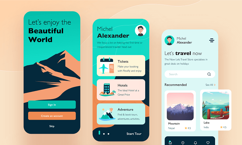
Avatars are ubiquitous across modern digital applications, occupying prime real estate in profile screens, team directories, activity feeds, leaderboards, and user reviews. Far from being a purely decorative placeholder, a user avatar represents an individual’s visual identity within a digital product. A well-structured avatar UI component enables users to express their identity while helping teammates and community members quickly recognize contributors.
This comprehensive guide explores the core principles of building responsive, accessible, and scalable avatar components for your design system.
1. The Core Purpose of a User Avatar
Avatars serve multiple functional and psychological roles within user interfaces.
1.1 Context Differentiation
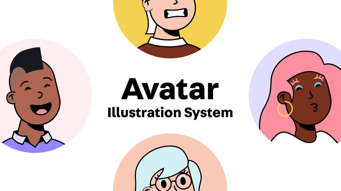
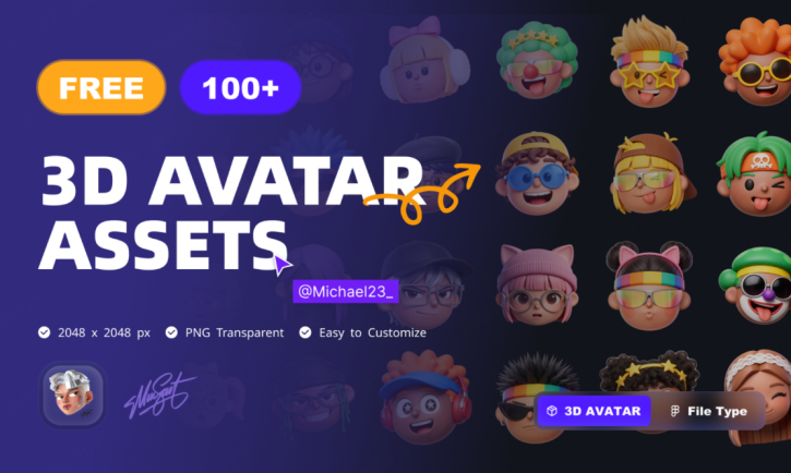
Visual styling must adapt to the product environment. Enterprise software workspaces frequently utilize professional portrait photography to help foster a sense of professional credibility, whereas social platforms and gaming applications often leverage playful 3D characters or custom illustrations. Aligning the avatar UI style with your brand and target audience helps set clear contextual expectations for users.
1.2 Expressing Personality and Identity
Avatars serve as a versatile outlet for self-expression. Illustrated personas can convey a creative and playful tone, realistic portrait photography can project transparency, scenic photography reflects a calm aesthetic, and abstract vector avatars offer a visual alternative for users who prefer not to share personal photos.
1.3 Fostering Community Connection
Whether in live team chats or document collaboration threads, pairing text with a recognizable UI avatar helps enhance social presence and team empathy. It bridges the gap across distributed teams, making digital interactions feel more personal and approachable.
2. Primary Types of User Avatars
When you design an avatar component library, you need to support several baseline avatar variants to handle every stage of the user lifecycle.
2.1 Default Placeholders
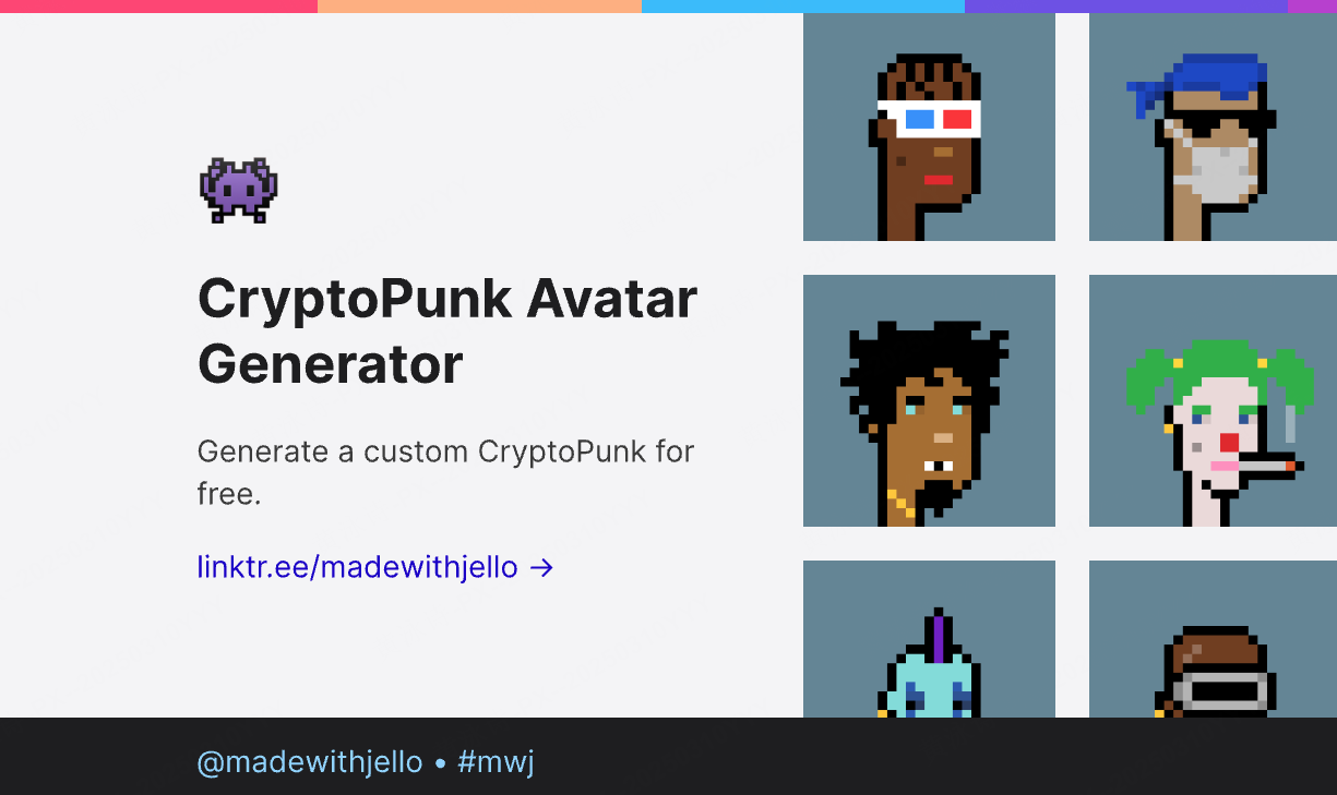
Default avatars serve as visual placeholders for users who have not yet uploaded a custom photo, preserving layout balance across your interface. These are typically rendered as neutral silhouette vectors on a subtle background. They also function as reliable fallback states when network connections drop or image files fail to load.
2.2 System Preset Libraries
Many modern applications provide curated avatar libraries, including 3D Memojis, minimalist icons, and colorful character illustrations. Offering predesigned options lowers onboarding friction for privacy-conscious users while maintaining consistent brand aesthetics.
2.3 Text and Initials Avatars
Widely used across collaborative workspaces, productivity software, and team dashboards, initials-based avatars extract the first letters of a user's first and last name. Assigning consistent background colors based on user identity ensures every team member remains instantly recognizable even without uploaded profile pictures.
2.4 Custom Photo Uploads
Custom image uploads remain a popular choice in social and collaborative software, enabling users to upload and crop personalized photos from their local devices.
3. Anatomy, Sizes, and Interactive States
A production-ready user avatar system requires flexible sizing tokens, layered status indicators, and clear interactive feedback.
3.1 Example Sizing Scale (Web & Mobile Tokens)
Avatar dimensions should align with platform standards (CSS px for Web, dp for Android, pt for iOS) and meet minimum interaction target boundaries:
- Small (20–32px / dp): Compact scale for tight navigation bars, breadcrumbs, and dense data tables.
- Medium (36–48px / dp): Standard baseline for messaging threads, activity feeds, and comment streams.
- Large (56–96px+ / dp): Prominent scale for user profile headers, hero cards, and account settings.
3.2 Activity Rings and Story Indicators
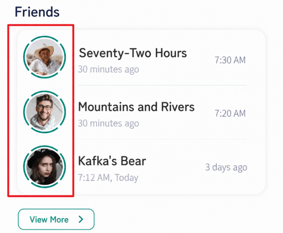
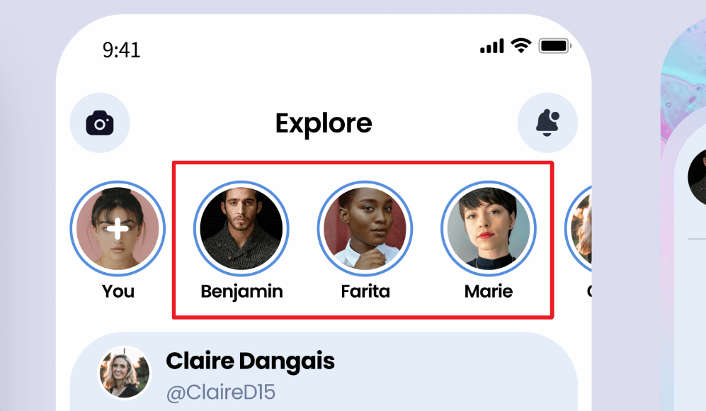
Social applications often wrap a vibrant gradient or solid-colored ring around the outer boundary of the avatar to signal fresh status updates, active stories, or live broadcasts.
3.3 Real-Time Presence Indicators
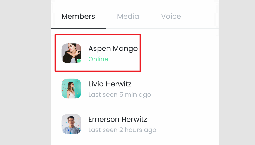
In team collaboration tools, communicating user availability requires multimodal cues beyond color alone (conforming to WCAG 2.2 Use of Color criteria). Position status badges at the bottom-right corner using distinct shapes, icons, and programmatic state attributes:
- Online/Active: Green fill paired with an inner checkmark or active pulse icon, exposed programmatically as aria-label="Status: Online".
- Busy/Do Not Disturb: Red fill with a horizontal minus slash icon (aria-label="Status: Busy").
- Away/Idle: Amber fill with a clock/crescent icon (aria-label="Status: Away").
- Offline/Unknown: Outlined circle with a slash or neutral icon (aria-label="Status: Offline"). Avoid treating an empty badge slot as an implicit offline state, as it may indicate an unconfigured or privacy-masked status.
3.4 Notification Badges and Counter Pills
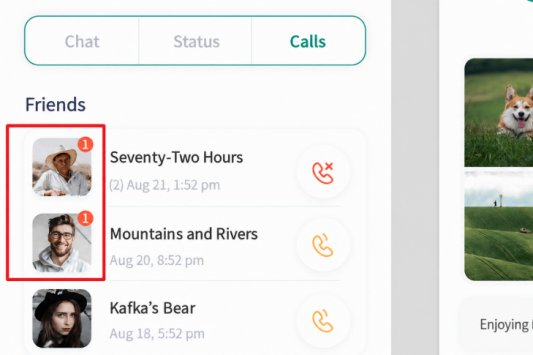
Unread alerts and direct messages attach to the perimeter corner of the avatar container. To convey priority without relying purely on color:
- Low Priority: A subtle notification dot with high-contrast borders and an accessible title (aria-label="Unread updates").
- Medium Priority: A counter pill containing distinct numeric text (e.g., 3) and semantic markup.
- High Priority / Urgent: A high-contrast badge combining bold typography, distinct border styling, and an urgent icon (such as an exclamation mark) accompanied by aria-live="polite".
3.5 Interactive Overlays and Accessible Quick Actions
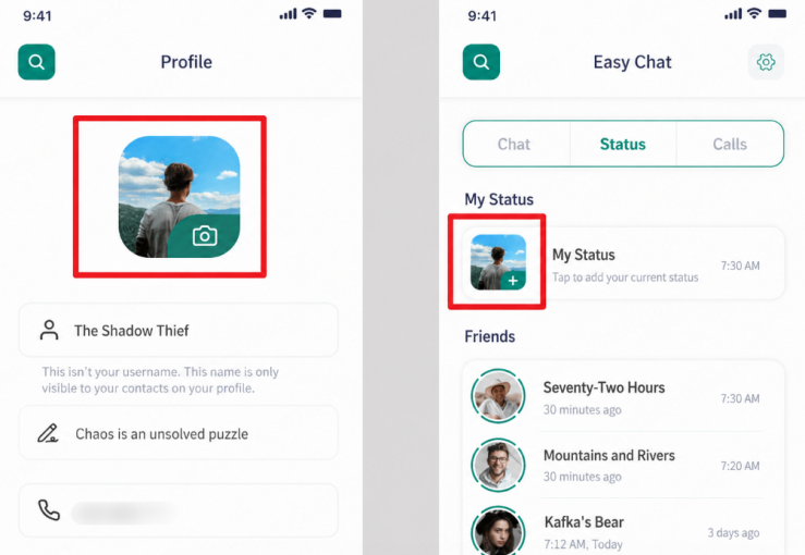
Avatars frequently host embedded trigger buttons for profile management. Each overlay control must meet minimum touch target sizes (at least 24×24 CSS px, ideally 44×44 px on touch devices or provide adequate target spacing) and supply clear accessible labels:
- Photo Upload/Replace: A camera icon button with aria-label="Upload profile picture" and clear :focus-visible styling.
- Add/Invite Action: A plus badge button with aria-label="Add new collaborator" that responds to both Enter and Space keys.
- Delete/Remove Action: A trash icon button (aria-label="Remove avatar photo") that triggers a confirmation dialog or non-destructive undo toast rather than immediate permanent deletion.
3.6 Typography Pairings and Metadata
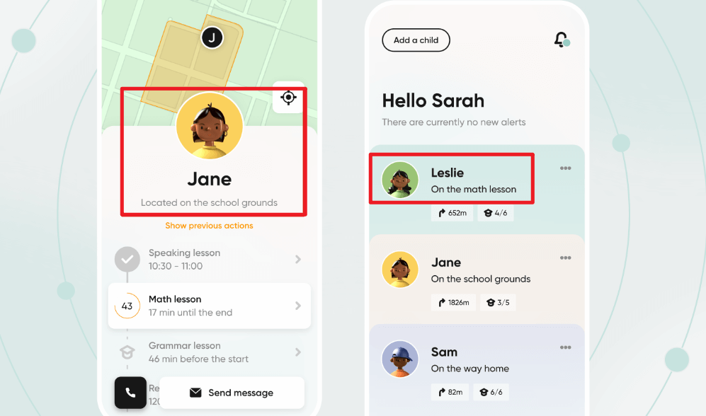
Avatars frequently sit beside supporting typography in list views and headers:
Two-line metadata: A bold primary title displays the user name, accompanied by a smaller secondary line indicating role, status, or timestamps.
Bottom-centered labels: Used on user cards, grid layouts, and standalone profile views.
4. Avatar Stacks and Grouping Patterns
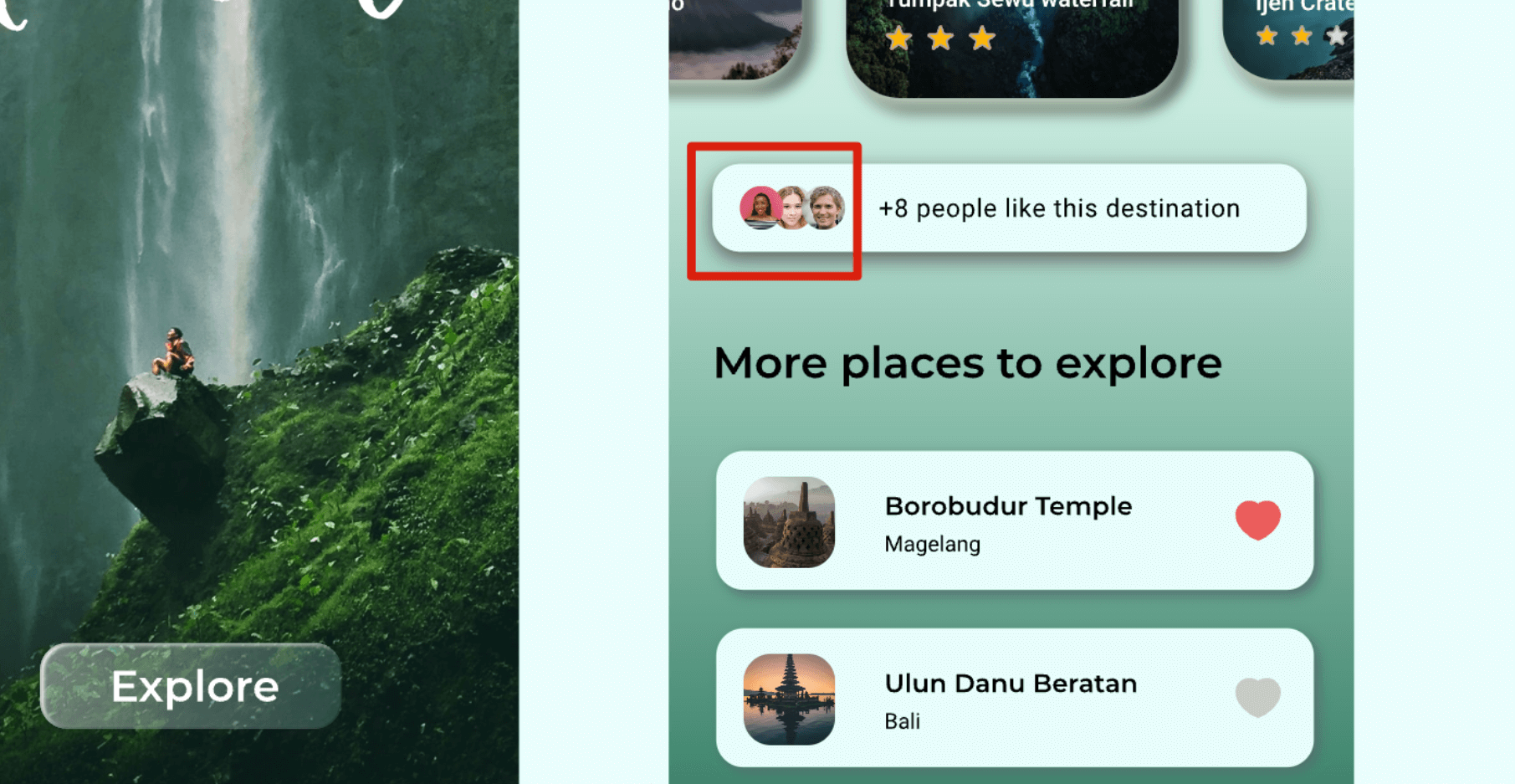
When displaying multi-user collaboration, stacking avatars provides a compact overview of team activity.
4.1 Nested Action Buttons
Placing an overlapping plus button at the end of an avatar group allows users to invite team members or manage access permissions quickly.
4.2 Overflow Counter Badges
When user groups exceed screen space, an overflow badge displaying a plus count (such as plus three) indicates remaining hidden participants.
4.3 Popover Cards and Focus Tooltips
In collaborative layouts, hovering over or focusing on an avatar should trigger an accessible rich card. Under WCAG 2.2 guidelines (Success Criterion 1.4.13: Content on Hover or Focus), the overlay must:
- Be triggerable via mouse hover, keyboard focus (Tab), and mobile touch tap.
- Be dismissible via the Esc key without moving focus.
- Be hoverable so users can move the pointer over the popover content without it disappearing.
- Display full user metadata, time zone, and accessible interactive action links.
5. Elevating UX and Usability Feedback
5.1 Event and Milestone Rings
Wrap the avatar with a stylized outer border to highlight user achievements, subscription tiers, or verified statuses.
5.2 Progress Rings
Circular progress rings built around the avatar perimeter serve as engaging visual cues for profile completion or gamified rewards.
5.3 Selection State Feedback
In multi-select lists and bulk action tables, never rely solely on a brand-colored border. Pair a visible focus/selection ring with a high-contrast checkmark icon overlay, an explicit checked background state, and appropriate ARIA attributes (aria-selected="true" or aria-checked="true").
6. Streamlining Avatar Workflows with Modern AI Tools
Building individual avatar component variations across multiple breakpoints, light and dark themes, and framework states can be time-consuming. Modern UI platforms and collaborative design tools like Pixso and Paico streamline component creation by generating modular React/HTML code starting points directly from vector UI layouts and wireframes.
By defining your color tokens, presence indicators, and typography scales early, you create a cohesive avatar system that scales smoothly across every screen of your product.
FAQ
Q1. How should designers implement accessibility and screen reader support for a user avatar?
Accessible avatar components require clear semantic markup. When an avatar conveys functional information such as author identity, provide an alt attribute or aria-label containing the full name of the user rather than generic terms like image or profile. If an avatar serves as a purely decorative element next to an existing text name, apply an aria-hidden attribute so assistive technologies skip redundant announcements.
Q2. What are the recommended performance and security standards for avatar uploads and rendering?
A production-grade avatar pipeline requires both robust client-side optimization and rigorous server-side validation:
- Server-Side Security & Validation: While client-side cropping (to a 1:1 aspect ratio) improves the cropping experience, servers must strictly validate file types via binary signatures/magic bytes (disallowing executable payloads), enforce maximum file size limits, sanitize file names, store assets in isolated object storage (e.g., S3 buckets with restricted execution), and provide secure account deletion/purge mechanisms compliant with privacy regulations.
- Modern Formats & Fallbacks: Encode uploaded images into modern formats like WebP or AVIF while providing standard JPEG/PNG fallbacks for legacy environments.
- Responsive Delivery: Implement srcset and sizes attributes with explicit width and height properties to prevent cumulative layout shifts (CLS). Combining edge CDN caching with multi-resolution generation (1x, 2x, 3x) helps high-density displays render crisp visuals without transferring redundant pixel payload.
Q3. When should design systems use circular avatars versus rounded squares?
Circular masks are widely used for individual users because circular geometry naturally centers the human face and contrasts against rectangular interface grids. However, rounded squares or squircles are frequently adopted for teams, organizations, channels, or company profiles (as seen in Microsoft Fluent and Slack design systems). Choosing between circular and square shapes offers clear semantic differentiation between individual personas and collective entities.
Q4. How does generative AI enhance modern avatar design workflows?
Generative tools streamline profile creation by rendering custom vector illustration packs and thematic personas during user onboarding. UI-to-code platforms like Paico help accelerate front-end drafting by translating multi-user avatar stacks and layout tokens into clean component scaffolds. From there, engineering teams can seamlessly integrate live WebSocket presence states, authentication checks, WCAG keyboard handlers, and production test suites into their codebase.