Scott
Why examples need a selection method
Searching for “design system examples” often produces a gallery of logos. A logo tells you who published a resource; it does not tell you whether the resource fits your platform, code stack, content, accessibility needs or release process. Material, Fluent, Apple Human Interface Guidelines and a content style guide can all be valuable, but they do different jobs.
These ten resources illustrate different ways to organize interface design: platform conventions, reusable controls, product language and shared implementation. Use the directory to find the kind of guidance your project needs, then compare one component with your own content. A small address form can reveal more about a system's suitability than a large gallery of polished screens.
First classify the resource
Before comparing names, label the kind of guidance you are reading:
| Resource type | What it usually answers | What it does not guarantee |
|---|---|---|
| Platform guidelines | Conventions for a platform or ecosystem | A complete web component library |
| Content style guide | Voice, tone, labels and editorial rules | Visual tokens or coded components |
| Design library | Foundations, components and states | A production-ready package for every stack |
| Code library | How components are implemented and shipped | That the visual system fits your product |
| Governance documentation | Ownership, contribution and release decisions | That a team will follow the process automatically |
One system may publish several kinds of guidance. Keep the labels visible so a reader does not mistake a writing guide for a UI kit or a screenshot for an API contract.
Seven questions for every example
Use the same seven columns when reviewing a resource:
- Surface: Which platform, product or ecosystem does it serve?
- Foundations: Are tokens for type, color, spacing and motion explained?
- Component states: Are default, focus, disabled, error, loading and empty states covered?
- Accessibility: Are semantics, keyboard behavior, contrast and alternatives documented?
- Code path: Is there a maintained package, example or implementation contract?
- Contribution: Can a team suggest changes, report issues and understand ownership?
- Update signal: Are releases, deprecations and version boundaries clear?
Do not mark a column “yes” just because a page has a component gallery. Link the evidence or record “not documented.” That distinction is useful when a product team decides whether to adopt, adapt or only reference a system.
1. Google Material Design
Material 3 is a broad reference for Android and cross-platform interface decisions. Use it to study component anatomy, theming, motion and adaptive behavior. Start with the platform and interaction states, not with copying a color palette from a screenshot.
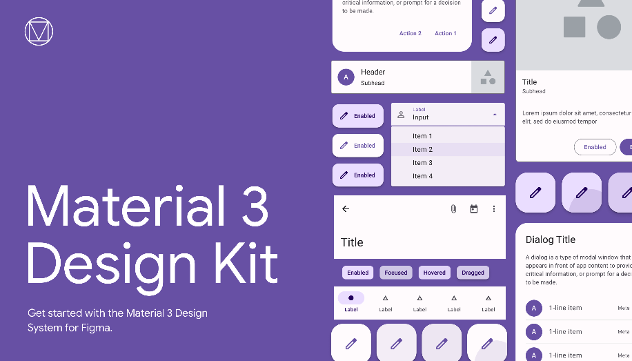
What to study: how component anatomy, state and theme work together. Compare the same control at rest, in focus and in an error state, then map those distinctions to the implementation package your team uses. This is a useful starting point for Android or Material-influenced products; the package and platform still determine what you can ship.
2. Mailchimp Content Style Guide
The Mailchimp Content Style Guide is useful for voice, tone and content decisions. Its accessibility guidance connects plain language, persistent form labels, descriptive links and document hierarchy. For a component library, this is the writing layer: the field's label and error message need shared rules just as its border and spacing do.
What to study: how the writing rules help people understand an action. For an address field, compare “Invalid input” with “Add the street name.” The second message tells the person what to change. Adapt the guide's approach to your audience and supported languages; keep your own product's voice.
3. Microsoft Fluent 2
Fluent 2 documents components, tokens, accessibility considerations and platform-specific surfaces. The examples can help a team reason about density and adaptive layouts in a large product ecosystem.
What to study: how a shared design language is expressed across platforms. Fluent's official site separates web, iOS, Android and Windows resources. Select the relevant platform before comparing a component, then examine density, text length and interaction states in that implementation.
4. Apple Human Interface Guidelines
Apple’s HIG explains conventions for Apple platforms and helps teams reason about navigation, controls, typography and privacy. It is a platform reference, not a single web kit.
What to study: the navigation and control conventions of the Apple platform you target. Use those conventions to explain why a custom interaction is necessary. A native app may benefit more from a familiar control than from matching the exact appearance of its web counterpart.
5. Atlassian Design System
Atlassian Design System combines foundations, components, content and implementation guidance for product software. Study how it describes states, language and patterns that need to work across a suite rather than one marketing page.
What to study: how recurring product patterns give a complex workflow a consistent language. Choose one work-management task, such as editing an item in a table, and trace the control, feedback and confirmation it needs. Compare that with your own content and permissions before extending the pattern across a product.
6. Shopify Polaris
Shopify's Polaris web components for App Home provide controls for applications inside Shopify admin. The current reference groups them around merchant work: actions, feedback, forms, layout and data display. Start with the API documentation for the Shopify surface you are building. A general commerce website and an embedded admin app have different constraints.
What to study: how the component categories support merchant tasks. Follow a simple edit-and-save operation through its field, primary action and feedback. Use the current documentation's version selector and surface-specific API; older React examples may belong to a different generation.
7. Adobe Spectrum
Adobe Spectrum covers foundations and component resources for Adobe experiences. Review a component’s states, interaction behavior, color modes and implementation package instead of using the visual style as a shortcut.
What to study: how a control communicates its state in a dense workspace. Review a menu or field at the size your product needs, including its focus treatment and longer labels. Pair the design guidance with the particular implementation package and theme you intend to use.
8. Uber Base Web
Base Web is a React component toolkit associated with Uber's design system. It is most useful to evaluate alongside the developers who would integrate it: open a required control, inspect its properties and styling approach, then try it with your own content. Treat the package and its release requirements as part of the design choice.
What to study: how the component API supports the states your screen needs. For a field, try a long label and error message before investing in a full themed library. Ask the implementation owner to confirm package compatibility, customization costs and the release plan.
9. Salesforce Lightning Design System
The Salesforce Lightning Design System supplies guidance and resources for Salesforce experiences. It is a useful reference when records, forms, tables and related actions must fit a common enterprise interface. Begin with the version and platform components required by the Salesforce project, then identify where local customizations will need to be maintained.
What to study: how related record information and actions remain understandable at high density. Reproduce one task with your own field names and access rules. For a standalone application, use the result as a design reference rather than assuming a Salesforce-specific component can be adopted unchanged.
10. IBM Carbon
IBM Carbon offers foundations, components, content and code resources for enterprise products. Study how the system expresses data-heavy states, themes and contributions.
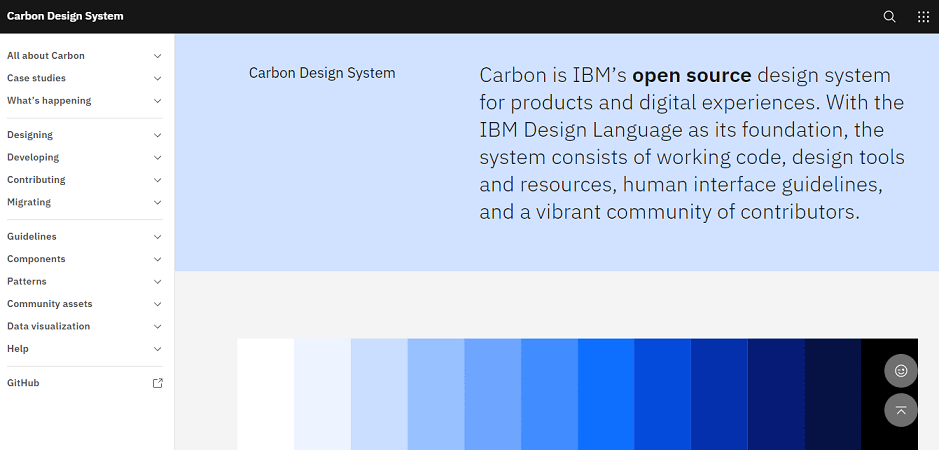
What to study: the connection between component anatomy and content. Carbon's text-input guidance is a useful place to inspect labels, helper text and validation states together. Compare the documented behavior with the component package your developers will use.
Turn a directory into a shortlist
Choose one repeated task, such as an address form or table filter. For each candidate system, map the states and find the relevant component guidance. Build a small specimen rather than a complete application. Include default, focus, disabled, loading, error and empty states; add a long label and a translated string if the product is multilingual.
Score only what you can observe:
| Criterion | Question | Evidence |
|---|---|---|
| Coverage | Does the resource describe the task and states? | Linked component or pattern page |
| Integration | Can the implementation fit the stack? | Current package or API documentation |
| Accessibility | Are semantics and keyboard behavior explicit? | Accessibility notes and test result |
| Governance | Who changes and versions the system? | Contribution/release documentation |
| Exceptions | Can the product document deliberate differences? | Local extension and review rule |
The result is not a universal score. It is a record of fit, cost and risk that a team can revisit when the product or dependency changes.
From reference to a working system
Adoption needs more than importing components. Define names, owners, release notes, deprecation, contribution review and migration. Keep foundations and semantic roles separate from component implementation so a brand theme can change without rewriting every usage. Provide a visible path for exceptions; a system that hides exceptions encourages local copies.
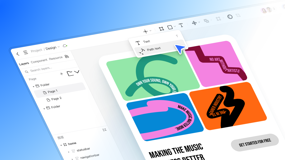
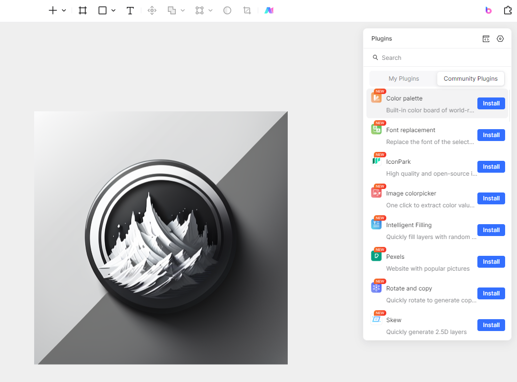
In Pixso, create shared styles and components only after the task pilot has exposed the real states. Publish a small library with usage guidance, then review a sample screen with design and engineering. The tool can help teams edit, review and hand off together, but the governance decision remains the team’s responsibility.
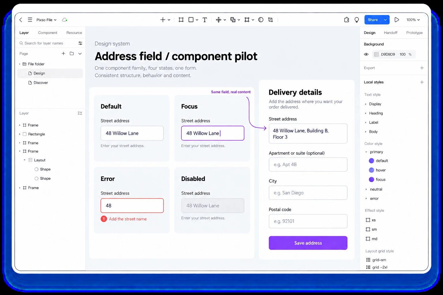
Use the shortlist to build one working screen in Pixso rather than copying an entire library. Choose a recurring component such as a text field, then create its default, focus, error and disabled designs using your own product language. Apply the component to a short form with realistic labels, helper text and an unusually long value. Share the screen with a developer and a content designer so they can review the states together. Keep the decisions that fit your product and record where you departed from the reference. This gives the team a concrete starting point for a shared component library.
What the address-field pilot should tell you
Take the field in the Pixso example: “48 Willow Lane” is easy to fit, while “48 Willow Lane, Building B, Floor 3” exposes a width constraint. The short value tests the normal state; the longer value forces a decision about the control. A single-line input may scroll its value horizontally. A read-only address summary can wrap. Those are different behaviors, so the same rectangle should not silently stand for both.
For the error case, enter only “48” and pair the field with “Add the street name.” This tests whether the label stays visible, the message describes a correction, and the next field moves down rather than being covered. Ask the developer which input behavior the chosen component supports, then record any local extension. The pilot now produces a concrete adoption decision instead of an impression that the library looks polished.
Further reading and sources
- Material 3
- Microsoft Fluent 2
- Apple Human Interface Guidelines
- Atlassian Design System
- Adobe Spectrum
- IBM Carbon
- Pixso’s design system, design tokens guide and scaling systems.
Common adoption mistakes
The first mistake is choosing a system because its gallery looks polished. A gallery does not describe states, code boundaries or ownership. The second is importing a component before naming the task it must support. A button can look correct while its focus, loading, destructive and long-label behavior remain undefined. The third is copying tokens without a migration plan; a team then has two sources of truth and cannot tell which one governs a release.
A rejected resource can still be a useful reference. An Apple navigation convention may inform a native app while a web component library supplies the browser implementation. Keep the reason for each choice explicit: platform, package, density, licensing or maintenance. That record is more useful to the next designer than a list that simply calls one system the best.
A lightweight maintenance cadence
Revisit the choice when an upstream release changes a component you use, your supported platform changes, or several teams request the same local exception. Assign one owner to assess the change and publish migration notes alongside the library update. A calendar review can help, but the release and product dependencies determine how often the system needs attention.