Scott
Have you noticed how almost every landing page, dashboard, and personal portfolio looks like an organized Japanese lunch box lately? From large tech corporations to indie startups, bento box ui has become the defining layout of modern web design. Originating from the physical bento box concept—where different foods are neatly compartmentalized—this framework translates beautifully onto digital screens. Users crave structured, highly scannable layouts that display a variety of content without causing visual fatigue. But why is this layout style everywhere, and how do you build one that functions seamlessly? Let’s break down the mechanics of bento ui and see how next-generation design tools make building them effortless.
Part 1: Streamlining your workflow: designing Bento Grids with Pixso
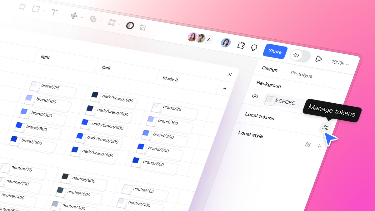
While designing these layouts manually can be a tedious process of aligning frames and adjusting padding, modern design systems have simplified the process of creating bento grids. This is where Pixso excels. As a collaborative, all-in-one UI design tool, Pixso offers powerful AI features and smart design mechanisms that act as a high-fidelity bento grid generator, removing the manual friction from grid creation.
| Pixso UI | ||
| Pixso AI Asset Generation | Auto Layout Responsive Grid | Component Libraries |
Whether you are a solo designer or working with an enterprise product team, Pixso provides a robust set of features tailored specifically for modern layouts:
- Pixso AI and Intelligent Design: Generating unique visuals, custom icons, and copy for multiple grid modules can consume hours of manual design time. With Pixso’s integrated AI capabilities, you can instantly generate clean graphics, draft context-specific text, and refine UI assets with simple text prompts, boosting your productivity and serving as a smart companion for bento grid design.
- Native Auto Layout Engine: The success of a clean layout hinges on consistent padding and gaps. Pixso’s Auto Layout feature allows you to group frames, set exact spacing, and configure elements to stretch or shrink dynamically. If you change the text in one card, the rest of your dynamic bento ui adjusts automatically, keeping everything aligned without manual pixel-pushing.
- Responsive Layout Grid Systems: Adapting a complex layout from desktop to mobile can feel like building a completely new page. Pixso acts as an automated responsive bento grid generator. By defining flexible constraints and parent-child container relationships, your designs easily adapt to any screen width. You can preview how your cards wrap or stack, ensuring a cohesive user experience across desktop, tablet, and mobile layouts.
- High-Value Component Libraries and Templates: Pixso offers extensive design systems, reusable components, and ready-to-use template resources. Instead of building your cards, borders, and text systems from zero, you can leverage Pixso's pre-made layouts and UI packages to assemble high-fidelity screens in minutes, keeping design maintenance costs to a minimum.
Part 2: Why Bento Box UI dominates modern design (The Psychology & Philosophy)
To create interfaces that truly connect with users, we must understand the underlying logic of bento grids. Why do our brains naturally love these compartmentalized designs? It comes down to cognitive psychology, specifically a concept known as chunking.
In user experience design, chunking is the practice of breaking down massive walls of information into smaller, self-contained, and digestible units. Traditional column-based layouts often require users to read from top to bottom, which can lead to visual fatigue. A bento ui, however, organizes varied content types—such as text, telemetry, illustrations, and interactive toggles—into distinct, bordered cards. By utilizing clear visual boundaries and information block-modularization, designers can present multi-format, high-density data on a single viewport. This modular layout reduces the effort needed to comprehend an interface, and the adoption of bento grids facilitates a much lower cognitive load and a highly efficient scanning experience.
| Traditional Layout | Bento Box Layout | |
| Header Text Continuous paragraph of text that goes on and on... | Hero Card | Metric Card |
| Image Module | Toggle Buttons | |
The aesthetic appeal of bento grid design also perfectly matches the expectations of modern web design. Modern digital experiences are moving away from sterile, symmetrical layouts in favor of structured dynamism. This layout style provides a harmonious balance of mathematical order and asymmetric visual interest. It offers a sophisticated framework for strong brand expression. Brands can mix rounded corners, subtle gradients, high-contrast imagery, and micro-interactions within a cohesive grid, giving the entire experience a premium editorial feel.
Furthermore, this approach is highly versatile. It is ideal for feature showcases, SaaS dashboards, pricing tables, and interactive portfolios. Rather than relying on simple text lists, it lets you display a product's diverse ecosystem in one unified view, delivering a powerful brand message instantly.
Part 3: Step-by-step guide: how to create a responsive Bento Grid design
Creating a successful grid is about setting up a reliable framework that adapts seamlessly across viewports and translates perfectly into production code. Here is a step-by-step guide to building one.
Before designing, audit the content you want to display. Since bento layouts group diverse information, you need a strong hierarchy. Identify your primary call-to-action or hero visual—this should occupy the largest card (often a 2x2 or 2x1 block). Secondary features can sit in medium-sized cards, while tertiary settings or micro-elements fit into smaller, 1x1 blocks. A successful bento grid design relies on visual hierarchy; your main message should occupy the most significant real estate, with minor details filling the smaller squares around it.
In Pixso, set up a parent frame and apply a grid overlay. A standard 12-column grid or a simple 4-column layout works best. This structured approach serves as your manual bento grid generator, keeping your alignment locked. Set your vertical and horizontal gutters to a consistent measurement, such as 16px, 20px, or 24px, to maintain negative space.
Create your individual grid items. Add background colors, rounded corners (typically between 12px and 24px), and internal padding. Group these cards into larger rows and columns using Auto Layout. Make sure to set the horizontal resizing of the child cards to "Fill Container." This is the secret to responsive bento grids. When the screen shrinks, the cards adjust their widths proportionally, keeping the layout perfectly proportioned.
Designing a beautiful UI is only half the battle; it must also be easy for developers to build. Bento layouts align perfectly with CSS Grid, the modern web standard for responsive layouts.
When you build your layout inside Pixso using clean Auto Layout rules, the structure maps directly to CSS. Developers inspecting your design files can easily extract the gap sizes, margins, padding, and flex properties. They can recreate your layout in code using minimal, semantic CSS Grid properties like grid-template-columns and grid-gap. This developer-friendly workflow results in cleaner code, higher page speed, and excellent SEO-friendliness for the finished site.
Part 4: Common pitfalls in Bento UI and how to avoid them
While bento box ui designs look highly professional when executed correctly, they can easily become cluttered, illegible, or broken if you miss critical details. Let’s look at the most common design pitfalls and how to solve them:
With so many separate boxes on screen, it is easy to overfill them. If every block contains bright colors, heavy illustrations, and blocks of text, the user's focus is scattered, defeating the goal of a low cognitive load.
- Solution: Introduce empty space and simplified cards. Let some cards act as purely visual relief—perhaps featuring a simple icon or a solid background with minimalist typography. Balance is key to keeping the aesthetic high-end and modern.
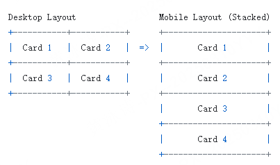
A horizontal layout with four cards side-by-side will look incredibly cramped on a vertical mobile screen.
- Solution: Set up responsive stacking rules. When designing for mobile devices, transform your horizontal bento grids into a clean, single-column vertical layout. In Pixso, you can quickly test this transition by dragging the boundaries of your responsive frames to see how they fold, making mobile adaptation a breeze.
Nothing ruins a bento design faster than mismatched gaps and uneven corner radiuses. If your cards have a corner radius of 16px, but the distance between the cards is only 8px, the visual relationship feels disjointed.
- Solution: Implement a cohesive visual system. Maintain a mathematical relationship between card corners and the gutters separating them. Leverage Pixso's global styles and variables to lock in these rules, ensuring that every element across your platform maintains absolute visual consistency.
Part 5: Bento Box UI inspiration and future trends
As we navigate through the modern digital landscape, the bento box ui continues to evolve beyond static presentation cards. Designers are finding inventive ways to merge structured geometry with organic expression:
- Interactive and Dynamic Cards: Instead of displaying static text, modern cards are becoming modular mini-apps. Designers are building cards with hover states, micro-animations, real-time interactive charts, and draggable components. Hovering over a card might trigger an elegant glassmorphism transition or slide open a secondary menu.
- Breaking the Grid Boundaries: To make designs feel less rigid, creators are deliberately allowing visual elements to spill over card borders. A 3D illustration might float slightly outside its card frame, or a headline might overlap multiple boxes. This controlled chaos breaks the predictability of bento grids while retaining structural order.
- Futuristic Dark Mode Visuals: High-tech platforms are leveraging dark, glowing aesthetics to highlight distinct content blocks. By combining dark backgrounds with subtle neon borders, inner shadows, and gradient backdrops, designers create a striking sense of depth that makes each box look like a premium physical device.
For inspiration, explore sleek hardware showcase pages, personal portfolio sites, and administrative analytics dashboards. Seeing how professional creators master the art of bento grid design to manage content density and white space in their layouts will give you fresh ideas for your next digital product.
Conclusion
The bento box ui is more than just a fleeting aesthetic trend; it is a highly functional, responsive, and visually engaging framework built for modern user experiences. By organizing content into structured, scannable blocks, you can reduce cognitive load and deliver a premium, clean design. Creating these interfaces is simple when using advanced, collaborative tools. With its intelligent Auto Layout, Pixso AI, and seamless developer handoff, Pixso serves as your ultimate bento grid generator. Start designing your next bento-inspired project today to build websites and applications that are as organized, responsive, and engaging as they are beautiful.