Scott
The Google icons you see every day on your smartphone home screen have undergone a massive transformation. In 2026, Google executed a sweeping Google icon redesign, overhauling more than 14 apps, from Gmail and Google Drive to Google Calendar and Google Meet. This isn’t just a simple palette tweak. It is a visual declaration of Google’s transition into an AI-first brand.
In this post, we will take a deep dive into the gradient design that forms the core of this Google icon change and analyze exactly which apps evolved and how. For those looking to apply this latest trend to their own workflows, we will also show you how to create a gradient-based design icon and UI mockups using a modern collaborative design tool.
Part 1. The 2026 Google app icon redesign: What changed and how?
The Background: Visual Language for the AI Era
The starting point for this overhaul is Google's AI service, Gemini. In September 2025, Google officially articulated its new design philosophy:
"While retaining our four iconic colors, we will visually express AI-driven innovation and creative energy through brighter tones and gradient design."
This philosophy was first applied to Google Photos and Google Maps. Later, in late April 2026, the complete redesign plan for every Google workspace icon was unveiled, with the official rollout across web and app environments taking place around May 18. Following its introduction at Google I/O 2026, Google formally announced the global deployment of the new icons via its official blog.
The core element is simple: Gradients. The previous flat, solid-color icons have transitioned into soft, dynamic gradient icons.
Detailed Breakdown of the Redesign by App
A total of 14 apps were targeted in this major Google app icon overhaul. Gmail, Google Calendar, Google Chat, Google Meet, Google Drive, Google Docs, Google Slides, Google Sheets, Google Vids, Google Keep, Google Forms, Google Voice, Google Sites, and Google Tasks have all received a fresh coat of paint. Let’s look at the specific changes for the major apps.
- Gmail: The legacy Gmail icon featured an "M" made of red, blue, and green on a white background. Following the update, the "M" shape remains but with much softer, rounded corners. The overall color palette has been streamlined into a warm, red-centric gradient. The smooth transition from red to pink and into orange is particularly striking.
- Google Drive: While the triangular structure of the Drive icon remains, the corners are significantly rounder. Previously, the red, blue, and green segments were starkly separated. In the new version, these colors blend naturally, connected by seamless gradients.
- Google Calendar: Maintaining its core structure displaying the date, the entire background of the Calendar icon has shifted to a crisp, light blue gradient, giving it a much brighter and cleaner feel than its predecessor.
- Google Meet / Google Chat: Historically, these two apps shared similar color schemes, occasionally causing user confusion. With this update, Google Meet claims a distinct yellow-orange identity, while Google Chat leans heavily into green. They feature a bold, near-solid base color layered with subtle gradient effects to ensure distinct app recognition.
- Google Docs / Sheets / Slides: Previously, these apps faced criticism for being hard to distinguish, as they all utilized a vertical document shape with a similar four-color mix. The new icons break away from the vertical paper metaphor, adopting a horizontal, functional layout. Docs is firmly blue, Sheets is green, and Slides centers on yellow-orange, drastically strengthening their individual identities.
- Google Keep / Voice / Forms / Sites: Keep retains its yellow lightbulb silhouette but now features a warm, golden gradient. Voice has been reborn as a green-mint gradient phone icon, Forms utilizes a purple-lavender gradient, and Sites adopts a deep blue gradient aesthetic.
Three Strategic Effects of the Gradient Transition
- Visual Cue for AI Integration: Google strategically initiated the use of gradients on services powered by Gemini AI. Therefore, gradient icons act as a visual cue signaling, "This app is connected to AI." As more Google apps integrate AI features, this aesthetic is expected to expand.
- Enhanced App Differentiability: Since 2020, Workspace icons faced backlash for using the exact same color combinations, making them difficult to tell apart. This redesign is engineered to amplify the distinct primary color of each app. The goal is to maintain the cohesive feel of the Google ecosystem while drastically improving the speed at which users identify specific apps.
- Brand Modernization: Breaking away from the flat design trend, gradients add depth and vitality. They intuitively communicate to a global audience that Google is evolving into a modern, AI-first brand.
Part 2. Creating gradient logos and UI mockups with Pixso
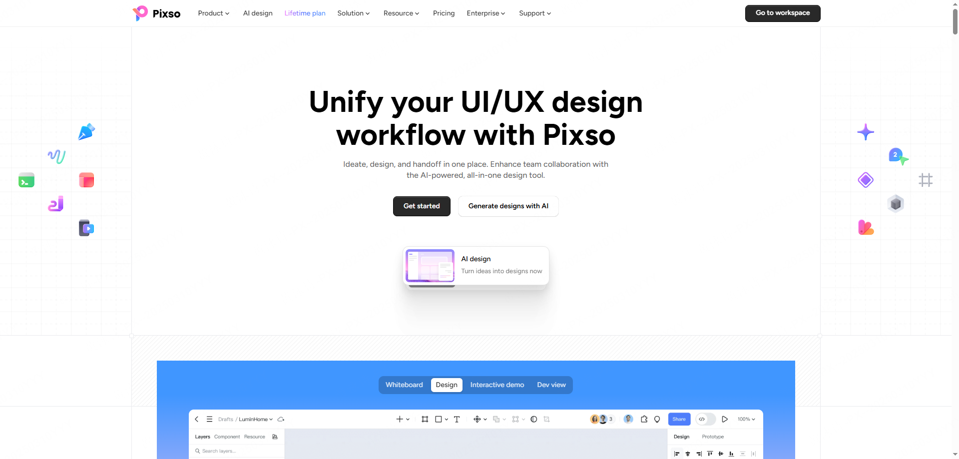
What is Pixso?
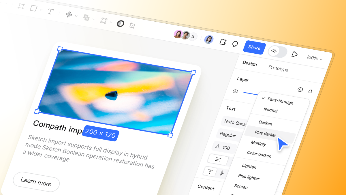
Pixso is a cloud-based UI/UX design tool that runs directly in your browser. While offering a professional interface that designers are already familiar with, it sets itself apart with built-in AI capabilities that enable faster, more intuitive design workflows. Widely used by individual designers and enterprise teams alike, it excels in creating logos, crafting app icons, and executing high-fidelity UI mockups.
How to Design Google-Style Gradient Icons in Pixso
The gradient effect—the hallmark of the recent icon updates—can be effortlessly replicated in Pixso in just a few steps:
- Step 1. Set Up the Frame and Grid: In Pixso, create a frame matching your desired icon dimensions (e.g., 1024×1024px). You can import iOS or Play Store icon specifications or set up a custom grid to establish your foundation.
- Step 2. Draw Basic Shapes: Utilize basic shape tools (circles, triangles, rectangles) to block out the silhouette of your design icon. Just like the new tech trends, you can intuitively adjust the Corner Radius in Pixso to achieve that smooth, rounded look.
- Step 3. Apply Gradient Fills: Navigate to Pixso’s Fill options and select either a Linear Gradient or a Radial Gradient. You can recreate the red-to-pink-to-orange flow of Gmail, or the signature blue-green-yellow transition of Drive. By adding Color Stops and adjusting the opacity at each point, you can instantly achieve a vibrant, dynamic aesthetic.
- Step 4. Add Details and Export: Place your central symbols over the background and check the visual balance. Pixso’s robust Export feature supports various formats (PNG, SVG, PDF) and sizes, allowing you to extract your finished assets instantly.
Beyond Icons: Generating UI Mockups with Pixso AI
Pixso’s true strength lies in its AI-driven editing capabilities. Beyond simply crafting a single icon, you can rapidly generate complete brand design mockups.
- AI Design Generation: Leveraging Pixso AI, you can auto-generate design drafts using text prompts. For example, typing "a cloud service logo using blue and green gradients" prompts the AI to provide multiple variations. With a few minor tweaks, you can finalize a highly polished logo in record time.
- Comprehensive Mockup Creation: Pixso isn't limited to icons. You can design mobile app UIs, web landing pages, marketing banners, and social media cards all on a single infinite canvas. With gradients dominating current trends, Pixso’s advanced color tools allow you to efficiently apply a cohesive visual brand across all channels.
- Real-Time Team Collaboration: Because Pixso is completely cloud-based, you can co-design and exchange feedback with team members in real-time. Sharing a design mockup via a single link and iterating through comments perfectly mirrors modern agile workflows.
- Extensive Template Library: Pixso offers hundreds of free templates, including logos, icons, and UI kits. Even if you lack extensive design experience, you can start with a template, tweak the colors and gradients, and easily produce trendy brand assets.
FAQ
Q1. How do I choose the right colors when applying gradient design to an icon?
A. The most critical factor for gradient icons is color harmony and brand consistency. If you have an established brand color, use it as your starting point. From there, adjust the brightness or saturation to set the endpoint color. For example, for a red-themed app, a gradient flowing from deep red to coral or pink feels natural. If you don't have a strict brand color yet, a common technique is to shift the Hue value by 20 to 40 degrees within the HSB (Hue, Saturation, Brightness) color model to establish the gradient's direction. In Pixso, you can execute this seamlessly using the Color Picker and gradient stops.
Q2. Can I create logos or design mockups in Pixso even if I have no design experience?
A. Absolutely. Pixso provides a vast array of templates and AI-powered generation features tailored for beginners, allowing anyone to produce professional-grade results. Specifically, the Pixso AI feature generates initial design drafts based on your desired style and keywords. This means non-designers can visualize their ideas right from the drafting phase. Starting from a template and simply altering the typography, colors, and gradients is enough to finalize a trendy brand design. Referencing the newly updated collection of google icons and trying to mimic their style is also a fantastic starting point for beginners.
Conclusion
The 2026 overhaul is far more than a simple rebranding exercise. It is a visual declaration of building an AI-centric ecosystem, ensuring users feel that shift at their fingertips every single day. The transition from flat, solid colors to breathing, vibrant gradients has officially become the mandatory syntax for modern digital brands. The warm red gradient of Gmail, the dynamic tricolor flow of Drive, the crisp sky-blue gradient of Calendar, every single google icon change sends one unified message.
If you want to apply these cutting-edge trends directly to your own brand and projects, Pixso is the most efficient choice available. From crafting a gradient logo to designing an engaging google app icon alternative, UI mockups, and marketing assets, Pixso’s intuitive editing environment and powerful AI capabilities will elevate your design workflow to the next level. The visual language of the tech world has evolved; now, it’s time to make it your own using Pixso.
![[Latest] How to use and activate Figma AI: a complete guide](https://pixso.net/assets/how-to-use-figma-ai_9b374da1603dee272052.png)