Scott
Adapting a desktop web interface for mobile screens is one of those tasks that sounds simple on paper but drains massive amounts of time in reality. Converting a single, moderately complex landing page or dashboard layout for small screens can easily eat up half a day to a full day of design time.
But the real, hidden drain on productivity happens after that initial handoff. Every time you iterate on the desktop version, you have to manually copy those changes over to the mobile layout. This double-handling of visual assets slows down your product releases, creates consistency errors, and keeps designers stuck in a loop of tedious layout adjustments instead of focusing on actual user experience design.
Pixso addresses this exact bottleneck with its built-in multi-device adaptation engine. By selecting a desktop web mockup and entering a simple prompt, the platform's layout parser analyzes the structure of your canvas. It automatically determines whether specific containers should stack, collapse, hide, or wrap on smaller viewports.
Instead of resizing grids and scaling typography by hand, designers can generate fully responsive desktop, mobile, and tablet layouts simultaneously. This shifts the workflow from manual pixel-pushing to conversational direction, saving hours of work.
This guide looks closely at the friction of manual layout conversion, breaks down how automated layout models work under the hood, and compares how different systems on the market handle this process.
Part 1. Why traditional manual UI adaptation fails to scale
To understand why automated layout engines are becoming essential, we have to look closely at the sheer volume of manual work required to move a design from a desktop browser to a mobile viewport. Many non-designers assume viewport adaptation is just a matter of scaling elements down, but that approach ruins the user experience.
1.1 The Manual Viewport Checklist
To convert a web page into a high-quality mobile layout, a designer must manually handle several distinct processes:
- Layout Reconstruction: Desktop layouts often use wide 12-column grid systems. On a mobile screen, these columns must collapse into a single vertical feed. This requires reorganizing information based on hierarchy. Designers have to decide which elements are essential for the first screen view and which secondary components can be hidden or collapsed into expandable drawers.
- Touch Target Optimization: Mouse cursors are incredibly precise, but human thumbs need larger targets. Components like input fields, text links, and buttons must be adjusted to meet standard usability guidelines, such as the minimum 44x44pt target on iOS or 48x48dp on Android. Equal scaling is not an option; buttons must stay large while the surrounding container shrinks.
- Typography Hierarchy Redefinition: A bold 48px heading that works on a 1440px desktop viewport will look massive and break awkwardly on a 375px mobile screen. Designers have to reconfigure type scales, shrinking headlines down to reasonable sizes while keeping paragraph text readable at 14px to 16px.
- Image Aspect Ratio Refactoring: Landscape banners are standard on desktop browsers, but they become illegible on mobile devices if they are just scaled down. Designers must crop images, shift focus areas, or swap horizontal banners for vertical portrait layouts to keep key product photography visible.
- Mobile-First Interaction Mappings: Desktop interactions rely on hover states, tooltips, and precise right-click actions. Mobile viewports require tap gestures, swipe events, pull-to-refresh indicators, bottom sheets, and slide-out menus. These must be drafted entirely from scratch.
For a single page of medium complexity, running through this checklist takes a skilled designer hours of repetitive work. For larger platforms with dozens of unique screens, the workload multiplies.
1.2 The Hidden System Costs of Manual Adjustments
Beyond the direct hours spent pushing pixels, manual adaptation introduces systemic friction into product teams:
- Visual Discrepancy Risks: When changes are made to a desktop frame, designers often forget to copy those updates over to the mobile layout. This leads to inconsistent user experiences across devices once the product goes live.
- Communication Overhead: When a designer has to deliver separate, static desktop and mobile drafts, developers have to inspect two distinct design sets. Product managers and quality assurance teams must review and test both versions individually, which complicates project tracking.
- Slower Feedback Loops: Since every design iteration must be manually applied across multiple screen sizes, implementing simple feedback from stakeholders takes twice as long, stalling the overall development cycle.
Part 2. AI-driven viewport adaptation explained
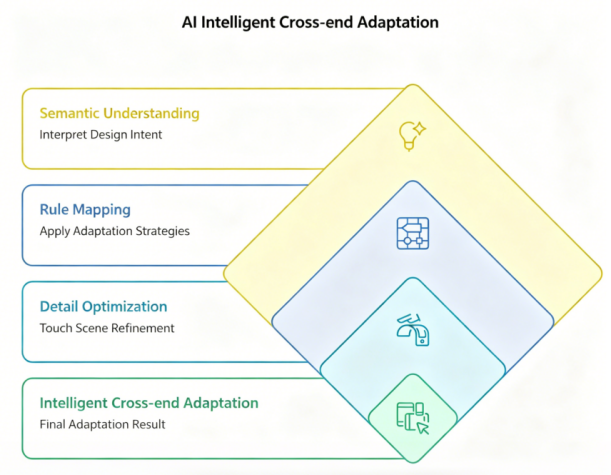
Automated mobile responsive design is not about applying simple scaling rules. It requires intelligent, context-aware layout generation. To produce professional results, an AI layout system must process designs through three distinct layers.
2.1 Layer 1: Semantic Design Interpretation
Before rearranging elements, the system has to understand what it is looking at. An advanced layout assistant analyzes the structure of your desktop canvas to identify structural components. It recognizes navigation bars, hero headers, multi-card feature lists, form fields, and footers. It also calculates the visual hierarchy of these layers to understand which components contain core product messaging and which are decorative.
When you select a web layout and ask pixso ai to adapt it for mobile, the system first constructs a semantic tree of your canvas. It groups nested frames and auto-layouts, identifying structural relationships before moving elements around. This keeps the design looking clean and intentional, rather than scrambled.
2.2 Layer 2: Adaptive Strategy Mapping
Once the system understands the design layout, it applies standard rules of responsive web design:
- Grid Collapse: Multi-column grids are transformed into a vertical feed, arranging the columns sequentially.
- Navigation Compacting: Desktop header links collapse into compact toggle bars or floating menus depending on the layout style.
- Sidebar Transformation: Fixed desktop navigation sidebars slide off-screen, accessible via expandable hamburger menus.
- Smarter Forms: Horizontal, side-by-side forms stack vertically to make typing on mobile devices easier.
The system applies these structural rules dynamically. It distinguishes between an e-commerce product grid and a text-based blog archive, adjusting column wraps and grid padding to match the content type.
2.3 Layer 3: Touch-Target and Interface Refinement
Finally, the AI refines layout details specifically for touch interfaces:
- It checks touch targets to ensure interactive elements are easy to tap.
- It scales font line-heights and letter-spacing to prevent text crowding on small screens.
- It updates margins and paddings so content flows naturally on narrower viewports.
- It swaps out desktop-specific UI states for mobile equivalents, like using bottom sheets instead of modal overlays.
Part 3. Industry comparison: Figma AI vs. Lovable vs. Pixso AI
Different tools on the market approach multi-viewport design from different angles. Let's look at how the top options compare.
3.1 Figma AI
Figma offers excellent collaborative features and a massive global developer community. Its recent AI additions help generate design systems and translate layout elements into front-end code.
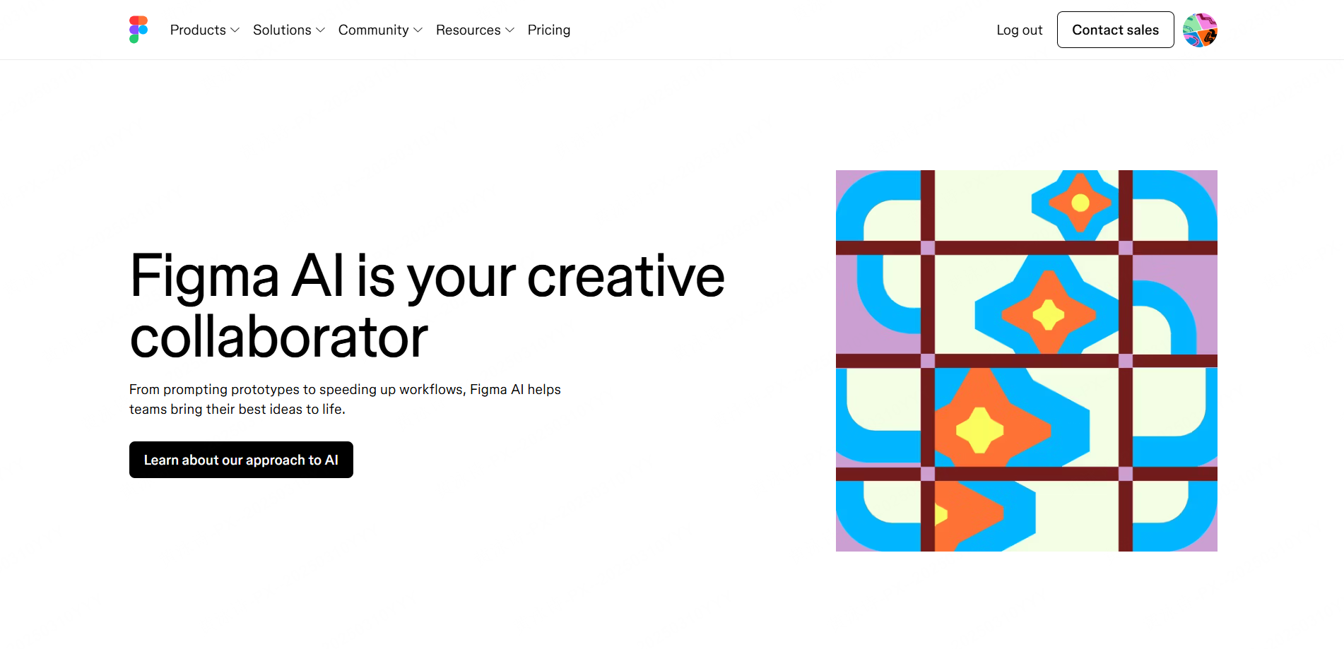
However, its responsive layout capabilities focus heavily on the code output rather than the design canvas itself. If you want to transform a desktop design file into a mobile-ready vector frame in Figma, you still have to do a lot of manual layout restructuring and autolayout mapping.
- Best for: Teams with highly established, manual design system libraries who rely on developers to build responsive views during production.
3.2 Lovable
Lovable is incredibly fast at generating live, fully functional web applications directly from natural language prompts. It is highly popular among product managers and developers who want to test interactive prototypes quickly.
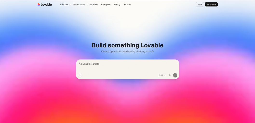
The limitation here is that Lovable outputs code, not vector files. Professional design teams who need to tweak individual vector points, organize design systems, and run design audits cannot easily edit their visual assets inside Lovable. It lacks a true design editor canvas.
- Best for: Small teams and solo developers who want to skip the design phase entirely and jump straight into functional code.
3.3 Pixso AI
Pixso focuses on design-to-design vector canvas transformation. Instead of forcing you to build separate responsive design mobile desktop optimization mockups from scratch, the system handles the visual translation directly inside your workspace.
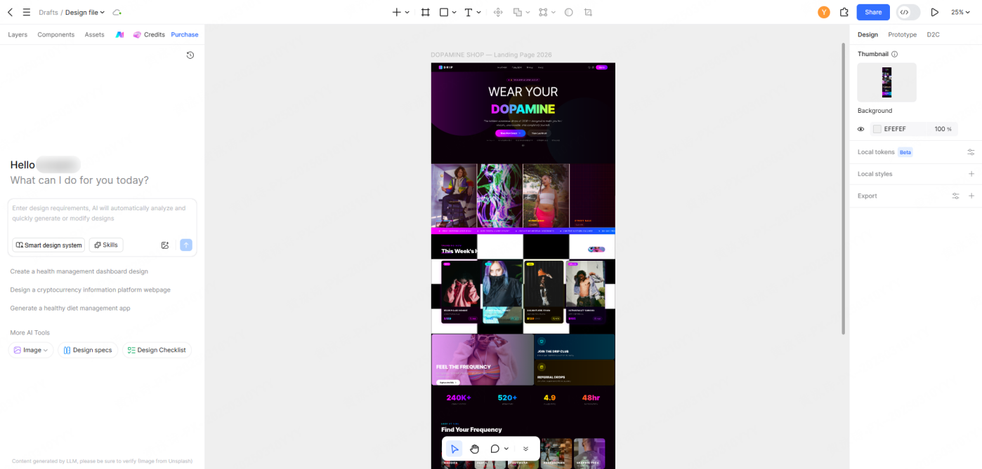
When you tell the assistant to adapt a web frame for mobile, it outputs fully editable vector layers on your canvas. It keeps your layer groups clean, applies responsive behaviors, and wraps containers using standard auto-layout rules.
- Best for: Product design teams who want to maintain clean design systems, preserve precise control over vector details, and keep their design files updated alongside their code.
Feature Comparison Matrix
| Features | Figma AI | Lovable | Pixso AI |
| Vector-Level Workspace Adaptation | Limited | No (Code Only) | ✓ Full Native Support |
| Simultaneous Multi-Viewport Generation | No | No | ✓ Fully Supported |
| Editable Layout Output | ✓ Yes | ❌ No | ✓ Yes (Clean Layer Trees) |
| Design System Awareness | ✓ Yes | ❌ No | ✓ Yes |
| Localization & Local Server Speed | Average | Average | ✓ Fast and Stable |
Part 4. Step-by-step tutorial: Adapting desktop layouts with Pixso AI
Here is how to take a desktop design frame and adapt it for mobile and tablet views in under five minutes.
Prep Work: Organize Your Source File
For the best results, take a moment to ensure your source desktop file is organized:
- Group related sections (such as Header, Hero section, Features, and Footer) into clearly named Frames.
- Ensure primary design elements, like buttons or navigation items, are built as standard Components.
- Ensure you have defined global text and color styles instead of using detached values.
If you are importing design files from other vector tools, you can upload them to Pixso, and the tool will preserve your original auto-layout constraints and grouping structures.
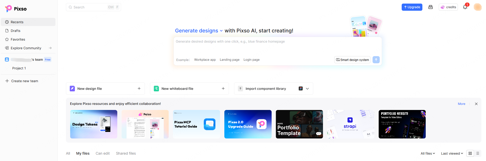
Step 1: Open the AI Workspace Assistant
Open your working file and select the AI icon in the top toolbar to launch the design assistant panel.
If you don't have a starting layout, you can quickly generate a desktop mockup using prompts:
- Prompt Example:"Generate a landing page layout for a SaaS analytics tool, including a dark header navigation, a prominent hero image, a pricing section with three columns, and a clean footer."
The assistant will build the complete desktop design on your canvas.
Step 2: Run the Viewport Adaptation Command
Select your desktop frame, focus on the AI input field, and enter a specific adaptation instruction:
- Prompt Example:"Using this web layout, generate a mobile version sized for an iPhone 15 viewport. Convert the top nav links into a hamburger toggle, stack the pricing columns vertically, and scale down the typography to keep it legible."
Watch as the assistant restructures the layout section-by-section, automatically wrapping content and resizing containers on a new artboard.
Step 3: Fine-Tune the Output
Once the mobile screen is generated, check each section for visual balance:
- Check the Touch Targets: Verify that your links, menu items, and CTA buttons are comfortable to click on mobile screens.
- Check Content Hierarchies: Verify that vital brand messaging appears above the fold and that long text blocks stack naturally.
- Modify Specific Elements: If you need to make changes, you can use conversational commands like: "make the hero call-to-action button full-width" or simply use standard design tools to edit the vector curves directly.
Step 4: Generate a Tablet Version (Optional)
If your project requires tablet support, you can generate an iPad layout using the same process:
- Prompt Example:"Using this web layout, generate a tablet version for a 12.9-inch iPad. Use a double-column grid for the features list and keep the header navigation visible."
Since tablet layouts generally sit between desktop and mobile structures, the assistant will preserve more of your original horizontal spacing while scaling down the outer paddings.
Step 5: Gather Feedback and Hand Off
Arrange your desktop, mobile, and tablet artboards side-by-side on your canvas. Use Pixso's share feature to generate a live link for your team. Product managers and developers can review the designs and leave comments directly in their web browser, without needing to install separate design software.
Part 5. Advanced strategies for high-quality responsive layouts
Using these expert techniques can help you get the most out of your multi-device design workflows.
Strategy 1: Predefine Breakpoint Rules
Before starting on your desktop layout, set clear breakpoint values (such as 1440px for desktop, 1024px for tablet, and 375px for mobile). Mention these specific breakpoints in your file description or prompts. This ensures the assistant scales and repositions elements to match your project’s actual front-end grid system.
Strategy 2: Use Component Variants to Manage Layout Differences
For complex components that change dramatically across devices (like complex tables or long navigation menus), create distinct variants in your component library (e.g., Desktop/Header and Mobile/Menu). The AI can then swap these variants automatically when generating layouts for different screen sizes, keeping your master components fully synced.
Strategy 3: Connect Design Tokens Globally
Manage foundational design properties (like color systems, spacing, and font sizes) through variables. By setting up design token variations for mobile views—such as reducing global side-padding from 24px on desktop to 16px on mobile—the adapted designs will automatically follow your system specifications down to the pixel.
Strategy 4: Generate Quality Checklists
Once your layouts are generated, you can ask the assistant to review your mobile screens for usability:
- Prompt Example: "Create a mobile UX review checklist for this generated artboard".
The system will analyze your mobile design and output a tailored quality list covering layout hierarchy, readability, and tap targets, making it easy to run a quick quality check before handoff.
FAQ
Q1: Can developers use the code output directly, or is it just for visual reference?
A: You can use it directly. Designers can switch the canvas to "Inspect Mode" with one click, letting developers copy clean CSS styles, layout dimensions, and typography weights. By integrating these visual assets with your design to code tools, developers can output clean HTML, CSS, or framework-specific code (like Flutter or ArkUI), reducing the time spent translating mockups into code.
Q2: Can the tool adapt large, multi-page platforms at once?
A: Yes. The system can read and process entire design files. You can request the assistant to generate mobile alternatives for all the artboards in your current directory, saving hours of manual resizing on larger projects.
Q3: What is the difference between adaptive layouts and responsive code?
A: Responsive code uses media queries to adjust layout styles dynamically in the browser. Multi-device design drafts, on the other hand, define the ideal visual state for each specific viewport size beforehand. This ensures the final code matches your brand’s standards on every device.
Conclusion
Manual layout conversion shouldn't slow down your product releases. With modern ai ui design tools, you can automate the repetitive parts of responsive web design and focus your time on polishing your user experience. If you are ready to speed up your product cycles, try using the automated layout features inside Pixso. You can sign up for a free account at pixso.cn and generate your first responsive mobile views today.