Sherry
A good app user experience helps people understand what they can do, complete the task, and recover when something goes wrong. Clear navigation, meaningful feedback, and accessible controls matter as much as visual style. The principles below connect those decisions with research, prototyping, and team review in Pixso.
Core Principles of a Good App User Experience

The difference between a good app and a great one lies in intentional design choices.
1. Simplicity and Intuitive Navigation
Make the next action understandable without hiding information people need. For example:
- Progressive disclosure: show the information needed for the current decision and make additional options easy to find.
- Predictable patterns: use navigation that fits the platform, content, and task instead of changing familiar behavior without a reason.
- Explain unfamiliar or consequential actions in context. A brief hint can be useful; the interface should not depend on a separate manual for routine tasks.
2. Consistency in Visual and Interaction Patterns
Uniformity builds trust. Key practices include:
- Design Systems: Reusable components for buttons, typography, and icons.
- Motion consistency: use similar transitions for similar changes of state, and make destructive actions clear before they happen.
3. Accessibility as a Non-Negotiable
Design for different access needs and test the implemented experience:
- Contrast Ratios: Text readable in sunlight or low light.
- Screen-reader support: provide meaningful labels and a sensible reading and focus order in the implemented app.
4. Responsive Feedback and Micro-Interactions
Silent interfaces confuse users. Enhance app user experience with:
- Loading states: choose a progress indicator that fits the wait and makes the current state clear.
- Haptic Feedback: Subtle vibrations confirming actions like payments.
User-Centric Design: From Research to Iteration
Great design starts with understanding real people, not assumptions.
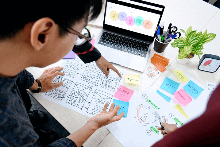
1. Empathy-Driven User Research
Map pain points through:
- Journey Mapping: Identify frustrations in sign-up, onboarding, or checkout flows.
- Usability Testing: Observe how users navigate prototypes.
2. Prototyping and Testing with Tools Like Pixso
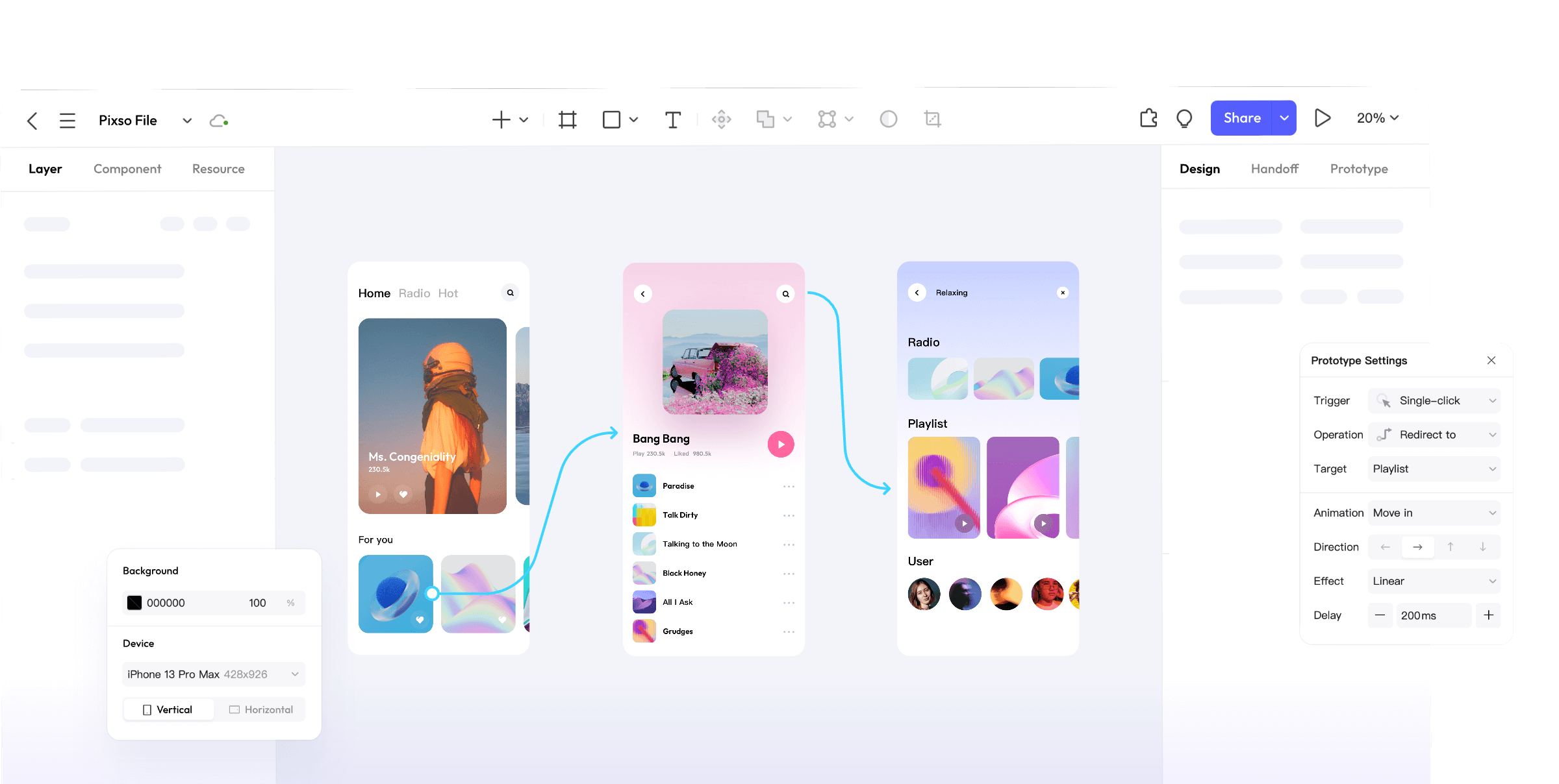
Pixso bridges the gap between ideas and execution:
- Interactive Prototypes: Simulate flows like form submissions or menu transitions.
- Real-Time Collaboration: Developers and stakeholders annotate designs live.
- Design Handoff: Auto-generate specs for padding, fonts, and assets.
3. Continuous Improvement Based on Data
Use research and product data to understand where the experience needs work:
- Track drop-off points in funnels.
- A/B test button colors or CTA placements.
Use Pixso to Develop and Review the App Flow
A shared design file gives designers, developers, and stakeholders a place to discuss the same screens. In Pixso, connect the task flow, reuse components, and keep feedback beside the relevant state.
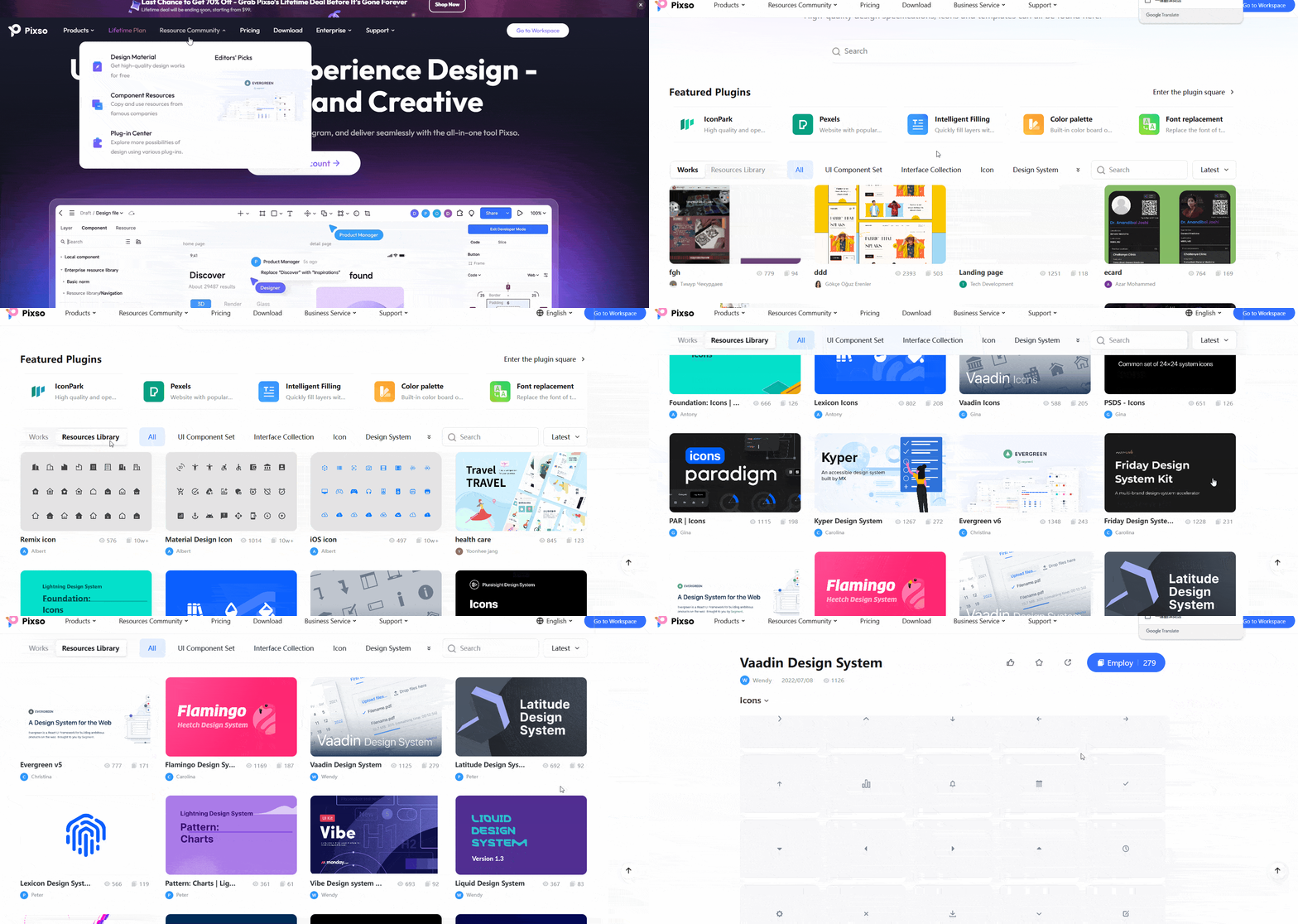

A trial project can help you assess three practical needs:
- Workflow fit: try the screens, prototype, and handoff your team needs before deciding which tools to keep.
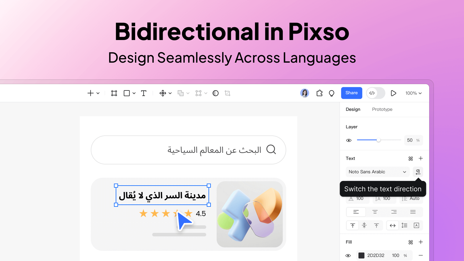
- Language fit: check the editor, fonts, help materials, and translated content used by the team.
- Starting resources: adapt relevant community templates and components after checking their structure and usage terms.
Below, we break down how Pixso empowers designers at every stage of the UX process.
1. Unified Workspace for End-to-End Design
Keep wireframes, detailed screens, and review comments connected as the flow develops. For example, use the same registration task to compare an early layout with a version that includes final labels and error states.
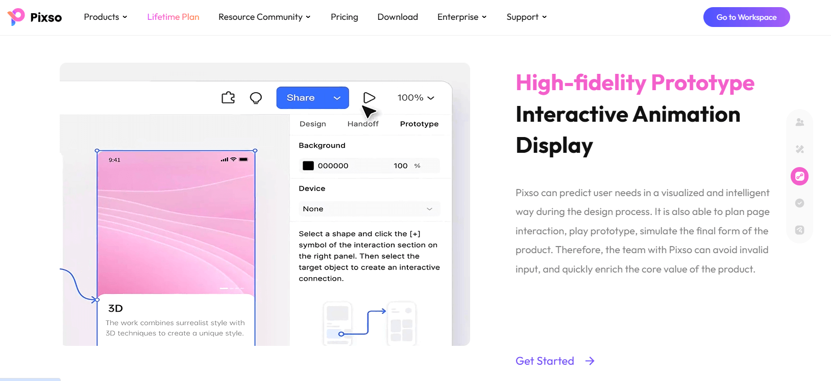
- Wireframes and detailed screens: begin with structure, then add content and shared components. Use Auto Layout to inspect how the layout responds to text and size changes.
- Interactive Prototypes: Simulate complex user flows, such as multi-step onboarding or gesture-based navigation. Pixso's hotspot linking and animation presets (e.g., smart transitions, overlay effects) let stakeholders "experience" the app before coding begins.
- Developer handoff: share measurements, text styles, component states, and exportable assets. Review implementation details with the developer before delivery.
2. Real-Time Collaboration: Design with Context
Great app user experience requires alignment across teams. Pixso's cloud-based platform enables:
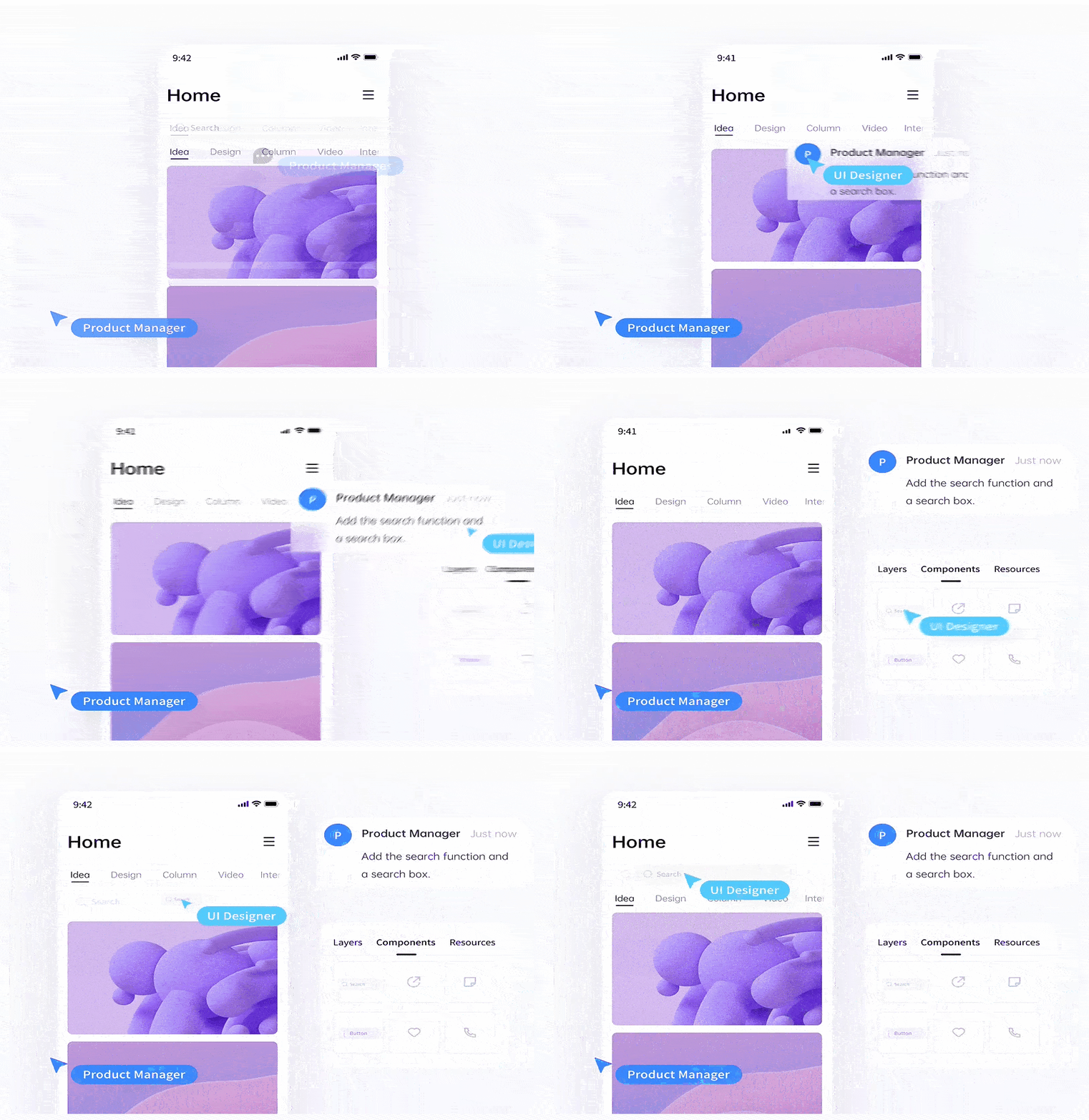
- Live Co-Editing: Product managers, developers, and designers can annotate designs simultaneously. For example, a copywriter might refine microcopy directly on a prototype while a UX designer adjusts button placements.
- Version history: name review milestones and return to earlier versions when the feature is available for the file and plan.
- Review links: configure access for the people reviewing the prototype. Whether a visitor needs to sign in depends on the file’s sharing settings.
3. Design System Management for Consistency
Shared components make repeated screens easier to maintain when the team has a clear publication and update process:
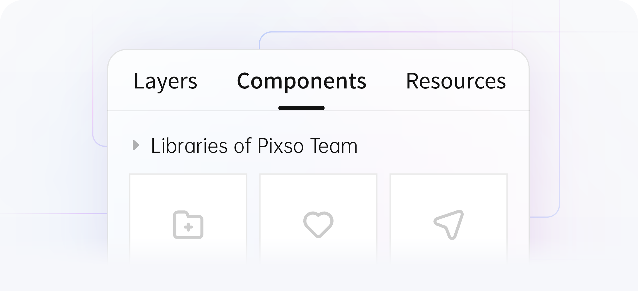
- Component Libraries: publish an updated component to the team library. Designers can then review and apply the update in the files using it, rather than having every file change immediately.
- Style Guides in Context: Attach usage guidelines (e.g., "Use this error state for form validations") directly to components, reducing onboarding time for new team members.
- Accessibility review: inspect contrast, labels, focus behavior, and error messages. A design review helps identify issues; the implemented app also needs testing with the relevant access methods.
4. User Testing and Iteration Made Simple
Use a prototype to investigate a specific design question, such as whether people can find a delivery option or recover from an invalid entry:
- Prototype sessions: give participants a task and observe their route, hesitation, and mistakes. Record findings beside the relevant screens.
- Alternative designs: prepare two versions when there is a meaningful decision to compare, using the same content and task.
- Research records: keep observations and decisions in the team’s chosen research system. Do not assume the design file itself collects heatmaps or session recordings.
Examples of Seamless App User Experience
1. Onboarding Flows That Educate Without Overwhelming
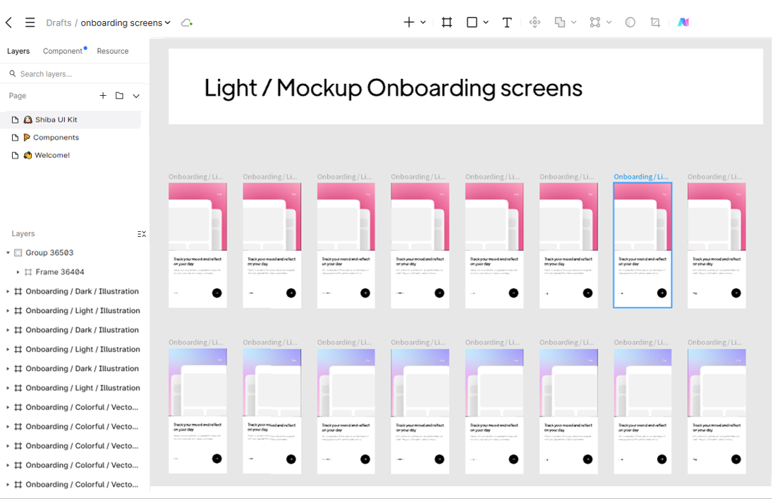
- Progressive Tutorials: Teach features contextually (e.g., tooltips during first use).
- Skippable Steps: Let users explore freely, offering help via a floating chatbot.
2. Contextual Help and Error Prevention
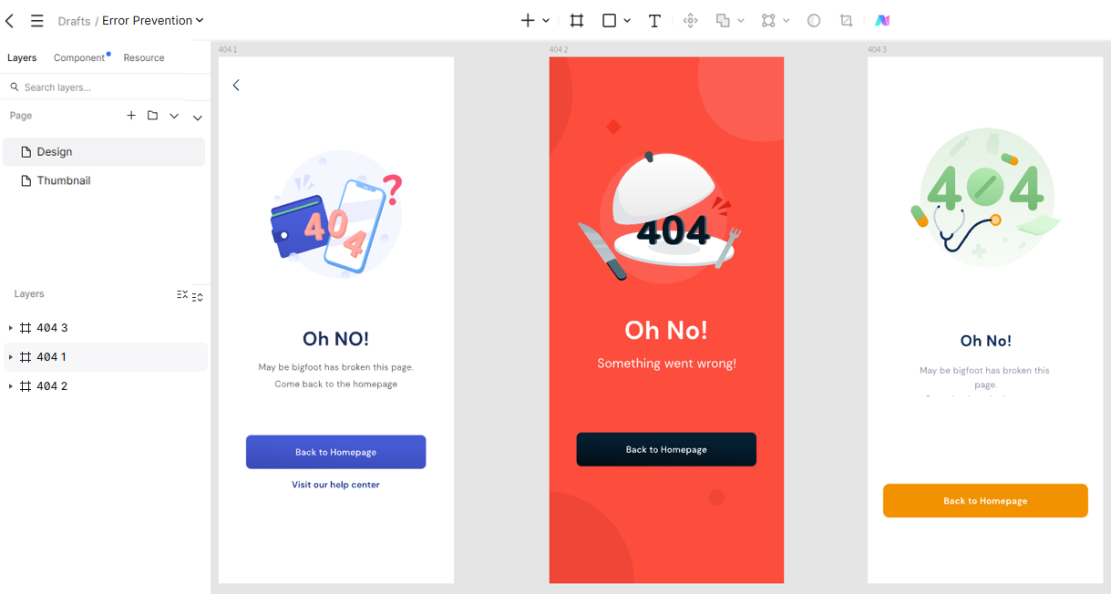
- Smart Defaults: Pre-fill forms with geolocation data.
- Plain-Language Errors: Avoid technical jargon ("Connection Lost" vs. "HTTP 504 Error").
3. Personalization Without Complexity
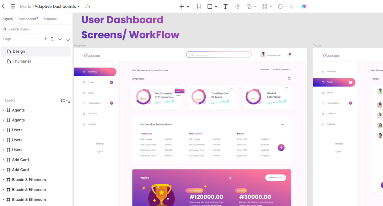
- Adaptive Dashboards: Highlight frequently used tools for returning users.
- Privacy-First Customization: Let users opt into recommendations.
Future-Proofing Your App's Design
Stay ahead with trends like:
- AI-Powered Adaptivity: Interfaces that adjust to user habits.
- Voice-Accelerated UX: "Show me last week's stats" instead of manual filtering.
- Cross-Device Harmony: Sync states between mobile, desktop, and wearables.
Final Thoughts
A good app experience comes from clear tasks, understandable feedback, and careful handling of different states. Use research to find the difficulty, develop the relevant screens in Pixso, and carry the agreed behavior into implementation.