
Scott
Choosing from Google Fonts depends on the content, language, and role of the text. A display face can give a heading character while becoming tiring in a long paragraph. Compare the fonts below using your actual labels and body copy, then test the chosen family in the layout and browsers your audience uses.
Understanding the Role of Fonts in Visual Design
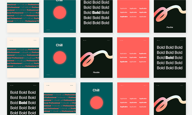
1. The Psychology of Fonts
A typeface contributes to tone through its proportions, stroke contrast, and details. Compare options in context: a serif is not automatically formal, and a sans-serif is not automatically easier to read.
2. Readability and Legibility
Fonts need to be readable and legible. Consider size, spacing, and contrast when choosing. A font's suitability also depends on the medium and audience.
3. Visual Hierarchy
Fonts create a visual hierarchy. Use different sizes, weights, and styles to highlight important info. Larger, bolder fonts for headings and smaller ones for body text work well.
Tailored Google Font Recommendations for Diverse Design Needs
Best Google Fonts for Headings
When it comes to headings, you want to choose a font that is bold, eye-catching, and easy to read. Some of the best Google Fonts for headings include:
Playfair Display: This serif font is known for its elegant and sophisticated design, making it perfect for headings in formal or traditional designs.
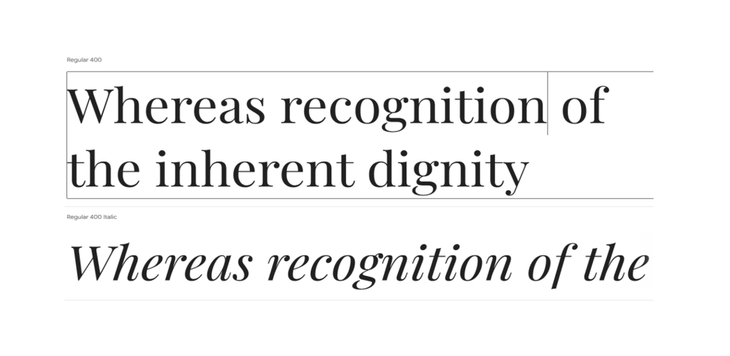
Roboto: This sans-serif font is a popular choice for headings in modern and minimalist designs. It is clean, simple, and easy to read, making it a versatile option for a variety of design projects.
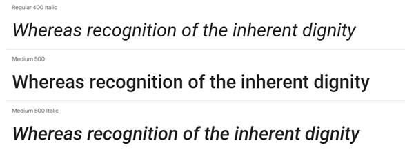
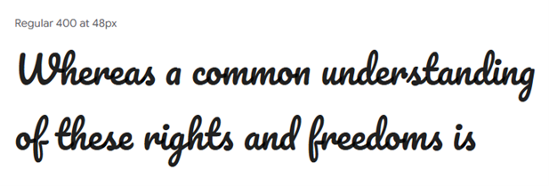
Pacifico: This script font is fun, playful, and full of personality, making it a great choice for headings in designs that require a touch of creativity and whimsy.
Best Google Fonts for Body Text
For body text, you want to choose a font that is easy to read and comfortable on the eyes. Some of the best Google Fonts for body text include:
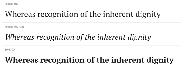
PT Serif: This serif font is a great choice for body text in printed documents, such as books, magazines, and newspapers. It is elegant, readable, and has a classic look that is suitable for a variety of design projects.
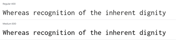
Inconsolata: A monospace option for code samples, technical labels, and data where character alignment is useful. Test longer prose separately before choosing it for all body text.
Best Google Fonts for Logo Design
When it comes to logo design, you want to choose a font that is unique and memorable and reflects the personality of your brand. Some of the best Google Fonts for logo design include:
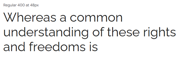
Raleway: This sans-serif font is a popular choice for logo design. It is clean, modern, and has a unique style that is suitable for a variety of design projects.
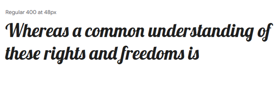
Lobster: This script font is fun, playful, and full of personality, making it a great choice for logo design in designs that require a touch of creativity and whimsy.
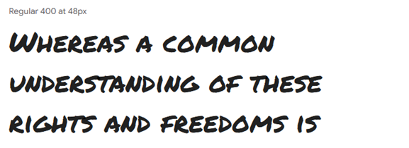
Permanent Marker: This display font is bold, eye-catching, and has a unique style that is suitable for logo design in designs that require a strong and memorable brand identity.
Best Google Fonts for Web Design
For web design, compare legibility, language coverage, available weights, and the files the website will need to load. Font selection and implementation both affect the result.
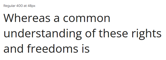
Open Sans: A sans-serif option to test for interface labels and body copy. Check the selected weights and character coverage with your own content.
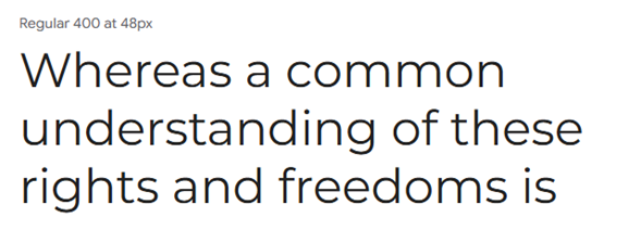
Montserrat: This sans-serif font is a great choice for web design. It is bold, eye-catching, and has a unique style that is suitable for websites that require a strong and memorable brand identity.
Dive into Font Variety with Pixso
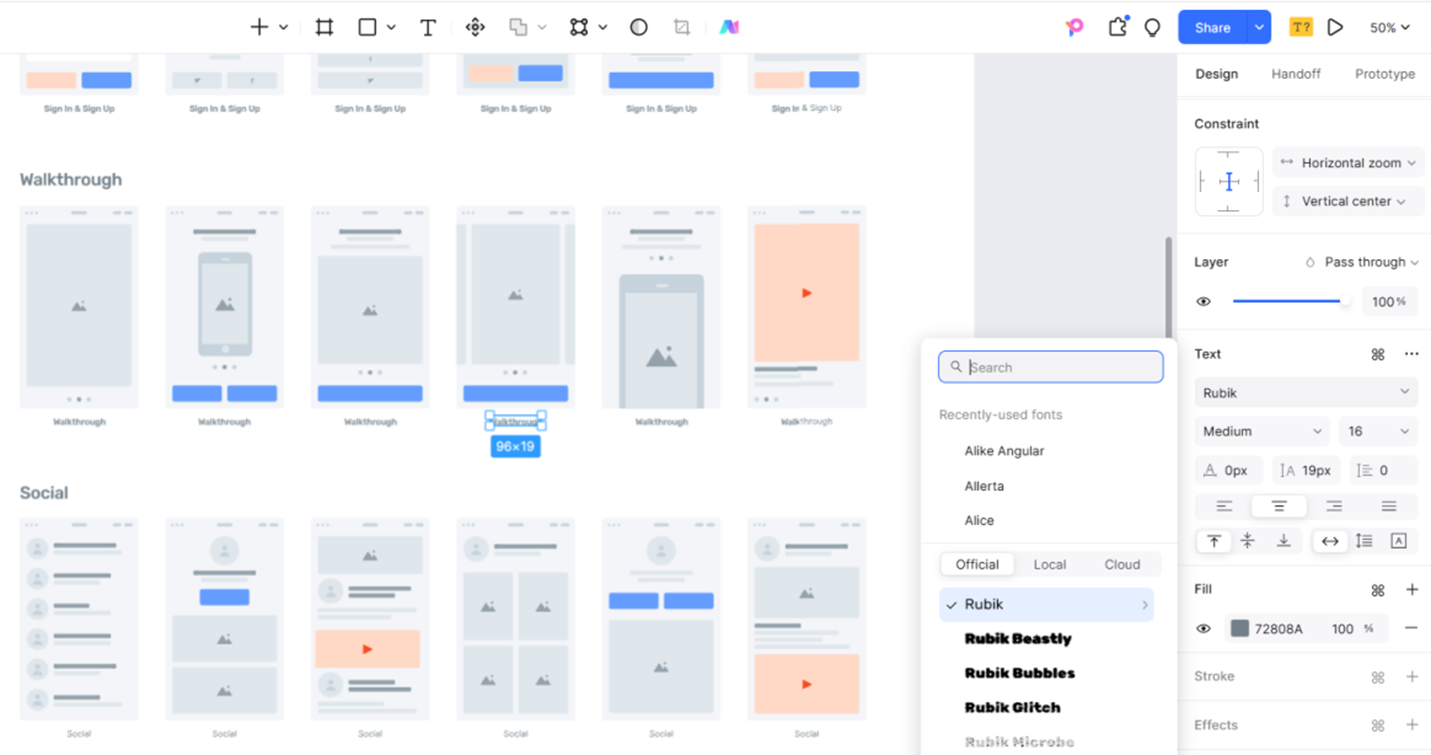
Use Pixso to compare typefaces on the same screen. Set up a heading, paragraph, button, and error message with realistic content, then apply a candidate font to each. If a font is not available in the file, use the supported local-font workflow and make sure collaborators can access the required family.
A useful comparison keeps the text and container width fixed. Note line breaks, label fit, and the contrast between headings and body copy before deciding which family to use.
5 Expert Tips for Designers Using Google Fonts with Pixso
Choosing the right typography is critical. These five steps connect font selection in the design file with the website your team will build:

1. Prioritize Readability and Brand Alignment
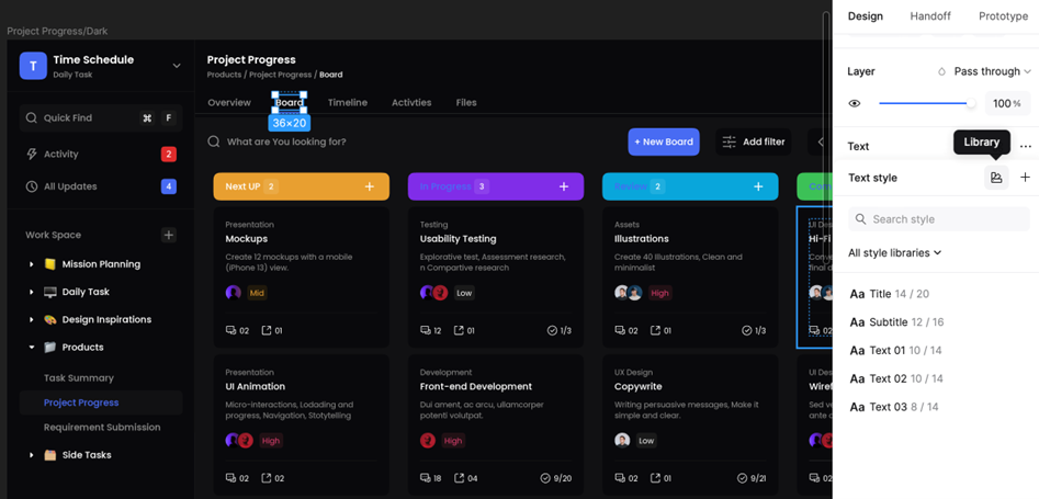
Test the font with real headings, labels, numbers, and longer passages. Compare its tone with the brand and inspect small text at the intended size. Save agreed settings as text styles in Pixso so the team can apply them consistently.
2. Optimize Loading Speed
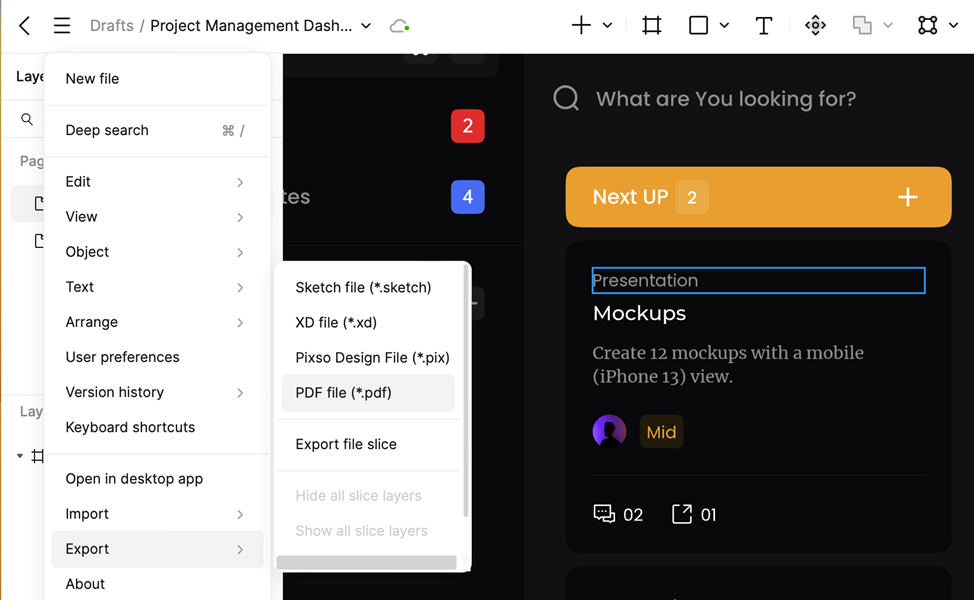
Load only the font files, weights, and character sets the website needs. A variable font may replace several static files, but compare the actual file sizes and loading behavior before choosing it. Exporting a design image does not configure font loading in the implemented website.
3. Compare Font Pairings in Context
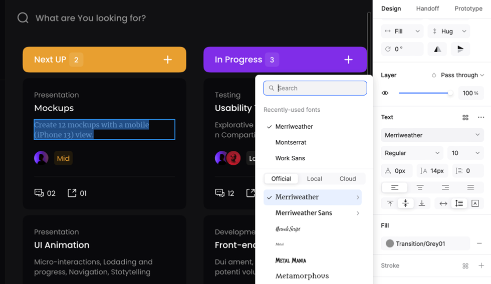
Place candidate heading and body fonts on the same screen. Compare their proportions and hierarchy using the actual content, rather than judging a pair from a short specimen alone. Ask teammates to review dense sections as well as the hero heading.
4. Ensure Cross-Platform Compatibility
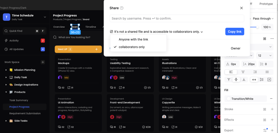
Test the chosen fonts, weights, and fallback fonts in the browsers and devices your audience uses. Review missing characters, line breaks, and text that shifts while the font loads. Share the agreed family and weight names with developers.
5. Localize for Global Audiences
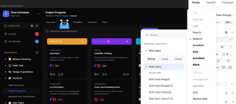
Check the scripts and characters each language needs. Use a suitable language-specific family when necessary, and test translated text at realistic lengths. A family name alone does not guarantee that every required script is included in the file you selected.
Conclusion
Choose typography with actual content in Pixso, then carry the agreed font families, weights, and styles into implementation. The final test is whether readers can distinguish the hierarchy, read comfortably, and complete the interface’s tasks.


![[Full Guide] Tags UI Design](https://pixso.net/assets/media/tags-ui-intro-fdf1d4dad4511eb5.webp)


