Scott
Transforming complex metrics into clear, actionable interfaces is one of the toughest challenges in product design. When raw numbers overwhelm users, intuitive visual storytelling bridges the gap between confusion and clarity.
Whether you are building an enterprise analytics portal, a SaaS metrics hub, or a fintech monitoring tool, high-impact data visualization design dictates how quickly users extract meaningful insights. In this comprehensive guide, we examine 8 curated data visualization examples from real-world UI design files, break down modern interface patterns, and explore how an integrated design workflow supports your production pipeline from initial concept to developer handoff.
Part 1: The Modern State of Data Visualization UI: Challenges and Workflow Bottlenecks
Designing an enterprise-grade data visualization UI requires balancing aesthetic precision with functional utility. In day-to-day design work, design and product teams frequently encounter critical bottlenecks that stall progress:
- High Cognitive Load: Cramming too many widgets, mismatched color palettes, and competing visual weights into a single viewport overwhelms users and obscures critical anomalies.
- Component Inconsistency: Redrawing axes, tooltips, legends, and grid lines manually across multiple artboards leads to fragmented design systems and wasted hours.
- The Design-to-Development Gap: Traditional static design files rarely communicate dynamic data states, responsive breakpoints, or clear tokens, requiring developers to interpret chart states manually.
- Fragmented Toolchains: Product teams often juggle separate apps for whiteboard brainstorming, UI layout, prototype validation, and design spec handoffs, creating alignment friction between stages.
Addressing these challenges requires both thoughtful interface principles and a unified design environment that supports key stages of the product design workflow.
Part 2: Accelerating Data Viz Workflows with Pixso: From Idea to Production Baseline
To reduce workflow friction, many digital product teams leverage Pixso, an all-in-one collaborative product design and engineering delivery platform. Pixso connects early ideation, design system management, multiplayer design reviews, and structured code extraction.
1. Structuring the Data Narrative on Pixso Whiteboard
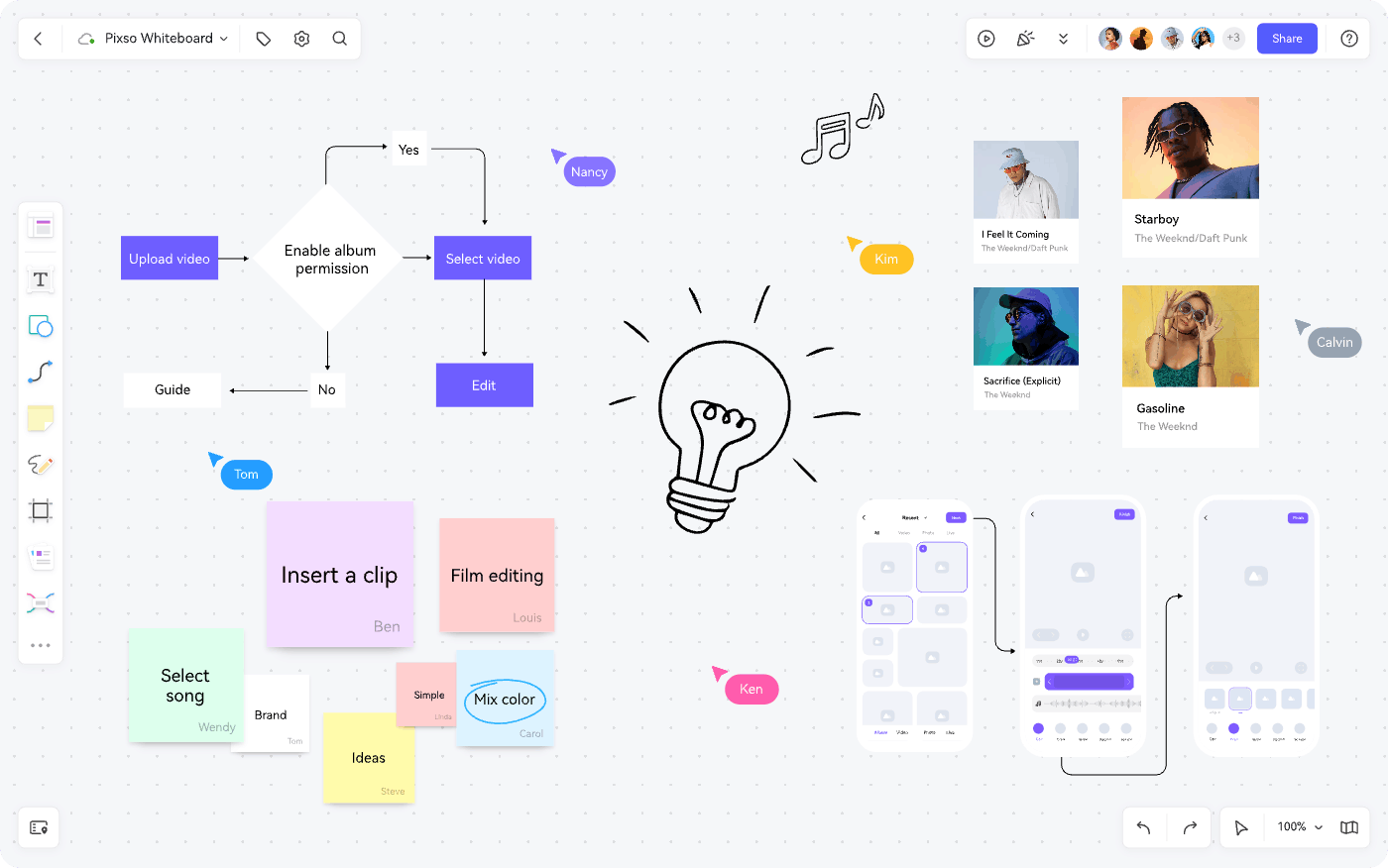
Before placing chart components, product managers and designers can map out information hierarchies on Pixso Whiteboard. Equipped with pre-built brainstorming boards, user flow diagrams, and PRD tables, teams can clarify metrics, business logic, and user journeys collaboratively in one shared canvas.
2. Concept Validation with Pixso AI
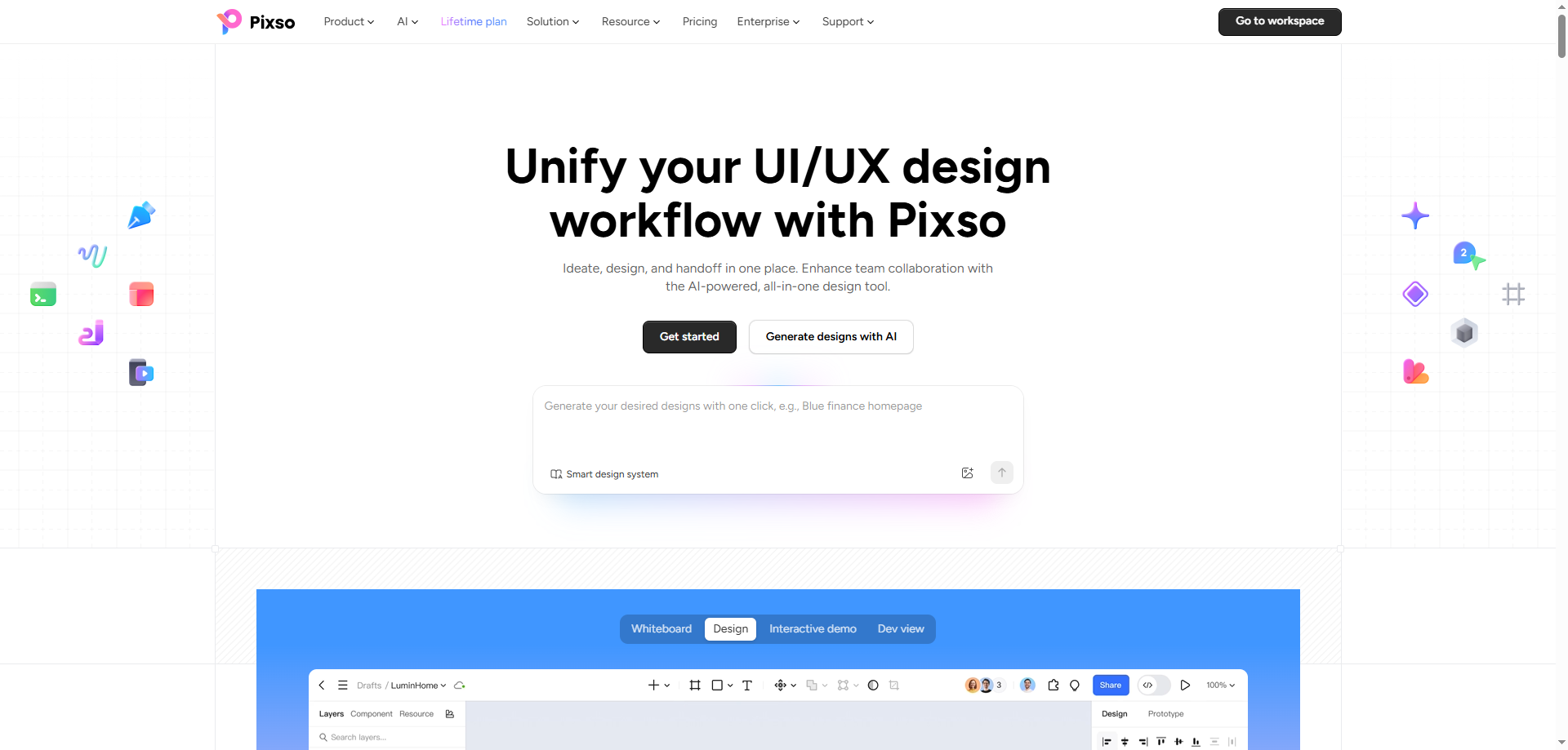
Validating an interface layout early can help teams align faster. Pixso AI features a text-to-design generator: enter a natural language prompt describing your target dashboard, and the system generates an editable layout draft to explore layout directions.
Pixso AI also assists designers across iterative workflow tasks (note: AI-generated outputs should always be reviewed and refined by designers):
- AI Smart Edit: Adjust component properties or tweak screen elements using text prompts.
- AI Smart Layout & Layer Organization: Assists in organizing selected compatible frames and renaming layers with clearer semantic tags.
- AI Image Generation & Editing: Create supporting visual assets, remove backgrounds, or upscale graphics directly inside the editor.
- AI Design Specs & Checklists: Suggest harmonious color palettes, establish typography hierarchies, and run basic layout checklists.
- AI Copywriting Assistant: Draft, translate, or refine chart labels, tooltip explanations, and summary text.
3. File Migration & Design System Management
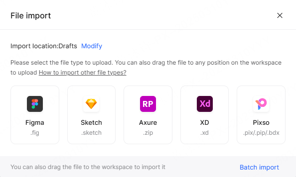
If your team already uses other tools, Pixso supports batch importing Figma, Sketch, and Axure files with over 90% compatibility. While layers, vector assets, and basic color styles translate smoothly, teams should verify component relationships, custom fonts, visual effects, and prototype interactions after migration to accommodate cross-platform differences. Once imported, you can standardize colors, typography, and chart elements into a central design system repository for consistent reuse.
4. Interactive Validation and Code Inspection
Testing how a data dashboard performs across different screen sizes is essential. Pixso supports interactive prototype presentations, including an offline demo mode for smooth stakeholder walkthroughs without network lag. Multiple team members can interact with prototypes and leave contextual feedback in real time.
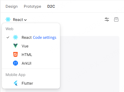
For handoff, Pixso's Dev Mode allows developers to inspect layout measurements, extract design tokens, and generate starter code in React, Vue, HTML, ArkUI, and Flutter. While this code accelerates frontend UI scaffolding, developers should still integrate their own business logic, API connections, state management, and accessibility enhancements.
Part 3: Comparative Framework: Choosing the Right Data Visualization Paradigm
Selecting the right visual structure depends on your target user's domain and technical goals. The table below outlines common visual models, their core chart types, and typical applications:
| Design Paradigm Framework | |||
| Paradigm | Core Chart Archetypes | Primary Strengths | Recommended Applications |
| Operational Dashboard | Sparklines, Gauges, Real-time Line Charts | Quick status appraisal, low cognitive overhead | Server monitoring, live logistics, operational feeds |
| Analytical BI Suite | Candlesticks, Heatmaps, Scatter & Bubble Plots | Multidimensional dataset exploration, pattern discovery | Financial analysis, cohort retention, deep research |
| Executive KPI Summary | Donut Charts, Compact Metric Cards, Bar Charts | High-level goal tracking, quick summaries | Executive overviews, revenue reports, quarterly reviews |
| Relational & Flow Analysis | Sankey Diagrams, Chord Diagrams, Treemaps | Visualizing path transitions, hierarchies, and entity ties | Funnel analysis, supply chain paths, budget allocation |
Part 4: 8 Inspiring Data Visualization Examples and UI Templates in Pixso Community
All 8 templates featured below can be discovered and accessed in the Pixso Resource Community. You can inspect layout hierarchies, duplicate files to your drafts, and adapt components to your product requirements.
(Note: Community resources are published by independent creators. Always check license notes inside the file before commercial deployment. Many community files are provided under open personal/study terms and may require author attribution for commercial distribution.)
Case 1: Data Visualization Templates
- Creator: Elmo
- License: Community Free for Study
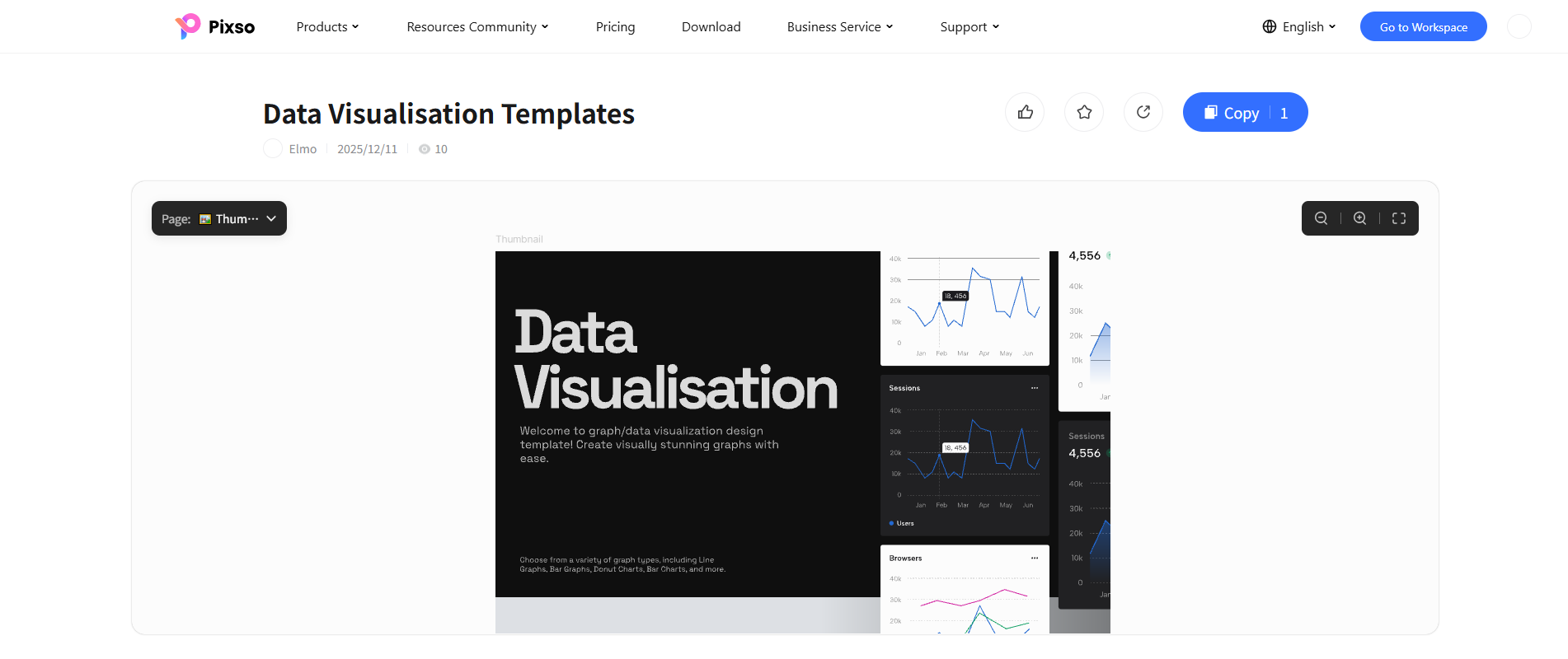
- Description: This clean UI template focuses on core monitoring interactions. It features minimalist line charts with sample tooltip states, multi-series browser breakdowns, and both light and dark canvas styling. The intentional use of negative space helps key trends remain readable.
- Key Strengths: High-contrast line graphs with interactive data callout badges, versatile light/dark canvases, and modular metric cards.
- Best Used For: Web analytics platforms, SaaS traffic monitoring, and customer session tracking.
Case 2: Material Design Data Visualizations
- Creator: Elmo
- License: Community Free for Study
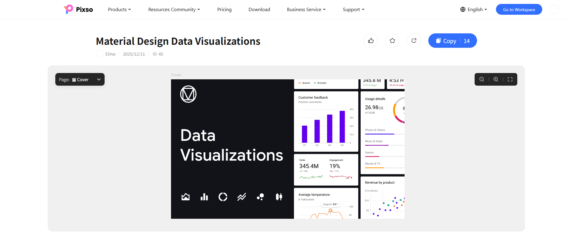
- Description: Following classic Material Design guidelines, this kit uses structured elevation cards, follows a consistent 8px grid, and features restrained color accents. It includes segmented vertical bar charts for quarterly feedback, split-line progress indicators, and compact scatter plots.
- Key Strengths: Consistent grid spacing, clear visual hierarchy with subtle surface elevation, and pre-configured customer satisfaction metrics.
- Best Used For: Enterprise admin portals, CRM customer feedback dashboards, and B2B operational tooling.
Case 3: Advanced Data Visualization
- Creator: Elmo
- License: Community Free for Study
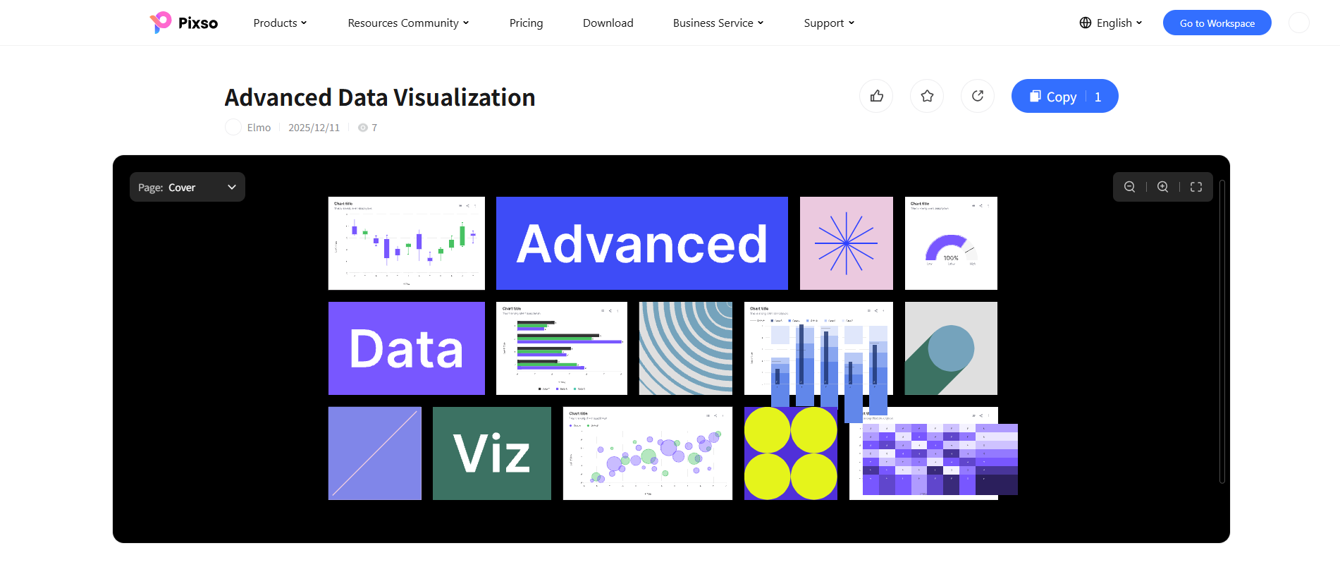
- Description: When basic bar charts fall short, this advanced kit offers specialized visual archetypes. It provides multi-layer horizontal bar graphs, candlestick financial modules, concentric radial meters, and dense matrix heatmaps.
- Key Strengths: Handles multidimensional datasets with high visual clarity, balanced typography scales, and modular card structures.
- Best Used For: Trading terminals, quantitative finance platforms, and multi-variable engineering logs.
Case 4: Data Visualization Package
- Creator: Pixso Community Contributor
- License: Community Free for Study
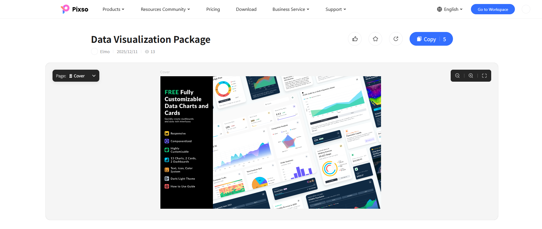
- Description: A comprehensive UI asset kit featuring a versatile selection of chart types, dashboard screens, and dedicated metric cards. The set showcases radar charts, smooth area distributions, grouped horizontal bars, and circular progress rings in both light and dark themes.
- Key Strengths: Organized component structure with responsive auto-layout frames and reusable color and typography styles.
- Best Used For: Product designers building unified cross-platform enterprise analytics suites from modular foundations.
Case 5: Data Visualization Dashboard v1.0
- Creator: Pixso Community Contributor
- License: Community Free for Study
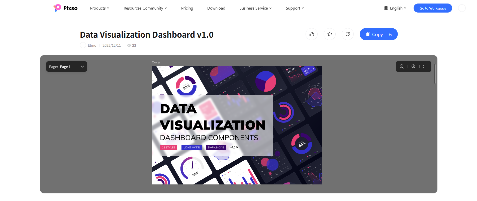
- Description: This dashboard kit emphasizes rich, modern visual styling. With multiple card configurations, glowing visual accents for dark interfaces, circular completion gauges, and multi-series line comparisons, it is tailored for monitoring stations.
- Key Strengths: Polished dark-mode color balance, tactile gauge meters, and versatile card frames designed for fast modular assembly.
- Best Used For: IoT monitoring hubs, cybersecurity command centers, and real-time gaming telemetry.
Case 6: Data Visualization Components
- Creator: Pixso Community Contributor
- License: Community Free for Study
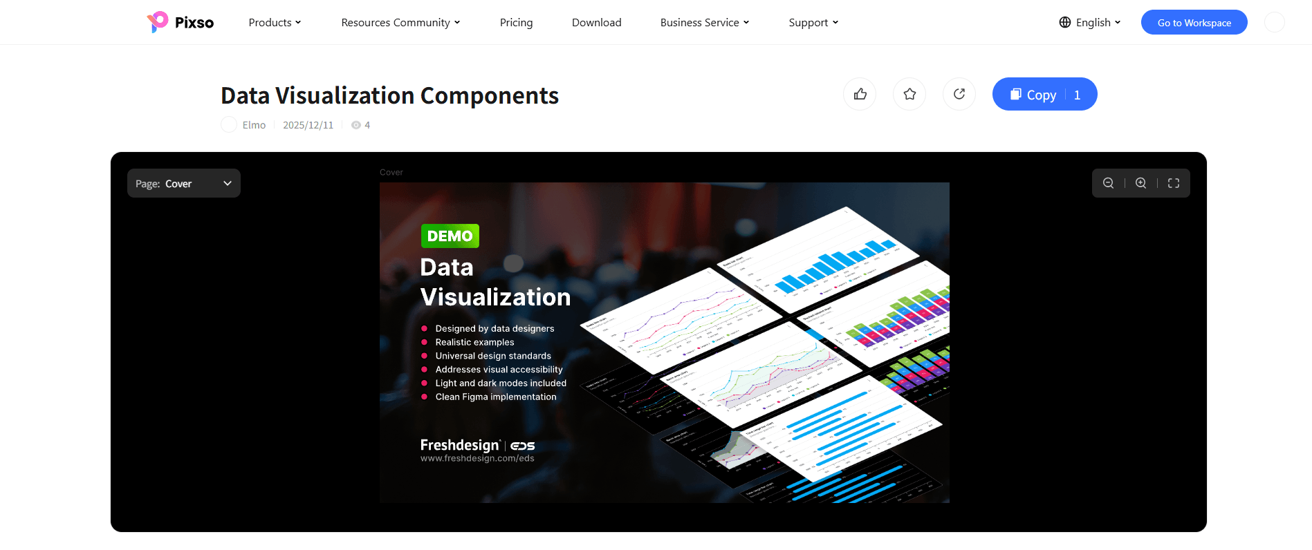
- Description: Built for readability, this component system prioritizes clean visual architecture. It includes multi-series step lines, stacked percentage columns, and horizontal range bars that incorporate strong contrast considerations between data series and card surfaces.
- Key Strengths: Palettes selected with accessibility considerations in mind, structured component variants, and realistic sample data sets.
- Best Used For: Healthcare analytics, public sector dashboards, and enterprise platforms requiring clear data legibility.
Case 7: Visual Design of Data Statistics Card
- Creator: Joanne
- License: Community Free (Check file notes for reuse)
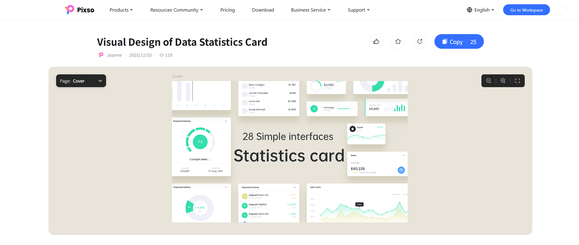
- Description: A refined collection of compact metric cards and widget components. This library highlights soft drop shadows, pastel color accents, balance breakdown donuts, and floating revenue summary widgets.
- Key Strengths: Clean interaction-state examples, versatile widget layouts for easy copy-and-paste reuse, and balanced layout padding.
- Best Used For: Mobile banking apps, digital wallets, personal expense trackers, and e-commerce KPI widgets.
Case 8: Data Visualization Chart Set 1
- Creator: Pixso Community Contributor
- License: Community Free for Study
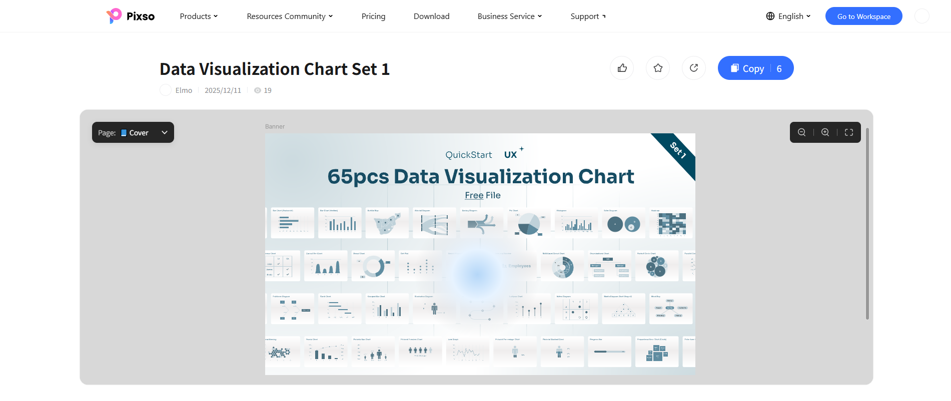
- Description: A broad library covering foundational chart archetypes. From area plots to specialized formats like Sankey diagrams, chord plots, bubble density maps, Gantt timelines, and treemaps, this kit serves as a valuable reference catalog.
- Key Strengths: Broad visual coverage of conventional chart archetypes, consistent stroke weights, and uniform label hierarchies.
- Best Used For: Design system team libraries, academic research portals, and data science reporting interfaces.
Part 5: Best Practices for Implementing High-Impact Data Visualization Dashboards
Building a successful data visualization UI requires thoughtful visual engineering. Consider these practical design guidelines:
1. Maintain a Cohesive Visual Hierarchy
Avoid giving every widget equal visual prominence. Highlight primary KPIs (such as Total Revenue or Critical Alerts) with prominent typography, while secondary historical tables and supporting breakdown charts maintain muted background treatments.
2. Practice Purposeful Color Encoding and Accessibility
Color in data visualization should convey meaning rather than mere decoration. Limit saturated hues to key alerts, active selections, or primary trends. Always avoid relying solely on color (such as red/green) to communicate critical system status; supplement colors with text labels, icons, or varied line textures.
| Dashboard Layer Styling Guidelines | ||
| Layer | Recommended Styling | Design Purpose |
| Canvas Background | Neutral Gray / Slate (#F8F9FA or #0F172A) | Provides a stable base contrast for foreground elements |
| Frame Cards | Solid White / Deep Slate (#FFFFFF or #1E293B) | Groups contextual information with clean frame boundaries |
| Grid Lines & Axes | Subtle stroke (1px, 10–15% opacity) | Guides eye movement without competing with actual data points |
| Primary Metric Series | High-saturation Accent / Brand Primary | Focuses user attention on core series (verify text contrast with a tool) |
| Alert / Status Indicators | Semantic Red / Amber / Green paired with Text or Icons | Conveys status through redundant cues, avoiding sole reliance on color |
3. Design for Dynamic and Empty States
Real-world data fluctuates. Always account for edge cases: zero-data empty states, skeleton loading placeholders, single-point anomalies, and string truncation for large values. Creating component variants in Pixso helps keep edge-state behavior predictable across design and engineering handoffs.
Part 6: Bringing Your Visualizations to Life: How to Duplicate and Customize in Pixso
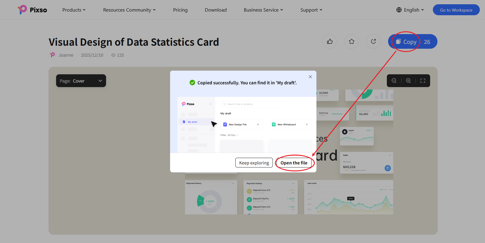
Working with community resources in Pixso is straightforward:
- Explore Community Assets: Navigate to the Pixso Resource Community and search for keywords like data visualization or dashboard.
- One-Click Duplication: On the resource detail page, click the Copy button in the upper-right corner.
- Open in Your Personal Drafts: In the prompt dialog, select Open file to load the resource into your Pixso editor canvas.
- Iterate with Pixso Tools: Adapt chart cards, adjust auto-layout constraints, update labels, or use Pixso AI to explore layout variations and text drafts.
- Inspect & Export Code: Switch to the Dev Mode panel to inspect layout properties, extract design tokens, and generate starter code in React, Vue, HTML, ArkUI, or Flutter to provide a structural frontend baseline for engineering implementation.
Conclusion
Mastering data visualization design requires more than placing charts on an artboard—it calls for structured component systems, accessible visual hierarchies, and clear alignment between designers and developers.
By studying real-world data visualization examples and taking advantage of Pixso's collaborative platform, from Whiteboard planning and AI layout assistance to shared design tokens and code inspection, teams can reduce repetitive manual drawing and iterate on data products with greater confidence. Visit the Pixso Community today to explore these templates and start building your next dashboard.