Elodia
A poster has to communicate before the viewer moves on. Start with one message, decide where the poster will appear, and build a clear path from the headline to the details and next action. The steps below cover layout, type, color, and imagery; for a different visual direction, see how to design a poster with AI-generated 3D artwork.
Define the poster's job before its style
Write a short brief: who should notice the poster, what they should understand, and what they should do next. Include the output size and viewing context. An event poster across a hallway needs a different hierarchy from a promotional graphic viewed on a phone. For an event, settle the name, date, time, location, and booking destination before arranging the page.
How to design a poster, step by step
1. Collect references with a purpose
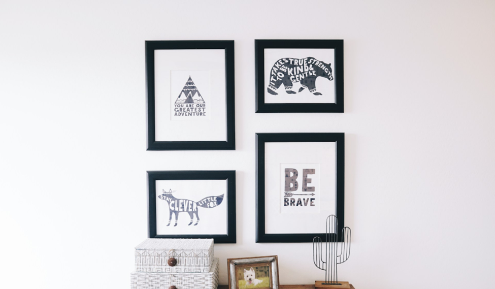
Choose a small set of references and identify what each one does well: a readable title, a striking crop, a restrained palette, or an unusual composition. Build a mood board around those decisions instead of copying a finished poster. For example, a music event might use tightly cropped photography and bold type, while a workshop may need more space for practical details.
2. Choose a format or template
Set the intended width and height before adding content. If you use a template, choose one with a structure suited to your message, then replace its sample text early. For printed work, obtain the printer's requirements for dimensions, bleed, color, and file delivery. For digital placements, note the required aspect ratios and the areas that may be cropped.
3. Build the layout around a clear hierarchy
Place the main message first, supporting details second, and the next action where it is easy to find. Use a grid or alignment guides to connect these groups. Leave space around the headline and keep related facts together: the event date should not be separated from the time by a large decorative image. Reduce the design to a thumbnail to see which element attracts attention first.
4. Select colors that support the message
Begin with a small palette: a background, a text color, and an accent for emphasis. Test the text against its actual background, including any photograph beneath it. Bright colors can attract attention, but several equally strong accents compete with one another. Keep essential information readable even when the poster is viewed at reduced size or in less favorable lighting.
5. Make the typography readable at the intended distance
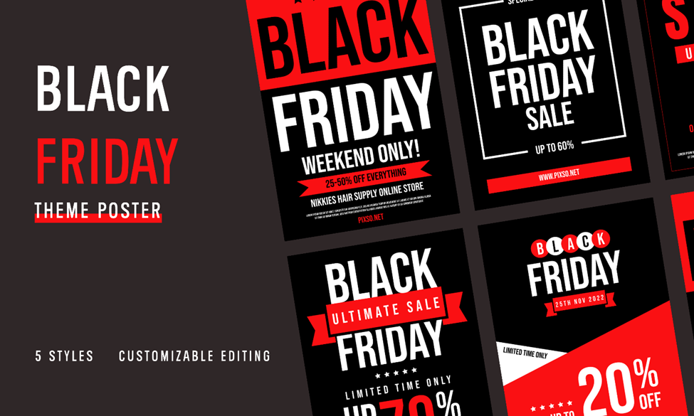
Start with one family, or pair a distinctive headline face with a simpler face for details. Create a visible difference between the headline, supporting line, and practical information. Judge sizes in the final format: a title that looks large on a zoomed canvas may be too small on a wall. Break lines deliberately, avoid isolating short words, and test the longest date, venue name, or translated text.
6. Choose images that carry part of the message
Use a photograph or illustration that tells the viewer something relevant, such as the performer, destination, or subject of a workshop. Check the image's usage rights and resolution for the intended output. Crop with the layout in mind: keep the subject clear and leave room for text where needed. Vector shapes can scale cleanly, while raster photographs still depend on their source resolution.
7. Give the viewer a clear next action
Match the action to the poster's purpose. “Book a seat,” “View the exhibition,” and “Download the schedule” make different promises. Give the destination enough space and contrast to be found without overpowering the main message. If the poster includes a QR code, test the printed or exported code at the size viewers will actually use.
Review the poster in context
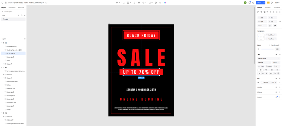
A poster should work in its final setting, not only in the editor. Review the exported version at its intended size and prepare separate adaptations when print and digital placements need different proportions.
Remove competing details
If the headline, image, and decorative elements all demand equal attention, choose one to lead. Remove information that belongs on the destination page and keep the facts needed to make the next decision. Simplicity means a clear order of information, not an arbitrary limit on the number of elements.
Ask what people understood
Show the poster briefly to someone who has not seen the brief. Ask what it is about, when or where it happens, and what they would do next. Their answers reveal hierarchy problems more clearly than asking whether they like the colors. Use feedback to resolve specific gaps, then recheck the date, spelling, links, and destination.
Develop a recognizable visual idea
Choose one idea that belongs to this message: a crop that emphasizes the subject, a headline arranged around a key word, or a repeated shape drawn from the event's theme. Develop that idea consistently. Originality comes from a relevant choice carried through the composition, not from adding an unrelated effect to every element.
Use Pixso to develop and review the layout
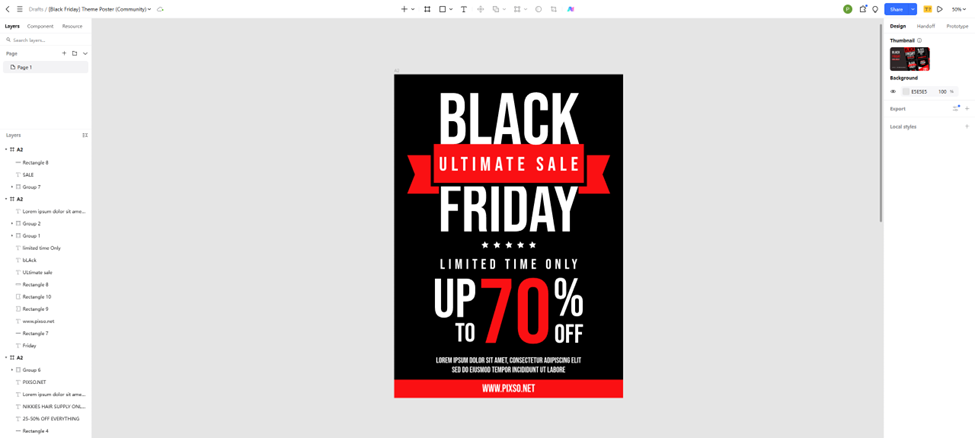
Create a frame for each required poster format in Pixso. Arrange text, images, and vector shapes, then compare variations beside one another. Share the design with collaborators so they can comment on the layout and copy. Keep the approved version clearly named and inspect the exported file before it goes to print or is uploaded.
Start your next poster in Pixso with the headline, essential details, and one visual direction. Once that structure reads clearly, refine spacing, color, and imagery. The finished poster should make its message and next step easy to understand.