Scott
A mockup is a static picture of how a product screen should look. It shows choices such as typography, color, imagery, spacing, and component states in enough detail for visual review. A wireframe asks whether the right information is in the right place; a prototype lets someone move through a flow. These artifacts can use the same design file, but they answer different review questions.
Imagine an event-registration page. A wireframe places the event details and form. A mockup shows the final visual hierarchy: how the date, venue, ticket choice, and primary action read together. A prototype connects the action to a confirmation or error state. If you are preparing that screen in Pixso's UI design workspace, decide which question your team needs answered before adding detail or interactions.
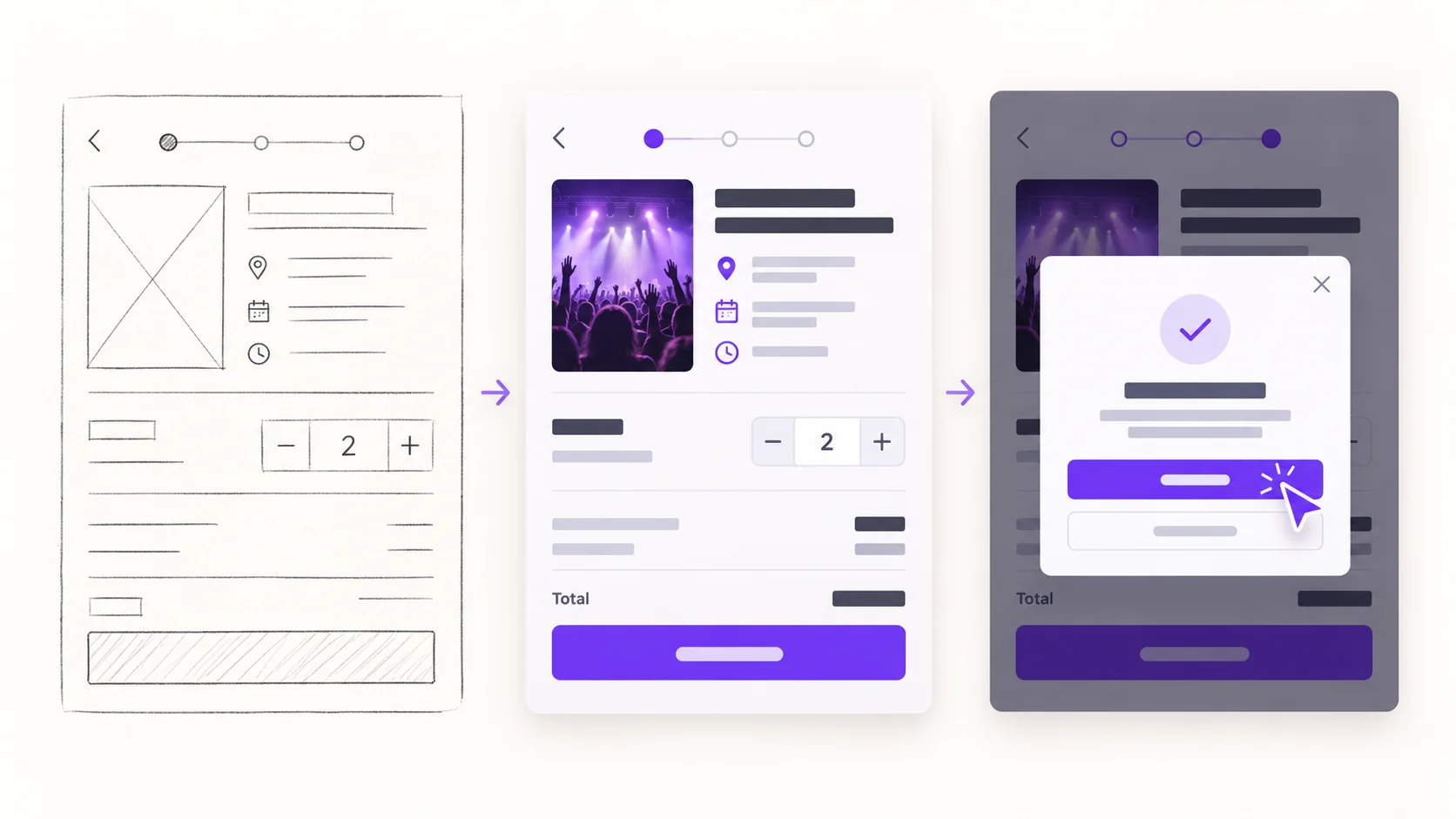
Mockup definition: a visual decision, not a working product
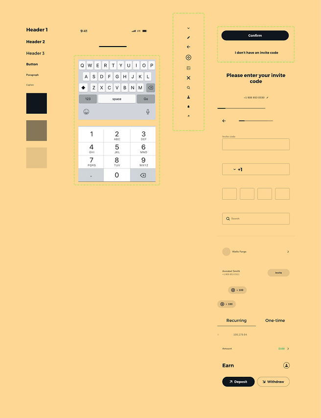
A mockup is a visual representation of a proposed interface. It can show real copy, images, styles, and layout at a specific screen size. It does not, by itself, submit a form or prove that a user can complete the task. That distinction matters when a stakeholder says a screen “looks ready”: the appearance may be approved while navigation, validation, accessibility, and technical behavior still need work.
For the event page, a useful mockup answers concrete questions. Is the date visible before the ticket options? Can people distinguish the registration button from less important links? Does the ticket summary remain readable on a narrow screen? Use content close to what will ship, including a long venue name or sold-out state where relevant, so the visual review is about the real interface rather than placeholder blocks.
A mockup can be rough or highly polished. “High fidelity” describes its level of visual detail, not whether it is clickable. Once you connect screens to simulate the task, the connected version functions as a prototype; the static screen can still be used as the mockup for visual sign-off.
What a mockup helps a team decide
Visual hierarchy. A mockup makes it possible to compare what draws attention first. If the event photo overwhelms the date and venue, the team can adjust scale, contrast, and spacing before implementation.
Consistency. Repeated buttons, form fields, and cards should follow the same design rules. A mockup exposes mismatched corner radii, text styles, or spacing that are easy to miss in a loose structural sketch. Shared components make later corrections less repetitive, but the team still needs to inspect each screen in context.
Review and handoff. A static screen gives stakeholders a common visual reference, and designers can annotate why a choice was made. Developers also need interaction rules and states; the mockup alone should not be treated as a complete specification.
Early visual feedback can reduce avoidable rework, but it does not guarantee lower cost or a better user outcome. The most useful review records a specific concern, such as “the price looks like part of the venue address,” then checks the revised screen.
Which kind of mockup do you need?
Quick visual direction. When the team is comparing two type scales or color directions, a relatively rough screen can be enough. Keep the content and primary action recognizable so reviewers can judge the choice, not just the palette.
Detailed visual sign-off. Before development, use near-final copy, imagery, spacing, and the important component states. For an event form this includes focused and invalid fields, disabled or loading buttons when those states affect the appearance, and a small-screen version if the layout changes.
Contextual presentation. The same screen may be placed in a device frame or presentation board to show its intended context. That presentation can help discussion, but it should not conceal crop problems or replace the full-resolution design file developers need.
Interactivity is a separate axis. A screen can be visually rough yet clickable, or visually polished yet static. Calling every polished screen a “prototype” obscures what has actually been tested.
Wireframe vs mockup vs prototype: one event page, three decisions
Wireframe — structure. Place the event title, date, venue, ticket selection, and registration action. Use simple boxes and labels to ask whether the content order and available actions make sense. A wireframe can be sketched or built digitally; it need not be ugly, and it does not have to contain every final visual detail.
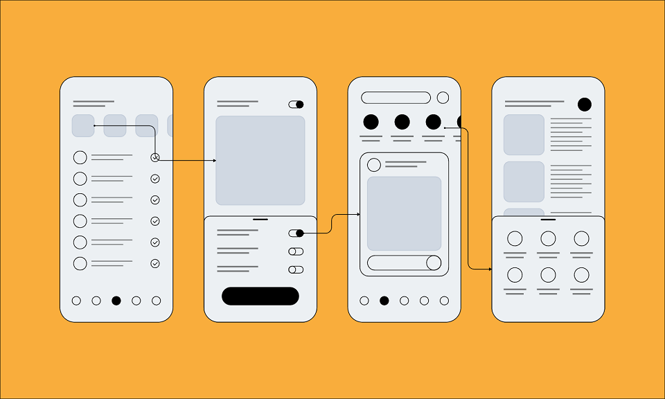
Mockup — appearance. Apply the event imagery, type, color, spacing, and component styling to that structure. Review whether the primary action stands out and whether the supporting information remains legible. The mockup may include an error-state screen, but a picture of that state does not show how the user reaches it or recovers from it.
Prototype — behavior. Connect the registration button to the next step, include a missing-field error, and allow the person to correct it and reach a confirmation. Ask a reviewer to register for a specific ticket without coaching them. Where they pause or take the wrong path is evidence for revising the flow; the mere existence of clickable links is not evidence that the design works well.
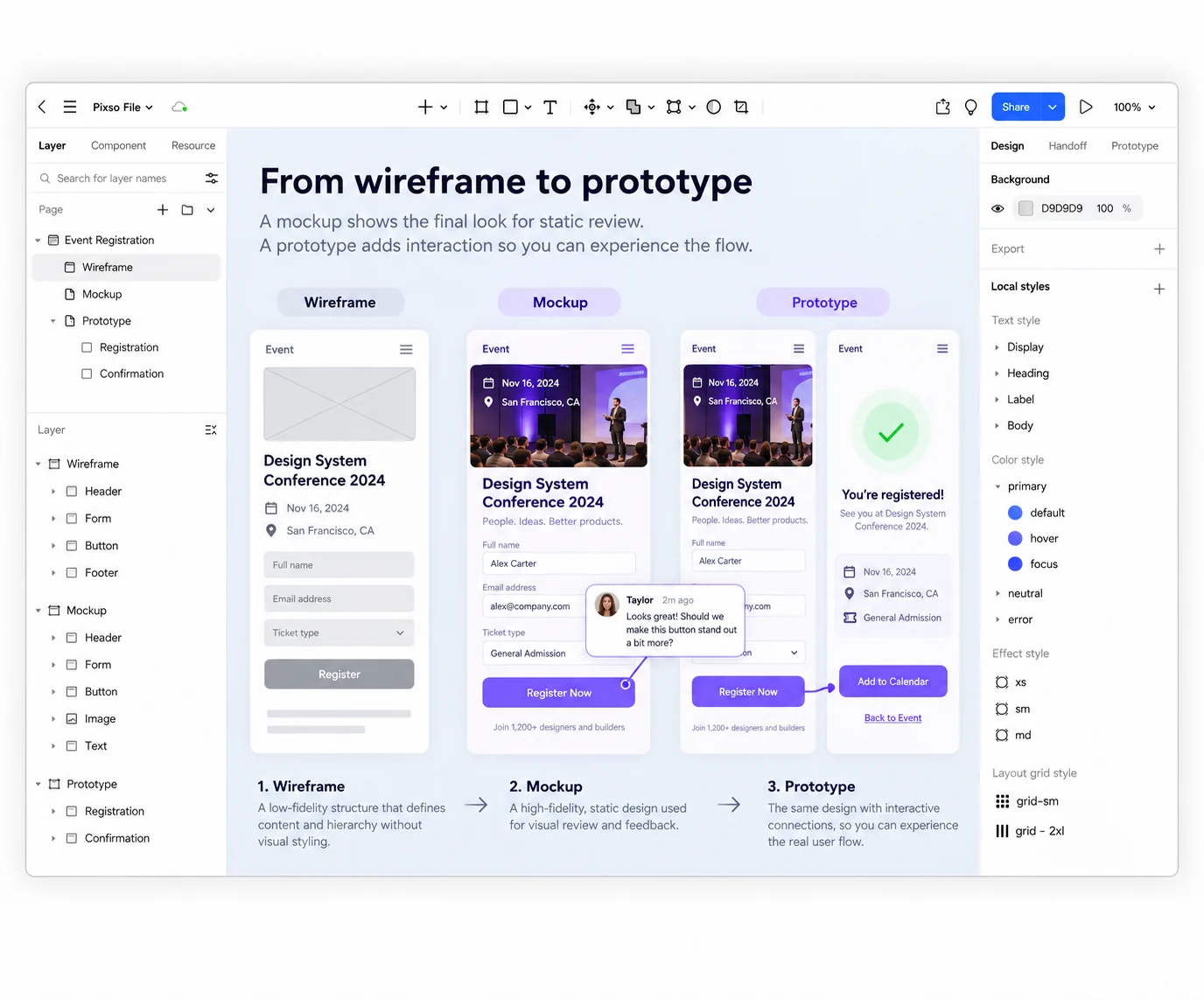
The three artifacts are not a rigid waterfall. A team may return to the wireframe after a prototype reveals that a required step is missing. The important point is to name the decision being reviewed: content order, visual presentation, or interaction.
Choose the next artifact your team actually needs
If people disagree about what the page should contain, start with a wireframe. If the structure is settled but the hierarchy and brand expression are unclear, make a mockup with realistic content. If the question is whether someone can register, recover from an error, or understand confirmation, connect a prototype and test that task. Do not add interaction to a static image merely to make the deliverable seem more advanced.
In Pixso, keep the event page's shared components together, annotate the choices that need review, then connect only the screens needed for the task at hand. The result is a clearer handoff: what the interface looks like, what it does, and what still needs implementation are visible as separate decisions.