Scott
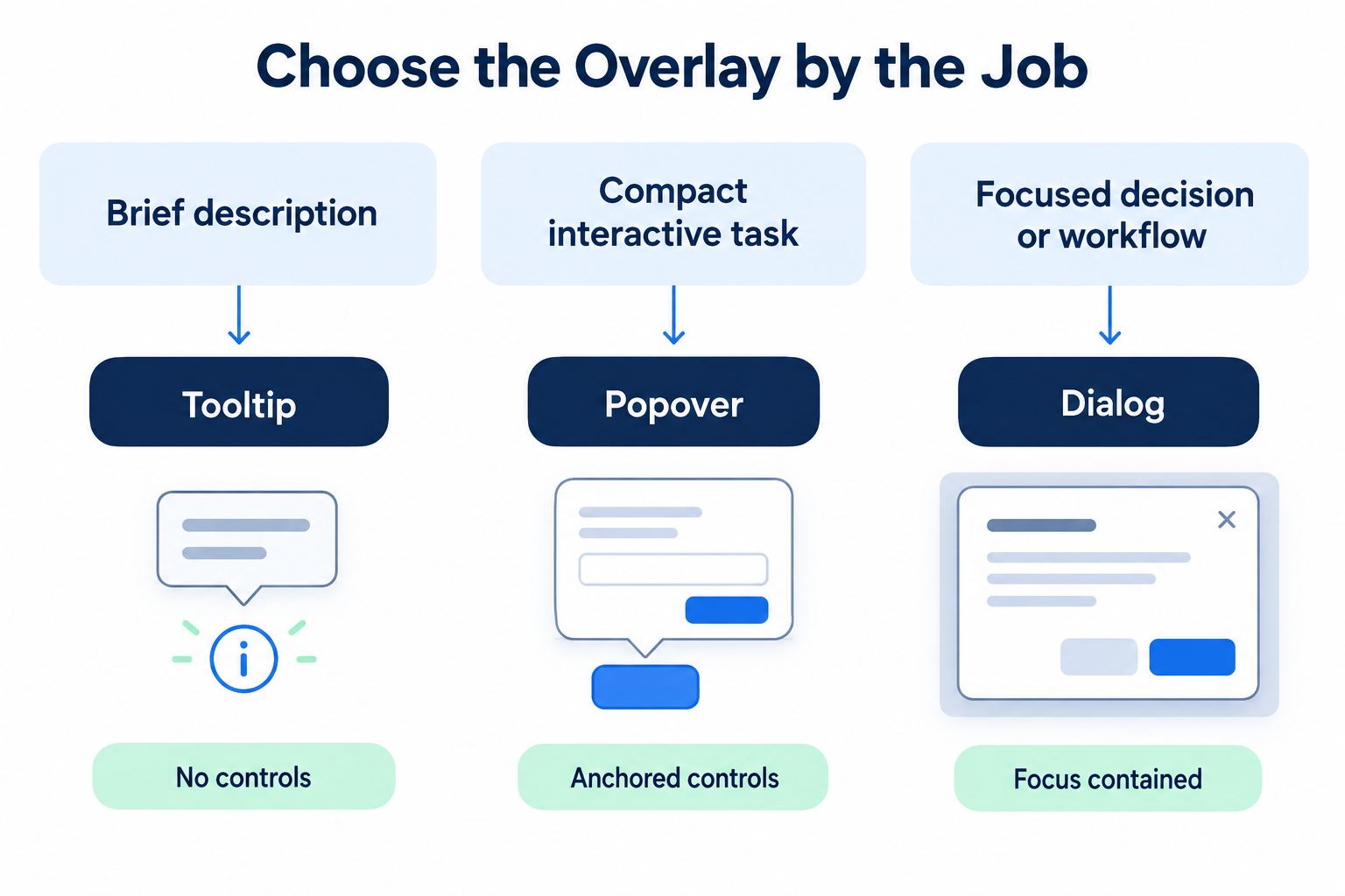
A tooltip explains one nearby control, a popover holds a small interactive task, and a dialog interrupts the current page to contain a focused decision or workflow. That distinction is the practical answer to tooltip vs popover vs dialog. Choose by content and behavior, not by visual size: ask whether the overlay needs interaction, whether the page behind it must remain available, and what should happen to keyboard focus.
Start with the job the overlay must do
Overlay patterns are often selected late, after the trigger icon and card styling already exist. That reverses the decision. First write the content contract: what must be shown, what the user can do, what page context remains relevant, and what evidence confirms completion.
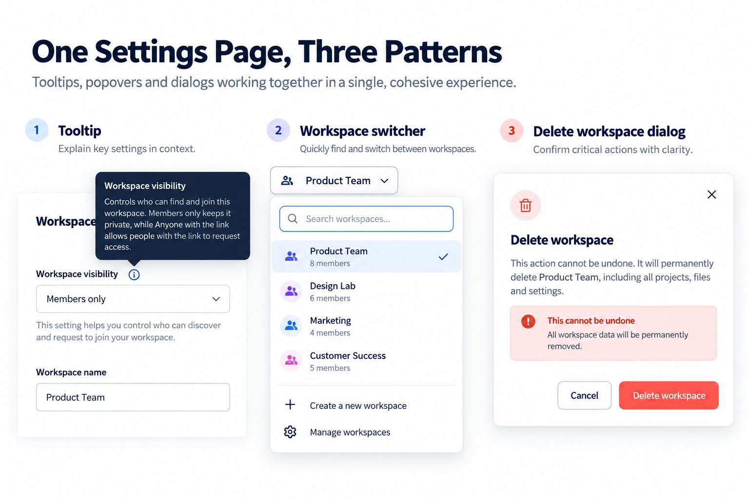
Use one settings-screen example throughout this guide. An unfamiliar information icon explains “Workspace visibility.” A compact account switcher lets the user choose a workspace without leaving the page. A destructive “Delete workspace” action requires consequences, confirmation, and a cancel path. These three moments may look like floating surfaces, but they have different interaction contracts.
| Pattern | Best-fit job | Interaction | Page behind it |
|---|---|---|---|
| Tooltip | Briefly describe an unfamiliar control | No controls inside | Remains fully available |
| Popover | Complete a small contextual task | Links, options, or compact controls | Usually remains available |
| Dialog | Focus attention on a consequential decision or bounded workflow | One or more controls | Modal version becomes inert |
The tooltip vs popover vs dialog question becomes easier when the job is written this way. Surface shape, shadow, and animation are secondary. A small dialog is still a dialog if it traps focus and makes the background inert. A large non-modal panel may still be a popover if the user can continue working with the page.
Use a tooltip for description, not hidden functionality
A tooltip is appropriate when the trigger already works without it and the content is short, supplementary, and non-interactive. In the settings example, the visible label “Workspace visibility” carries the primary meaning. The tooltip can clarify that invited members can see the workspace name. It should not contain a privacy toggle, a “Learn more” link, or information required to complete the form.
Design the tooltip UI for mouse, keyboard, and touch realities. Hover may reveal it for pointer users, but the trigger must also receive keyboard focus. The tooltip should remain available while the pointer moves over it and dismiss when focus leaves or the user presses Escape. On touch screens, hover does not exist, so essential help needs a visible disclosure or another persistent route.
Avoid putting a tooltip on every familiar icon. Standard controls still need accessible names in implementation, but visual tooltip overload creates delay and noise. Reserve visible tooltip UI for genuinely unfamiliar labels or truncated content, and write one concise statement rather than a miniature help article.
Use a popover for a compact contextual task
A popover stays anchored to its trigger and can contain interactive elements. In the workspace switcher, the popover UI includes search, a short list, current selection, and perhaps a link to manage workspaces. The user still understands the surrounding settings page and can dismiss the surface without completing a separate workflow.
Popover behavior needs explicit rules. Define whether clicking the trigger toggles it, whether clicking outside closes it, whether Escape closes it, and where focus moves on open and close. If the popover contains a list of options, specify arrow-key behavior and selection. Do not call every interactive overlay a “menu”: an action menu, listbox, combobox, and disclosure each have different semantics.
Keep the popover task bounded. If the content grows into multiple sections, requires extensive validation, or needs a review step, move it to a dialog or page. A popover that behaves like a compressed application becomes difficult to position, navigate, and use on a narrow viewport.
Use a dialog when attention and focus must be contained
A dialog creates a separate interaction context. A modal dialog makes the content outside it inert until the dialog closes. This is suitable for deleting a workspace because the user must understand the affected object, consequences, and available recovery before confirming. The visible title should name the action, the body should explain impact, and button labels should be specific: “Delete workspace” and “Cancel,” not “Yes” and “No.”
A non-modal dialog can remain available while the page is still interactive, but it still represents a distinct window with its own title and focus expectations. That makes it different from a small anchored popover. In a tooltip vs popover vs dialog review, ask whether the surface is merely attached to one trigger or must remain as an independent working context while the user refers to the page.
Keyboard behavior is part of dialog UI design, not an implementation detail to postpone. According to the WAI-ARIA modal dialog pattern, focus moves inside the dialog when it opens, Tab and Shift+Tab remain within it, Escape closes it, and focus generally returns to the element that opened it. The final implementation must verify these behaviors in the browser; a design frame can only express the intended sequence.
Do not use a modal dialog for routine information that requires no decision. Interrupting users for “Settings saved” adds work without adding control. Likewise, do not place an entire multi-page experience inside a fixed-height modal simply to avoid navigation. A dedicated page may provide better space, history, and mobile behavior.
Specify trigger, focus, dismissal, and placement
Every overlay should have a four-part behavior specification. First, name the trigger and accessible label. Second, state the initial focus target. Third, list every supported dismissal route. Fourth, explain how placement adapts near viewport edges and on small screens.
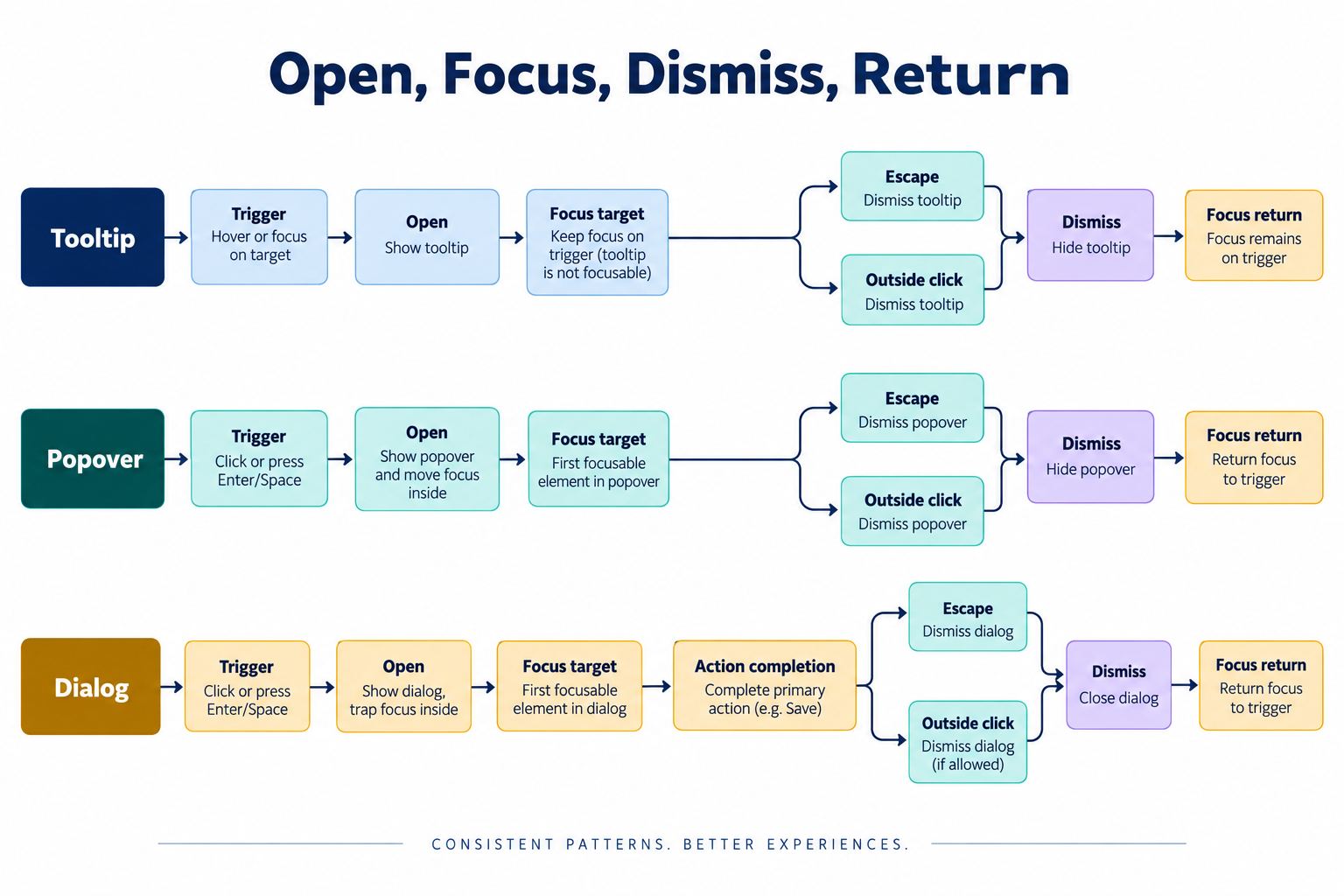
For the tooltip, focus stays on the trigger. For the workspace popover, focus can move to search or the selected workspace, depending on the chosen interaction pattern. For the delete dialog, focus should move to an appropriate element inside; the safest initial target may be the title or Cancel rather than the destructive button.
Placement should never obscure the trigger or force content off-screen. A popover can flip above or below its anchor. On a small viewport, a complex popover may become a bottom sheet if the product's component system defines that adaptation. Record the adaptation rather than allowing engineering to improvise a different interaction model.
Design the pattern set in Pixso
Use Pixso's UI design workspace to keep overlay anatomy, states, and usage notes in one editable file. Build separate components for tooltip, popover, and dialog instead of one generic “overlay” component with dozens of unrelated properties. The input is the approved content and behavior contract; the output is a reviewable component set with explicit state examples.
For each component, create only meaningful variants. A tooltip may need placement and visibility variants. A workspace popover may need default, search, no results, selected, and loading states. A dialog may need default, processing, failure, and completion transitions represented as separate design states. Pixso components and variants help the team reuse those structures, while Auto Layout can preserve spacing when labels wrap or translated text expands. The Pixso component guide documents current component and variant behavior.
Pin behavior notes beside the component rather than hiding them in layer names. Reviewers should see the trigger, focus destination, dismissal routes, responsive adaptation, and content limit. Use contextual comments to resolve open questions, then deliver approved measurements and assets through the relevant inspection workflow. The implementation still needs semantic HTML, focus management, keyboard tests, zoom tests, and assistive-technology review.
Test edge cases before handoff
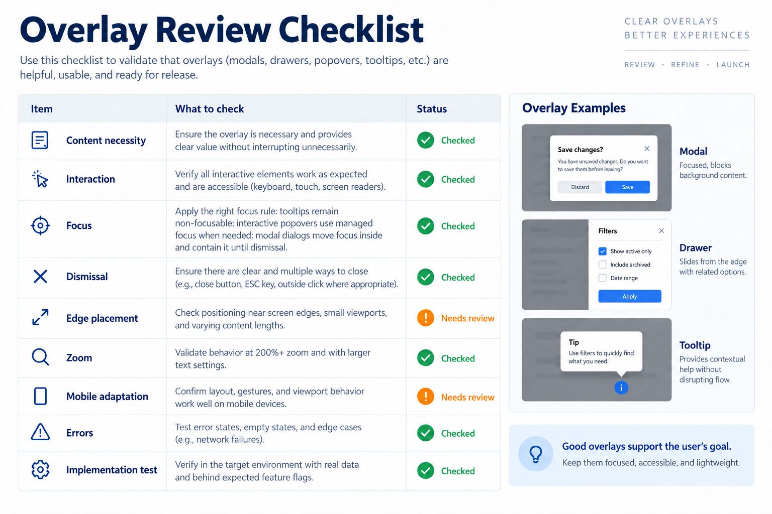
Test tooltip vs popover vs dialog decisions against the same edge cases. Replace the label with a long translation. Move the trigger against every viewport edge. Zoom to 200%. Navigate only with a keyboard. Open the overlay, trigger an error, and close it. Check whether focus returns to a logical place. Confirm that a tooltip does not hide required content and a popover does not contain an unmanageable workflow.
For the settings example, verify these outcomes:
- The visibility explanation remains understandable when the tooltip is unavailable.
- The workspace popover supports search, no results, current selection, loading, and dismissal without losing the settings page.
- The delete dialog names the workspace, describes the consequence, prevents background interaction, handles submission progress, and reports failure without closing unexpectedly.
- Opening one overlay closes any incompatible overlay already open.
- Mobile placement keeps the trigger and primary action reachable.
Common overlay mistakes
The most common mistake is hiding required information inside a tooltip. The second is putting a form into a popover without defining validation and focus. The third is using a dialog for non-blocking feedback. All three come from choosing by appearance instead of task.
Another mistake is treating the design canvas as proof of accessible behavior. A visual connection can show intent, but it cannot confirm browser focus containment, reading order, accessible names, or announcement timing. Include those requirements in the handoff and verify them in the built interface.
Finally, keep the chosen terminology consistent across design, acceptance criteria, and code. When one team calls the same component a tooltip, popover, and modal, important behavior gets lost. A shared tooltip vs popover vs dialog decision record gives every role the same expectation.
Conclusion
Resolve tooltip vs popover vs dialog by matching the overlay to its job. Use a tooltip for a brief description, a popover for a compact contextual task, and a dialog for focused work that may suspend the page behind it. Document trigger, focus, dismissal, placement, responsive behavior, errors, and focus return, then validate the real implementation rather than judging the design frame alone.