Sherry
UI design examples show how a product turns a user task into screens, components, states, and interaction feedback. Study an example for the decisions behind the interface, then test those decisions against content, accessibility, responsive behavior, and the people who will use the product.
How to Access Pixso's UI Design Examples
The Pixso Resource Community can be used as a source of interface references. This guide explains how to inspect a resource and how to separate visual inspiration from decisions that need to be tested in your own file.

Open the Pixso Resource Community and check the current access conditions for the file you want to study. Use a test file when you need to confirm whether a resource can be viewed, copied, or edited for your workflow.
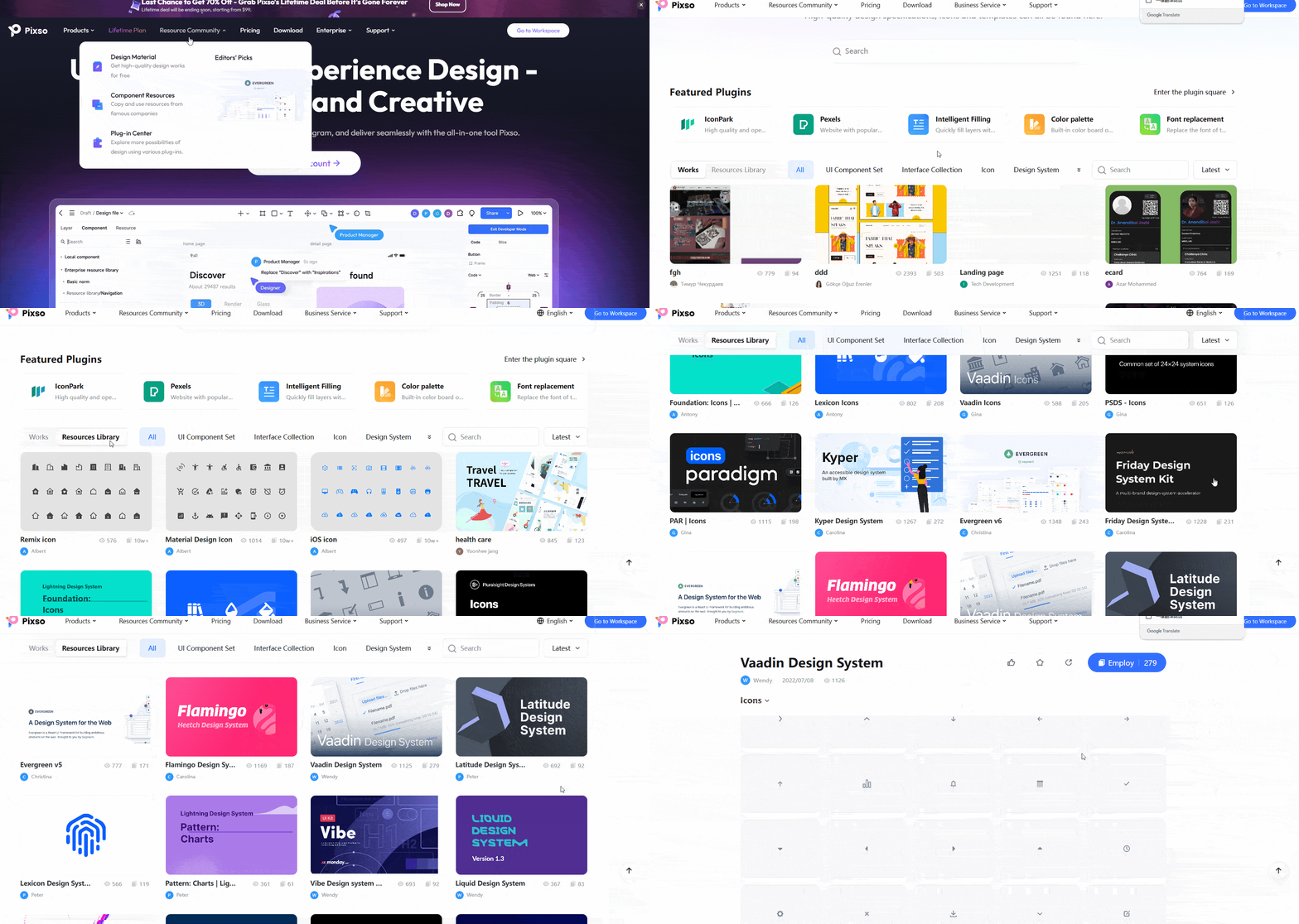
Filter by the product task and platform first, then search for a pattern such as onboarding, checkout, navigation, or settings. Note the screen type, content density, and states before treating a resource as a useful reference.
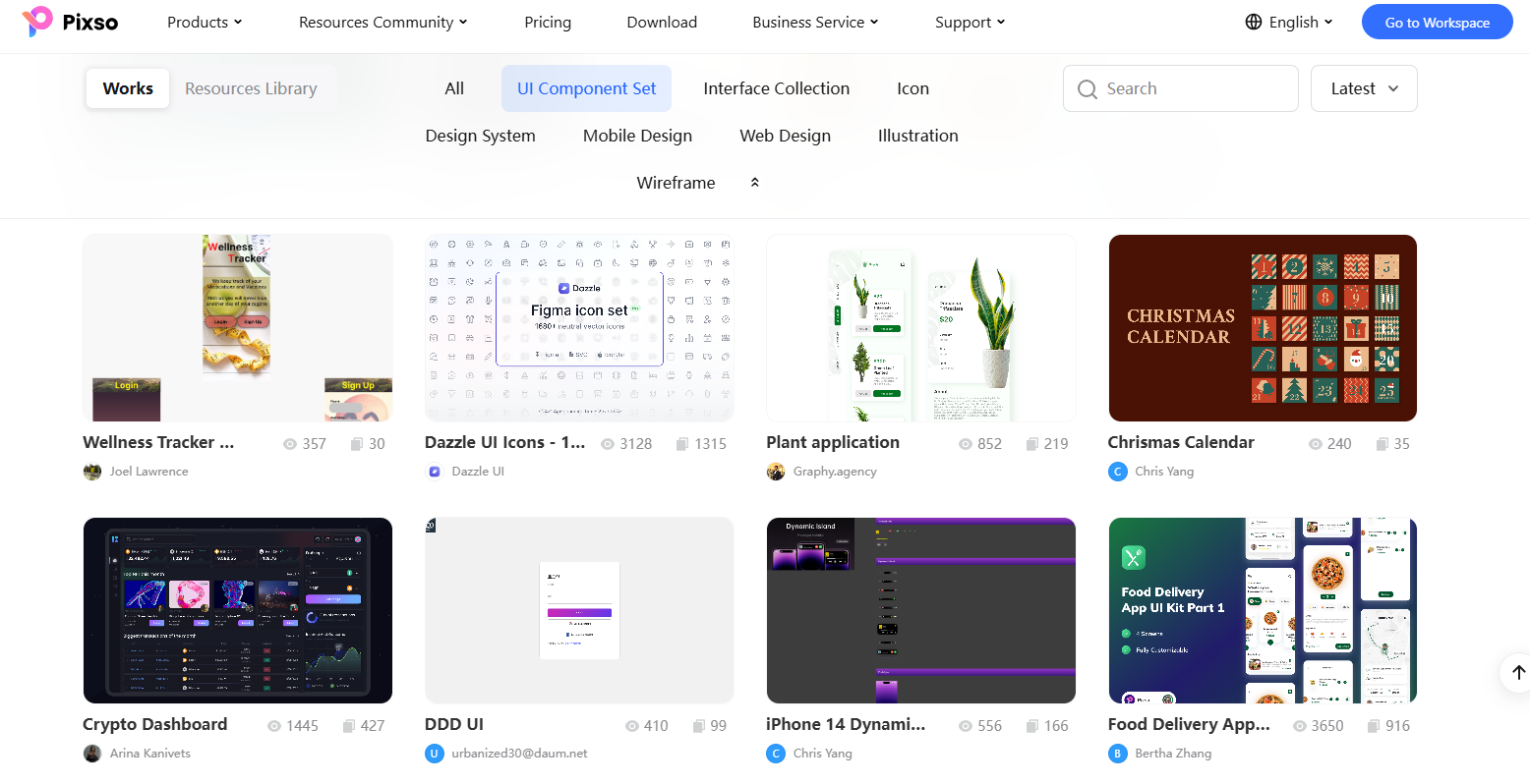
Open the resource details, inspect its layers and reusable parts, and copy or edit it only when the current resource permissions allow it. Rebuild one representative flow in your own file so you can test content, states, and responsive behavior.
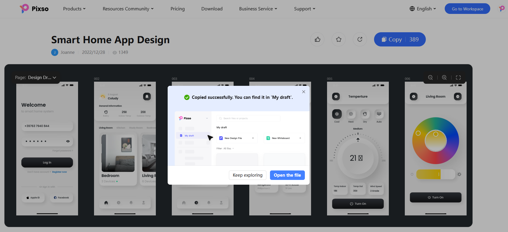
10 UI design examples to inspect
1. Social App UI Design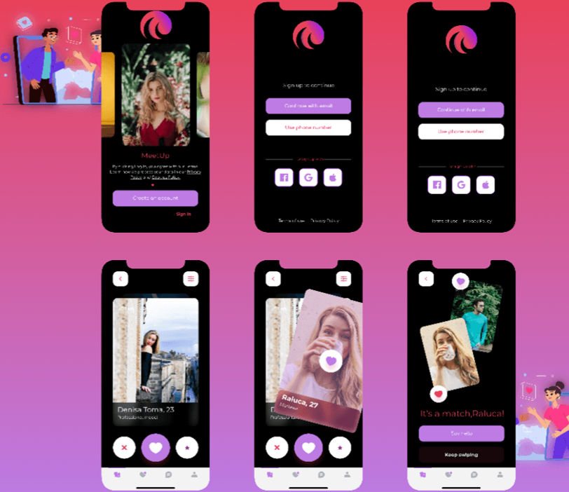
A social product needs a clear content hierarchy, recognizable actions, and states for empty feeds, loading, posting, and moderation. Use the dark surface and accent colors as a visual reference, then check contrast, type scale, and whether the primary action remains discoverable on a narrow screen.
2. News App UI Design
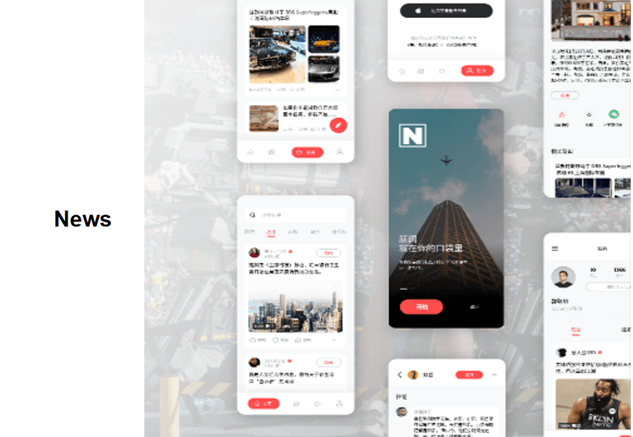
A news interface has to help people scan categories, headlines, summaries, and article actions. The multi-screen reference is useful for checking hierarchy across the feed, article, and comment states; test long headlines, missing images, loading, and error recovery before reusing the pattern.
3. Metaverse UI Design
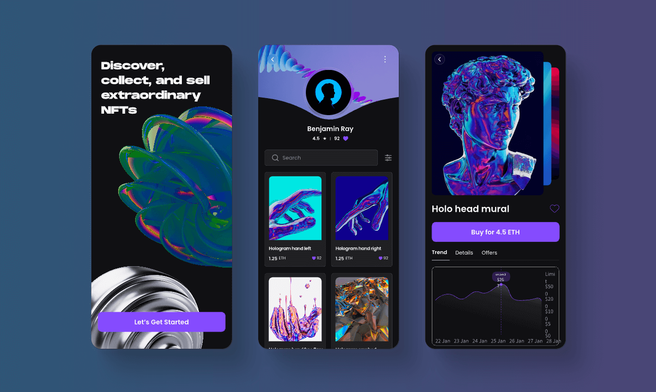
A dark, immersive interface can establish a strong visual direction, but the task still needs clear navigation, focus states, readable text, and motion controls. Review contrast and reduced-motion behavior before treating atmospheric effects as part of a reusable system.
4. Medical Product UI Design
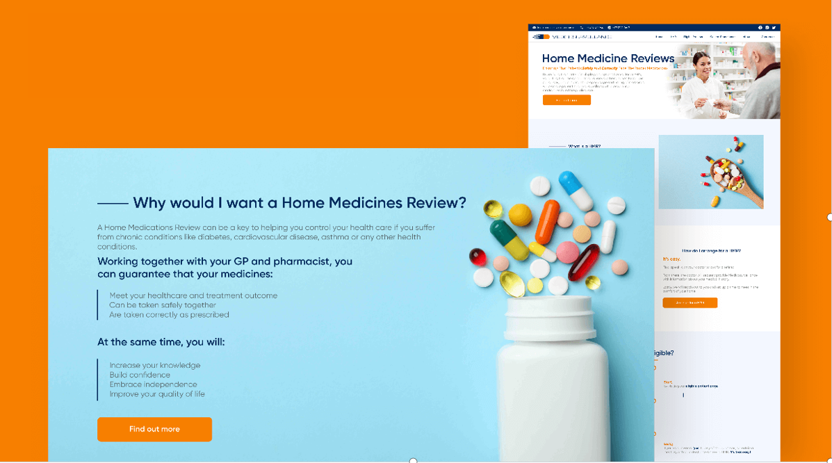
Medical interfaces should make status, instructions, urgency, and next actions easy to distinguish. Use the reference to inspect hierarchy and attention cues, then add validation, error, permission, and accessibility checks rather than relying on color alone.
5. E-commerce Website UI Design

An e-commerce flow usually connects discovery, product detail, account input, cart, and checkout. Inspect how the layout handles filters, unavailable items, prices, validation, and confirmation; a warm palette is only one part of making the task understandable.
6. Ticketing App UI Design
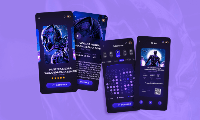
A ticketing flow should show selection, availability, price changes, payment errors, and confirmation without losing the user's place. Use the example to map the complete flow and test back, cancel, timeout, and recovery states.
7. Travel App UI Design
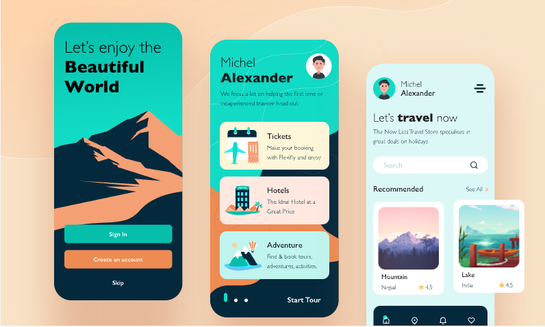
Travel interfaces combine search, dates, locations, results, and booking decisions. Examine how the example separates filters from primary actions, then test long place names, empty results, changed availability, and a clear confirmation state.
8. Smart Home App UI Design
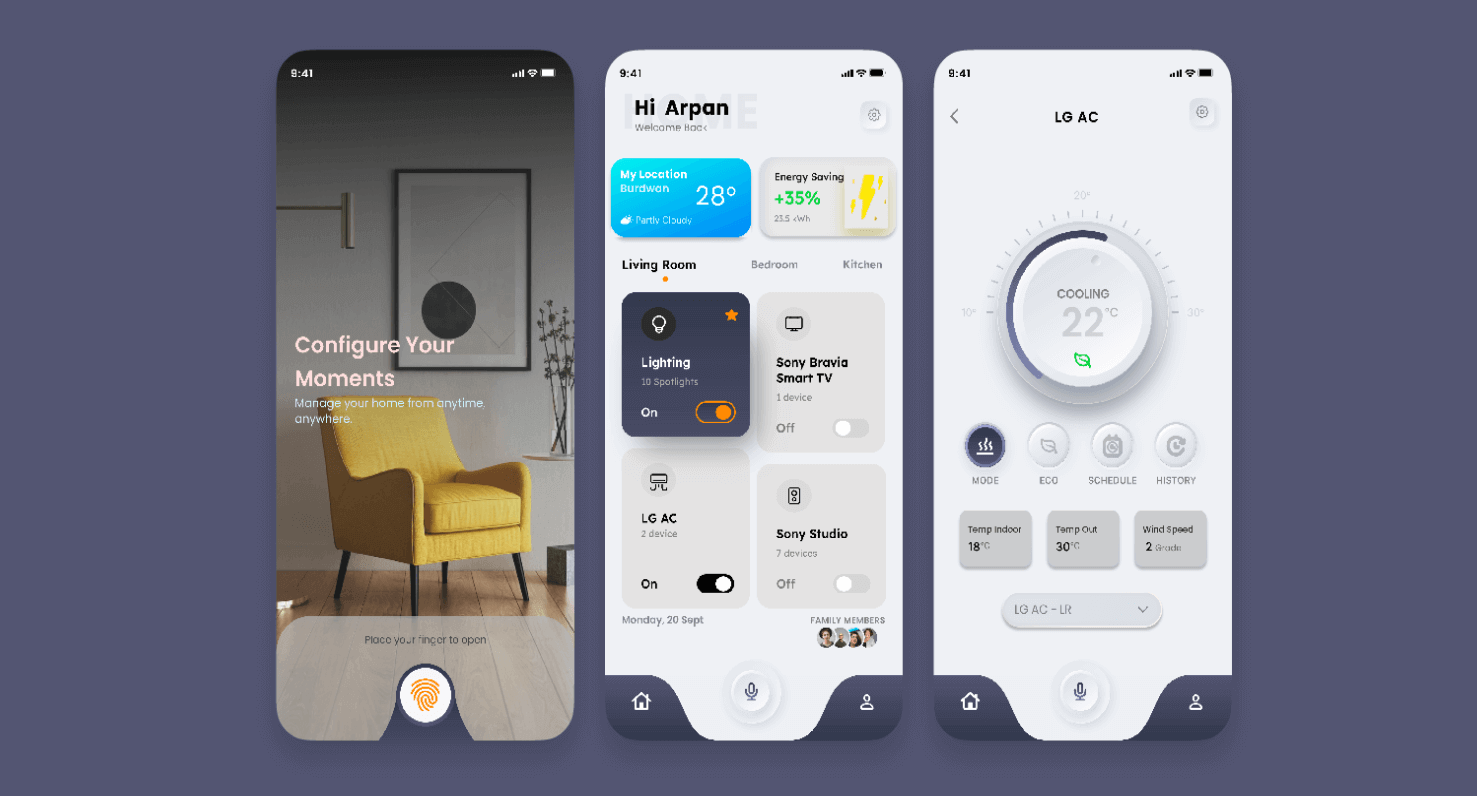
Smart-home screens must communicate device status, controls, permissions, and offline or delayed responses. Study the component grouping and neutral palette, then verify feedback for unavailable devices, loading, and a command that did not complete.
9. NFT Landing Page UI Design
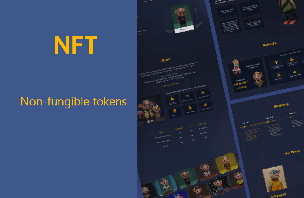
A digital-asset landing page needs clear product information, ownership or transaction states, and a trustworthy path to the next action. Use the example to inspect hierarchy and content disclosure, and review wallet, error, and permission states before implementation.
10. Website Login Page UI Design
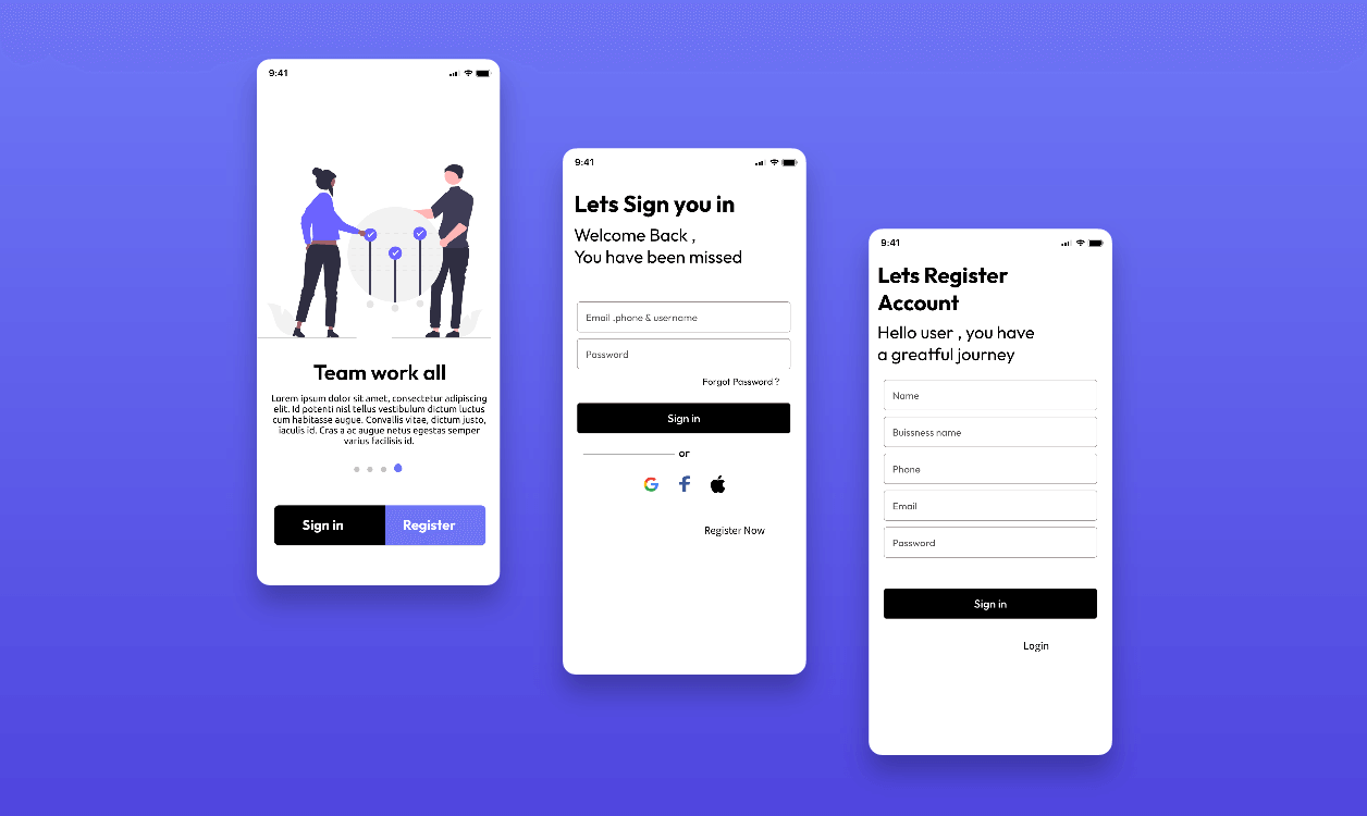
A login page should make labels, focus, password recovery, validation, and error messages easy to find. Inspect the visual hierarchy and illustration treatment, then test keyboard navigation, long errors, loading, and a failed sign-in without relying on color alone.
Final thoughts
UI design examples are most useful when they explain a decision, not when they only provide a screenshot. For every reference, record the user goal, information hierarchy, component states, accessibility checks, and responsive changes that would be needed in a real product.
Use the Pixso Resource Community to find references, then test one flow in your own file. A shared UI design workspace, design system, and interactive prototype make it easier to review the decisions before handoff.
How to learn from a UI design example
Do not copy a screenshot without understanding the task behind it. Identify the user goal, information hierarchy, primary action, empty and error states, responsive behavior, and reusable components.
Use examples as a starting point, then build and test your own screens in a shared file. Explore the design system workflow when several screens need the same components, and use interactive prototyping to review behavior.