Scott
A reliable date picker UI design makes the user’s scheduling rule visible before they commit. It should show which dates can be selected, how a range is formed, which time zone controls the result, and how to recover from an invalid choice. The calendar is only one layer of the control; the input, helper text, validation, and confirmation state complete the experience.
Part 1. Start with the scheduling task, not the calendar
First decide what the user is scheduling. A hotel stay needs check-in and check-out dates. A report filter may allow an open-ended range. A meeting needs a date, time, duration, and time zone. These tasks can look similar in a mockup but follow different rules.
Write a short date contract before drawing the component:
- Selection: single date, date range, multiple dates, or date plus time.
- Boundary: earliest date, latest date, maximum range, and blocked dates.
- Calendar system: locale, first day of week, month naming, and year format.
- Time interpretation: user time zone, account time zone, venue time zone, or UTC.
- Completion: whether selection applies immediately or waits for an Apply action.
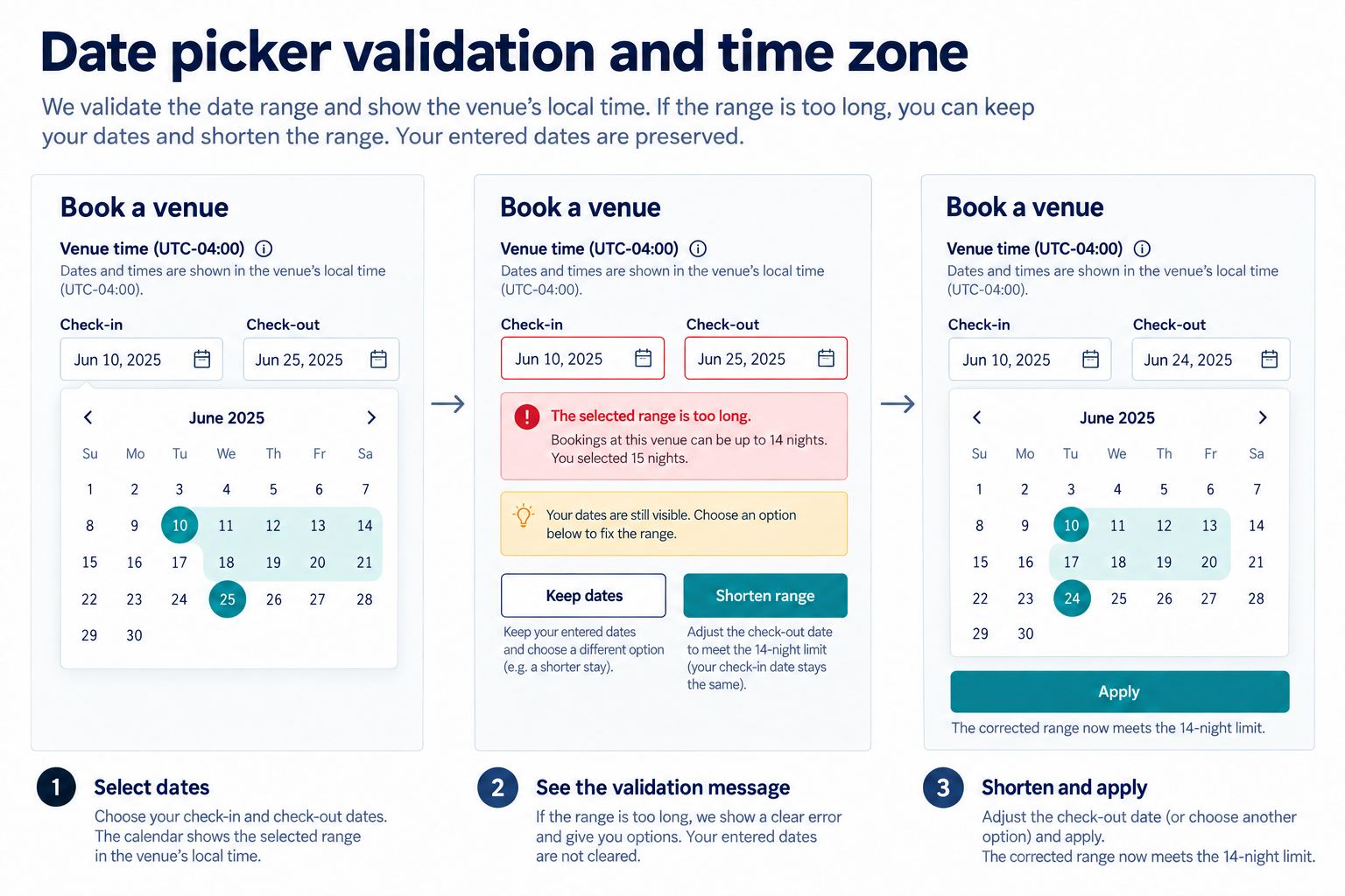
For this tutorial, the worked example is a booking filter. A user chooses a check-in date and a check-out date, stays between one and fourteen nights, cannot select past dates, and sees availability in the venue’s time zone. The same example carries through the layout, states, errors, and review checklist.
This date picker UI design contract keeps every later visual decision tied to a real scheduling rule.
Part 2. Choose the right input model
A calendar popover is helpful when users need to understand weekdays, blocked dates, or the relationship between two dates. It is not always the fastest way to enter a known date. A date picker UI design can combine a text input with a calendar trigger so keyboard users and frequent users can type while visual users can browse.
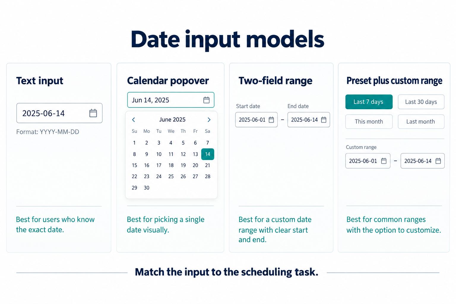
| Model | Use when | Watch for |
|---|---|---|
| Text input | The user knows the exact date and speed matters | Ambiguous formats, partial values, and parsing errors |
| Calendar popover | Weekday context and nearby availability matter | Keyboard navigation, narrow screens, and distant years |
| Two-field range | Start and end dates must remain visible | End-before-start errors and unclear active field |
| Preset plus custom range | Common analytics periods repeat | Whether “last 7 days” includes today and which time zone applies |
For the booking example, use two visible fields labeled “Check-in” and “Check-out,” plus one calendar button per field. Keep the selected range visible in both the inputs and calendar. Do not rely on color alone: mark the start and end with shape, text, or accessible names in the final implementation.
Part 3. Define range behavior before styling
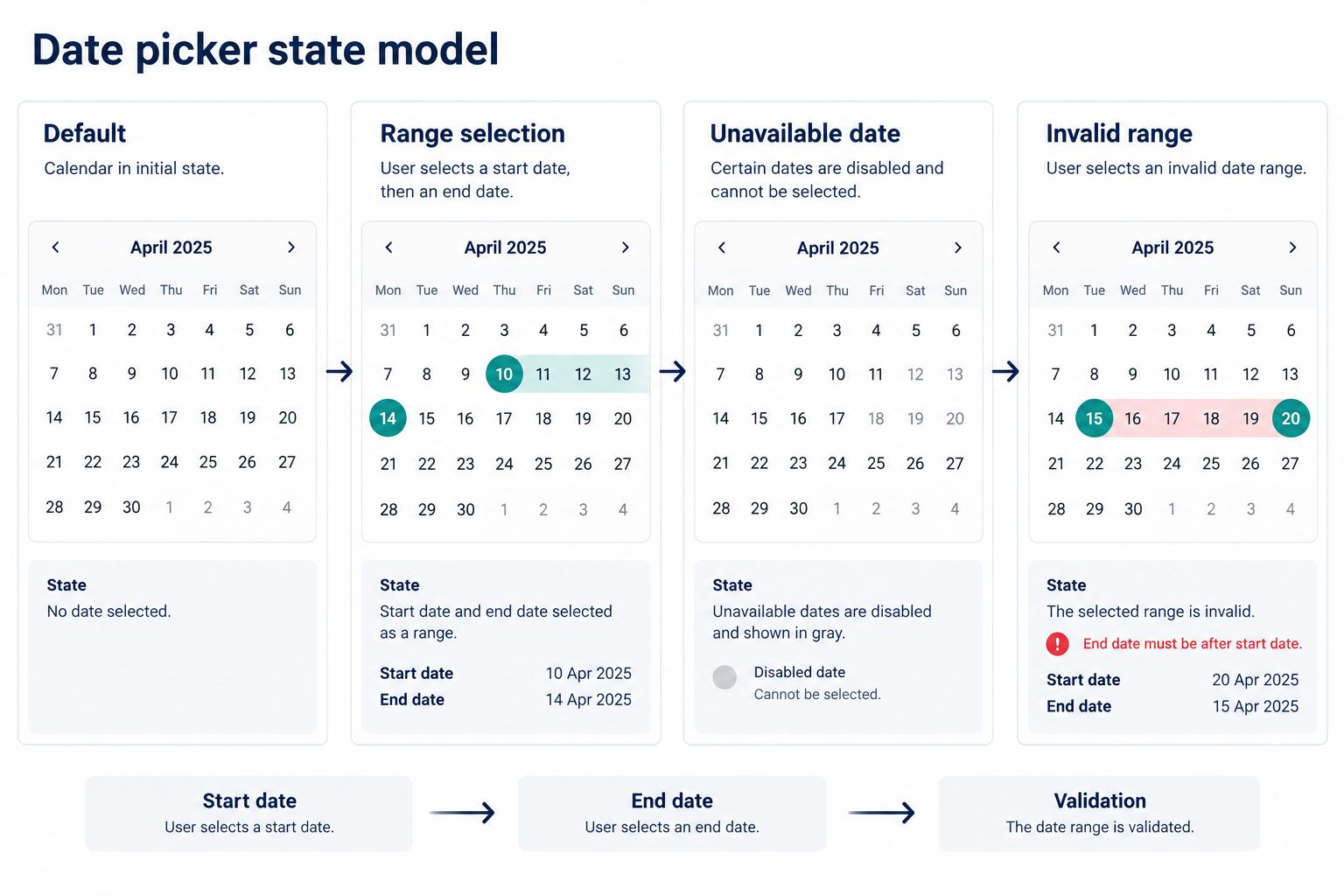
Range selection needs an explicit sequence. After the user chooses check-in, move the active target to check-out and keep check-in visible. Hover or focus may preview a possible range, but it must not look confirmed. When check-out is selected, validate the whole range rather than only the second date.
In the booking example, selecting September 21 as check-in highlights that date as the start. Moving across September 22–24 may preview the span. Selecting September 24 commits a three-night range. If September 23 is unavailable, the interface should prevent or reject a range that crosses it according to the product rule. The design must not invent whether blocked dates can be crossed; product and engineering must provide that answer.
Include a clear Reset or Clear action when users can change their mind. If an Apply button is required, disable or withhold it until the range is valid and explain why. If selection applies immediately, update the surrounding result summary and announce the change in the implemented interface.
Part 4. Make unavailable and constrained dates understandable
Disabled dates often fail because they are merely pale. A person still needs to know whether a date is in the past, sold out, outside the booking window, or blocked by another rule. These causes may require different help or next actions.
- Keep unavailable dates visually distinct from selected and out-of-month dates.
- Provide a programmatic disabled state and an accessible reason in the built product where useful.
- Do not place focus on dates that are completely unavailable unless the interaction intentionally allows users to inspect the reason.
- Explain unusual constraints near the control, such as “Book up to 14 nights.”
- Show loading separately when availability has not arrived; do not present unknown dates as sold out.
For details about keyboard patterns and calendar-grid behavior, use the WAI-ARIA date picker dialog example as an implementation reference. A design file can document intended focus order, but the final keyboard and assistive-technology behavior must be tested in code.
Part 5. Treat time zone as part of the value
A plain date may still shift meaning across regions when the system stores a timestamp. Label the time zone whenever it can affect availability, cutoffs, or reporting. “Venue time (UTC−04:00)” is more useful than an unlabeled abbreviation that can mean different regions.
For the booking example, the venue’s time zone controls midnight and availability. A traveler in another zone still chooses venue dates. Display that rule next to the fields and repeat it in the confirmation summary. If the user can change the zone, state whether existing selections are reinterpreted as the same local date or converted as moments in time.
Daylight-saving transitions need engineering and content review. A date-only booking may avoid the missing-hour problem, while an appointment picker must handle it. The UI should not promise a time that the underlying scheduling service will reject.
If a schedule repeats, define recurrence rules and exceptions alongside the time zone, including whether a change affects one occurrence, this and future occurrences, or the whole series.
Part 6. Design errors around correction
Errors should preserve the user’s entered dates when it is safe, identify the affected field, explain the rule, and provide a clear correction path. “Invalid date” is rarely enough.
| Condition | Message | Recovery |
|---|---|---|
| End before start | Check-out must be after September 21. | Keep check-in; return focus to check-out |
| Range too long | Choose a stay of 14 nights or fewer. | Keep both dates; let the user shorten the range |
| Date became unavailable | September 23 is no longer available. | Keep context; reopen the calendar around nearby dates |
| Unrecognized typed date | Enter a date as MM/DD/YYYY. | Preserve the text for editing; show an example |
Validate typed syntax after the user has had a reasonable chance to finish. Cross-field and availability rules are usually clearer when the user applies the range or proceeds. Avoid interrupting partial typing with an error on every keystroke.
Part 7. Build and review the component in Pixso
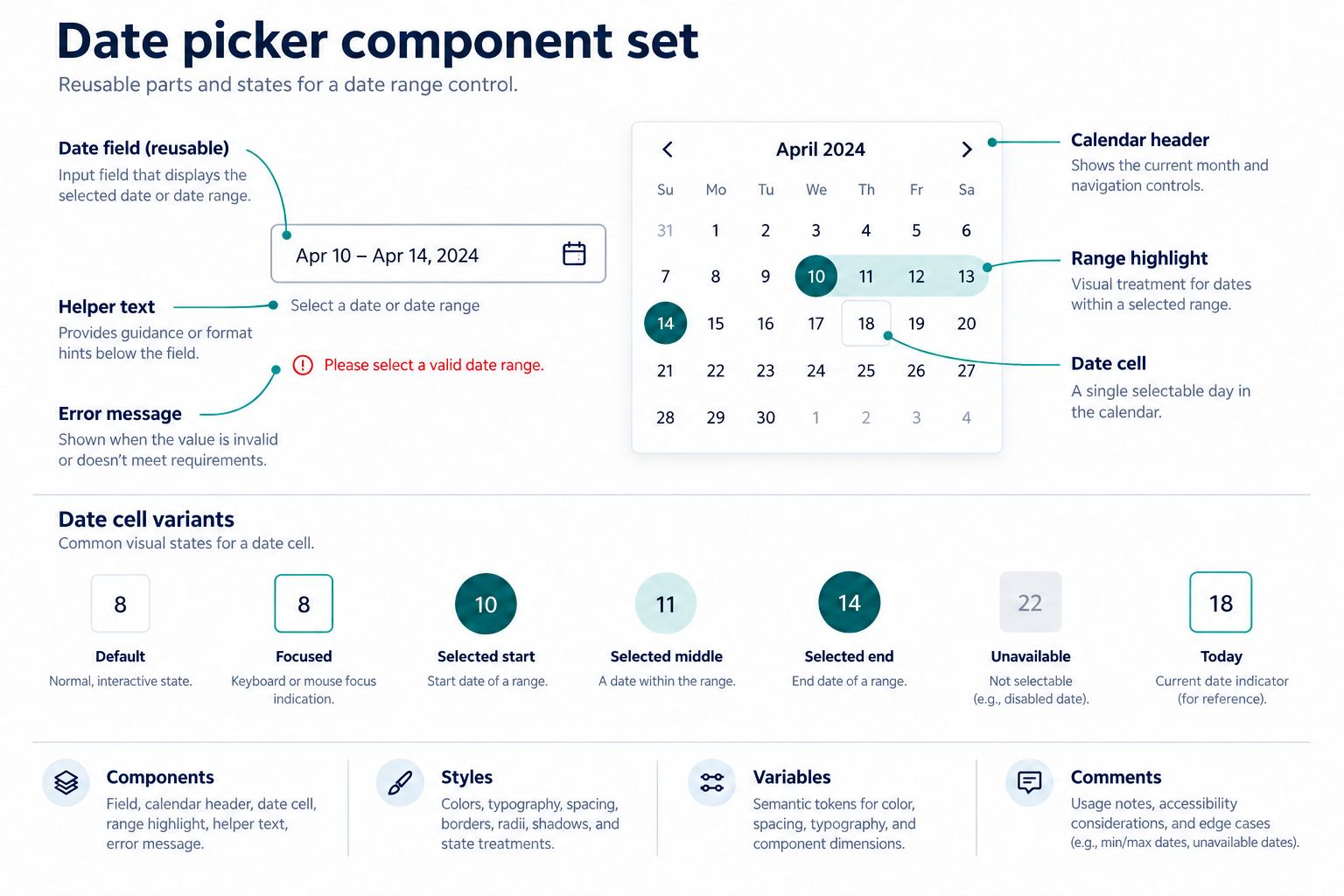
In Pixso, create the date picker as an editable component set rather than separate screenshots. Build the field, calendar header, weekday row, date cell, range highlight, helper text, and error message as reusable parts. Use component properties or clearly named variants for states such as default, focused, selected-start, selected-middle, selected-end, unavailable, today, and out-of-month.
Use layout settings to keep spacing and alignment consistent as labels or error messages change. Place the booking rules beside the component, and create frames for the four important scenarios: first open, selecting a range, unavailable date, and invalid range. Pixso’s shared components, styles, and variables can keep the visual system consistent; the product rules still need an accountable source.
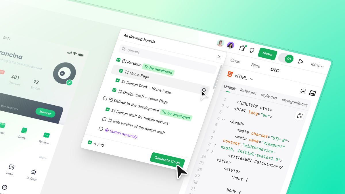
Share the file with product, content, accessibility, and engineering reviewers. Ask them to comment on the exact frame and state. For broader reusable standards, connect the component to the team’s Pixso design system workflow. Use the Pixso design workspace to refine the editable artifact, then verify the implemented control separately.
Part 8. Check responsive and accessible behavior
On a wide screen, two months can help range selection. On a narrow screen, one month with clear next and previous controls is usually easier to read. Do not shrink two months until date targets become hard to select. Keep the two input values visible above the calendar so users retain context while scrolling.
Document the intended keyboard path: open the calendar, move by day and week, change month, select a date, escape without changing, and return focus to the trigger. In implementation, ensure labels, instructions, errors, selected states, and updates are exposed to assistive technology. Contrast, target size, zoom, and high-contrast modes also require code-level verification.
Include realistic localization samples in review. A month name, weekday order, numeric format, and translated helper message can all change width. The design should tolerate those changes without clipping the selected value or moving the primary action out of view.
Part 9. Date picker UI design checklist
- The control matches a single-date, range, multi-date, or date-time task.
- Typed and calendar input produce the same value and format.
- Start, end, preview, today, unavailable, and out-of-month states are distinct.
- Minimum, maximum, blocked-date, and range-length rules are visible.
- The active time zone is named wherever it changes the result.
- Errors preserve correctable input and explain the recovery action.
- Loading, empty availability, success, and changed-availability states are covered.
- Responsive layout keeps targets readable without hiding selected values.
- Keyboard and assistive-technology behavior is specified and tested in implementation.
Conclusion
Good date picker UI design connects the visible calendar to a clear scheduling contract. Define the task, range rules, unavailable states, time zone, validation, and confirmation evidence before polishing the surface. Build those states as reusable, reviewable components in Pixso, then test the implemented keyboard, localization, and service behavior with real constraints.