Elodia
Material Design gives Android teams a shared set of components and layout conventions. The useful starting point is the app you are building: its main tasks, navigation, screen sizes, and accessibility needs. This guide explains how to choose a UI kit, organize a screen, and turn its components into a coherent Android interface.
1. Choose an Android Material Design UI kit
Android Material Design provides guidance for the appearance and behavior of Android interfaces. When choosing a kit from Pixso's resource community, check which Material version it represents and whether that matches the component library your developers use. A kit is a starting set of parts; your project still needs decisions about content, navigation, and component states.
Start by separating system UI from the areas your app controls. Then decide which navigation and content components each screen needs.
Core elements of an Android interface
Content area: Place the information and actions needed for the current task here. On a product page, that might mean the product image, price, available options, and purchase action. Let their importance determine the hierarchy.
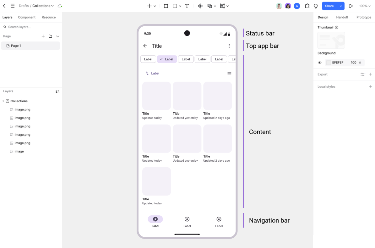
Status bar: This system area displays information such as time, connectivity, and battery status. Account for system insets and display cutouts rather than assuming a fixed height will work on every device.
Top app bar: Use this area for the screen title, navigation, and relevant actions. Choose the bar variant and text style from the Material version used by the app, then test long titles and larger text settings.
Navigation bar: Use clearly labeled destinations for the app's main sections. Keep navigation choices distinct from actions such as creating or saving an item. If the destination set becomes crowded, reconsider the information architecture or choose a navigation pattern suited to the screen size.
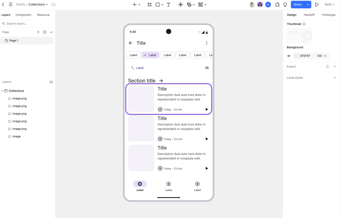
Cards: group related content
A card should present a recognizable item or topic, such as a saved project or an event. Keep its title, image, supporting text, and actions together. Repeated cards need consistent structure, but their heights may need to grow when content or text size changes.
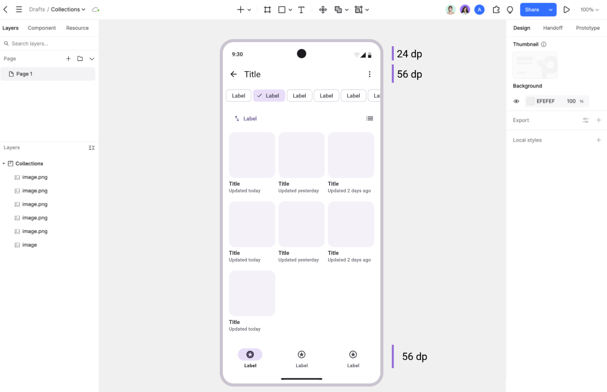
Margins, gaps, and padding
These spacing values serve different purposes. Margins separate content from the screen edge, gaps separate neighboring elements, and padding separates a container's contents from its boundary.
Screen margins: For an initial compact-screen layout, you might start with 16dp side margins. Treat that as a project choice, then adjust it to the component guidance, viewport, and content density. It is not a universal minimum.
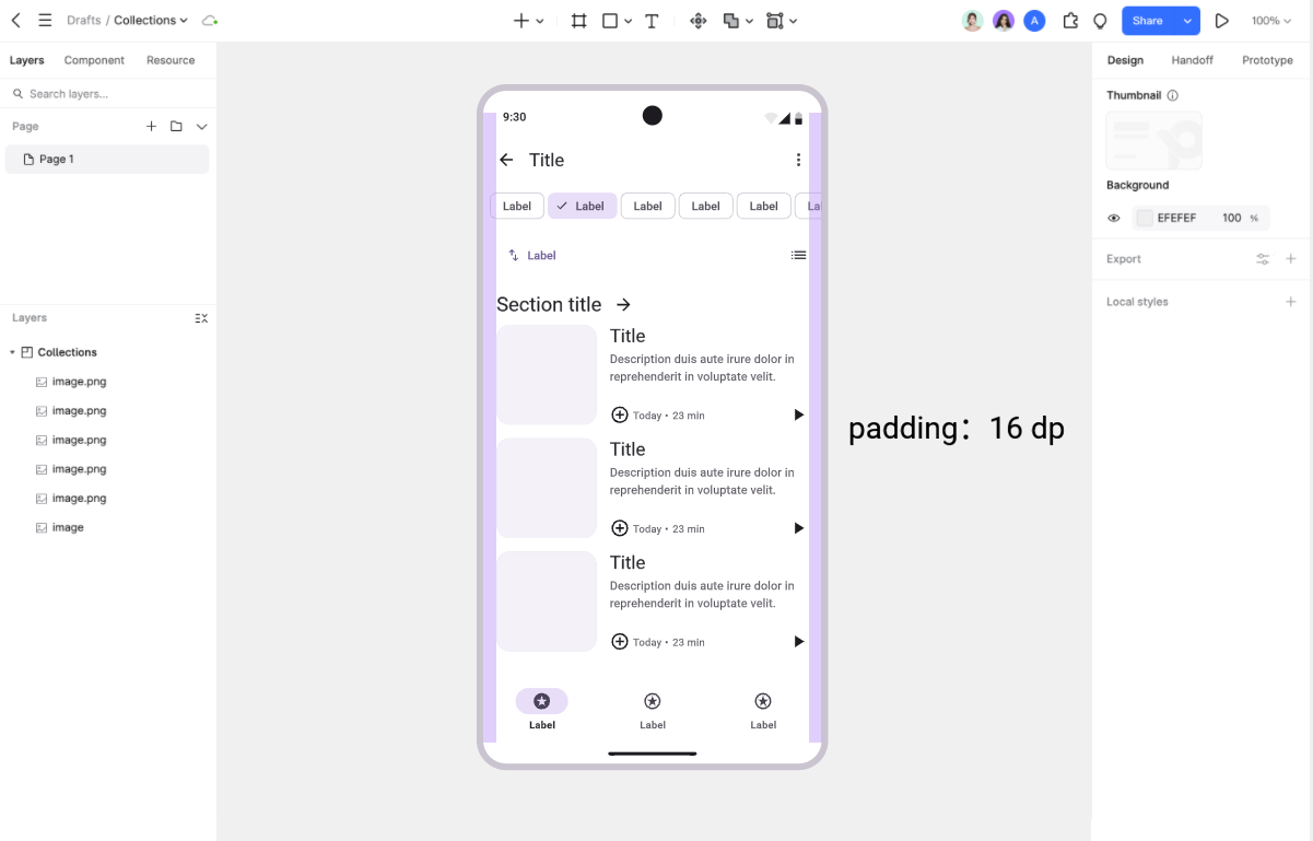
Card padding: Align related text and controls inside the card. Use the chosen component's spacing as the starting point, then test wrapped titles and secondary actions before changing individual values.
Spacing scale: Define a small set of reusable values so similar relationships look consistent. A tighter gap can connect a label to its value; a larger gap can separate two groups. Document exceptions that have a clear purpose.
Buttons: distinguish visual size from touch area
A button needs a clear label, a recognizable state, and enough room for accurate interaction. The visible shape and the touch target are related but are not necessarily the same size.
Touch target: Android recommends an interactive area of at least 48 × 48dp. A smaller visible icon can sit inside a larger padded target. Check the actual clickable area in the implementation, not just the icon dimensions in the design file.
Neighboring actions: Leave enough separation to make each target easy to select. When two actions compete for space, shorten their labels or change the layout before shrinking the targets.
Button text: Use concise labels such as “Save changes” or “Create project.” Keep the text legible at normal and enlarged font settings. Uppercase styling is not a reason to reduce text to an arbitrary smaller size.
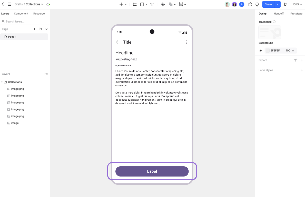
States: Design the enabled, pressed, focused, disabled, and loading states that the action needs. Explain what happens after activation, especially when a save or network request takes time.
Review these decisions on a complete screen. A correctly sized button can still be hard to find if its label is vague or if several nearby controls have equal visual emphasis.
2. Use a Material Design UI kit in Pixso
Choose one representative task, such as creating a project, and build that flow before expanding the kit across the app. This exposes gaps in the component set early.
Step 1: Open a design file. Sign in to Pixso and create a file for the app. Add frames for the screen sizes you plan to support and name them by task or screen.
Step 2: Find a suitable kit. Search the resource community for Material Design components. Inspect the kit's version, included states, and usage terms before bringing it into the project.
Step 3: Adapt the components. Replace sample copy with realistic titles, labels, and values. Apply your product's colors and text styles, then check how the components behave with longer content.
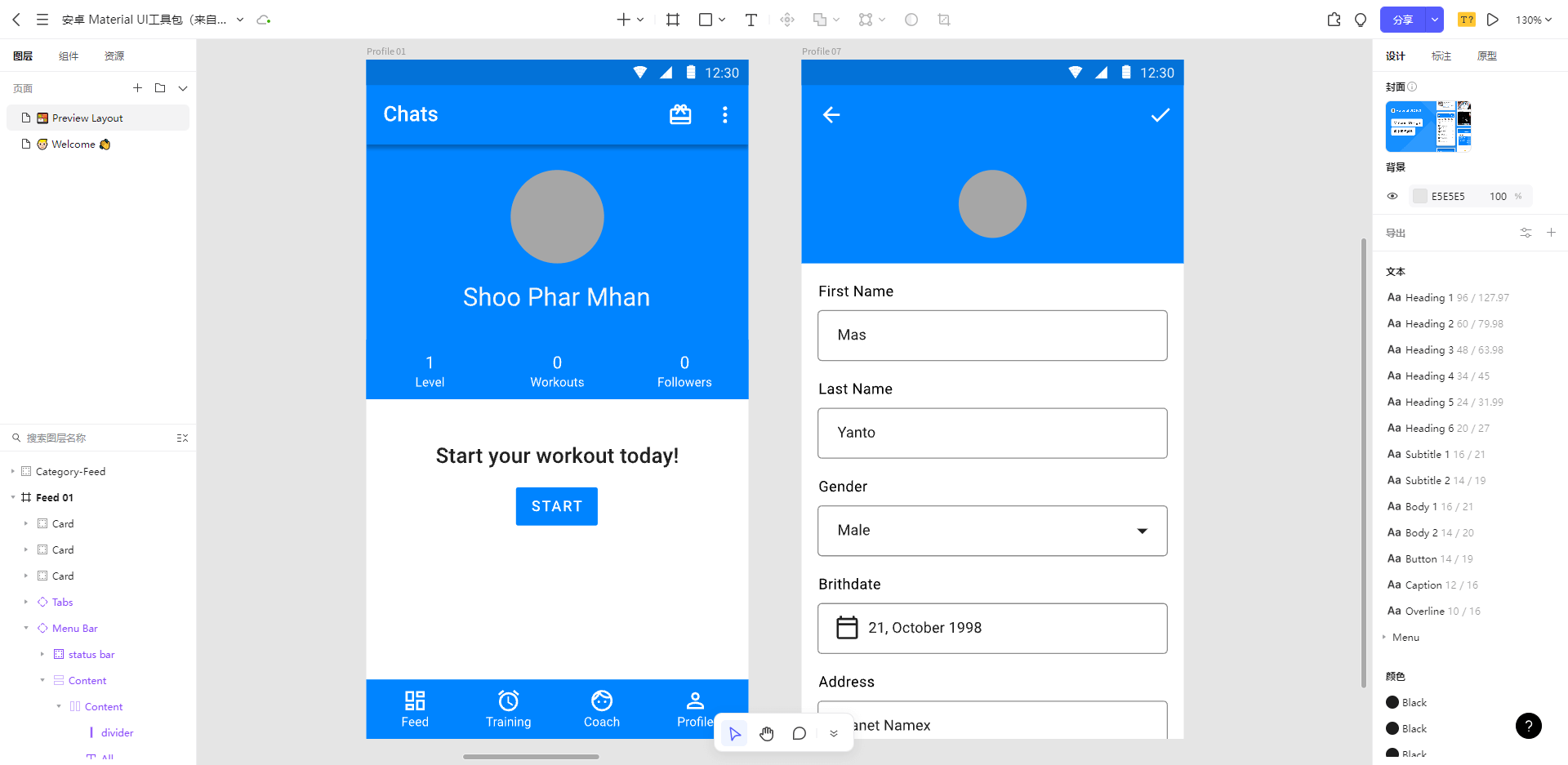
Keep frequently used elements in a reusable component set. Name their states and record the spacing and text styles the team should use. When sharing a library, agree on who maintains it and how changes reach other files; a copied kit does not manage that process by itself.
3. Make the design easier to build
Preserve icon proportions. Resize icons proportionally unless you intend to redraw them. For text, change the font size or text-box dimensions instead of stretching letterforms.
Separate zooming from resizing. Zoom changes your view of the canvas; it does not alter the design's dimensions. Resizing a layer changes its geometry, so inspect the resulting size and alignment before handing it off.
Use intentional dimensions. Avoid unexplained fractional values introduced by accidental dragging. Specify Android layout measurements in dp and text measurements in sp, and review rendered edges on target devices rather than treating every fraction as an error.
Reuse components with meaningful states. A selected tab should differ from an unselected one, but unrelated copies should not drift in padding or typography. Name variants clearly so developers can map them to the implemented component states.
Start with one complete task
Build a short flow with realistic content, including a long label, an empty state, and an error state. Review it at the intended screen size and with enlarged text. These cases reveal more about the design than a screen filled only with ideal sample content.
Then agree on the component versions, spacing values, and interaction states with the developer. A shared kit is most useful when its design decisions are explicit and its components match what the app will actually render.
![[2026] The Best UI/UX Tools that Every Designer Should Use](https://pixso.net/assets/media/top-5-ui-ux-tools-872368e4bf4b4e3c.webp)