- Start with one queue and one decision
- Make selection scope literal
- Preview the change, not just the command
- Decide what happens when some rows are ineligible
- Show progress and an honest mixed result
- Recheck changing data before commit
- Keep the action usable on small screens and by keyboard
- Build and review the flow in Pixso
- Hand off the rule behind each state

Scott
For a bulk status change, show exactly which records are selected, what their status will become, and which records cannot change before anyone confirms. After the operation, report changed and unchanged records separately. If you are still designing the table itself, start with the data table component tutorial; this guide picks up when a person has already selected records and needs to act on them safely.

Start with one queue and one decision
Imagine an asset-review queue. A reviewer filters to 47 items needing action, selects 12 across two pages, and chooses Change status to Published. Ten items are eligible. One selected item has already been published by a teammate; another is locked to a different reviewer. The interface must answer three different questions: Did “12 selected” mean 12 named items or every item matching the filter? Will the two ineligible items block the whole operation? What does success mean if only ten statuses change?
Draw the answer as a sequence, not a single confirmation dialog: selection, change preview, processing, and result. This sequence can be tested without inventing a perfect data set. Include the already-published item and the locked item from the start so the design cannot hide its hardest case in an error message added at the end.
Make selection scope literal
A header checkbox often means “select visible rows,” while a separate action may extend selection to all records matching the current filter. Those are different sets. Say 12 selected across two pages when the selection consists of named rows. Say All 47 results matching “Needs action” only when the user has explicitly chosen that wider scope. Never let a button labeled “Publish selected” silently change its meaning after pagination or filtering.
Keep the count and scope visible in the action bar. If the filter changes, either retain the exact selected records and say so, or clear the selection with an explanation. Do not leave a stale “12 selected” badge while the table now shows a different subset. When selection spans pages, provide a way to review the selected items before an irreversible action. IBM Carbon’s data-table guidance treats batch actions as a distinct mode after selection; the important design decision here is what that mode includes.
Preview the change, not just the command
“Publish 12 items?” repeats the action but gives little help in catching a wrong selection. A useful preview names the target status and separates rows by outcome. In this example it could show:
| Group | Count | What the reviewer sees |
|---|---|---|
| Will change | 10 | Current status → Published, with item names available for review |
| Will not change | 2 | One was already published; one is locked to another reviewer |
| Selection scope | 12 | The twelve explicitly selected items, not all 47 filtered results |
The preview should make a wrong target value, unexpected item, or exclusion visible before commit. For a small, low-risk edit, a compact summary may be enough. For a consequential change or a large selection, let people inspect the affected rows and old/new values. Basis Design System likewise recommends a selected count and a change preview for complex bulk edits in its bulk-editing pattern.
Decide what happens when some rows are ineligible
The interface cannot solve an undefined backend contract with nicer copy. Product and engineering teams first need to choose one of three behaviors:
- All or nothing: If any selected record is ineligible, change none. The preview identifies the blocking rows and offers a way to remove them.
- Eligible rows only: Apply the change to the ten eligible records and leave the other two untouched. The confirmation and result must state this before and after the action.
- Queued job: Start a background operation and show a job state. The interface must distinguish “request accepted” from “records updated.”
Choose the rule that fits the actual product and its data guarantees; do not mix them. In the example below, assume eligible rows only. The primary button can therefore say Publish 10 items, with the two exclusions immediately beside it. If the business process instead requires all-or-nothing publication, the button should stay unavailable until the two ineligible records are removed. Do not promise an Undo control unless the product can actually reverse the operation, including side effects such as notifications.
Show progress and an honest mixed result
After confirmation, keep the selected set stable and prevent a second submission while the first is unresolved. For a short operation, a working state and disabled submit button may suffice. For a longer job, show a meaningful status such as Updating 10 eligible items and provide a place to return to the result. A progress bar that merely animates without reflecting known progress is less useful than a clear job state.
When ten succeed and two remain unchanged, the headline should not say “All 12 published.” Say 10 published; 2 unchanged. Keep the unchanged items accessible, explain why one was already published and the other was locked, and offer a relevant next step for the locked item. If one of the ten eligible items fails during processing, report that separately from the two known exclusions. A preflight exclusion and a runtime failure need different remedies.
For products that support retry, bind it to the failed item IDs rather than replaying the original twelve-row selection. Otherwise a reviewer may submit already updated items twice. The result screen is part of the task, not a disposable toast that disappears before someone can resolve an exception.
Recheck changing data before commit
Selection and confirmation are separated in time. Another teammate may publish an item, change its owner, or remove the reviewer’s permission while the preview is open. When those facts affect eligibility, recompute the preview before commit or reject the stale attempt and show which rows changed. Keep the originally selected IDs visible so the user understands why the count moved from twelve to eleven rather than assuming a row vanished.
A useful test is to open the preview, change one record in a second session, then return and confirm. The desired result depends on the product’s concurrency policy, but it should never quietly apply a different operation from the one the user just reviewed. The handoff should identify which fields are revalidated and what error state the interface displays.
Keep the action usable on small screens and by keyboard
Selection state should not depend on a color change alone. Give the count a readable label, keep row checkboxes reachable by keyboard, and make the action bar discoverable after the first selection. On a narrow screen, less-used actions can move into an overflow menu, but the current selection and primary action must remain understandable. The preview should wrap long item names and keep the old/new status comparison readable without making the entire page scroll sideways.
Keyboard focus also needs a planned route. After opening the preview, focus its heading or first meaningful control; after the operation, move focus to the result announcement. If the preview closes because the selection is cleared, return focus to a predictable place in the table. These are implementation requirements to test with the built interface, not capabilities a static mockup can prove.
Build and review the flow in Pixso
In Pixso, use one editable table example as the starting point, then create frames for the twelve-item selection, the ten/two preview, the working state, and the mixed result. Reuse the table row and status components so the same item retains its name and status across frames. Connect the frames as a prototype and invite reviewers to walk the path with the already-published and locked records still present. The bulk status change is the application interface being designed on the canvas; it is not a native Pixso command that updates a live queue.
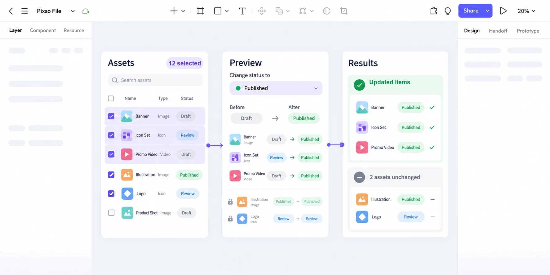
Ask a reviewer to identify the selected set, predict what happens to the two unchanged rows, and find them after confirmation. If they cannot answer from the interface, revise the labels or grouping before polishing colors. Capture the chosen all-or-nothing or partial-apply rule beside the frames so development does not infer it from a mockup. Then check the implemented selection scope, concurrency behavior, announcements, and retry path with real data.
Hand off the rule behind each state
For this queue, the decisive specification is compact: the selection consists of explicit record IDs across two pages; the preview shows ten eligible, one already published, and one locked; confirmation applies to eligible rows only; the result lists changed, excluded, and runtime-failed items separately. If the filter changes, the selected IDs remain fixed and the interface says so. If eligibility changes before commit, the preview must be refreshed. Those rules make the visual states testable and prevent a polished “Publish” button from concealing an ambiguous operation.