Scott
A useful data table component in Pixso starts with a field and action contract, then turns cells, rows, headers, and toolbar controls into reusable Auto Layout components. This tutorial builds an invoice table with sorting, selection, density, loading, empty, error, and narrow-screen states. The output is an editable component system and handoff board, not a picture of an ideal data set.
Write the invoice table contract
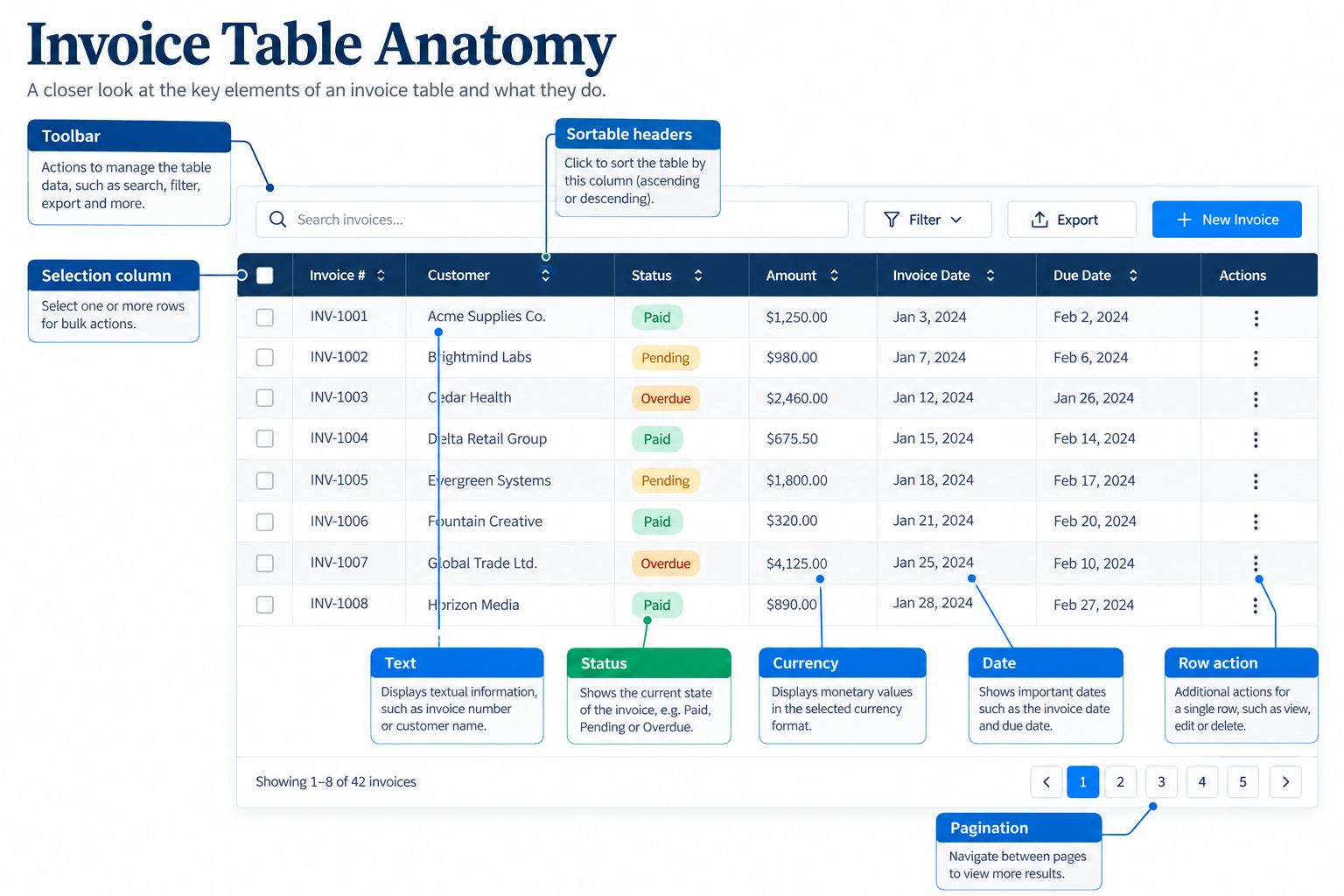
Our example helps an accounts team review invoices. Each row contains invoice number, customer, status, amount, due date, owner, and actions. Users can search, filter by status, sort by due date or amount, select multiple invoices, open one invoice, and export a permitted selection.
For every column, record data type, formatting, priority, minimum useful width, alignment, truncation rule, empty value, sort behavior, and narrow-screen treatment. Currency values align consistently and include a currency. Dates use an agreed format and time zone. Status uses text plus visual treatment. Row actions have visible or accessible labels in implementation.
| Column | Content rule | Behavior | Narrow-screen priority |
|---|---|---|---|
| Invoice | Stable identifier, never truncated beyond recognition | Opens detail | Always visible |
| Customer | Name plus optional company | Wrap or truncate with full value available | Always visible |
| Status | Draft, sent, overdue, paid | Filterable; not color-only | Always visible |
| Amount | Localized value and currency | Sortable | Visible |
| Due date | Explicit date format | Sortable | May move to detail |
| Owner | Name or unassigned | Filterable if required | May move to detail |
A table is not the right pattern if users mainly compare visual cards, scan a simple list, or complete one action per item on a phone. The data table UI design should earn its density through real comparison and management tasks.
Build the smallest reusable cells
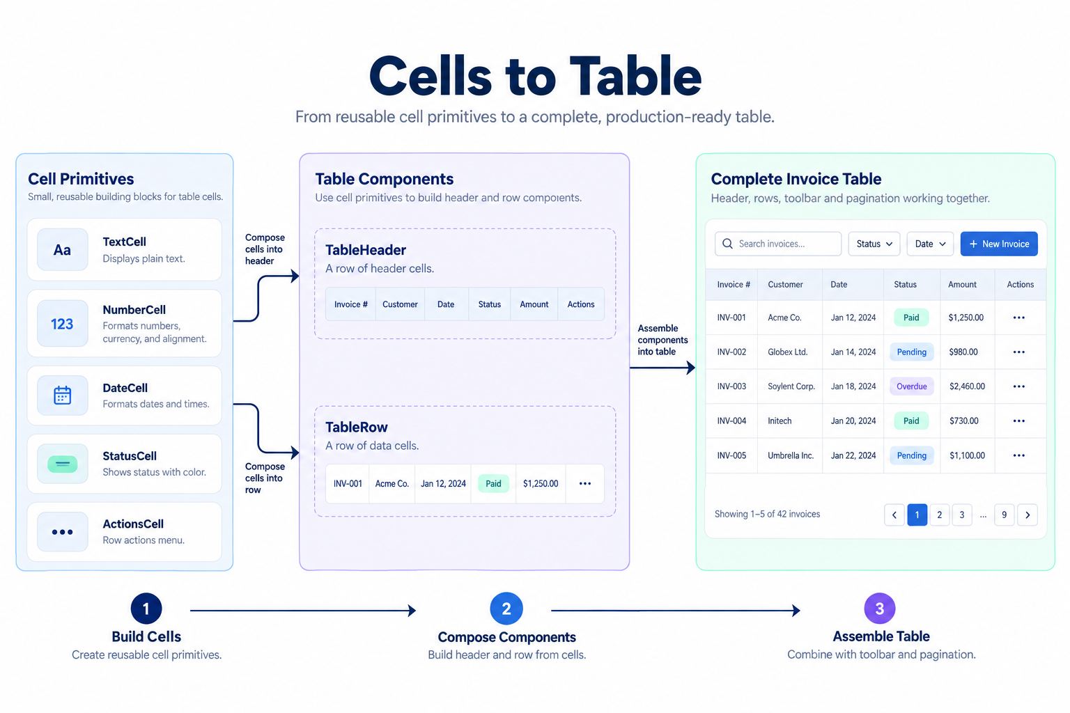
In a Pixso design file, create cell components before the whole row: text cell, numeric cell, status cell, checkbox cell, and action cell. Use Auto Layout inside each cell to control padding and alignment. Set realistic text constraints so long customers and large amounts expose layout problems. This establishes the first layer of the data table component in Pixso.
Create cell variants only for structural differences. Status values can use a nested badge component rather than making a separate row for every status. Selection belongs in a checkbox component. Sort direction belongs in the header cell. This keeps the data table component in Pixso understandable and avoids a combinatorial variant set.
Use semantic component names such as Table/Cell/Text and Table/Header/Sortable. Pixso supports components and related variants, while Auto Layout allows content-driven spacing. Refer to the current Pixso components guide when organizing the library.
Assemble row and header components
Place cell instances into a horizontal Auto Layout row. Define column widths deliberately: fixed widths for controls and status, flexible space for customer, and stable numeric alignment for amount. Create row states for default, hover, keyboard-focus intent, selected, and unavailable only when the business rule requires it.
The header row needs labels, sort affordances, select-all behavior, and optional resize handles if the product supports column resizing. A sort indicator should name direction visually and in implementation. Do not use a decorative arrow that appears only on hover if users need to know the current sort.
Test a representative set of values: a one-character customer, a 70-character customer, zero amount, a large amount, unassigned owner, overdue status, and missing due date. Auto Layout can expose overflow and wrapping, but the team still chooses which values wrap, truncate, or move.
Add density without sacrificing readability
Offer compact and comfortable density only if users have distinct needs. Compact rows help experienced operators scan more invoices, while comfortable rows improve target size and readability. Density should change vertical padding and perhaps supporting text, not remove essential information without warning.
Create a density property on the table or row component, then test it with selection, error, and wrapped content. A compact table that breaks as soon as a customer name wraps is not a complete variant. Record minimum row height and vertical alignment so implementation remains consistent.
Do not present density as a substitute for prioritization. If twelve columns are all “required,” investigate the task. Users may need saved column preferences, a details panel, or separate table views for different roles.
Design sorting, filtering, and bulk selection
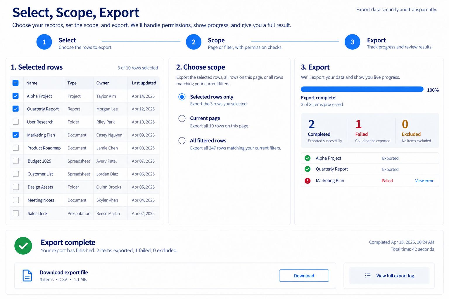
The toolbar contains search, status filter, density choice, export, and selection count. Keep global table actions separate from row actions. When users select rows, reveal a bulk-action bar that states the number selected and the action scope. “Export 12 invoices” is clearer than “Export.”
Specify selection across pagination and filters. Does Select all mean the current page, all filtered results, or every invoice? If changing a filter clears selection, warn before losing work. When some selected invoices are not exportable, show the excluded count and reason before the action runs.
Sorting and filtering require loading feedback if data comes from a server. Preserve the active query, prevent duplicate requests, and communicate stale or partial results. The design file should show these states even though the backend behavior is implemented elsewhere.
Create loading, empty, error, and partial states
A skeleton can represent initial loading when table structure is known, but it should not imitate real data so closely that users mistake it for content. During a refresh, keeping existing rows with a progress indicator may preserve context better than replacing everything with placeholders.
Separate empty states:
- No invoices yet: explain how to create or import the first invoice.
- No filter results: show active filters and offer a clear reset.
- No permission: explain access boundaries without implying the data does not exist.
- Load failure: preserve the query, provide retry, and distinguish cached data from current data.
- Partial data: state which range or source failed and what remains usable.
Success also needs evidence. After export, show the generated file or download status rather than only marking the selected rows green. After a bulk status change, report completed, excluded, and failed counts with a way to inspect details. When the table represents an audit log, distinguish the event outcome from whether the interface could load its details.
Specify pagination and large-result behavior
The data table component in Pixso should show how users move through more invoices than one page can display. Define page size, total-result wording, next and previous behavior, direct page access where justified, and what happens when filtering reduces the current page beyond the new result count. Preserve search and sort state when users open an invoice and return.
For very large or continuously updated data sets, engineering may use server pagination or virtualization. The design should not promise that every row is present in the browser. Record which totals are exact, estimated, or unavailable, and whether selections can include unloaded results. A loading indicator needs to distinguish fetching the next page from refreshing the current rows.
Use realistic pagination labels and disabled boundary states in the data table component in Pixso. Test a single page, the first and last page, a result count that changes, and a failed page request. Performance is an implementation concern, but the UI must give users an understandable position and recovery path.
Design narrow-screen behavior intentionally
A responsive data table cannot always shrink. For medium widths, freeze priority columns and allow horizontal scrolling inside the table container, with a visible cue that more columns exist. For phones, consider a stacked row summary that preserves invoice, customer, status, and amount, with secondary fields in an expandable detail area.
Create separate responsive examples in Pixso rather than relying on one squeezed frame. Ensure selection and row actions remain reachable. Test long translated labels, 200% zoom, sticky headers, and the interaction between horizontal scroll and page scroll.
Document which information is hidden, moved, or abbreviated. Developers should not decide column priority from whichever CSS rule happens to fit. The editable Auto Layout table is a design artifact; production must still use suitable table or grid semantics based on interaction requirements.
Review and hand off the full system
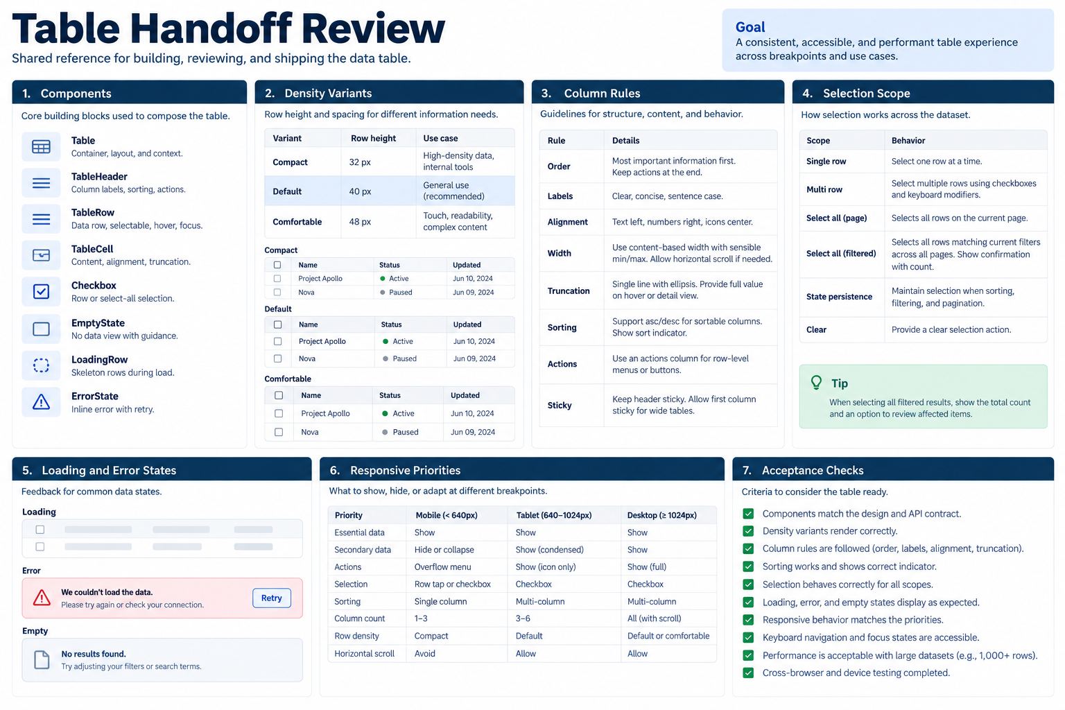
Publish approved table components to the team library only after naming and usage review. Use comments to resolve open questions about sorting, permissions, selection scope, and responsive behavior. Pixso's collaborative design and handoff workflow can keep review notes and inspectable specifications near the table.
Before engineering starts, confirm field definitions, example data, row states, keyboard intent, visible focus, accessible names, sort announcements, selection semantics, loading, empty, failure, completion, and narrow-screen behavior. Generated specifications or code do not validate data accuracy, performance, semantic structure, or accessibility; test those in the built product.
Review the data table component in Pixso whenever column rules, permissions, or bulk actions change. A shared component update can improve consistency, but every affected instance still needs inspection for local content and overrides.
Data table component checklist
- Every column has type, format, priority, width, empty value, and responsive rule.
- Headers communicate current sorting and available actions.
- Selection states scope Select all to page, filter, or complete result set.
- Bulk actions show count, permissions, progress, failures, and completion evidence.
- Compact and comfortable density work with real long content.
- Initial loading, refresh, no data, no results, no permission, failure, and partial data are distinct.
- Narrow layouts preserve important comparison and actions without page-level overflow.
- Implementation testing covers semantics, keyboard use, focus, announcements, zoom, and performance.
Conclusion
Build a data table component in Pixso from the data contract upward: cells, headers, rows, toolbar, state surfaces, and responsive alternatives. Auto Layout and reusable components make the system editable and consistent, while realistic invoice examples expose weak rules. Finish with selection scope, failure recovery, completion evidence, and implementation checks so the table supports real work rather than only a perfect data screenshot.