Scott
As data driven decision making becomes an essential standard across modern business ecosystems, effective dashboard design is no longer optional. A well structured dashboard translates complex numerical metrics and raw data streams into clear visual layouts, enabling team members to understand trends, track operational health, and evaluate key performance indicators at a glance. In an era where product managers, UI UX designers, data analysts, and software engineers collaborate continuously, choosing the right platform to visualize information determines how fast an organization can react to market changes.
In this comprehensive guide, we explore four of the latest dashboard design websites used by modern practitioners. We cover powerful enterprise analytics solutions as well as versatile graphic design software, providing actionable insights into how product teams can construct intuitive, responsive, and visually compelling data environments.
Part 1. The Essential Role and Business Impact of Dashboard Design
A specialized platform for dashboard design is far more than a simple drawing application or a tool for generating decorative bar graphs. It serves as a vital strategic framework to structure information systematically, accelerating the speed, efficiency, and accuracy of organizational decision making.
In modern business environments, different departments rely on tailored visual metrics to execute daily workflows:
• 📌Marketing teams monitor real time campaign performance, conversion funnels, customer acquisition costs, and social engagement metrics
• 📌Product and operations teams track user retention rates, system uptime, revenue growth, and supply chain logistics
• 📌Financial analysts evaluate cash flow trends, budget allocations, quarterly forecasts, and profit margins
• 📌Executive leaders gain instant visibility into top level key performance indicators to align cross functional strategies
With recent advancements in web dashboard design technology, organizations can configure interactive charts and responsive KPI layouts without writing complex manual code. Adopting proven dashboard design best practices enables design teams to convert raw analytical datasets into intuitive human centered visual languages.
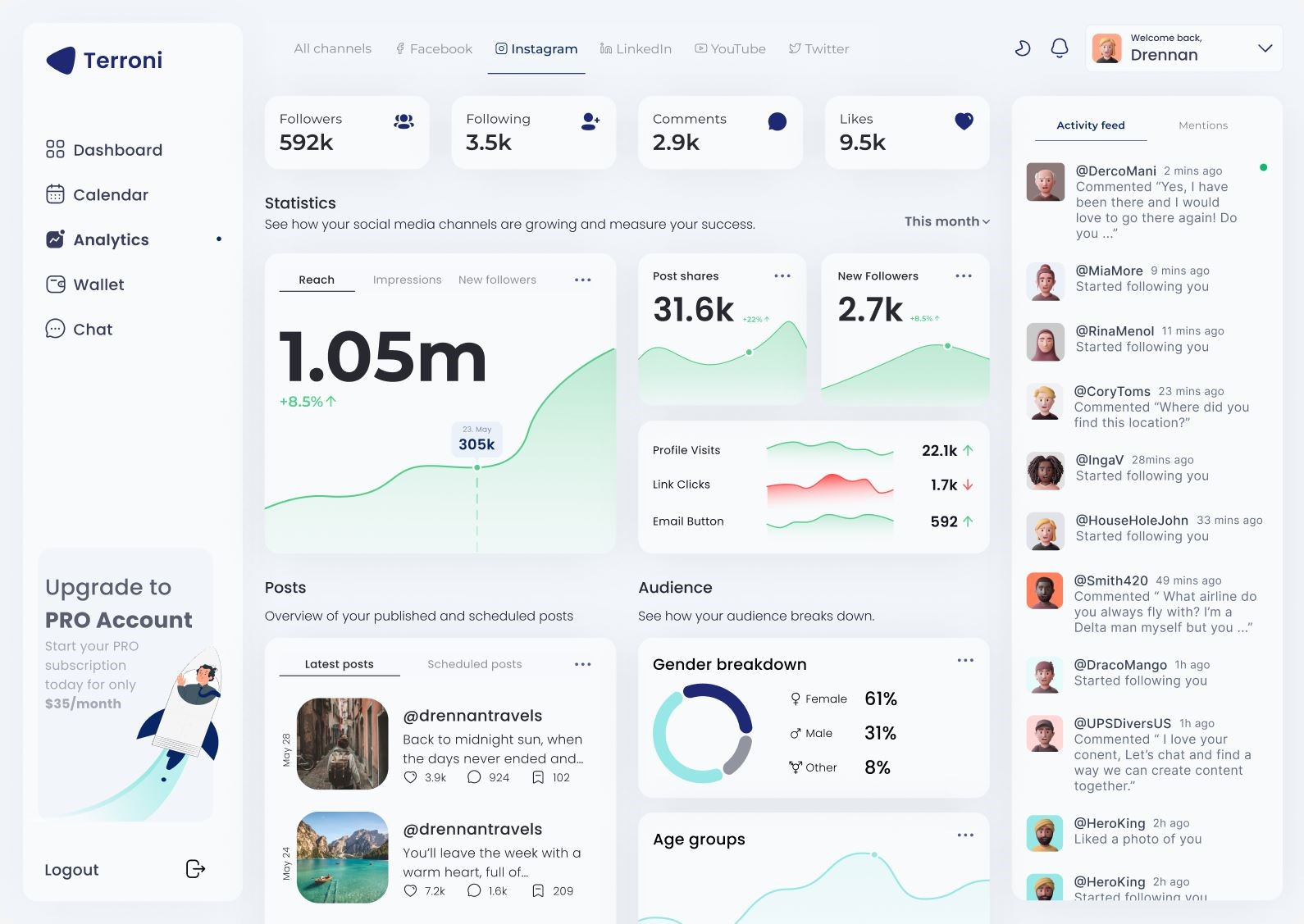
Part 2. Detailed Analysis of the Top 3 Enterprise Dashboard Design Websites
Enterprise business intelligence tools specialize in connecting large scale databases directly to interactive visualization dashboards. Here is a detailed breakdown of three top tier platforms widely adopted by corporate analytics teams worldwide.
1. Microsoft Power BI
Microsoft Power BI stands as an industry leading enterprise solution for complex data visualization and reporting. It offers seamless automated integration with a vast range of data sources, including Microsoft Excel spreadsheets, SQL databases, Azure cloud services, and third party platforms like Salesforce.
Key Capabilities:
• Advanced AI analytics features that automatically detect statistical anomalies and generate natural language insights
• Deep integration within the Microsoft enterprise software ecosystem, making security governance and role based access control seamless
• Robust data modeling engines capable of processing millions of records without sacrificing performance
• Customizable visualization libraries for building complex interactive reports
Ideal Use Case: Microsoft Power BI is best suited for large enterprises and corporate organizations that require heavy data modeling, strict compliance management, and direct integration with existing Microsoft infrastructure.
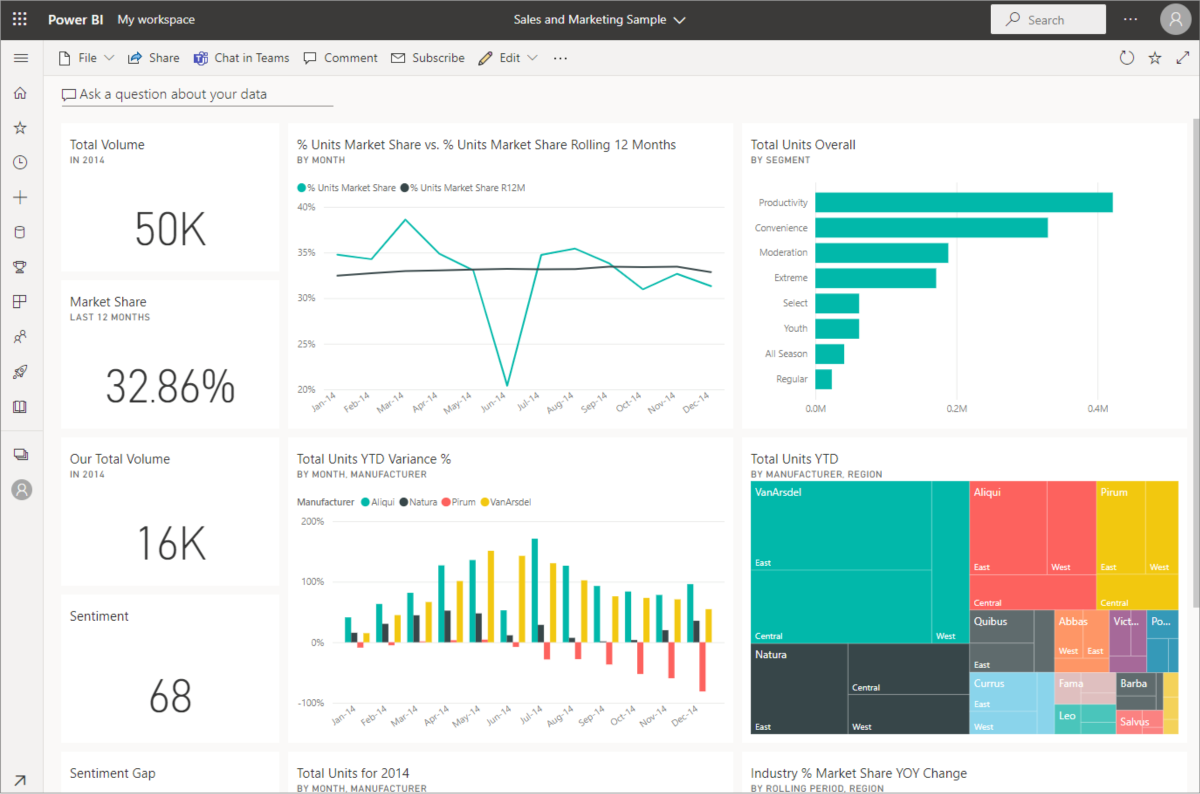
Image source: Microsoft Power BI official website
2. Tableau
Tableau is globally recognized as a benchmark solution in data visualization and analytics software. Renowned for its powerful visual query language, Tableau empowers users to transform raw datasets into dynamic visual charts with incredible graphical precision.
Key Capabilities:
• Intuitive drag and drop interface that allows creators of all technical experience levels to build interactive graphs easily
• Excellent responsive engine capable of optimizing web dashboard layouts for desktop monitors, tablets, and mobile devices
• Extensive geospatial mapping capabilities for analyzing location based and regional data distributions
• Vibrant international user community providing thousands of free visualization templates, tutorials, and shared learning resources
Ideal Use Case: Tableau is the preferred choice for data scientists, professional business analysts, and research teams who need maximum flexibility to perform exploratory data analysis and craft customized visual stories.
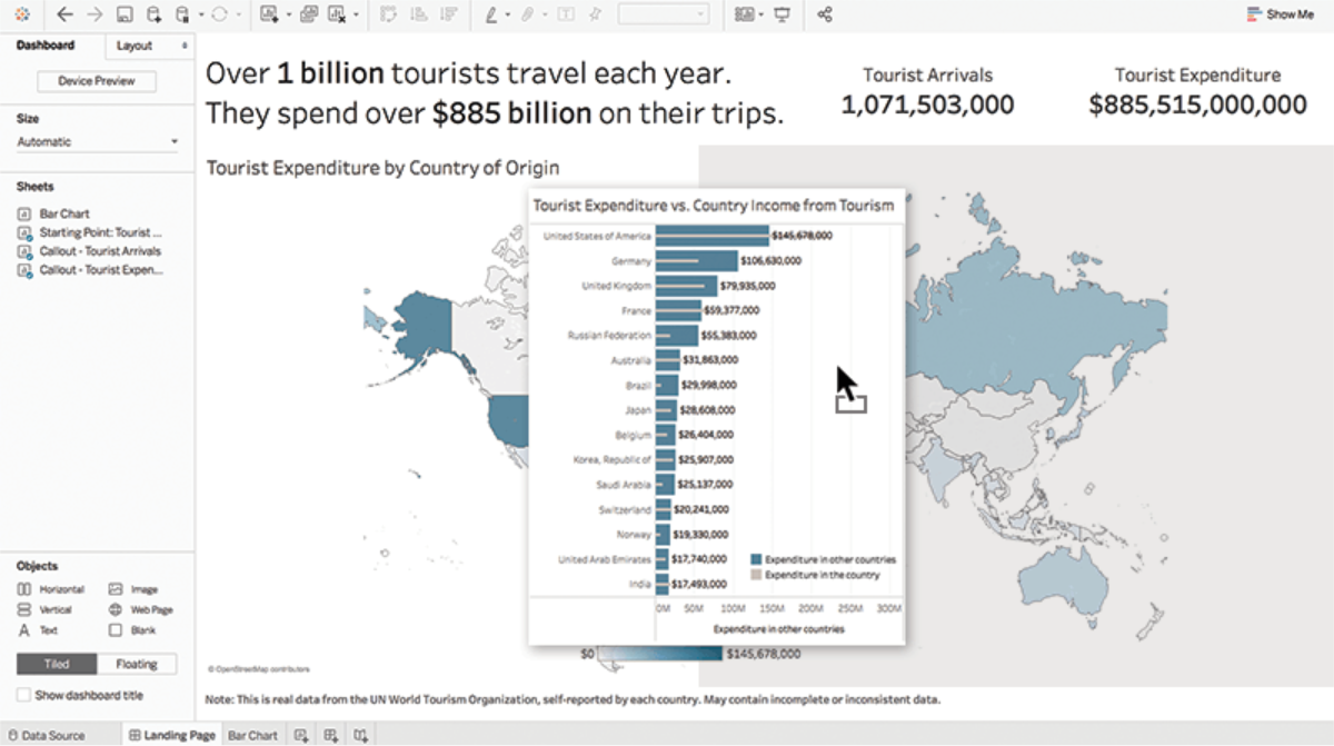
Image source: Tableau official website
3. FineReport
FineReport is an enterprise grade reporting and business intelligence platform designed to combine complex document automation with interactive visual dashboards. It bridges the gap between traditional corporate paper reporting and modern digital analytics environments.
Key Capabilities:
• Outstanding compatibility with corporate ERP, CRM, and OA systems through flexible database connectors
• Grid based design interface that simplifies the creation of multi sheet enterprise financial reports and operational ledgers
• Real time data refresh capabilities tailored for monitoring live manufacturing lines, inventory tracking, and sales performance
• Robust multi language localization support and enterprise system integration options for corporate IT environments
Ideal Use Case: FineReport is ideal for manufacturing enterprises, retail conglomerates, and corporate organizations that require standardized automated reporting alongside interactive operational dashboards.
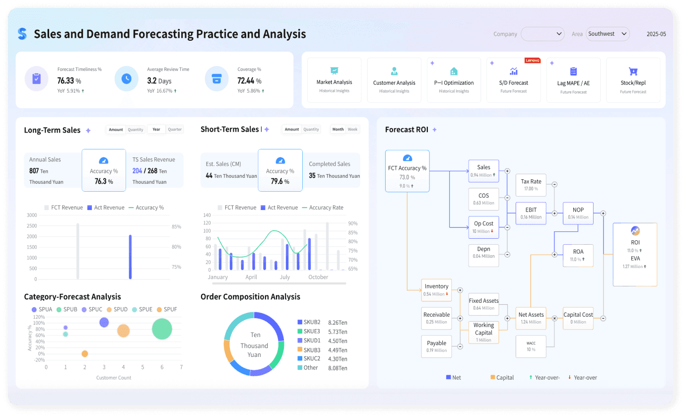
Image source: FineReport official website
Part 3. Key Principles and Step by Step Guide on How to Design a Dashboard
Creating an effective dashboard ui design requires a thoughtful approach that balances information density with visual clarity. Designers must avoid cluttering screens with unnecessary graphical elements while ensuring critical metrics remain immediately visible.
Here is a structured walkthrough detailing how to design a dashboard that delivers immediate clarity and user engagement:
Step 1. Define User Personas and Primary Key Performance Indicators
Before opening any design software, identify who will use the dashboard and what decisions they need to make. Executive dashboards require high level summaries and macro metrics, while operational dashboards require granular real time data grids and filterable tables. Select between five and seven core KPIs per screen to avoid cognitive overload.
Step 2. Establish a Logical Visual Hierarchy
Arrange information according to human visual scanning patterns. Place the most critical summary cards and top level KPIs at the top left corner, where users naturally start reading. Position middle level trend graphs and comparative charts in the central region, and reserve the bottom section for detailed data tables, activity logs, or secondary breakdowns.
Step 3. Select Appropriate Data Visualization Charts
Choose chart types that accurately represent the underlying data relationships:
• Line graphs for tracking continuous metrics over time
• Bar charts for comparing categorical quantities
• Donut charts or stacked bars for illustrating part to whole proportions
• Sparklines and KPI metric cards for displaying single numerical highlights alongside quick directional trends
Step 4. Implement Consistent Color Systems and Dark Mode Adaptability
Use color purposefully rather than decoratively. Apply neutral gray shades for card backgrounds and container borders, reserving high contrast saturated colors for critical status alerts, threshold warnings, or call to action buttons. Ensure your color choices maintain adequate contrast ratios for accessibility and offer seamless switching between light mode and dark mode themes.
Part 4. Pixso: The Best Free UI Design Tool for Web Dashboard Projects
When product designers need to wireframe, prototype, and build custom web dashboard layouts from scratch, specialized UI UX design software offers far greater creative freedom than rigid business intelligence templates. For creators seeking a modern collaborative platform, Pixso is an outstanding web based solution.
Pixso combines full graphical vector editing, responsive auto layout capabilities, and cloud based real time collaboration into a unified design environment. It equips product creators with built in UI design components specifically tailored for building custom web dashboard design systems.
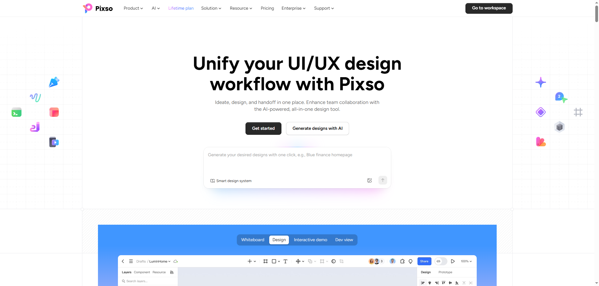
✨Key Features of Pixso for UI UX Designers:
• All in One Product Workflow: Seamlessly covers the entire product creation process, from whiteboard brainstorming and interactive prototyping to high fidelity UI design and developer handoff, all inside a single unified workspace.
• Pixso AI Design Assistant: Drastically reduces time spent on initial drafts, image editing, global adjustments, and repetitive design tasks, allowing designers to focus on creative innovation and detail refinement.
• Seamless Design to Code (D2C) Handoff: Bridges the communication gap between design and engineering by automatically generating clean, production-ready code, making design to development handoffs faster and frictionless.
• Real Time Cloud Collaboration: Enables multi role product teams, designers, and developers to co edit canvases simultaneously, leave pinpoint feedback, and review live interactive prototypes in real time.
Step by Step Guide: Using Dashboard Templates in Pixso
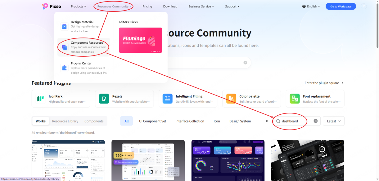
Step 1. Access the community resources
Navigate to the Pixso official website and open the Community workspace. In the search bar located at the top right section, type dashboard to explore a broad collection of community created UI kits and dashboard design templates. Preview various visual styles to select a layout that aligns with your product goals.
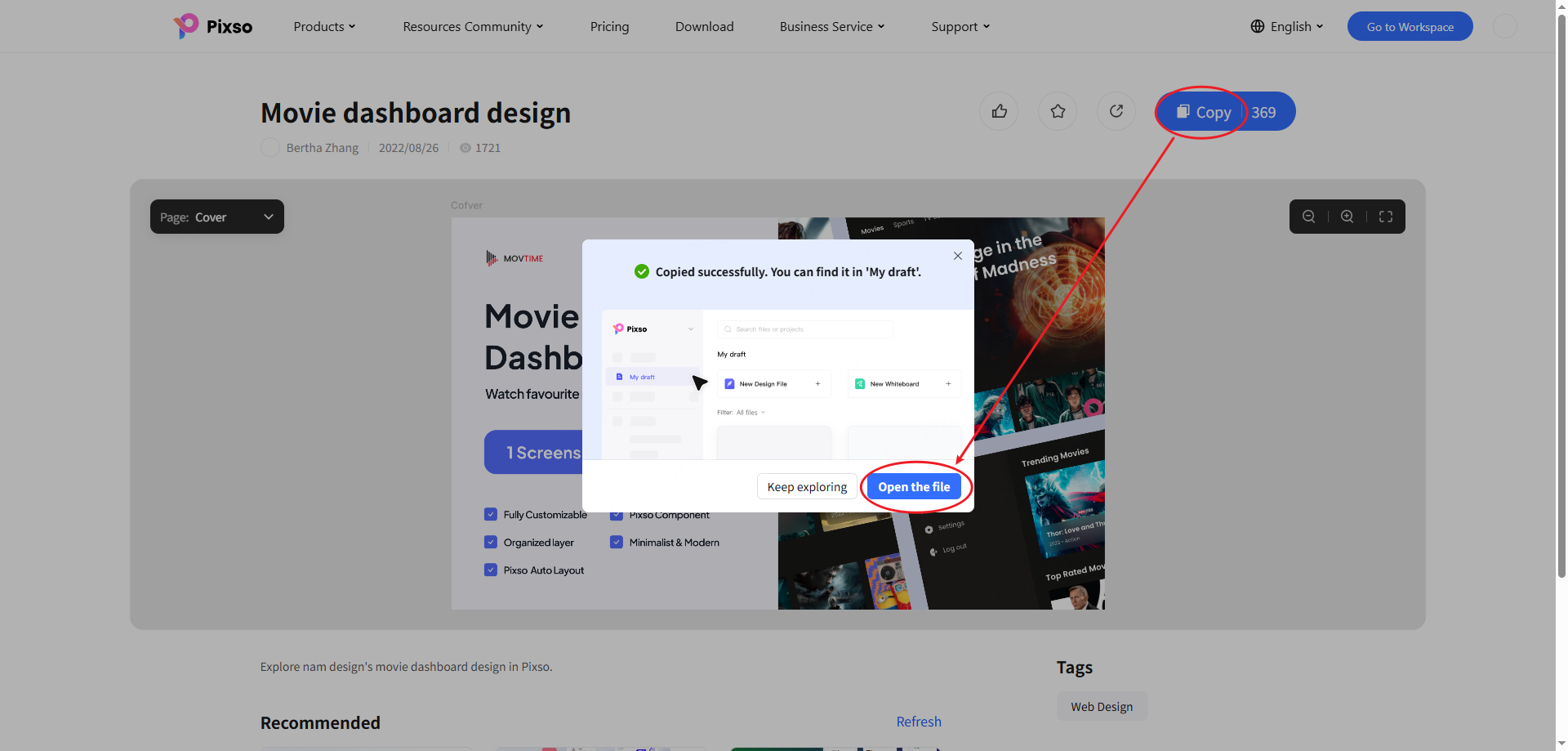
Step 2. Duplicate the template to your workspace
Click on your preferred template card to open its detailed overview page. Click the Copy or Duplicate button on the right side of the screen. The entire file, including all vector components, typography styles, and design frames, will save directly into the My Files folder of your Pixso account.
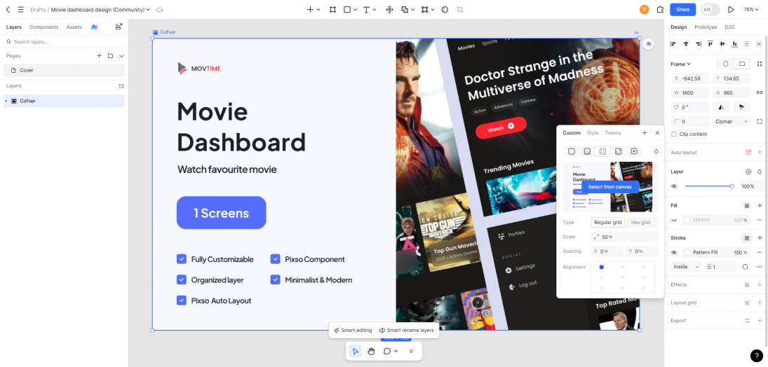
Step 3. Customize and export your design system
Open the copied file within the Pixso canvas editor. Adjust color variables, modify text layers, reconfigure chart layouts, and add your custom branding assets. Once your design is complete, generate a shareable preview link for team review or export design tokens and assets directly for developer handoff.
FAQ
Q1: How do I choose the right color scheme for a functional dashboard ui design?
Use color purposefully rather than decoratively. Limit your primary palette to two or three neutral background shades and reserve high contrast accent colors strictly for critical alerts, threshold breaches, or urgent status changes. Maintaining consistent color meanings across all screens helps reduce cognitive fatigue for users.
Q2: What is the ideal layout hierarchy when learning how to design a dashboard from scratch?
Follow the inverted pyramid structure. Place high level summary cards and primary key performance indicators at the top left where users scan first. Position mid level trend charts and comparison graphs in the middle region, and place detailed data tables or transaction logs at the bottom for deep analytical reviews.
Q3: How can product teams maintain visual consistency across multi page web dashboard design projects?
Establish a centralized design system containing reusable UI components, typography scales, and standardized spacing tokens before creating individual screens. With a collaborative design platform such as Pixso, teams can publish shared component library updates for reuse in other files.
Q4: How frequently should dashboard data visualizations refresh to ensure optimal performance?
Data refresh intervals should align with operational needs rather than default to continuous streaming. Operational dashboards monitoring live logistics or server health require near-instant polling, whereas executive summary dashboards or monthly sales reviews perform best with scheduled periodic updates to prevent server load and visual distraction.
Q5: What is the difference between specialized business intelligence platforms and UI design tools like Pixso?
Business intelligence tools like Power BI and Tableau focus on direct database connections, automated SQL queries, and backend analytical calculations. UI design tools like Pixso focus on creative visual design, custom interface wireframing, component design systems, interactive prototyping, and seamless developer handoff for custom web application development.
Q6: How do responsive auto layout features in Pixso assist in dashboard creation?
Auto layout features allow visual elements inside dashboard cards to respond dynamically to changing data lengths or screen resolutions. When text values expand or sidebar navigation collapses, cards adjust their padding and alignment automatically, preserving visual balance without requiring manual pixel repositioning.
Conclusion
Modern dashboard design has evolved beyond basic data display into a sophisticated visual language that shapes organizational strategy and accelerates product innovation. Enterprise solutions like Microsoft Power BI, Tableau, and FineReport offer unmatched analytics infrastructure for corporate environments, while versatile UI design tools like Pixso empower product teams to conceptualize, wireframe, and build custom user interfaces with complete creative freedom.
By adhering to fundamental dashboard design best practices, structuring clear visual hierarchies, and leveraging modern collaborative design platforms, teams can turn complex data ecosystems into intuitive user experiences. In 2026 and beyond, leverage these four recommended platforms to build clear, accessible, and high impact dashboard environments for your business.
Try Pixso for free and transform your web dashboard design workflow today.