Scott
In today's highly digital world, an exceptional company website is an essential tool for attracting potential clients, establishing brand identity, and boosting business performance. Regardless of the size of your business, building a professional and high-performing company website will significantly enhance your market competitiveness. In this comprehensive website design guide, we will walk you through creating a visually stunning and feature-rich company website from scratch.
1. Web Design Fundamentals
1.1 HTML
1.1.1 Basic Structure of HTML Tags
HTML (HyperText Markup Language) is the standard markup language used to create web pages. It consists of a series of tags, each serving a specific function. Understanding the basic structure of HTML tags is fundamental in modern web design.
HTML tags are enclosed in angle brackets (< >) and typically appear in pairs: an opening tag and a closing tag. The content placed between the opening tag and closing tag is the element content. For example, the structure of a simple paragraph tag is as follows:


In addition to opening and closing tags, HTML elements can also contain attributes. Attributes provide extra information about the tag to control its behavior and styling. They are usually included in the opening tag as key-value pairs. For instance, you can add an href attribute to an anchor tag to specify the destination URL:


1.2 CSS
1.2.1 CSS Selectors
CSS selectors are used to target HTML elements and apply styles to them. Common CSS selectors include:
- Element Selectors: Select elements based on their tag name, such as p selecting all
elements.
- Class Selectors: Select elements by their class attribute, such as .red selecting all elements with the class red.
- ID Selectors: Select an element by its unique ID, such as #header selecting the element with id="header".
- Attribute Selectors: Select elements based on an attribute or attribute value, such as [type="text"] selecting all elements with a type attribute set to text.
- Pseudo-class Selectors: Select elements based on their state, such as :hover selecting an element when the mouse cursor hovers over it.
1.2.2 CSS Style Properties
CSS properties define the aesthetic look of elements. Common CSS properties include:
- color: Sets text color.
- background-color: Sets background color.
- font-size: Sets font size.
- font-weight: Sets font weight (thickness).
- text-align: Sets text alignment.
- padding: Sets the inner spacing of an element.
- margin: Sets the outer spacing around an element.
- border: Sets the border of an element.
1.2.3 CSS Box Model
The CSS box model wraps every HTML element in a rectangular box consisting of four layers: content area, padding, border, and margin. Key box model properties include:
- width: Sets the width of the element content area.
- height: Sets the height of the element content area.
- padding: Sets the inner padding space.
- border: Sets the surrounding border.
- margin: Sets the outer margin space.
1.2.4 CSS Layout Techniques
CSS layout techniques control the positioning and sizing of elements on a page. Common techniques include:
- Normal Flow Layout: Elements are arranged sequentially as they appear in the HTML source document.
- Float Layout: Elements are removed from the standard document flow using float properties for structural alignment.
- Positioning Layout: Elements are placed at specific coordinates using properties like absolute, relative, or fixed positioning.
- Flexbox Layout: Provides a flexible container to align and distribute space among items seamlessly.
1.2.5 Responsive Web Design with CSS
Responsive web design ensures that a page automatically adjusts its layout and aesthetics across various screen sizes and device resolutions. Essential CSS techniques for responsive design include:
- Media Queries: Apply custom CSS styles based on device viewport parameters.
- Flexible Grid Layouts: Utilize percentage-based widths and Flexbox properties for seamless auto-adapting layouts.
- Responsive Images: Automatically optimize image sizing and rendering quality based on screen display density.
1.2.6 CSS Animations
CSS animations add dynamic visuals and delightful micro-interactions to web interfaces. Common animation types include:
- Transitions: Smoothly animate transitions when an element changes from one state property to another.
- Keyframe Animations: Define precise frame-by-frame style rules along an animation sequence.
- Animation Properties: Fine-tune animation duration, delay, iteration count, and timing functions.
1.2.7 CSS Preprocessors
CSS preprocessors extend standard CSS with advanced features, enhancing code scalability and maintainability. Widely used CSS preprocessors include:
- Sass: A Ruby-based (and Dart-implemented) preprocessor offering variables, nesting, mixins, and functions.
- Less: A JavaScript-based preprocessor providing dynamic style capability with nesting and variables.
- Stylus: A flexible Node.js preprocessor with an ultra-clean, minimalist syntax.
1.2.8 CSS Frameworks
CSS frameworks offer pre-built components and responsive layout grids to accelerate website design workflows:
- Bootstrap: A popular front-end framework featuring responsive grid systems and versatile UI components.
- Foundation: A highly customizable framework for building mobile-first responsive interfaces.
- Bulma: A lightweight, flexbox-based CSS framework with a clean component structure.
1.2.9 CSS Best Practices
Adhering to CSS best practices helps maintain clean code architecture and optimal site performance:
- Use External Stylesheets: Separate structural HTML from presentation CSS to enhance maintainability and browser caching.
- Minify and Bundle Files: Compress and combine CSS files to decrease HTTP requests and accelerate loading speed.
- Avoid Overly Specific Selectors: Limit deep selector nesting to reduce style computation overhead and improve rendering speed.
- Leverage Preprocessors: Use preprocessors to streamline reusable style rules and improve readability.
- Comment Your Code: Include clear contextual comments to make maintenance easier for team collaboration.
1.2.10 CSS Debugging Techniques
Mastering CSS debugging is crucial when addressing UI layout bugs:
- Browser Developer Tools: Inspect styles, test dynamic changes, and debug box model dimensions in real time.
- Add Temporary Outlines/Borders: Apply temporary colored borders or background colors to quickly visualize element bounds and spacing.
- Incremental Styling: Apply styles one property at a time to isolate conflict sources effectively.
- Inspect Specificity Rules: Evaluate element style priority rules to resolve cascading overrides.
- Clear Floats: Implement clearfixes or modern formatting contexts to solve floating layout collapses.
1.3 JavaScript
1.3.1 Introduction to JavaScript
JavaScript is the dynamic scripting language used to create interactive user experiences on the web. By manipulating HTML structures and CSS styles, JavaScript enables rich interactive widgets, client-side validation, and dynamic data rendering.
1.3.2 JavaScript Syntax and Core Concepts
JavaScript syntax shares similarities with other modern programming languages. It uses variables to store data, functions to encapsulate reusable code blocks, and control flow logic (conditionals and loops) to drive interactivity. Key JavaScript concepts also include objects, arrays, asynchronous events, and DOM manipulation.
1.3.3 Applications of JavaScript in Web Design
JavaScript powers core dynamic behaviors across a company website. It can validate web forms prior to submission, power UI modules like hero image carousels or collapsible navigation drawers, and communicate asynchronously with back-end APIs to refresh dynamic page content without reloading.
1.3.4 Recommended JavaScript Learning Resources
You can learn JavaScript through dedicated industry books, interactive training programs, or self-paced tutorials:
- JavaScript: The Definitive Guide – An iconic, comprehensive deep dive suitable for developers building robust core knowledge.
- Codecademy – An interactive learning platform offering hands-on JavaScript tracks ideal for beginners.
- MDN Web Docs – Maintained by Mozilla, this is the definitive technical documentation and reference resource for web developers.
2. Tools for Company Website Design
2.1 Code Editors
2.1.1 Choosing and Installing a Code Editor
Selecting the right editor is essential for a smooth front-end workflow. Code editors highlight syntax, provide auto-completion, and offer code snippets that dramatically speed up development. When selecting an editor, consider your team's workflow and technical environment.
Popular web development editors include Sublime Text, Visual Studio Code, and Atom. These editors offer extension ecosystems designed to meet various front-end coding needs.
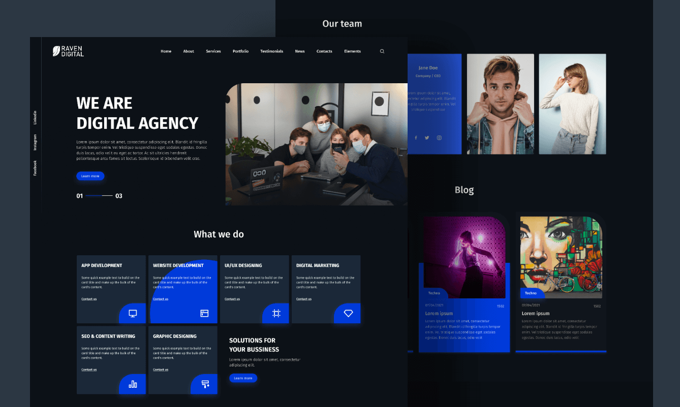
Installing a code editor is straightforward: download the executable installer for your operating system and follow the setup wizard. You can customize installed extensions and syntax extensions according to your preferences.
2.2 Graphic & UI Design Tools
2.2.1 Pixso
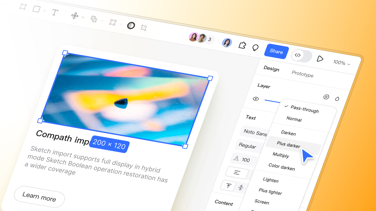
Pixso is a powerful cloud-based collaborative design tool tailored for modern UI/UX teams working on web design projects. It enables real-time multiplayer co-editing, allowing designers, developers, and product managers to collaborate seamlessly on a single canvas. Pixso supports vector graphics, responsive auto-layout, interactive prototyping, and contextual commenting to collect instant feedback. As a native browser-based design ecosystem, Pixso simplifies handoff and turns ideas into production-ready web interfaces efficiently.

✅ Pixso has a free entry plan for individual users
Pixso offers a free plan for individual creators, with plan-specific file, collaborator, and storage limits. Resource availability depends on the plan. It equips individual designers and small design teams with everything needed for efficient online collaboration and high-quality company website design. 👉 Click here to try Pixso online for free
2.2.2 Adobe Photoshop
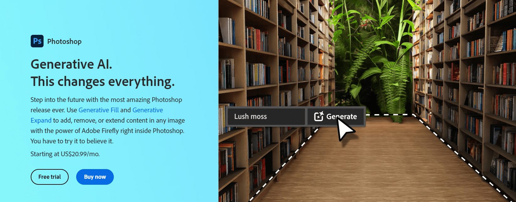
Adobe Photoshop is a standard tool for raster graphics editing and digital image processing in web design workflows. It provides extensive visual retouching tools, color grading capabilities, and texture controls to optimize hero images, banners, and photographic assets. Photoshop also supports layer-based editing, facilitating organized asset management.
2.2.3 Sketch
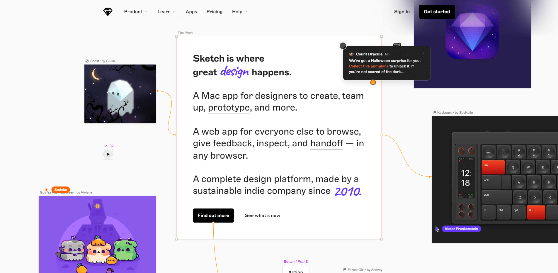
Sketch is a vector design application designed specifically for macOS users. Widely adopted for digital UI/UX layout creation, Sketch provides a clean canvas, vector drawing capabilities, symbol component libraries, and global design tokens to facilitate rapid interface prototyping and web vector asset creation.
2.2.4 Adobe Illustrator
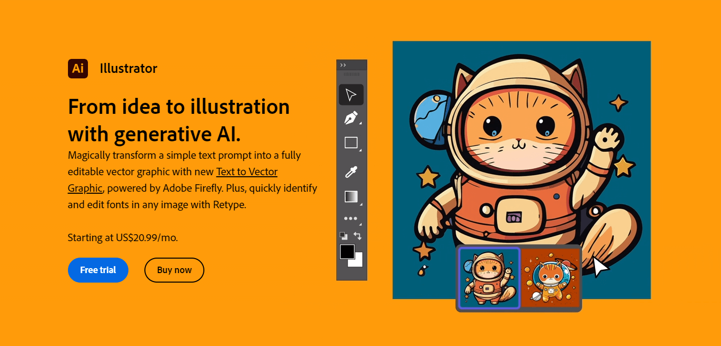
Adobe Illustrator is a vector graphics editor widely used in web design for creating scalable illustrations, brand logos, custom iconography, and typographic design. Its path tools and shape builders allow designers to export vector assets like SVG files that look crisp on modern high-DPI displays.
2.3 Version Control Tools
Git is a distributed version control system used across professional web design and development workflows. Git makes it easy to track code history, manage asset revisions, create isolated feature branches, and coordinate team contributions:
- Initialize Repository: Run git init in your web design project directory to begin tracking code changes.
- Stage Files: Use git add to add modified code files to the staging environment.
- Commit Changes: Execute git commit -m "Message" to save staged snapshots into the project history.
- View Commit History: Run git log to inspect developer authoring details, timestamps, and commit logs.
- Checkout Versions: Use git checkout to inspect or revert project files back to specific historical commits or branches.
- Branching Management: Use git branch to create or inspect development branches, and git checkout to switch between active feature branches.
- Remote Operations: Manage remote cloud repositories using git remote, push local codebase updates with git push, and retrieve team updates using git pull.
3. Step-by-Step Web Design Process
3.1 Requirements Gathering
3.1.1 Defining Website Project Requirements
Clarifying project requirements is the initial phase of any web design guide workflow. Designers must align closely with business stakeholders to map out brand objectives, user personas, and target outcomes.
Key steps to define clear requirements include:
- Stakeholder Discovery Meetings: Conduct discovery sessions to identify core business goals, target audiences, and brand guidelines. Important questions include: What key functional features must the company website provide? Which core content should be highlighted? Are there technical constraints?
- Gather Design Inspiration: Request brand assets, reference sites, layout inspiration, and preferred palette directions to establish early visual expectations.
- Draft a Design Brief: Consolidate user goals, key page templates, visual style specs, and technical deliverables into a design brief that guides the entire website design process.
3.2 Structuring Page Layouts
3.2.1 Selecting Page Layout Systems
Establishing clean structural page layouts is essential during wireframing. The structural layout determines visual hierarchy, content placement, and readability:
- Single-Column Layout: Features a unified, stacked central visual column ideal for mobile screens or simplified landing pages.
- Two-Column Layout: Splitting layout content into a main content section paired alongside a complementary navigation or sidebar column.
- Three-Column Layout: Displays a primary content column flanked by secondary utility sidebars and navigation panels.
- Responsive Dynamic Layout: Uses dynamic grid rules that adjust multi-column structures gracefully across tablet and mobile viewports.
The table below summarizes common layout patterns and their ideal applications:
| Layout Pattern | Key Characteristics | Ideal Use Cases |
| Single-Column | Unified visual path, minimalist structure | Landing pages, portfolio pages, mobile screens |
| Two-Column | Balanced primary section alongside side navigation | Corporate blogs, document sites, dynamic dashboards |
| Three-Column | Information-dense visual structure | Content portals, news sites, complex admin interfaces |
| Responsive Grid | Fluid auto-adapting structure across devices | Modern company website design across desktop & mobile |
3.3 Code Implementation
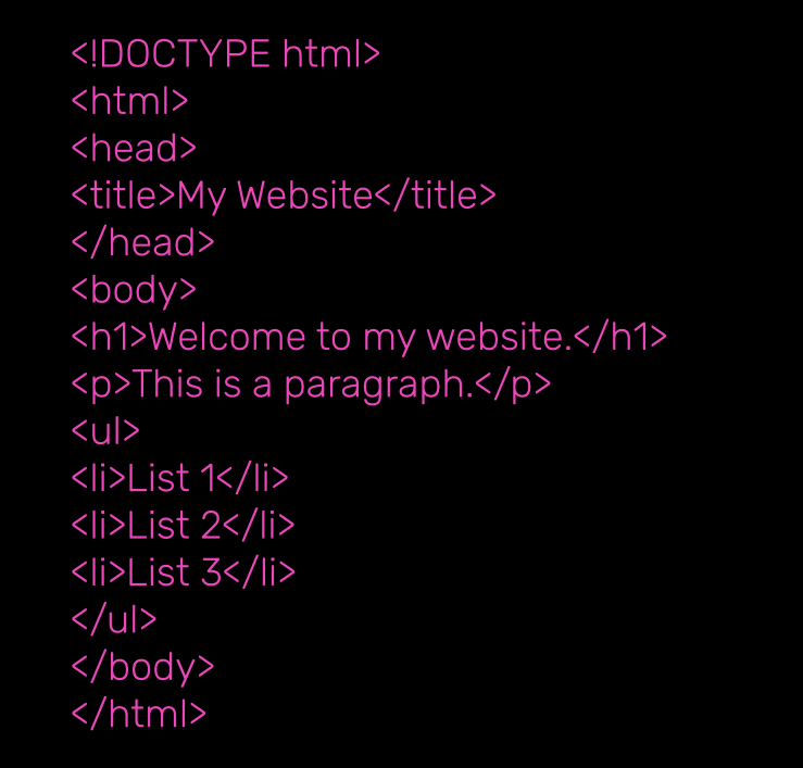
3.3.1 Writing Semantic HTML Code
Writing semantic, accessible HTML is a fundamental step when turning design mockups into functional web pages.
Below is a basic HTML boilerplate snippet:

3.3.2 Writing CSS Styles
After establishing page markup, CSS styles bring visual polish and branding to life.
Below is a basic CSS styling example:
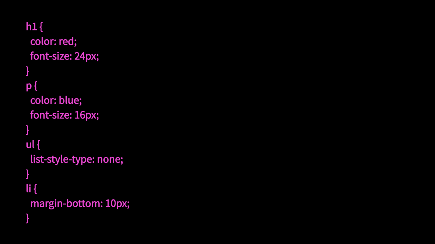
Applying structured CSS properties customizes typography colors, element dimensions, margins, and layout rules, transforming simple text into an engaging digital interface.
3.4 Debugging and Testing
3.4.1 Debugging Front-End Code
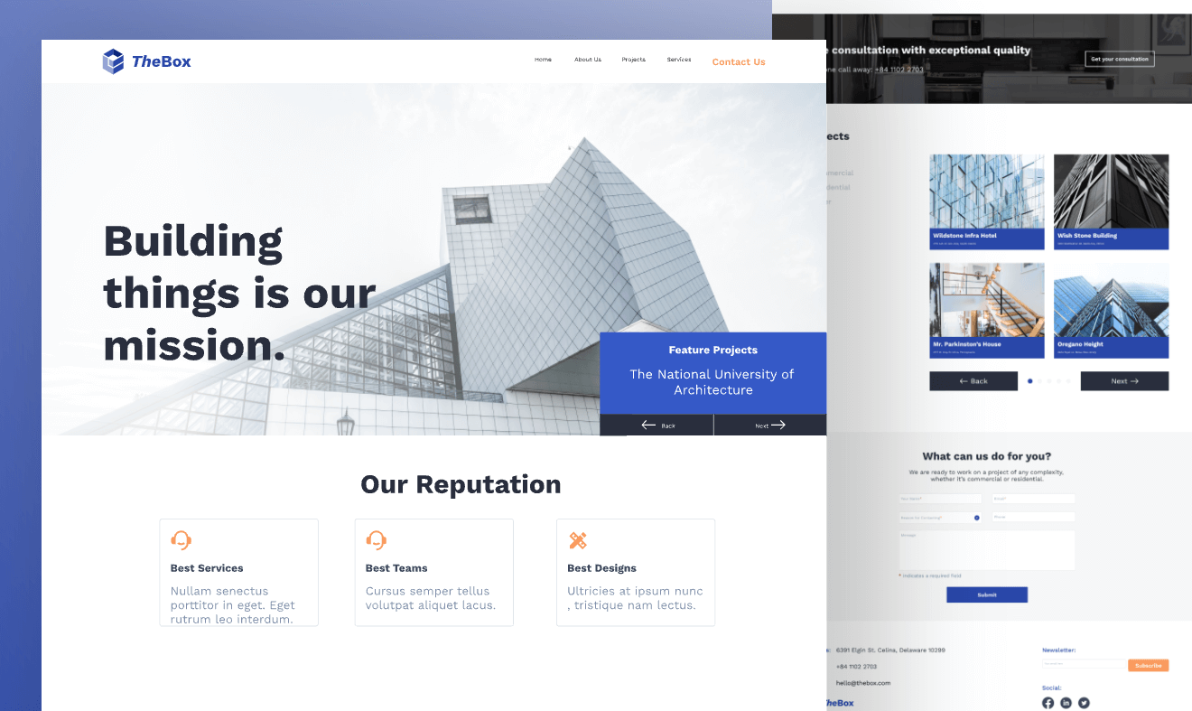
Testing and debugging guarantee functional reliability across devices, ensuring smooth navigation and visual consistency.
Practical debugging workflows using browser Developer Tools include:
- Open Developer Tools: Press F12 or right-click any UI element on your web page and choose Inspect.
- Inspect Elements & Styles: Use the Elements panel to audit rendered DOM structures, adjust CSS parameters live, and fix layout misalignments.
- Audit JavaScript in Console: Open the Console panel to trace runtime errors, review system warnings, and debug custom dynamic scripts.
- Analyze Network Performance: Use the Network tab to analyze asset loading times (images, stylesheets, JS files) and eliminate network performance bottlenecks.
- Set Breakpoints: Use the Sources tab to set debugging breakpoints and step through JavaScript execution line by line.
- Functional Testing: Perform thorough interactive QA testing across form submissions, navigation menus, and call-to-action buttons.
3.5 Deployment and Launch
3.5.1 Pre-Launch Checklist
Prior to pushing your site live, complete a pre-launch audit: verify that all visual assets, copywriting, interactive forms, and third-party integrations function as intended. Confirm that production web servers and domain DNS routing are ready, and perform full site backups.
3.5.2 Step-by-Step Launch Sequence
Deploying a live company website requires a structured execution sequence:
- Configure Web Server Environment: Provision server settings, install security certificates (SSL/TLS), and configure directory permissions.
- Upload Production Files: Transfer final web assets and compiled code base to hosting servers via SFTP, SSH, or automated deployment pipelines.
- Map Domain & DNS Records: Update domain DNS records (A Records, CNAMEs) to point your URL domain directly to hosting server IPs.
- Perform Staging Audit: Run final functional sanity checks on the production server environment.
- Create Production Backups: Archive a clean pre-launch backup copy of all site assets and code configuration files.
- Update Environment Configs: Verify production configuration settings, such as database endpoints and API secrets.
- Publish Site: Go live by removing staging password locks or routing main domain traffic to your live server directory.
- Post-Launch Verification: Inspect live site links, navigation menus, analytics tags, and dynamic forms.
- Monitor DNS Propagation: Allow time for global DNS changes to propagate fully across internet service providers.
- Implement Continuous Monitoring: Monitor uptime, site speed, and user error logs to resolve post-launch issues promptly.
4. Common Web Design Challenges and Solutions
4.1 Cross-Browser Compatibility
Cross-browser visual variance remains a common challenge during website design execution. Browsers can parse default styles or CSS properties differently, leading to layout inconsistencies.
To resolve cross-browser rendering issues, apply these proven methods:
- Use CSS Resets: Apply modern resets (e.g., Normalize.css) to eliminate default browser agent variance and establish a clean, consistent baseline across platforms.
- Vendor Prefixes: Include vendor prefixes (-webkit-, -moz-, -ms-) for newer CSS features to ensure support across older browser versions.
- Cross-Browser Testing: Test page renders systematically across major browsers, including Google Chrome, Mozilla Firefox, Apple Safari, and Microsoft Edge.
- Use Standardized CSS Libraries: Leverage browser-tested components and normalized CSS libraries to minimize rendering quirks.
4.2 Responsive Web Design
4.2.1 What is Responsive Web Design?
Responsive web design is an approach that allows web pages to adapt fluidly to varying display sizes and mobile viewports. Rather than maintaining separate codebases for desktop and mobile devices, responsive web design uses fluid CSS grids, media queries, and dynamic image scaling to deliver optimal readability and usability across all screen sizes.
4.2.2 Advantages of Responsive Design
Adopting responsive web design offers clear advantages:
- Enhanced User Experience: Delivers consistent interface interactions for users accessing your site from desktop monitors, tablets, or smartphones.
- Lower Maintenance Costs: Eliminates the need to maintain separate codebases for mobile and desktop versions, significantly reducing development overhead.
- Boosted Search Engine Rankings: Search engines prioritize mobile-friendly, responsively designed sites, helping drive organic search traffic to your company website.
4.2.3 How to Implement Responsive Design
Implement responsive web design using three core pillars:
- Fluid Grid Layouts: Design structural page grids using relative unit values (percentages, fr units, or Flexbox/Grid) instead of fixed pixel dimensions.
- CSS Media Queries: Tailor CSS rules to specific viewport width thresholds to tweak layouts dynamically.
- Scalable Responsive Graphics: Use responsive image techniques (like max-width: 100% or
elements) to prevent visual overflow on small screens.
4.3 Page Load Speed Optimization
- Problem: Slow loading speed degrades user experience, decreases search engine rankings, and leads to higher bounce rates.
- Solution: Optimize load performance using these front-end optimization techniques:
- Compress & Minify Code: Minify CSS, JS, and HTML files to remove unnecessary whitespace and reduce file download size.
- Image Asset Optimization: Compress images using modern web formats (WebP or AVIF) and implement lazy loading (loading="lazy") for below-the-fold visual content.
- Browser Caching: Configure HTTP cache headers to store static resources locally on the user's device, speeding up repeat visits.
- Defer Non-Critical JavaScript: Add defer or async attributes to script tags to prevent render-blocking during initial page loads.
- Reduce HTTP Requests: Combine visual assets into CSS sprites or vector SVG symbols to reduce network request overhead.
- Clean Up Front-End Code: Remove unused CSS styles and redundant JavaScript logic to improve rendering speed.
5. Company Website Design Examples & Case Studies
5.1 Homepage Design
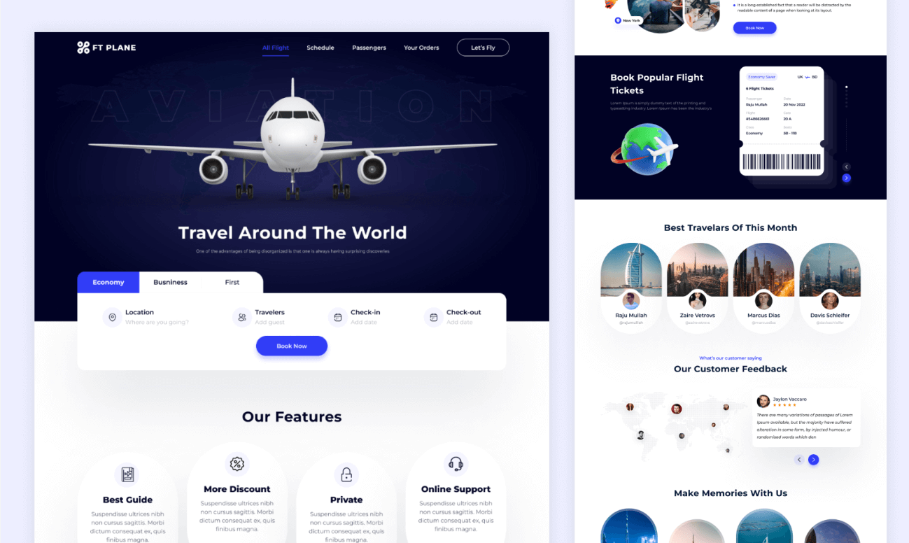
Designing a compelling homepage is a critical highlight of any web design guide. As the primary visual landing hub, a company homepage must instantly capture visitor interest and clearly communicate brand values.
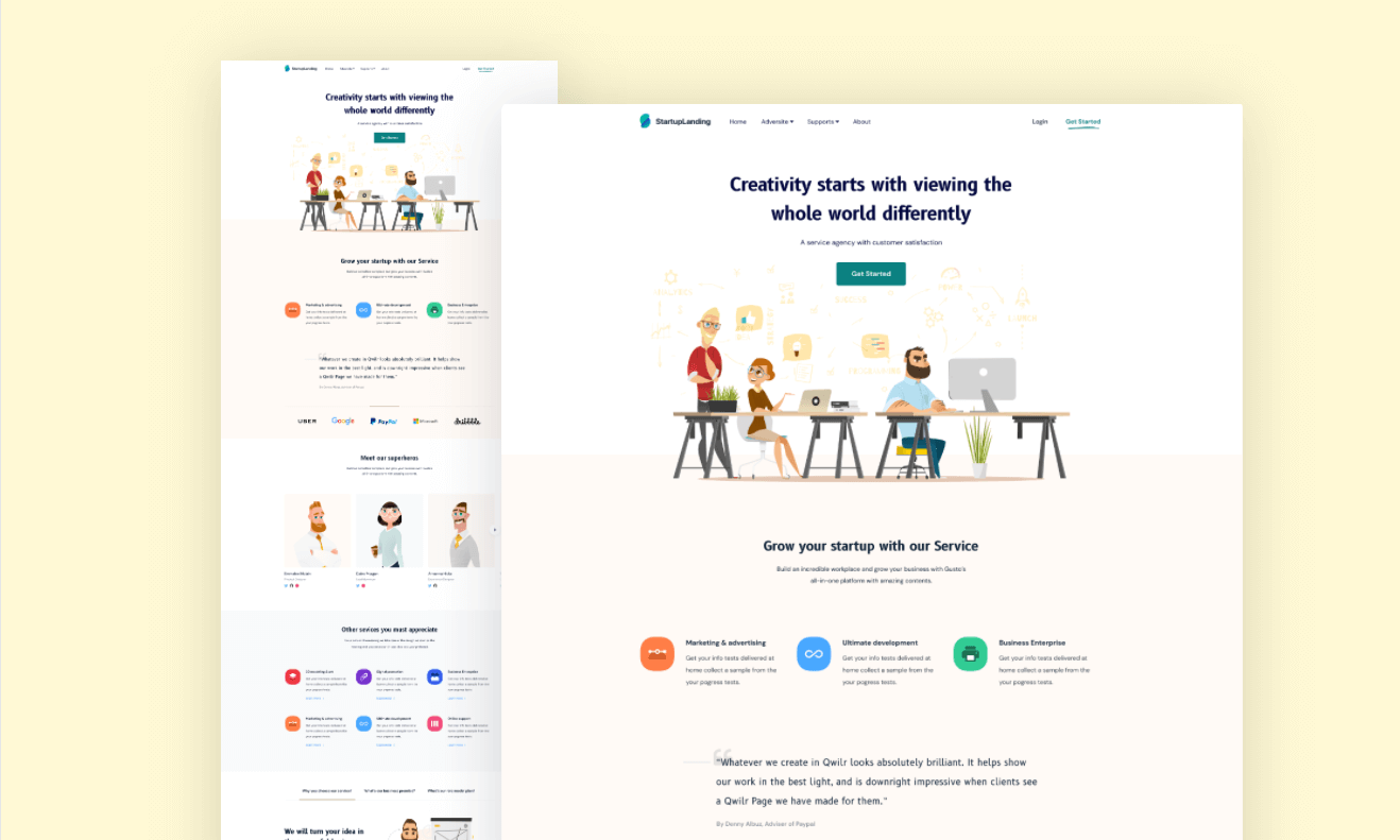
Essential steps for designing a modern corporate homepage include:
- Define Core Objectives and Target Audience: Align homepage messaging with primary user goals, whether driving sales conversions, building brand authority, or capturing incoming project leads.
- Structure Clear Visual Hierarchy: Organize content logically using a hero banner, key feature highlights, social proof sections, and a clear footer.
- Incorporate Strong Visual Assets: Integrate cohesive brand logos, strategic color schemes, crisp imagery, and iconography that reflect corporate identity.
- Build Intuitive Navigation Menus: Feature a prominent navigation header with concise link labels and dropdown menus to help visitors find information easily.
- Craft Engaging Copywriting: Highlight clear value propositions, service highlights, and customer testimonials using scannable headings and concise body text.
- Optimize Loading Speed: Compress high-resolution background visuals and optimize front-end scripts to ensure near-instant page load times.
5.2 Product Showcase Page Design
A well-crafted product showcase page effectively displays product features, engages potential buyers, and streamlines conversion paths.
Key design elements for a product showcase page include:
5.2.1 Page Layout Structure
- Header Navigation: Contains the company logo, clear navigation links, and search access points.
- Main Content Area: Arranged in a functional two-column split layout: high-resolution product image galleries on the left alongside key features, pricing, and specs on the right.
- Footer Section: Houses contact information, help desk links, privacy terms, and corporate copyright details.
5.2.2 Interactive Product Image Gallery
Integrate interactive image carousels or image zoom features on the left column to showcase product angles, details, and real-world usage scenarios.
5.2.3 Features & Value Proposition
Use clean typography, bullet points, and visual iconography on the right column to highlight key product specifications and unique competitive advantages.
5.2.4 User Social Proof & Calls-to-Action
Include customer review scores, user testimonials, and clear call-to-action (CTA) buttons—such as "Buy Now" or "Request a Demo"—to boost conversion rates.
5.3 Contact Us Page Design
The "Contact Us" page provides a direct line of communication between potential clients and your business. The layout should prioritize user convenience, clear information, and visual polish.
Design best practices for a Contact Us page include:
5.3.1 Structured Multi-Column Layout
Organize contact details into clear vertical or horizontal content blocks. Display physical addresses, phone lines, and email channels on one side, alongside an interactive message form on the other.
5.3.2 Clear Contact Information
Display phone numbers, physical locations, and support emails prominently using clean icon markers. Add one-click "click-to-call" and "click-to-email" links for seamless mobile usability.
5.3.3 Intuitive Contact Form
Incorporate a simple contact form with labeled input fields for Name, Email, Subject, and Message. Ensure form fields include input validation and clear confirmation feedback upon submission.
5.3.4 Integrated Social Media Links
Include links to active corporate social media profiles (such as LinkedIn, X/Twitter, or Facebook) within the page layout or footer area to encourage further brand engagement.
Conclusion
Building a company website may seem complex, but following this structured website design guide gives you the foundational knowledge to create professional, high-performing web experiences. Whether you are a beginner or an experienced UI/UX designer, leverage collaborative UI tools like Pixso to bring your website design vision to life!