Elodia
A catalog tells you where a design system lives. A component review tells you whether its rules help with your actual screen. Use these four exercises to produce a documented component decision. They are suggested activities, not a report of usability tests or proof that a design system works for everyone.
1. Prepare a component review sheet
Choose one real screen and one component that creates repeated work. Capture the user task, platform, content and current problems before opening an example.
- Task and context: what the person needs to do and where the component appears.
- Required states: default, focus, active, disabled, loading, empty and error where applicable.
- Content cases: short and long labels, localized text and realistic data.
- Evidence: a link to the current official component guidance and the version or package reviewed.
- Decision: use, adapt or reject, with the reason and the person responsible for implementation review.
2. Work through four component exercises
Material: make a button’s states explicit
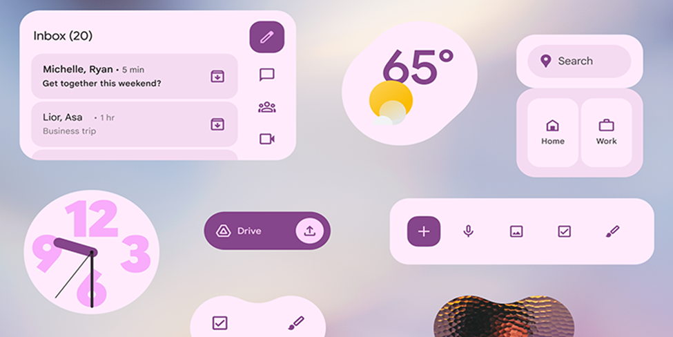
Open Material Design and find the button guidance for your platform. In a copy of your screen, identify the primary action and secondary action. Create the states you actually need instead of only reproducing the default shape.
Deliverable: a state sheet with labels, emphasis, focus and loading behavior. Review whether the same button remains understandable with a longer translated label and beside another action.
Polaris: review an input and its feedback
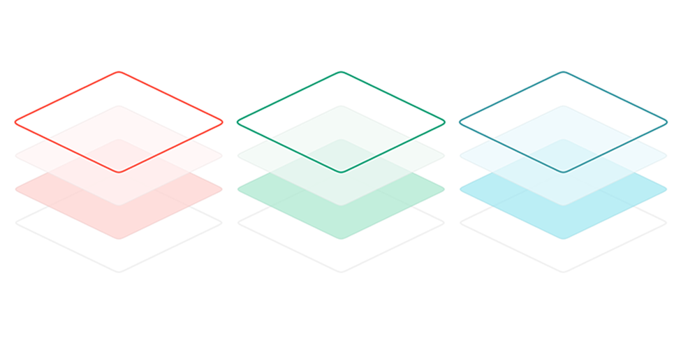
Use the current Polaris web-component documentation for the Shopify surface you target. Choose a form field and distinguish its label, description, validation message and submitted result.
Deliverable: a small form with ready, invalid, submitting and success states. Check which behavior the selected component provides and which the app must implement. Accessibility guidance supports evaluation; it does not guarantee that every finished form is accessible.
Apple HIG: preserve platform expectations
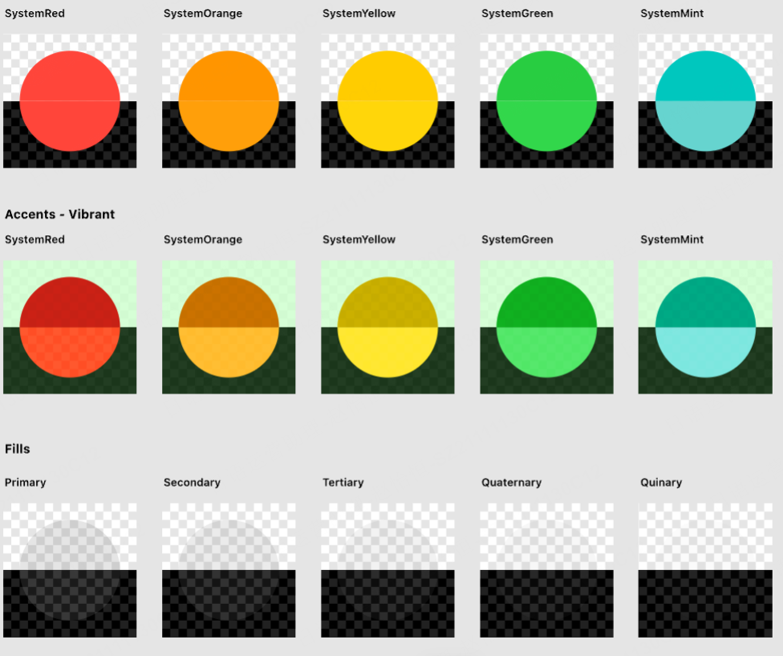
Read the relevant Apple Human Interface Guidelines for navigation or selection. Compare your custom control with the platform convention and write down why any deviation is necessary.
Deliverable: two annotated alternatives and a decision based on the task. Include behavior under larger text settings and the input methods your app supports. Do not treat a screenshot as a complete interaction specification.
Fluent: inspect the target platform and theme
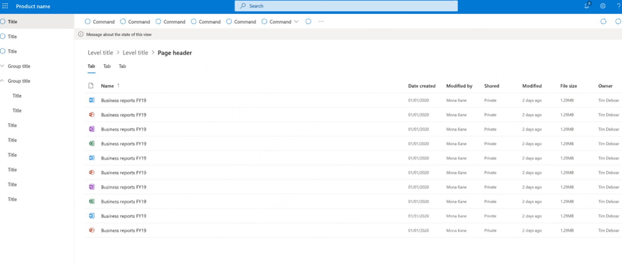
Find the component and platform resources in Fluent 2. Compare its content, state and theme requirements with your screen rather than applying one visual style across all devices.
Deliverable: a component example in the themes you support, with focus, contrast and content-overflow issues marked. Confirm that the implementation package matches your target platform.
3. Review the adaptation with design and engineering
- Keep the source documentation link beside the component so reviewers can check the decision.
- Use realistic data and longer labels before accepting the default dimensions.
- Compare the proposed states with the behavior available in the implementation. Record missing behavior separately from visual changes.
- Review accessibility in the implemented component, including keyboard and assistive-technology behavior. A design file alone cannot establish conformance.
- Record exceptions and a review date so later updates do not silently break the local adaptation.
4. Keep the exercise in a shared Pixso file
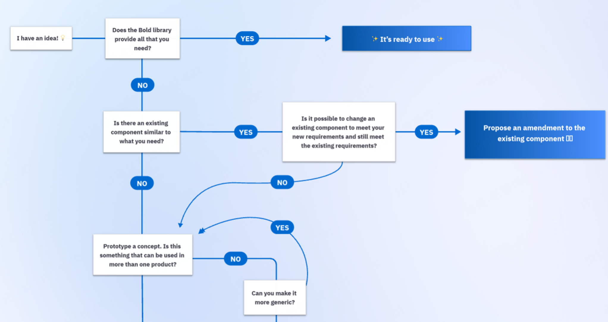
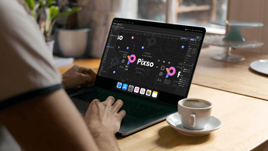
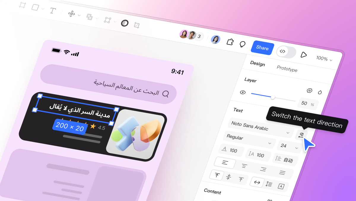
In Pixso, place the original screen, component variants and review notes together. Use reusable components and shared review to keep decisions visible. Verify the current library permissions and plan limits before extending the exercise to a team-wide system.
Use clear component names and annotate the states that developers must implement. Shared styles can help maintain a visual rule, but the team still needs ownership, documentation and testing as the product changes.
5. Keep the output small and reviewable
Finish with one component decision, its state sheet, source links and unresolved questions. Expand only after the component works in the actual product. This keeps the exercise focused on a task rather than producing another large collection of attractive but untested screens.
For a wider shortlist, return to the official design-system resource directory. It covers where to look and what each resource contains; this page focuses on how to inspect a component.