Scott
Reordering a list should answer a simple question: where will this item end up? A person moving a task from fourth to second needs to see the destination before release, confirm the new order afterward, and know whether that order was actually saved. A drag animation alone answers none of those questions. The same task also needs a path for someone who cannot or does not want to drag.
We will design one operations-team priority queue from first move through save failure. If you need to show the pointer, keyboard, and confirmation states to teammates before implementation, you can connect those screens in a Pixso prototype. This article describes the product interaction to design and test; it does not suggest that a visual prototype itself persists a production queue.
Set the order contract before drawing a drag handle
Imagine a queue containing Verify invoice, Contact supplier, Reconcile inventory, Review contract, and Publish update. A coordinator moves Review contract from position four to position two. The expected final sequence is Verify invoice, Review contract, Contact supplier, Reconcile inventory, Publish update. Write that sequence down before designing the interaction; it gives the team a concrete result to inspect.
Decide what the order means. Is it personal to the coordinator, shared by the operations team, or merely a temporary sort in one browser session? A shared queue needs a different save message from a personal list. Also decide whether the UI automatically saves each move or waits for an explicit Save order action. Mixing those models creates a dangerous moment: the cards appear rearranged, but a reload restores the old sequence without explanation.
Keep the meaning of position visible even when item labels are long. Numbered positions can help in a short priority queue, while a grouping label may matter more in a long backlog. Do not use color alone to say that an item has moved. A label such as “Moved to position 2 of 5” is more informative than a brief purple flash.
Make the insertion point visible before drop
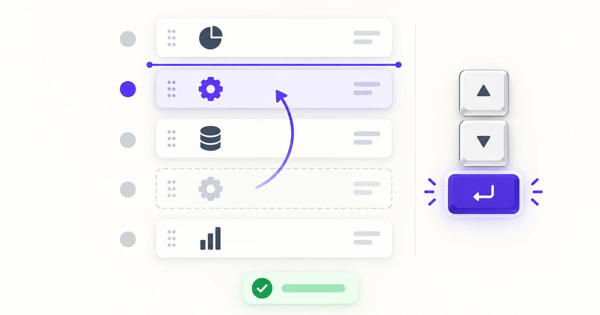
A handle should look like a handle and belong to the row it moves. Put it in a consistent place, with enough space to distinguish it from the row's checkbox, menu, or primary link. Once the pointer picks up Review contract, leave a clear placeholder at its former position and show an insertion line between Verify invoice and Contact supplier. The preview should not imply that the card will replace Contact supplier or open it.
As the item passes another row, show the proposed order continuously. Avoid large, bouncing transitions that make the insertion line jump away from the pointer. If the list scrolls, preserve a stable view of the destination; automatic scrolling should be gentle enough that a user can stop where intended. On touch screens, an accidental scroll must not instantly become a drag. A deliberate handle or other clear activation pattern makes the competing gestures easier to understand.
Some lists cannot be freely reordered. A pinned top item, a locked approval stage, or an item outside the person's permissions may limit destinations. Show the constraint before the person attempts to drop, and explain it in the same language the rest of the interface uses. Do not show an apparently valid insertion line and reject the move only after release unless the restriction genuinely depends on a late server check.
Provide a complete non-pointer route
The drag handle cannot be the only way to change order. One practical design is an action menu on each row with Move up, Move down, and—when the list is long—Move to position…. A keyboard user can focus the row, open the menu, move the item, and return to a predictable focused control. At the first and last positions, unavailable commands should be disabled or omitted consistently, not silently do nothing.
Announce the outcome in terms of the item and its position: “Review contract moved to position 2 of 5.” If the order is still unsaved, say that too. A screen reader user should not have to infer a move from a changed DOM order alone. For a custom list widget, define the roles, focus movement, and command behavior deliberately; the W3C listbox pattern offers useful keyboard and focus principles, but it is not a universal drop-in implementation for every reorderable list. Test the actual interaction with keyboard and assistive technology.
The pointer and keyboard paths must reach the same persisted order. Avoid a “keyboard mode” that only rearranges a visual copy or requires an extra hidden confirmation step. Atlassian's drag-and-drop accessibility guidance is a useful reference for designing beyond a pointer-only gesture; your product still needs its own tested interaction contract.
Confirm the new order, then handle save failure
After release, display the queue in its new order and retain focus on Review contract or its handle. If saving is automatic, show a short pending state followed by confirmation once the server accepts it. Do not call a local rearrangement “Saved” while the request is still pending. If the user must press Save order, show an unsaved-change indicator and make the action hard to overlook before navigation.
A recoverable mistake deserves an Undo action, particularly when a quick drag could move an item several positions. Undo should restore the previous sequence, not merely animate the card back while leaving the stored order changed. If another teammate has edited a shared queue in the meantime, explain which version is currently authoritative. A conflict message should let the coordinator review the latest order and reapply the intended move rather than silently overwrite teammates' changes.
For a failed save, choose and communicate one of two honest models: keep the proposed order marked as unsaved with Retry and Discard, or restore the last confirmed order with a clear explanation. A transient toast that disappears while the cards remain in an uncommitted order is not enough. The list's visual state and the server's accepted state must eventually agree.
Test the states, not just the animation
A small state contract exposes gaps before implementation. Use the same fourth-to-second move for each path rather than testing only a happy-path drag.
| Moment | What the person should see | What to verify |
|---|---|---|
| Ready | Stable order and a recognizable handle or move command | Every item has the same available paths |
| Moving | Original-position placeholder and exact insertion point | Scrolling and touch do not create surprise drops |
| Placed, not saved | New sequence with a pending or unsaved label | Reload behavior matches the stated save model |
| Saved | Confirmation tied to the moved item or list | The accepted sequence survives a reload |
| Rejected or conflicted | Retry, review-latest, or restoration path | No silent divergence from the stored order |
| Undone | Original sequence and clear confirmation | The persisted order, focus, and announcement agree |
Check the same contract with a mouse, touch, keyboard, screen reader, and a narrow viewport. The exact input mechanics may differ, but the resulting item order and save status must be understandable in every path. Atlassian's design guidelines provide a useful comparison for visual feedback and affordances; use observed behavior in your own product to settle the final details.
Map the move and recovery states in Pixso
Build a small storyboard: before, insertion preview, placed but unsaved, saved, and failed. Repeat the placement using the keyboard action menu rather than drawing a second unrelated list. The five task labels and the fourth-to-second move should remain identical across frames; otherwise reviewers may argue about the content instead of the interaction.
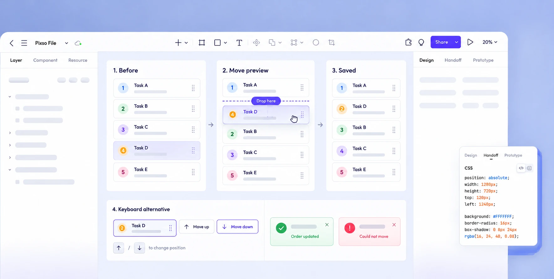
During review, ask someone to predict the outcome before each interaction: Which row will move? Where will it land? Has the new order been saved? What happens when the save fails? If the answer depends on a designer explaining the screen, the interface needs a stronger cue. Once the team agrees on the contract, the same frames can guide implementation and acceptance testing.
Design for a trusted result
The most important part of list reordering is not the motion. It is a trustworthy transition from an old sequence to an intended new sequence, with the same destination reachable without dragging. Show the insertion point before the move, preserve orientation after it, and distinguish a visible rearrangement from a saved change. Those decisions make a priority queue usable when the interaction becomes messy—not only when the animation looks smooth.