Scott
Truncating a name is safe only when the remaining text still helps people identify the right item and they can reach the complete value when needed. If three documents share a long prefix, adding an ellipsis to the end can make all three look identical. A tidy column is not useful if it hides the difference the person came to find.
Start from a practical UI type system, then decide which parts of a name matter for the task. Shrinking the text until everything fits trades an information problem for a readability problem.
Find the part of the name that changes the decision
Imagine a project-deliverable picker containing three files:
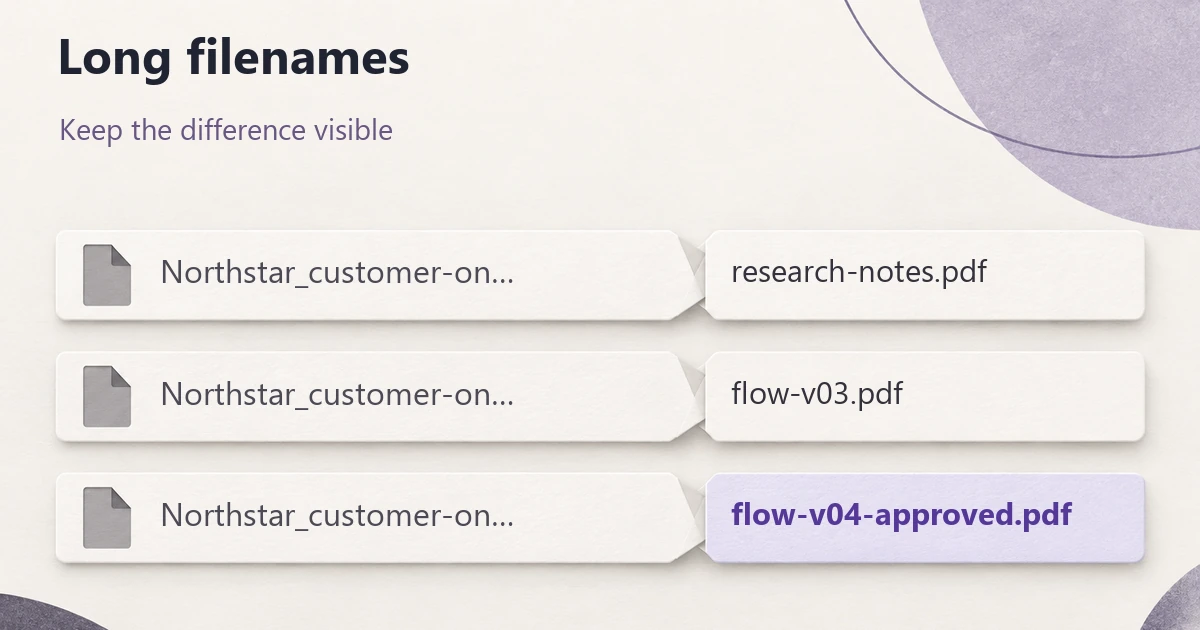
- Northstar_customer-onboarding_research-notes.pdf
- Northstar_customer-onboarding_flow-v03.pdf
- Northstar_customer-onboarding_flow-v04-approved.pdf
The user needs the approved flow. The project prefix gives context, but the suffix distinguishes the correct file. If a compact panel renders all three as “Northstar_customer-on…”, it has hidden the very information needed to choose.
Before choosing a text treatment, identify which part of each value supports recognition, comparison and action. A customer name might be meaningful from its beginning; a filename might need its extension and version suffix; a record identifier might need every character. The same ellipsis position will not serve all three.
Use actual content extremes in the design specimen: a short value, a typical one, an unusually long one, and several that differ only near the end. Random long placeholder text can reveal overflow while missing the identification problem entirely.
Let wrapping earn its space
Wrapping is often the clearest option when names are primary content. Two lines can preserve more distinguishing text while keeping a list scannable. In the deliverable picker, allowing the filename to wrap may be more useful than squeezing a decorative thumbnail beside it.
Variable row heights have consequences. Align supporting metadata deliberately, keep actions associated with the right item, and prevent a long name from pushing the only control outside the visible panel. Test several long rows together rather than placing one long row among convenient short ones.
A line limit does not remove the need for a disclosure rule. If the third filename still exceeds two lines, decide where its complete value can be read and copied. “Two lines” is a layout constraint, not a guarantee that the important text will fit.
For values that cannot break naturally, such as identifiers or long unspaced strings, specify wrapping behavior with engineering. Breaking a displayed value across lines must not insert characters into the value someone copies.
Use an ellipsis where it hides the least useful text
| Treatment | Useful when | Failure to watch for |
|---|---|---|
| Wrap | The value is important and extra vertical space supports the task. | Actions drift away from their item or repeated long rows become difficult to scan. |
| End ellipsis | The opening words usually distinguish items and the full value remains reachable. | Shared prefixes conceal meaningful endings, versions or qualifications. |
| Middle ellipsis | Both the beginning and ending carry identifying information. | Too little of either side survives, or the implementation cuts an important character sequence. |
| Short display name plus detail | The product has a legitimate human-readable label separate from a full identifier. | A generated abbreviation makes different records indistinguishable or looks like the underlying value changed. |
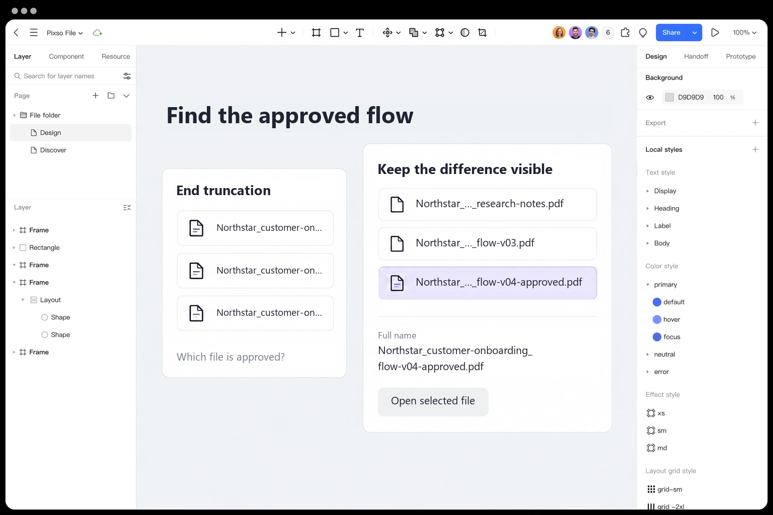
For the example picker, a middle treatment such as “Northstar_…_flow-v04-approved.pdf” keeps the project cue and the distinguishing suffix. It is worth testing, not automatically correct. At a still narrower width, the suffix may dominate so much that the list loses project context. A wrapped label or a focused detail view may then be clearer.
MDN's text-overflow reference explains how clipped overflow can be signaled. The property does not itself create an overflow condition or supply a way to read the complete value. Middle truncation also requires an appropriate implementation; a designer cannot specify an arbitrary center cut and assume one CSS setting will reproduce it.
Use an ellipsis to communicate that text is omitted, not as decoration after a complete value. Preserve the underlying name. Copying a filename should normally copy the complete filename, not the shortened rendering.
Make the full value reachable without a mouse hover
A hover tooltip can supplement a compact label on pointer devices, but it should not be the only route to important text. Touch users do not have a dependable hover state, and keyboard users need a reachable interaction. Depending on the task, an expanded row, details panel, clearly labeled disclosure, or destination page may be more useful.
A name that opens a file has a primary action already. Do not make a first tap unpredictably reveal its tooltip and a second tap open the file. Keep opening, selecting and revealing distinct when the distinction matters. In the picker, the row can select the deliverable while a clearly named details action exposes its full name, type and version.
If you use custom content on hover or focus, WCAG's guidance for SC 1.4.13 describes dismissible, hoverable and persistent behavior, with specified exceptions. A tooltip that vanishes when the pointer moves toward it or covers the next control is not a reliable reading surface.
Keep the complete text available through appropriate accessible semantics in the implementation, and test how it is announced. Do not blindly add a second accessible label that causes the same name to be read twice. Visual access and programmatic access need to agree on which record the user is choosing.
Compare the same names at two widths in Pixso
Create a content specimen in a Pixso design file with a 280px picker panel and a 640px table. These are test widths for this exercise, not universal breakpoints. Place all three filenames in each layout. Compare wrapping, end ellipsis, and a proposed middle treatment without changing the strings to make a variant look better.
Keep the selected state and the full-name detail beside the compact list. Ask a reviewer to find the approved flow and copy its complete name. If they must open every file to distinguish them, the compact treatment has failed the task even if no text overflows.
Annotate which portions must remain visible and where the full value is available. Keep any proposed middle-truncation logic in the handoff notes; a static frame demonstrates the intended result, while the actual text handling needs implementation testing.
Compare long-content layouts in Pixso →
Some text should change the layout instead
Do not hide the useful part of an error message to maintain equal-height cards. A message such as “Cannot submit until…” is not actionable if its condition disappears. Let the message wrap or move it to an appropriate persistent region.
The same caution applies to amounts, safety instructions, status qualifiers and action labels. “Delete selected…” can conceal what will be deleted. A value with an omitted minus sign or unit can become misleading. Prioritize the information before deciding that an ellipsis is harmless.
When a compact UI repeatedly needs long overlays just to explain its labels, reconsider the density. Remove secondary metadata, move details to a deliberate second level, or allocate more width to the identifying content. The tooltip, popover and dialog comparison can help when additional content genuinely needs its own surface; it should not become a workaround for every crowded row.
Retest the decision when the text changes
Character counts do not predict rendered width across fonts, languages and scripts. A translated label may wrap differently; a missing font may change the measurements; user text enlargement may remove the space that the original specimen relied on. Test supported scripts and longer localized values in the same interaction, not only in a typography sample elsewhere.
Check the list at narrow widths and enlarged text, then use keyboard and touch to reach the complete values. Confirm that focus indicators and actions remain visible and that copying returns the original data. For the deliverable picker, the final test remains simple: can someone distinguish the approved flow from the research notes and the older version without guessing?